In SwiftUI’s layout system, the .layoutPriority modifier might seem inconspicuous at first glance, yet it can decisively influence a view’s size allocation when it matters most. Most developers know its “magic”—in a VStack or HStack, a higher priority view will fight for more space when things get cramped. But did you realize that .layoutPriority can work wonders in a ZStack too? Its behavior there is entirely different from VStack and HStack. In this article, we’ll dive deep into this little-known feature and show you how to harness layout priority inside a ZStack.
What Is layoutPriority
Apple’s official documentation defines .layoutPriority like this:
Sets the priority by which a parent layout should apportion space to this child.
In other words, you can assign a numeric priority (default is 0) to a view. But the docs don’t explain whether—or how—each container actually uses that information during layout.
Put another way: Different layout containers may interpret and apply layoutPriority in wildly different ways. Understanding each container’s “rules of the game” is key to mastering SwiftUI layouts.
layoutPriority in HStack and VStack
In HStack and VStack, most developers have already found plenty of use cases for .layoutPriority. When space is tight, a higher-priority view will claim a larger portion of the proposed size.
Example 1: HStack
struct HStackDemoView: View {
    var body: some View {
        HStack(spacing: 0) {
            Text("Leading String, Leading String")
                .font(.largeTitle)
                .layoutPriority(0)      // Default
                .border(Color.red, width: 2)

            Text("Trailing String 123456")
                .font(.largeTitle)
                .layoutPriority(1)      // Higher priority
                .border(Color.orange, width: 2)
        }
        .frame(height: 50)
    }
}
When the container’s width is insufficient, the second Text (priority 1) arrogates more of the available space.

Example 2: VStack
struct VStackDemo: View {
    var body: some View {
        VStack(spacing: 0) {
            Rectangle()               // Default priority 0
                .foregroundStyle(.green)
            Text("Hello World")       // Default priority 0
            Rectangle()
                .foregroundStyle(.pink)
                .layoutPriority(1)    // Higher priority
        }
        .frame(height: 300)
    }
}
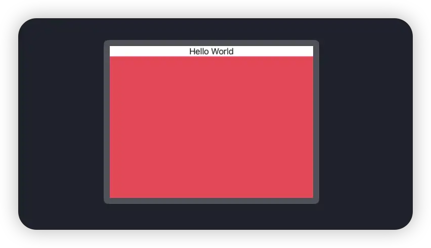
Here, the pink rectangle—with its higher priority—takes most of the vertical space, and the green rectangle is pushed out of view.

You might then wonder: why does the Text, also priority 0, remain visible? Even if you lower its priority further:
Text("Hello World")
    .layoutPriority(-100)   // Very low priority
…it still displays fully. This is because VStack treats “greedy” versus “non-greedy” views differently:
- Greedy views (like
Rectangle) report an infinite size in the container’s maximum-size query—they “want” all the space. - Non-greedy views (like
Text, or any view with an explicitframe) report only their intrinsic size.
When distributing space, VStack first satisfies all non-greedy views, then—among the greedy ones—it compares layoutPriority values. Since the pink rectangle and the Text belong to different “greediness” categories, they don’t compete directly.
A More Extreme Example
struct VStackDemo: View {
    var body: some View {
        VStack(spacing: 0) {
            Rectangle()
                .foregroundStyle(.green)
            Text("Hello World")
                .layoutPriority(-100)   // Very low priority
            Rectangle()
                .foregroundStyle(.pink)
                .layoutPriority(1)
        }
        .frame(height: 20)            // Only enough to show the Text
    }
}
This scenario highlights the difference even more: when the overall height is reduced to only fit the Text, it still remains visible, whereas the higher-priority pink rectangle is completely clipped.

Further Reading: For a thorough dive into
VStack’s sizing behavior, see my Let Vision 2025 talk “Exploring the Secrets of SwiftUI Layouts”.
From these examples, it’s clear that in HStack/VStack, layoutPriority affects how space is apportioned among siblings, not the container’s overall size. Next, let’s unravel how ZStack does things differently.
layoutPriority in ZStack
I had never realized that ZStack would also change its behavior based on its children’s priorities—until early this morning, when Kyle Ye (the author of OpenSwiftUI) messaged me. While working on OpenSwiftUI’s ZStack implementation, he discovered that layoutPriority affects the container’s resulting layout size.
struct ZStackDemo: View {
    var body: some View {
        ZStack(alignment: .topTrailing) {
            Rectangle()
                .foregroundStyle(.red.opacity(0.8))
                .frame(width: 200, height: 200)
                .layoutPriority(1)

            Rectangle()
                .foregroundStyle(.blue.opacity(0.8))
                .frame(width: 100, height: 100)
                .layoutPriority(2)

            Rectangle()
                .foregroundStyle(.orange.opacity(0.8))
                .frame(width: 150, height: 150)
                .layoutPriority(2)
        }
        .border(Color.black, width: 5) // Shows ZStack’s layout size
    }
}
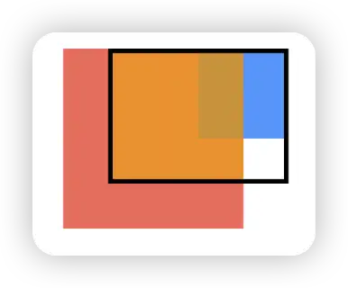
Notice the black border encloses only a 150×150 area—ignoring the 200×200 red rectangle. This reveals that:
ZStackdoes not simply use the smallest bounds that contain all subviews.- Instead, it calculates the minimum aligned size that fully contains all views with the highest
layoutPriority(in this case, 2), and uses that as its own required size.
To visualize this even more clearly, we can tweak the blue rectangle’s alignment:
Rectangle()
    .foregroundStyle(.blue.opacity(0.8))
    .frame(width: 100, height: 100)
    .layoutPriority(2)
    .alignmentGuide(.trailing) { $0.width / 2 }
This shifts the blue view under the .topTrailing alignment, yet the ZStack’s border still surrounds only the two priority-2 rectangles.

Dynamically Resizing ZStack
Armed with this behavior, you can keep subview sizes and identity stable, but toggle their priorities to let the ZStack expand or contract—something that plain if/switch conditionals or even ViewThatFits can’t achieve. For example:
struct SwitchDemo: View {
    @State private var selection: Selection = .a

    var body: some View {
        VStack {
            HStack {
                Text("Hello")
                DynamicSizeZStack(selection: $selection)
                Text("World")
            }
            .padding()

            Picker("", selection: $selection.animation()) {
                ForEach(Selection.allCases) { Text($0.rawValue).tag($0) }
            }
            .pickerStyle(.segmented)
            .padding(.horizontal)
        }
    }
}

struct DynamicSizeZStack: View {
    @Binding var selection: Selection

    var body: some View {
        ZStack {
            Rectangle().frame(width: 200, height: 200)
                .layoutPriority(selection == .a ? 1 : 0)
                .opacity(selection == .a ? 1 : 0)

            Rectangle().frame(width: 150, height: 150)
                .layoutPriority(selection == .b ? 1 : 0)
                .opacity(selection == .b ? 1 : 0)

            Rectangle().frame(width: 100, height: 100)
                .layoutPriority(selection == .c ? 1 : 0)
                .opacity(selection == .c ? 1 : 0)
        }
        .animation(.default, value: selection)
    }
}

enum Selection: String, CaseIterable, Identifiable {
    case a, b, c
    var id: Self { self }
}
With this trick, the parent container can automatically resize based on the active view—without recreating or resizing the subviews themselves—adding a powerful new tool to your SwiftUI layout toolbox.
💡 Common Practical Quick References
Black Box & Documentation
SwiftUI has now been around for seven years. On the surface, each release brings a host of new APIs, yet its core layout engine remains fundamentally unchanged. That original, carefully crafted design lets us witness consistent “rules” across HStack, VStack, and—now we know—ZStack.
Unfortunately, Apple’s official documentation often only “lifts the veil” in small snippets, leaving many layout details unexplained. We must stitch together our understanding through experimentation, open-source projects (e.g., OpenSwiftUI), and shared experiences.
When I find myself lost in the sparsity of docs and the mystery of this “semi-black-box,” I can’t help but quip:
“Thank you, Apple, for your restraint in documentation—giving us developers more joy in uncovering the secrets ourselves, and less chance of being replaced by AI.”
Happy stacking!