Grow is a health management app that has received App Store Editor’s Choice recognition in 173 countries and regions, with over 180,000 five-star reviews. When adapting to iOS 26’s Liquid Glass design language, the team faced numerous challenges: How to implement native morph effects in a UIKit + SwiftUI hybrid architecture? How to precisely control Scroll Edge Effect? How to handle dynamic sizing of custom navigation bar elements?
I invited Shuhari, one of Grow’s developers, to share the team’s practical experience during this adaptation process. The article covers refactoring solutions for common scenarios like Sheet, Navigation, and Popover, delves into underlying details such as UIBarButtonItem size calculation and CABackdropLayer side effect handling, and demonstrates how to create a unique “glass text” effect using Core Text. All core concepts come with a complete Demo project.
As a health product that has been evolving since 2021, Grow strives to integrate interesting and refined elements into what would otherwise be mundane data dashboards through stylized design. These elements naturally impose higher requirements on code implementation—complex UI and interactions have become key challenges we need to address. From Storyboard/XIB in the project’s early stages to a hybrid architecture based on UIKit with SwiftUI as a functional supplement, Grow has continuously sought balance between design philosophy and technical implementation.
As mentioned above, Grow’s code structure is relatively traditional, based on UIKit design. Therefore, the adaptation experience listed below primarily targets UIKit or hybrid architecture applications and may not be fully applicable to pure SwiftUI architecture apps.
Since the eve of iOS 26’s release, Grow has been conducting technical research based on rumors and attempting to integrate with the new design paradigm. After WWDC25, the team quickly began refining Liquid Glass interactions and design, first establishing two basic adaptation principles:
- Maintain the user experience for Grow users on older iOS versions unchanged
- Bring familiar interactions but refreshing visual experiences to users upgrading to iOS 26
To achieve these two goals, we need to first understand the project’s current state. Let’s start with presentation sheet refactoring:
Sheet Refactoring
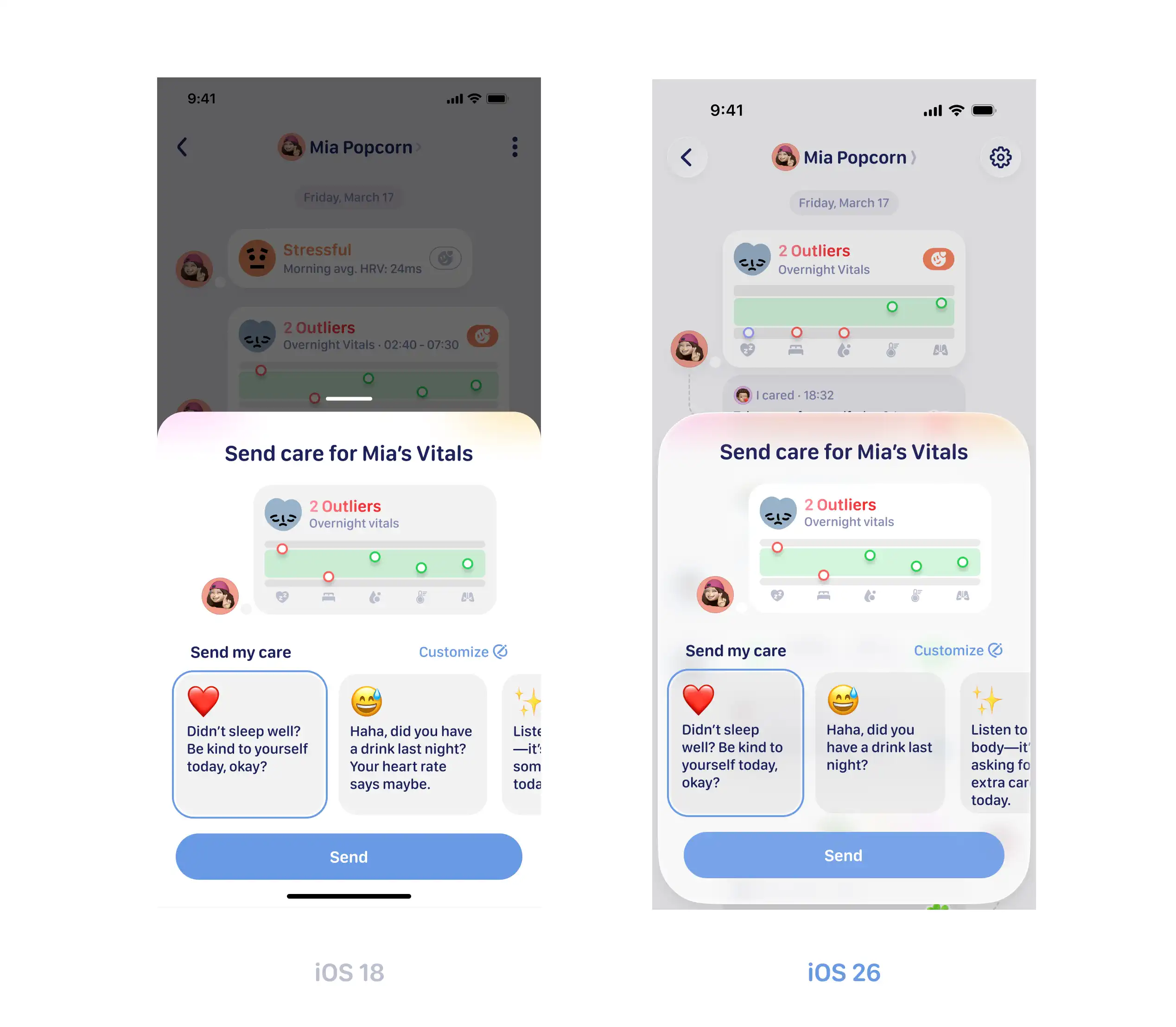
In Build a UIKit app with the new design, Apple clearly states that to fully showcase Liquid Glass’s glassy texture, all custom background content needs to be removed. For applications using APIs like sheet(isPresented:onDismiss:content:) or UISheetPresentationController, you simply need to use availability checks like #available(iOS 26.0, *) to differentiate background configurations for different system versions.
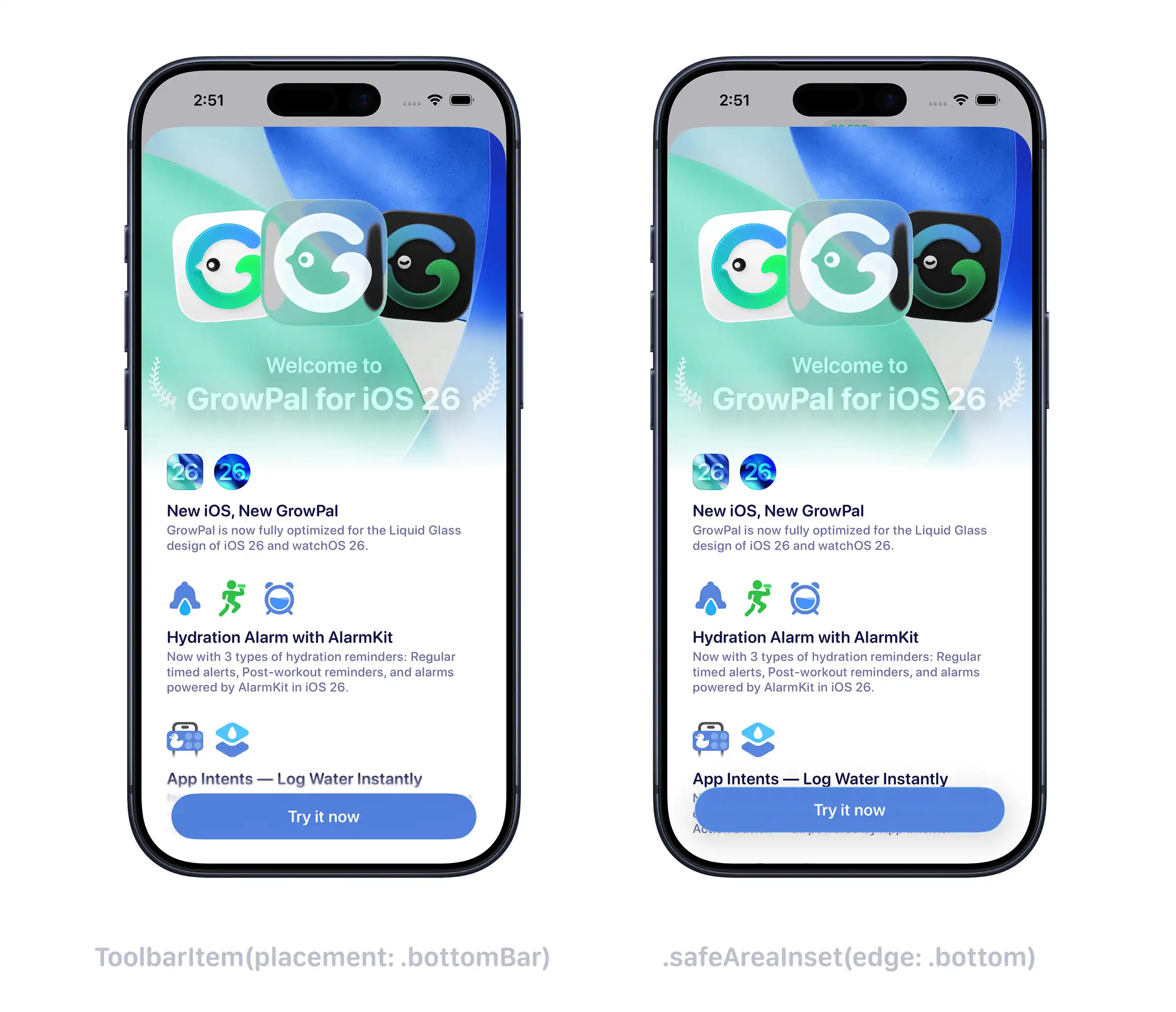
Additionally, to control the edge blur effect (Scroll Edge Effect), you can use ToolbarItem(placement: .bottomBar) to activate the effect and .safeAreaInset(edge: .bottom) to disable it. For example, when you need to keep content clear at the bottom of the page, you can use the latter to cancel the blur.
Navigation Refactoring
Grow uses UINavigationController to implement the navigation system, but early versions didn’t directly use UINavigationBar. Instead, we used custom UIView to host complex UI elements to simulate navigation bar functionality. Starting with the new version supporting iOS 26, we brought back the native UINavigationBar, hoping to unify the design language and improve development efficiency through Apple’s best practices.
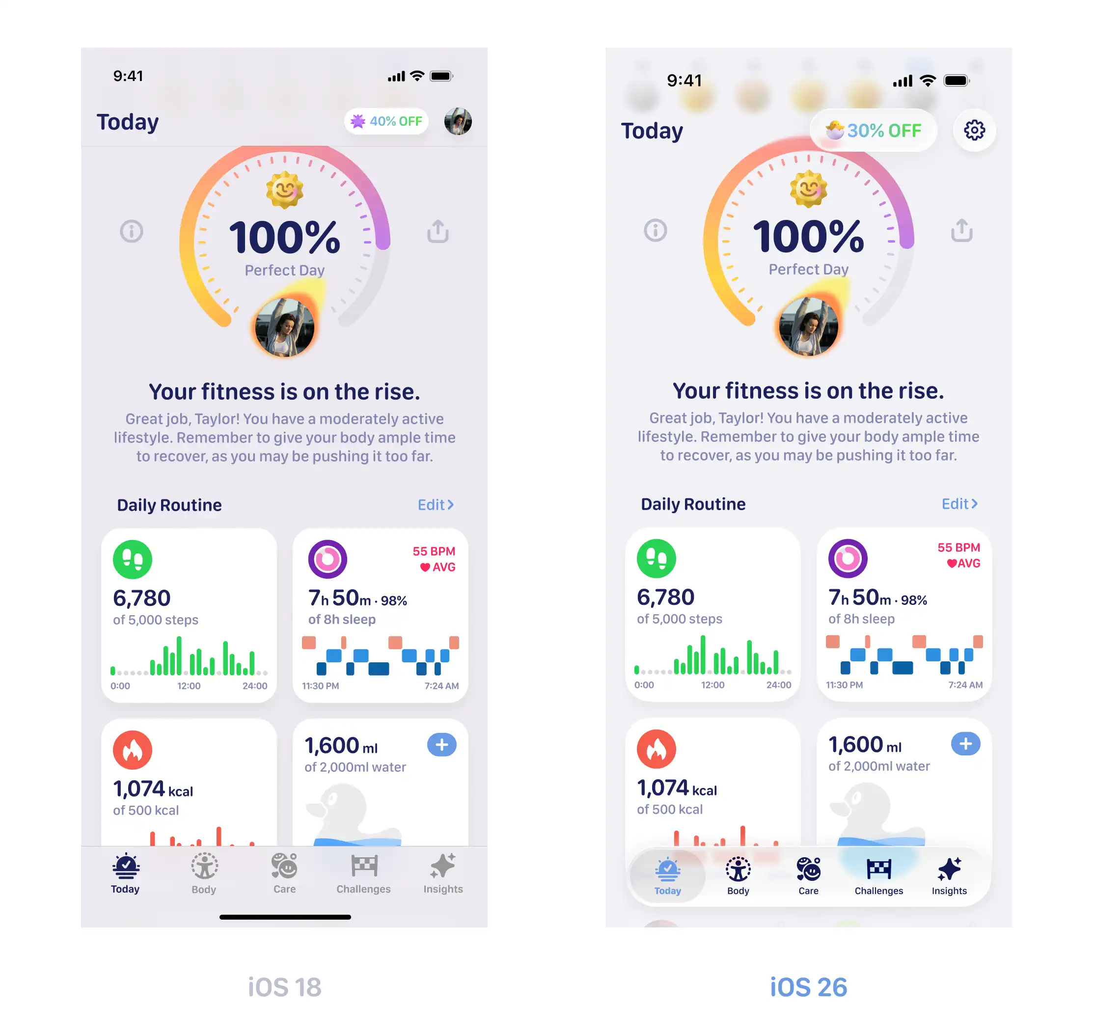
The five Tab pages in Grow have similar structures—all display a navigation bar in a UINavigationController container and use scroll containers like UIScrollView at the bottom to present page content. Therefore, you only need to configure navigationItem and use Auto Layout to lay out the scroll container:
private func setupNavigationItems() {
    navigationItem.largeTitleDisplayMode = .never
    navigationItem.leftBarButtonItem = ...
    navigationItem.rightBarButtonItem = ...
}

private func setupCollectionView() {
    collectionView.translatesAutoresizingMaskIntoConstraints = false

    NSLayoutConstraint.activate([
        collectionView.topAnchor.constraint(equalTo: view.topAnchor),
        collectionView.leadingAnchor.constraint(equalTo: view.leadingAnchor),
        collectionView.trailingAnchor.constraint(equalTo: view.trailingAnchor),
        collectionView.bottomAnchor.constraint(equalTo: view.bottomAnchor)
    ])
}
Implementing Morph Menu Effect with popoverPresentationController
To incorporate more Liquid Glass elements, we adjusted the date selection component on the “Insights” page from a sheet presentation to a custom popover menu form:
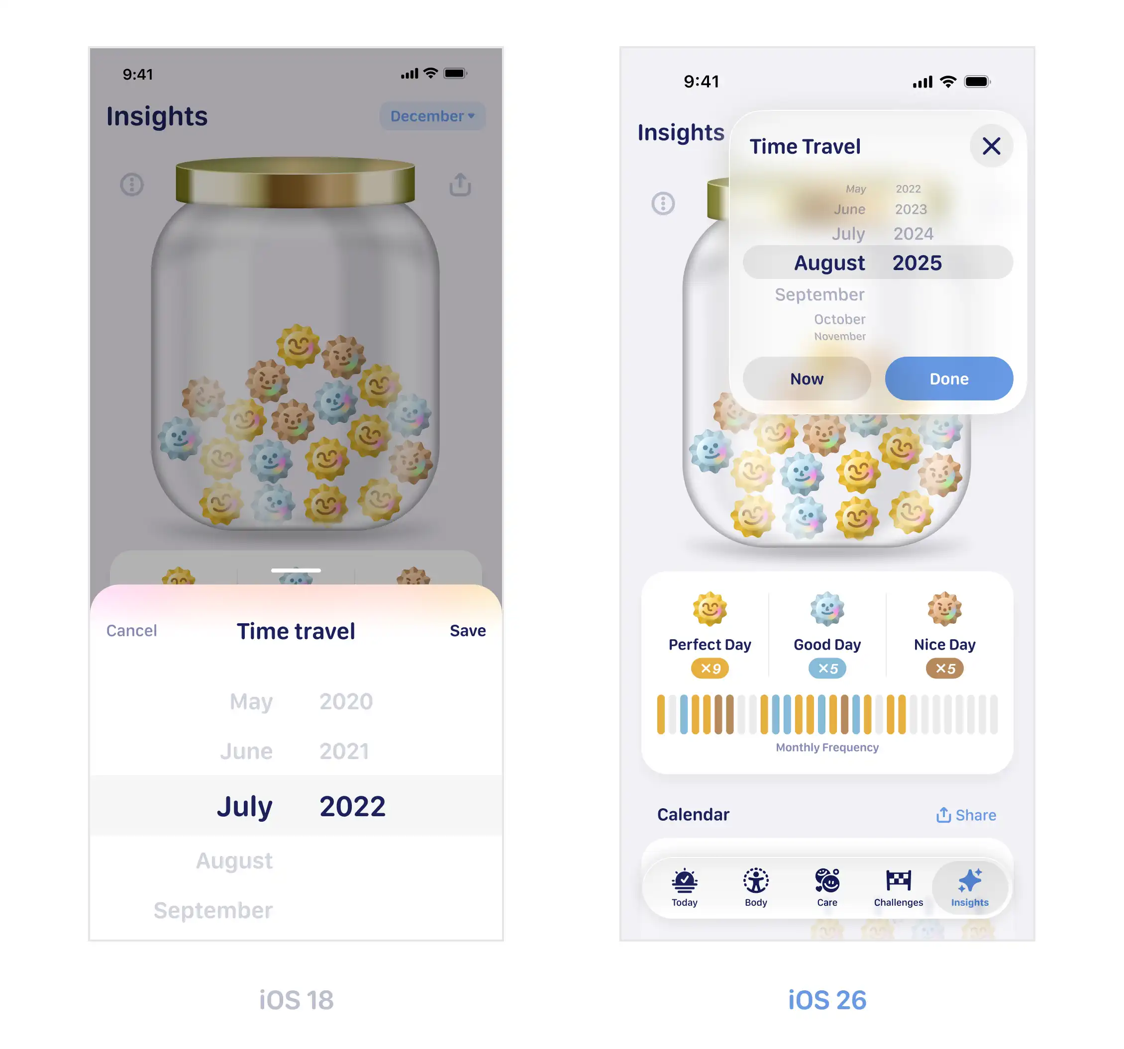
In UIKit, after laying out UI elements in UIViewController, we use popoverPresentationController and bind navigationItem.rightBarButtonItem to .sourceItem to achieve this effect:
private func setupCalendarButton() {
    let rootView = InsightsCalendarDatePickerButton(viewModel: calendarViewModel)
    let hostingController = UIHostingController(rootView: rootView)
    hostingController.view.backgroundColor = .clear
    hostingController.sizingOptions = [.intrinsicContentSize]

    let barButtonItem = UIBarButtonItem(customView: hostingController.view)
    navigationItem.rightBarButtonItem = barButtonItem

    calendarBarButtonItem = barButtonItem
}

private func calendarButtonTapped() {
    let popoverVC = InsightsCalendarDatePickerViewController(
        currentDate: currentMonth,
        minimumDate: minimumDate
    ) { [weak self] updatedDate in
        self?.calendarViewModel.updateMonth(using: updatedDate)
    }

    popoverVC.modalPresentationStyle = .popover
    popoverVC.popoverPresentationController?.sourceItem = calendarBarButtonItem
    popoverVC.popoverPresentationController?.delegate = self

    present(popoverVC, animated: true)
}
Since the UI width displayed on rightBarButtonItem for the finally selected date may vary, you need to set sizingOptions to [.intrinsicContentSize] when constructing UIHostingController, making it follow the root view’s content size.
If your application needs to implement similar effects in other scenarios using SwiftUI, you can refer to these two demos by Kavsoft:
Grow didn’t adopt these two implementation approaches for the following reasons:
- When bridging pure SwiftUI implementations through
UIHostingControllerin UIKit-based navigation bars, data coordination and view positioning become quite complex. - Navigation bar space is limited, and displaying child views that exceed the range typically requires handling complex responder chain issues.
Using UIPopoverPresentationControllerDelegate elegantly solves both problems:
func popoverPresentationControllerShouldDismissPopover(_ popoverPresentationController: UIPopoverPresentationController) -> Bool {
    return true
}

func prepareForPopoverPresentation(_ popoverPresentationController: UIPopoverPresentationController) {
    if let presentedVC = popoverPresentationController.presentedViewController as? InsightsCalendarDatePickerViewController {
        presentedVC.view.layoutIfNeeded()
    }
}popoverPresentationControllerShouldDismissPopover(_:)solves the response priority issue: when the popover is presented, clicking anywhere on the screen will prioritize closing the popover, except for manually callingdismiss(animated:).prepareForPopoverPresentation(_:)allows us to process content before the popover is finally presented, such as content size calculation, resetting internal animation states, etc.
UIBarButtonItem Size Calculation in UIKit + SwiftUI Environment
Grow designed clear page titles on the left side of the navigation bar for some top-level Tab pages, and some titles also implement simple content transition animations through .contentTransition(.numericText()). Taking the Today page as an example, when users select different dates, date text of different lengths needs to be displayed:
Considering the need to configure this custom view on UIKit’s navigationItem, we may encounter the following two problems:
- Which framework should be used to support this functionality and transition animation?
- How to handle the dynamic width of date text in
navigationItem?
Let’s solve them one by one:
The first problem is relatively simple. The most convenient way to use .contentTransition(.numericText()) is through SwiftUI View with injected ObservableObject, adjusting the currently selected Date data in the UIKit environment.
To handle the second problem, first construct the Text view wrapped by UIHostingController through UIBarButtonItem(customView:) and set it as navigationItem.leftBarButtonItem. Also remove the Liquid Glass effect on iOS 26: barButtonItem.hidesSharedBackground = true. Additionally, to ensure SwiftUI can correctly calculate content size and pass it to UIKit, you need to set the container’s sizingOptions to intrinsicContentSize. It will automatically update each time Text content changes and the view body recalculates.
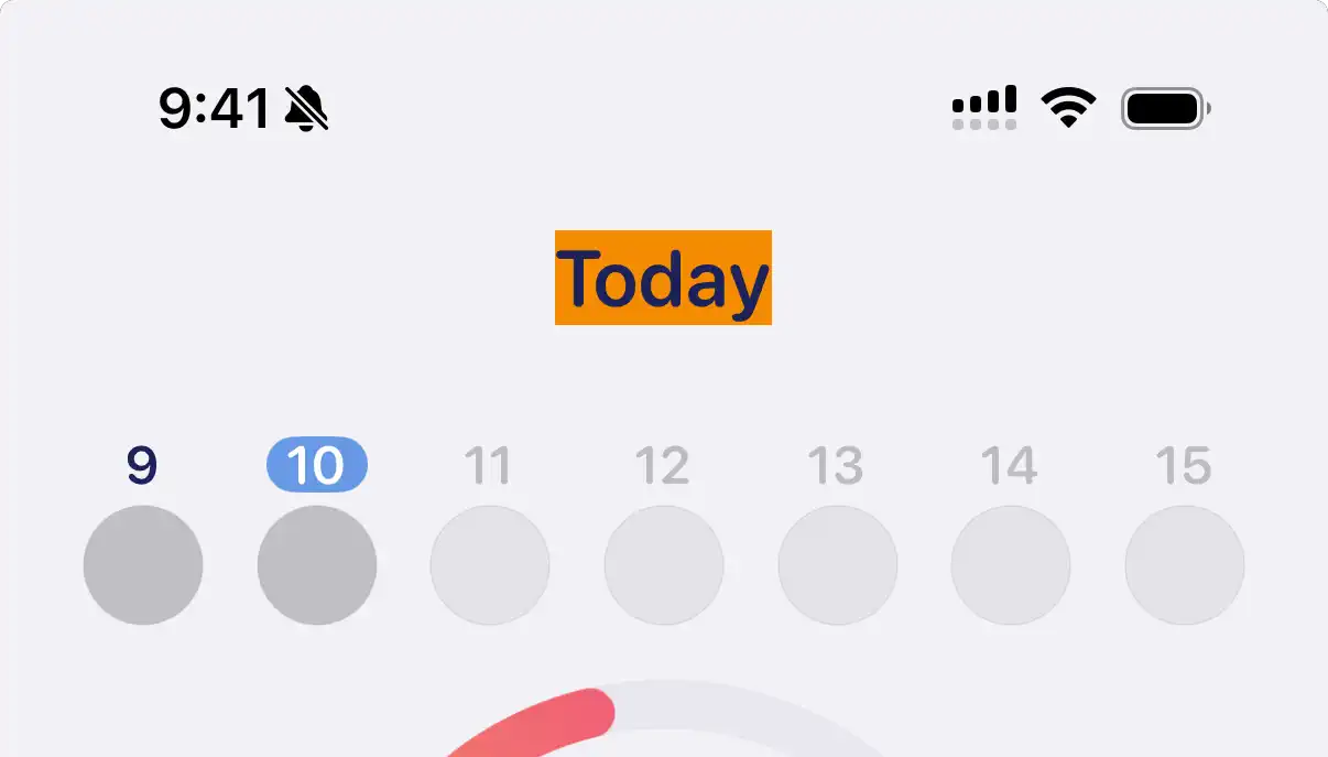
Besides SwiftUI’s size settings, you also need to adjust constraint conditions on the UIKit navigation bar. Content configured through custom view on navigationItem doesn’t recalculate size based on content changes by default (note the orange background in the video below).
Obviously, the orange background in the video didn’t adjust with intrinsicContentSize, indicating it was compressed. We just need to increase the content compression resistance priority:
hostingController.view.backgroundColor = .systemOrange
hostingController.view.translatesAutoresizingMaskIntoConstraints = false
hostingController.view.setContentCompressionResistancePriority(.defaultHigh, for: .horizontal)
The Liquid Glass Effect is Great, But I Want Control
When we call pushViewController(_:animated:), the default morph transition effect on iOS 26’s navigation bar produces side effects (unnatural animation of orange rectangle transitioning to circular back button):
To handle this problem, the key is to not configure any bar button item content on navigationItem. Since titleView can also receive UIView, we can try placing UIHostingController on navigationItem.titleView:
Second step, we need to remove the compression resistance priority and instead adjust the Content Hugging Priority, setting it to .fittingSizeLevel in the horizontal direction, indicating this view is “willing to be expanded and stretched”:
hostingController.view.setContentHuggingPriority(.fittingSizeLevel, for: .horizontal)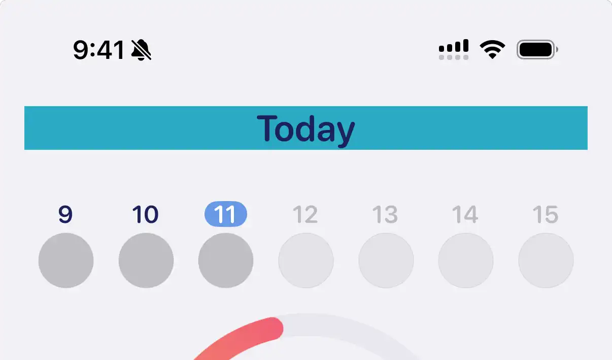
Finally, we just need to add content padding and left alignment modifiers to Text in SwiftUI to simulate a style similar to navigationItem.leftBarButtonItem. Then when calling pushViewController(_:animated:), there will be no more morph effect side effects:
Besides the morph effect produced by navigation bar push/pop, in some scenarios we also need conditional control over the Scroll Edge Effect of scroll views. A typical scenario is: when the top of the page has key visual elements like large images or maps, we usually don’t want them to be blurred. In the new version of Grow, we also made adjustments to the Challenge page:
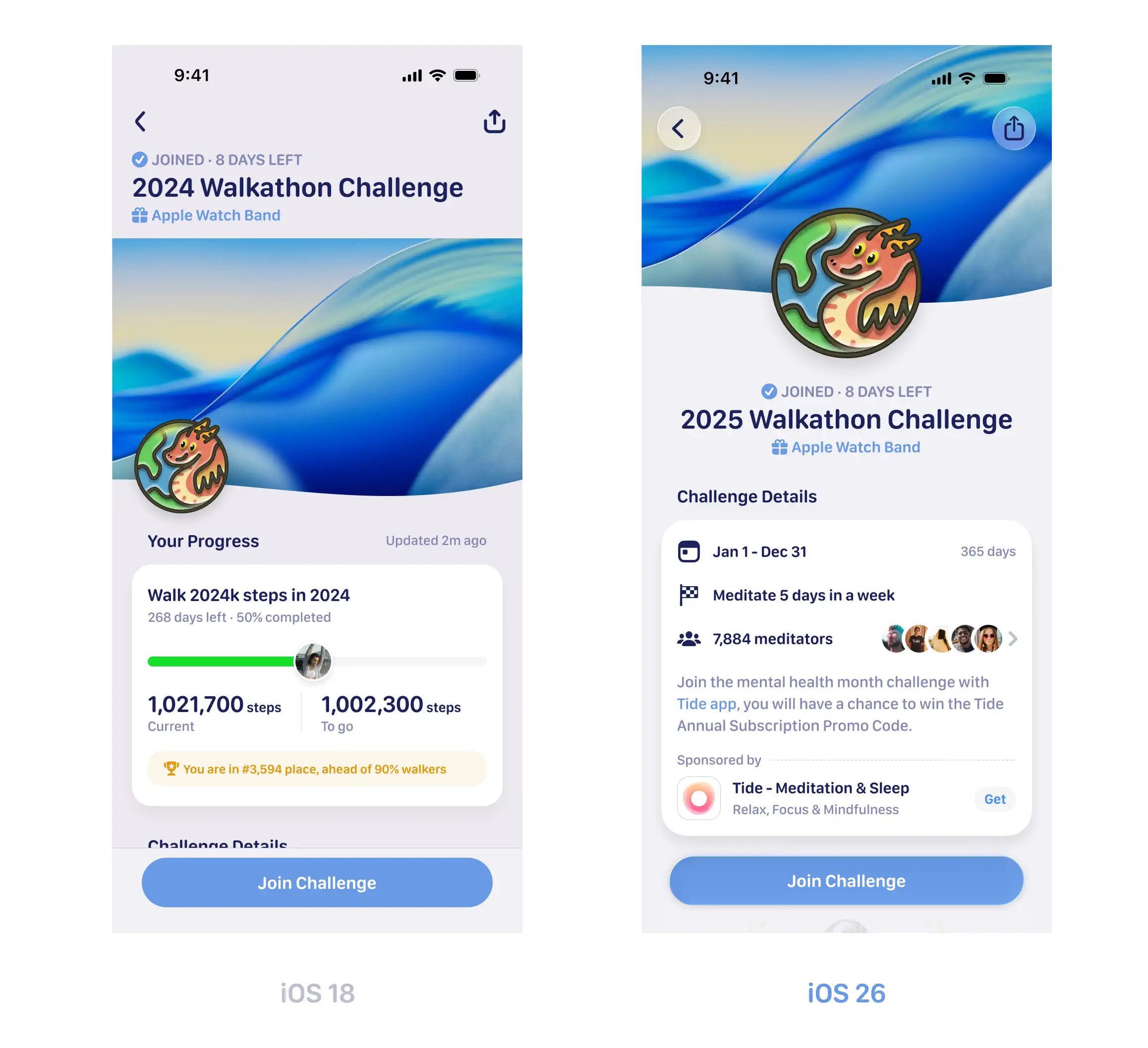
When entering the challenge detail page, we need to ensure the top image is clear, then trigger the Scroll Edge Effect after scrolling past the large title. In implementation, using UICollectionReusableView as a supplementary header view combined with content sections is a relatively conventional solution. But the problem is: both header and section belong to UICollectionView’s scrolling elements, and scrolling triggers the CABackdropLayer corresponding to top/bottom, causing the edge effect view to always be created:
To avoid this problem, we can make the supplementary header view independent as a view directly added to UICollectionView, without going through UICollectionViewCompositionalLayout for layout. Then set a contentInset.top equal to the header view’s height. This way, there’s no need to calculate how much offset to scroll before manually adjusting the hiding and showing of UIScrollEdgeElementContainerInteraction—as long as cells enter the navigation bar’s range, UIKit will automatically handle the Scroll Edge Effect:
Liquid Glass Shape
glassEffect(_:in:) provides a convenient way to apply Liquid Glass to View. In Grow, simply adjusting the style parameters of Glass can satisfy most scenarios. We noticed that the API’s second parameter accepts Shape type, which provides possibilities for further extension.
I wonder if anyone noticed that in the first version supporting iOS 26, we applied Liquid Glass effect to the title text at the top of the What’s New section:
By using CTFontCreatePathForGlyph in Core Text to convert glyphs to CGPath, then combining them into a glyph shape and passing it to glassEffect(_:in:) for shape rendering, we can obtain a transparent “glass text” material that’s not limited to pure geometric shapes and can have customized content.
Demo
To facilitate understanding and practice, I organized the above content into a demo project: Insights. The demo is organized around core concepts, each module contains complete implementation code, you can directly view the effects or integrate interesting parts into your own project. Code comments cover key implementation details for quick location and understanding.
It should be noted that this demo adopts a relatively experimental development approach, so some detail handling may not be rigorous enough. If you find problems or have improvement suggestions during use, feel free to contact me to discuss together.