
Although Liquid Glass has been around for one year, the compatibility issues it introduced haven’t completely disappeared. Drawing on a real-world project, SLIT_STUDIO developer Megabits summarizes several common UIKit adaptation pitfalls and the solutions he used to address them.
I’ve been meaning to write this article for quite a while. Now that iOS 27 is already out, I’m finally sitting down to talk about iOS 26. The main reason for the delay is that iOS 26 introduced so many bizarre bugs that I often couldn’t tell whether I was looking at a system bug—or whether I’d actually fixed it. Still, even if this article is a little late, I think it’ll remain useful. Just because iOS 27 is here doesn’t mean we can drop iOS 26 overnight. So let’s take a look at some of the traps Apple left for us this time.
UIBarButtonItem
If your app is built with UIKit rather than SwiftUI, and you’re using a customView inside a UIBarButtonItem, congratulations—you’ve probably got some surprises waiting for you.
Here’s a simple example to demonstrate what happens.
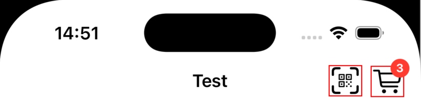
This demo is running on the iOS 18 Simulator. I’ll omit some of the code and only keep the important parts.
// Pass in the desired size
override init(frame: CGRect) {
    imageFrame = frame
    super.init(frame: frame)
    setup()
}

func setup() {
    // (omitted)
    translatesAutoresizingMaskIntoConstraints = false
    imageView.translatesAutoresizingMaskIntoConstraints = false
    imageView.contentMode = .scaleAspectFit
    addSubview(imageView)
    NSLayoutConstraint.activate([
        imageView.leadingAnchor.constraint(equalTo: leadingAnchor),
        imageView.trailingAnchor.constraint(equalTo: trailingAnchor),
        imageView.topAnchor.constraint(equalTo: topAnchor),
        imageView.bottomAnchor.constraint(equalTo: bottomAnchor),
        imageView.widthAnchor.constraint(equalToConstant: imageFrame.width),
        imageView.heightAnchor.constraint(equalToConstant: imageFrame.height),
    ])
    // (omitted)
}
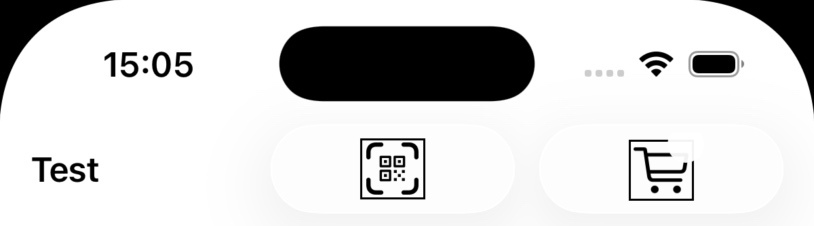
Everything looks perfectly fine on iOS 18—but on iOS 26, things suddenly fall apart.
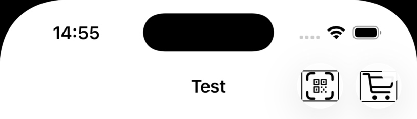
Two problems immediately stand out:
- The image is no longer square.
- All the colors are gone.
Let’s tackle them one by one.
Size Issues
If you’re particularly observant, you’ve probably noticed that the size passed into init seems to have been altered somewhere along the way. It’s no longer square.
What if we simply add these two constraints?
widthAnchor.constraint(equalToConstant: imageFrame.width),
heightAnchor.constraint(equalToConstant: imageFrame.height),
Unfortunately, that doesn’t seem to help.
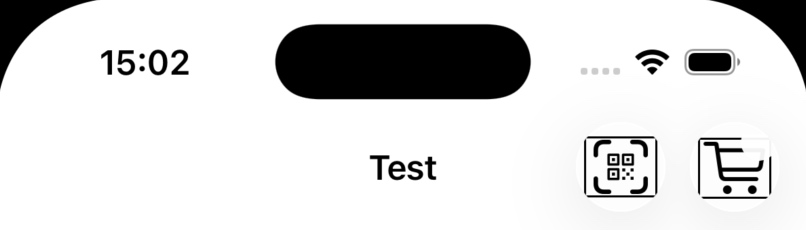
It turns out the view has to become completely independent of any external layout constraints.
NSLayoutConstraint.activate([
    widthAnchor.constraint(equalToConstant: imageFrame.width),
    heightAnchor.constraint(equalToConstant: imageFrame.height),
    imageView.centerXAnchor.constraint(equalTo: centerXAnchor),
    imageView.centerYAnchor.constraint(equalTo: centerYAnchor),
    imageView.widthAnchor.constraint(equalToConstant: imageFrame.width),
    imageView.heightAnchor.constraint(equalToConstant: imageFrame.height),
])
Now things finally look correct again.
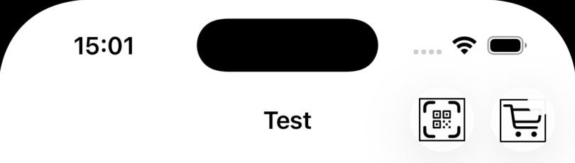
Both sets of constraints are required. Leave either one out, and you may end up with even stranger results.
Color Issues
Next comes the color problem.
The colored parts of my icon are drawn using CALayer, and on iOS 26 they’re completely gone. Interestingly, colors embedded directly in an image remain unaffected. It’s easy to verify this—just replace the red dot with an image.
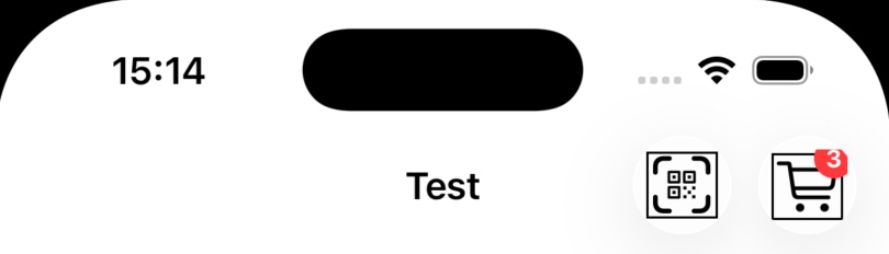
To this day I still don’t know why this happens, nor did I find a satisfying workaround. But the investigation eventually led me to a solution that fixed everything.
Use SwiftUI.
The Ultimate Fix
Replace the UIKit-based customView with a SwiftUI view wrapped in a UIHostingController, and suddenly everything starts working again—the layout is correct, and the colors come back.
Pretty ridiculous, isn’t it?
I still can’t tell whether this is a bug or an intentional behavior.
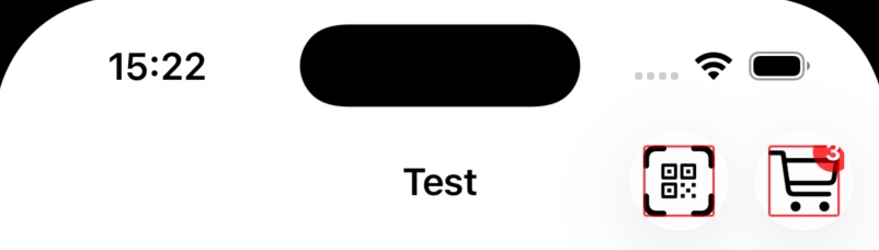
At this point, we can also switch to the new badge API, making the button look almost perfect.
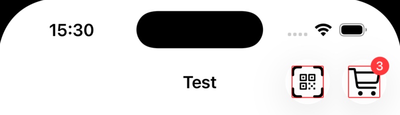
item.badge = .string("3")
item.badge?.backgroundColor = .systemRed
item.badge?.foregroundColor = .white
It Doesn’t End There
Think we’re done?
Not even close.
The new badge API introduced in iOS 26 has a rather nasty issue: sometimes the badge simply refuses to update. I stopped trying to determine exactly when it happens. The simplest workaround is to briefly replace the customView after updating the badge:
item.badge = .string("3")
item.customView = nil
item.customView = customView
There’s another issue as well.
If you’re using rightBarButtonItems, you may find that the button order occasionally gets reversed. This seems to be related to timing, and wrapping the update in DispatchQueue.main.async fixes it for me.
That said, I’d recommend adopting the newer trailingItemGroups API instead.
self.navigationItem.trailingItemGroups = [
    UIBarButtonItemGroup(barButtonItems: [rightBarButtonItems1], representativeItem: nil),
    UIBarButtonItemGroup(barButtonItems: [rightBarButtonItems2], representativeItem: nil)
]
The Cost of Ignoring the HIG
One of my apps customizes the Navigation Bar background color.
This is no longer the recommended approach.
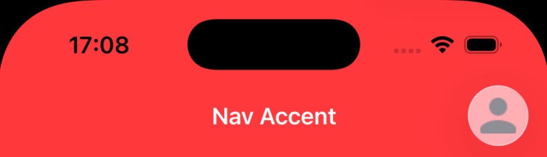
If you insist on doing it anyway, you’ll discover another interesting behavior: the appearance mode of UIBarButtonItem is determined not by the Navigation Bar’s background color, but by the content underneath—typically the UIScrollView. However, its colors still follow the Navigation Bar’s background.
As a result, everything looks acceptable with a light background:
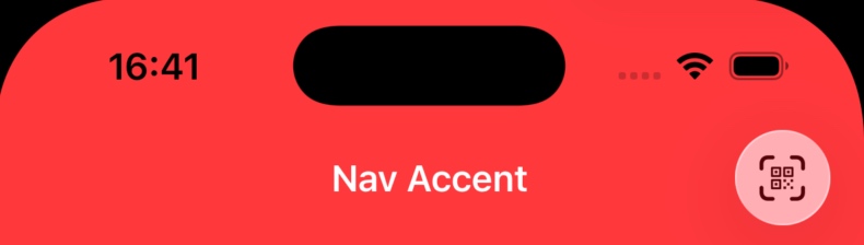
But with a dark background, it becomes… terrifying.
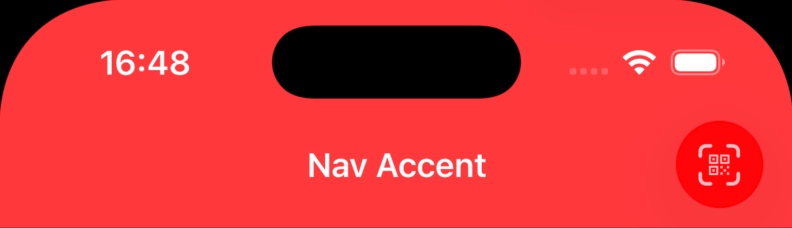
The best workaround I found is simply forcing the button to remain white.
scanItem.style = .prominent
scanItem.tintColor = .white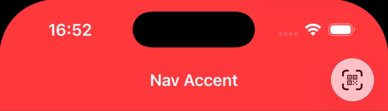
There’s another subtle detail worth mentioning.
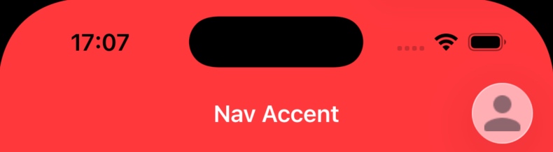
If your icon isn’t black, UIKit and SwiftUI customViews render differently.
UIKit’s customView appears darker because it’s influenced by the content behind it, matching the behavior of a standard UIBarButtonItem. SwiftUI’s version, however, ignores the underlying content almost entirely, making the icon appear much closer to its original color.
UITabBarController
TabBar’s Own Problems
Let’s start with this beautiful Tab Bar.

Imagine your app presents a login sheet. After the user signs in, you rebuild the entire UITabBarController.
let tb = UITabBarController()
tabBarVC?.willMove(toParent: nil)
tabBarVC?.view.removeFromSuperview()
tabBarVC?.removeFromParent()

tb.viewControllers = [
    makeTab(title: "Home", systemImage: "house.fill"),
    makeTab(title: "Search", systemImage: "magnifyingglass"),
    makeTab(title: "Profile", systemImage: "person.crop.circle.fill"),
]

addChild(tb)
tb.view.frame = view.bounds
tb.view.autoresizingMask = [.flexibleWidth, .flexibleHeight]
view.addSubview(tb.view)
tb.didMove(toParent: self)

self.dismiss(animated: true)
Congratulations—you’ve just triggered this bug.

Not weird enough?
Try pressing and holding it.
Now that’s impressive.

Fortunately, the fix is simple: wait until the dismiss animation finishes before replacing the Tab Bar Controller.
FB22597916 (confirmed fixed in iOS 27)
When TabBar Breaks Other Things
If your app embeds a WKWebView, watch out.
Even if your page renders perfectly in Safari, it may behave differently inside WKWebView.
When a Tab Bar is present, the web content extends beneath it automatically.
For ordinary pages this usually isn’t a problem, because scrolling to the bottom adds extra space automatically. However, elements using position: fixed are a different story.
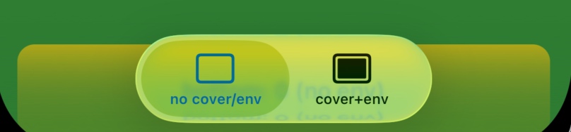
The fix is straightforward:
- Add
viewport-fit=coverto your page’s viewport meta tag. - Use
env(safe-area-inset-bottom)andenv(safe-area-inset-top)when calculating your CSS layout.
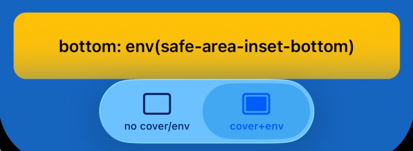
One more thing: if your page somehow contains multiple meta name="viewport" tags, make sure every one of them includes viewport-fit=cover.
Problems Without Solutions
Some issues simply have no workaround.
For example, if your app uses a Stepper together with UI elements that trigger the keyboard, the Stepper may unexpectedly shift upward.
Here’s what it looks like before and after:
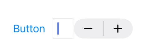
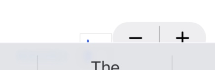
This has nothing to do with whether you’ve already moved the Stepper above the keyboard. The tiny offset clearly isn’t intended to keep it visible—it still ends up partially covered.
As long as the Stepper initially resides in an area that could be covered by the keyboard, this bug may occur.
FB20865249 (present since the first iOS 26 release, still unresolved in iOS 27)
Test Every OS Version
The exact same UI may behave completely differently on iOS 18, iOS 26, and iOS 27.
Every release introduces its own “features,” and different implementation choices can expose different issues.
If possible, keep devices—or at least simulators—for each supported iOS version, and pay extra attention to anything related to navigation.
Finally, try to stay as close as possible to Apple’s recommended design patterns. The further your app diverges from the standard approach, the more likely you’ll wander into areas Apple hasn’t thoroughly tested—and the more likely you’ll encounter bizarre bugs like the ones above.
That’s pretty much everything I’ve run into.
Hopefully it’s also obvious now why this article took me so long to finish.
Anyway… I’m exhausted.
Time to call it a day.