In SwiftUI, many layout container constructors include a spacing parameter with a default value of nil, which controls the spacing between adjacent views. This article will start with this default parameter to explore the concept of Spacing in SwiftUI in-depth, and share some related tips and considerations.
Why Are the Spacings Between My Subviews Inconsistent?
As developers become more proficient with SwiftUI, they gradually master certain “rules of thumb.” For instance, in a VStack, if the spacing parameter is not explicitly specified and its default value nil is used, the spacing is typically about 8.
struct RowSpacingDemo: View {
  @State var fixSpacing = false
  var body: some View {
    VStack {
      Toggle(isOn: $fixSpacing) { Text("Spacing: \(fixSpacing ? "8" : "Nil")") }
        .padding()
      VStack(spacing: fixSpacing ? 8 : nil) {
        rectangle
        rectangle
        rectangle
      }
    }
  }

  var rectangle: some View {
    Rectangle()
      .foregroundStyle(.red)
      .frame(width: 150, height: 30)
  }
}
However, if you make a slight modification, replacing the middle rectangle with a Text component, the spacing changes.
VStack(spacing: fixSpacing ? 8 : nil) {
  rectangle
  Text("Fat")
  rectangle
}
As shown in the videos, when spacing is set to nil, the distance between the Text and its adjacent views is no longer 8, and the spacings are not equal.
So, what does it mean when spacing is set to nil?
Apple’s official documentation describes the spacing attribute in layout containers as follows:
The distance between adjacent subviews, or nil if you want the stack to choose a default distance for each pair of subviews.
From the demonstrations above, it’s clear that the “default distance” is not a fixed value. Next, we will delve deeper into how this default distance is determined.
Spacing: The Hidden Property of SwiftUI Views
In many video games, characters possess visible attributes such as strength, agility, and speed. However, experienced players know that characters often have hidden attributes that are crucial to their development.
Similarly, in SwiftUI, views have not only visible properties like size and position but also some less apparent, hidden properties, among which Spacing is one. Until iOS 16, it was challenging to access the system-set Spacing information for views. However, with the introduction of the Layout protocol at WWDC 2022, we can now delve deeper into this attribute.
The spacing method within the Layout protocol allows for the return of preferred spacing values (ViewSpacing) for custom layout containers. For example, in the implementation below, we use the top spacing of the first subview as the top spacing for the custom container and the bottom spacing of the last subview as the container’s bottom spacing:
func spacing(subviews: Subviews, cache _: inout ()) -> ViewSpacing {
  var spacing = ViewSpacing()
  if let firstSubview = subviews.first, let lastSubview = subviews.last {
    spacing.formUnion(firstSubview.spacing, edges: [.top])
    spacing.formUnion(lastSubview.spacing, edges: [.bottom])
  }
  return spacing
}
Although the ViewSpacing type is public, developers can’t fully customize spacing values (except to zero) and must rely on the spacings provided by the subviews.
Nevertheless, the spacing method provides us with the capability to explore the default spacings set by SwiftUI for different components.
We created a custom layout container named SpacingPrint that accepts only one subview, prints its default spacing, and uses it as the container’s preferred spacing. This helps us observe the default spacings of different subviews:
struct SpacingPrint: Layout {
  func sizeThatFits(proposal: ProposedViewSize, subviews: Subviews, cache _: inout ()) -> CGSize {
    guard subviews.count == 1, let subview = subviews.first else { fatalError() }
    return subview.sizeThatFits(proposal)
  }

  func placeSubviews(in bounds: CGRect, proposal: ProposedViewSize, subviews: Subviews, cache _: inout ()) {
    guard subviews.count == 1, let subview = subviews.first else { fatalError() }
    subview.place(at: .init(x: bounds.minX, y: bounds.minY), anchor: .topLeading, proposal: proposal)
  }

  func spacing(subviews: Subviews, cache _: inout ()) -> ViewSpacing {
    guard subviews.count == 1, let subview = subviews.first else { fatalError() }
    print(subview.spacing)
    return subview.spacing
  }
}
To see the default spacing in the SpacingPrint container for a Rectangle:
struct SpacingPrintDemo:View {
  var body: some View {
    VStack {
      SpacingPrint {
        Rectangle()
      }
    }
  }
}
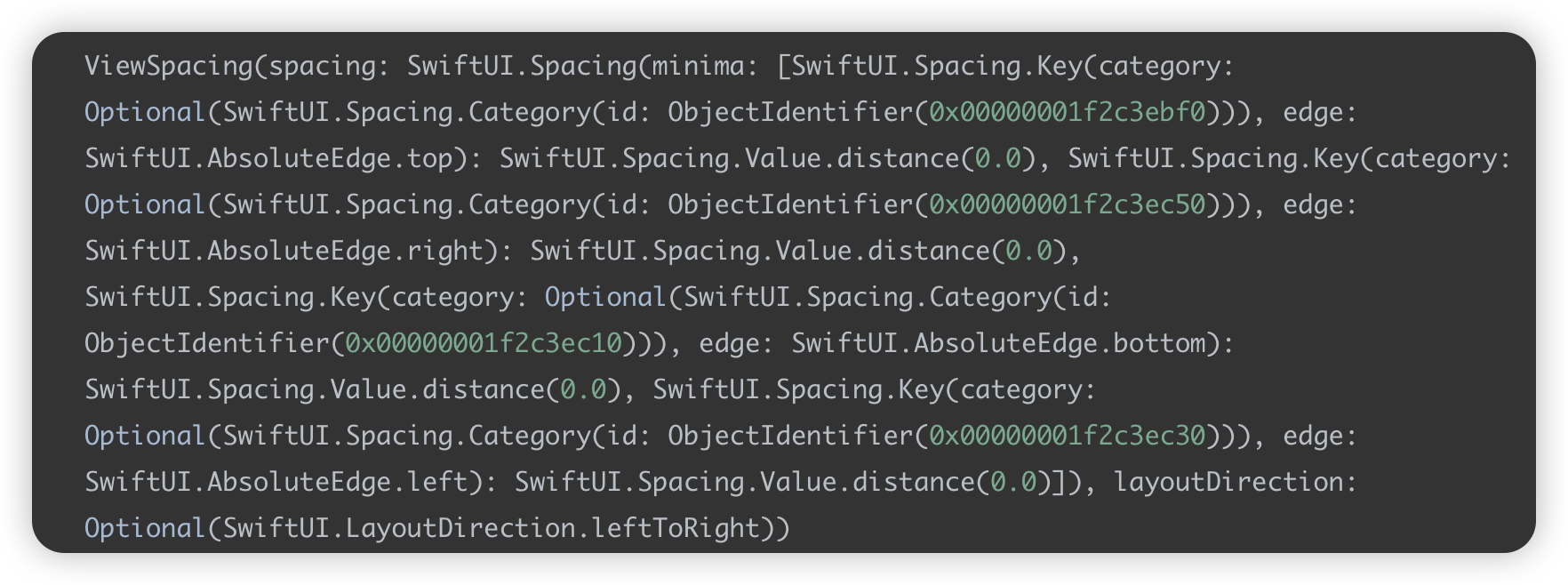
What? Didn’t see any Spacing information? That’s correct. In a VStack, only when there is more than one subview does the VStack need to fetch and apply the default spacing information between subviews. Now, let’s add a new view to the VStack:
struct SpacingPrintDemo:View {
  var body: some View {
    VStack {
      SpacingPrint {
        Rectangle()
      }
      Text("hello")
    }
  }
}
Upon execution, the output will be as follows:

Further analysis of the output yields the following key information:
ViewSpacingcontains aspacingattribute, corresponding to an undisclosedSpacingtype.- The
Spacingtype includes aminimaattribute, which is a dictionary with keys asSwiftUI.Spacing.Keyand values asSwiftUI.Spacing.Value. These key-value pairs describe the default spacing information in various directions or specific scenarios. - For the four basic directions (top, bottom, left, right), the
Rectanglehas a default spacing of0(i.e.,distance(0.0)).
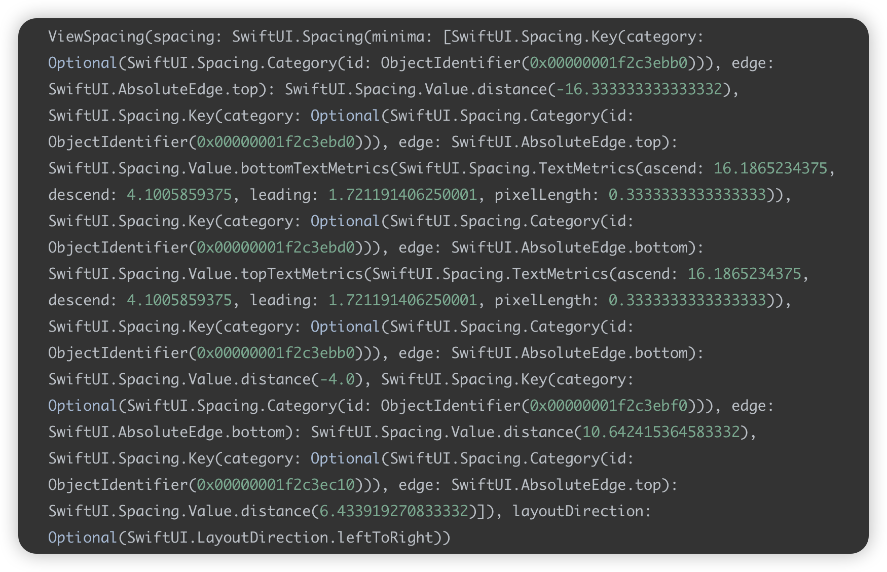
Now, let’s use SpacingPrint to check the default spacing for Text:
SpacingPrint {
  Text("Fatbobman's Blog")
}
Clearly, the default spacing for Text differs significantly from that of the Rectangle.

In addition to setting spacing on the four basic directions, SwiftUI also adds numerous text-related spacing settings for the Text component. Further testing shows that the same code might produce different default spacing values on different hardware and platforms.
This reveals that SwiftUI considers various factors when adding the Spacing attribute to various views and components. This also explains the question raised at the beginning of our article: what the default value nil for the spacing parameter truly implies.
- When
spacingis set tonil, the layout container automatically calculates the spacing between adjacent views based on their default spacings. This means that when using the default value, the spacing between adjacent subviews is dynamic. - Conversely, when a specific value is set for
spacing, the layout container ignores the default spacing attributes of the subviews and strictly adjusts the spacing between them based on the specified value.
In SwiftUI, not only VStack but many other layout containers such as HStack, LazyVStack, LazyHStack, LazyVGrid, LazyHGrid, and Grid include the spacing parameter and all follow the same logical processing.
For more detailed usage of the
Layoutprotocol, refer to Alignment in SwiftUI: Everything You Need to Know and SwiftUI Layout: The Mystery of Size.
Is It Necessary to Set Specific Values for the Spacing Parameter?
When using the default value nil, the spacing between subviews may vary, raising a question: should we explicitly set a value for spacing in all situations?
The decision to set spacing should be made based on the specific context.
Apple has designed a complex default spacing calculation system in SwiftUI, intended to provide ergonomically sound spacing logic based on various factors like hardware, platform, and typography. Therefore, unless the default spacing clearly does not meet development needs, it is generally recommended to continue using the nil value when the default spacing meets design requirements.
However, in certain scenarios, it is necessary to explicitly set a specific value for spacing to address specific layout issues. For example, in our article about new features in ScrollView, we discussed the safeAreaPadding view modifier and noted how its behavior differs from safeAreaInset in certain situations. If the spacing for safeAreaInset is not set to 0, an unnecessary gap appears between the content at the bottom of the scroll container and the safe area, due to the default value nil.

To eliminate this gap, spacing can be explicitly set to 0:
ScrollView {
    ForEach(0 ..< 20) { i in
        CellView(width: nil)
            .idView(i)
    }
}
.safeAreaInset(edge: .bottom, spacing: 0){ // spacing: 0
    Text("Bottom View")
        .font(.title3)
        .foregroundColor(.indigo)
        .frame(maxWidth: .infinity, maxHeight: 40)
        .background(.green.opacity(0.6))
}
Additionally, dynamically adjusting the spacing of safeAreaInset can also solve the issue of TextFields in a List being partially obscured by the keyboard in SwiftUI. The complete solution can be found here.
struct KeyboardAvoidingDemo:View {
  var body: some View {
    List(0..<20){
      TextField("\($0)",text:.constant(""))
    }
    .keyboardAvoiding() // lift TextField by adding spacing
  }
}
Can Spacing Be Negative?
Since the spacing is of type CGFloat, it indeed means that we can set it to a negative value. In fact, setting spacing to a negative number can be a very practical technique in certain development scenarios. For layout containers that support the spacing attribute, once a specific spacing value is provided by the developer, the container will precisely calculate the size and arrange the subviews based on this value, regardless of whether it is positive or negative.
In our article on using zIndex in SwiftUI, we demonstrated an example where adjusting the spacing dynamically changed the presentation of subviews within a VStack:
struct SpacingNegativeDemo: View {
  @State var cells: [Cell] = []
  @State var spacing: CGFloat = -95
  @State var toggle = true
  var body: some View {
    VStack {
      Button("New Cell") {
        newCell()
      }
      .buttonStyle(.bordered)
      Text("Spacing: \(spacing)")
      Slider(value: $spacing, in: -150 ... 20)
        .padding()
      Toggle("New view appears on top", isOn: $toggle)
        .padding()
        .onChange(of: toggle) {
          withAnimation {
            cells.removeAll()
            spacing = -95
          }
        }
      VStack(spacing: spacing) {
        Spacer()
        ForEach(cells) { cell in
          cell
            .onTapGesture { delCell(id: cell.id) }
            .zIndex(zIndex(cell.timeStamp))
        }
      }
    }
    .padding()
  }

  func zIndex(_ timeStamp: Date) -> Double {
    if toggle {
      return timeStamp.timeIntervalSince1970
    } else {
      return Date.distantFuture.timeIntervalSince1970 - timeStamp.timeIntervalSince1970
    }
  }

  func newCell() {
    let cell = Cell(
      color: ([Color.orange, .green, .yellow, .blue, .cyan, .indigo, .gray, .pink].randomElement() ?? .red).opacity(Double.random(in: 0.9 ... 0.95)),
      text: String(Int.random(in: 0 ... 1000)),
      timeStamp: Date()
    )
    withAnimation {
      cells.append(cell)
    }
  }

  func delCell(id: UUID) {
    guard let index = cells.firstIndex(where: { $0.id == id }) else { return }
    withAnimation {
      let _ = cells.remove(at: index)
    }
  }
}

struct Cell: View, Identifiable {
  let id = UUID()
  let color: Color
  let text: String
  let timeStamp: Date
  var body: some View {
    RoundedRectangle(cornerRadius: 15)
      .fill(color)
      .frame(width: 300, height: 100)
      .overlay(Text(text))
      .compositingGroup()
      .shadow(radius: 3)
      .transition(.move(edge: .bottom).combined(with: .opacity))
  }
}
Not All Spacing Parameters Are Used to Add Gaps
Although in most layout containers, the spacing parameter is primarily used to set specific distances between subviews, there are exceptions.
In the Mastering the containerRelativeFrame Modifier in SwiftUI article, we discussed three construction methods offered by this modifier. One version includes a spacing parameter, but here, spacing does not directly add space like it does in VStack or HStack.
In the context of containerRelativeFrame, the use of the spacing parameter is different: it does not directly add space but is considered as a factor in transformation rules. The actual distance between subviews is still determined by the spacing parameter of the containers they are in.
Conclusion
In this article, we have explored the issue of inconsistent spacings between subviews, deeply analyzing what the default value nil for the spacing parameter truly signifies. Additionally, we discussed several aspects related to the hidden property of Spacing in SwiftUI views. Understanding the composition and principles of Spacing is crucial for developers when handling complex layouts, and mastering certain spacing techniques can also help achieve layout effects that are difficult to realize through traditional methods.