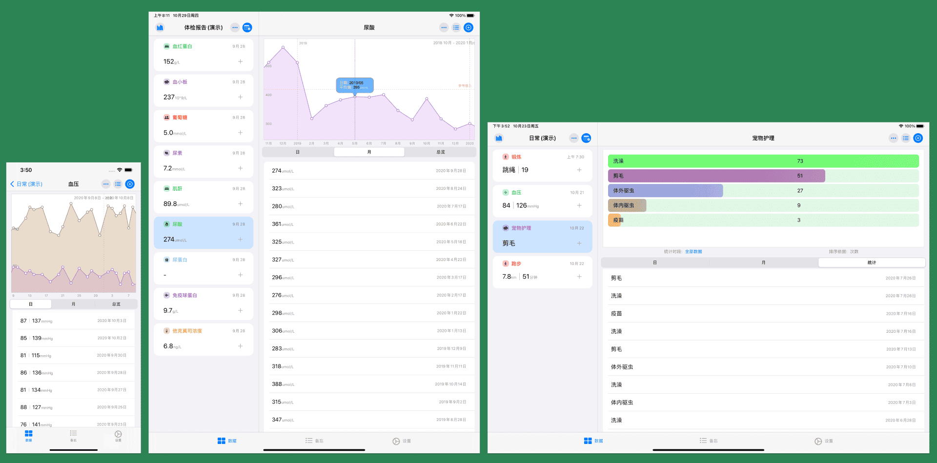
One of the initial purposes of creating SwiftUI was to efficiently and reliably adapt to multiple Apple hardware platforms. Adapting to the iPad was one of my design goals at the start of developing Health Notes 2.0. This article is not a tutorial but shares lessons and insights I gained while adapting to the iPad during this development.
Who Am I
The code in the app must efficiently and clearly understand the current device’s status, constantly clarifying who I am, where I am, what I am doing, etc. Therefore, at the start of the project, I prepared and created a series of codes.
For example, the current running device:
enum Device {
    //MARK: Current device type: iPhone, iPad, Mac
    enum Devicetype{
        case iphone,ipad,mac
    }

    static var deviceType:Devicetype{
        #if os(macOS)
        return .mac
        #else
        if UIDevice.current.userInterfaceIdiom == .pad {
            return .ipad
        }
        else {
            return .iphone
        }
        #endif
 }
If you want to know more about the current running device model, there is code on GitHub that returns more precise information.
To conveniently use these status information in the View and deal with different situations, further preparations are needed.
extension View {
    @ViewBuilder func ifIs<T>(_ condition: Bool, transform: (Self) -> T) -> some View where T: View {
        if condition {
            transform(self)
        } else {
            self
        }
    }

    @ViewBuilder func ifElse<T:View,V:View>( _ condition:Bool,isTransform:(Self) -> T,elseTransform:(Self) -> V) -> some View {
        if condition {
            isTransform(self)
        } else {
            elseTransform(self)
        }
    }
}
These two snippets are what I use very frequently. In SwiftUI, similar code can easily handle various situations with the same code.
For example:
VStack{
     Text("hello world")
}
.ifIs(Device.deviceType == .iphone){
  $0.frame(width:150)
}
.ifIs(Device.deviceType == .ipad){
  $0.frame(width:300)
}
.ifIs(Device.deviceType == .mac){
  $0.frame(minWidth:200,maxWidth:600)
}
Only after solving the question of who I am can the subsequent work unfold better.
Lying Down or Standing
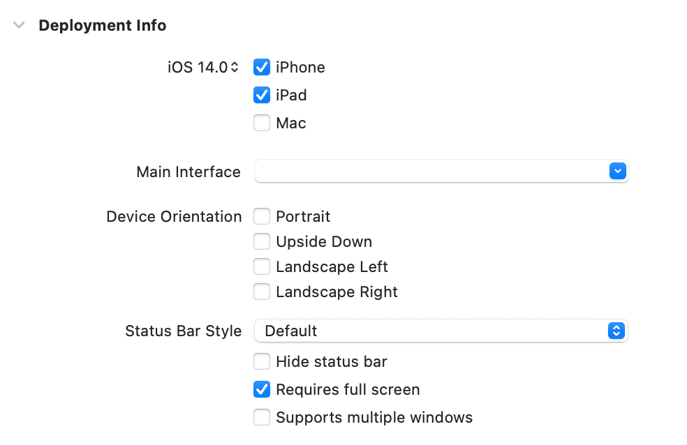
As Health Notes is an app mainly presented in a list format, initially, I wanted to keep it in Portrait on iPhone and in Landscape on iPad. However, I eventually decided to support both Portrait and Landscape on iPad.

For more flexibility, I chose not to set this in the info.plist but to respond to different situations in the delegate.

Since there is no need to support multiple windows, I turned off multiple windows. Also, activating Requires full screen is necessary for the delegate to respond.
class AppDelegate:NSObject,UIApplicationDelegate{
  func application(_ application: UIApplication, supportedInterfaceOrientationsFor window: UIWindow?) -> UIInterfaceOrientationMask {
        return Device.deviceType == .ipad
            ? UIInterfaceOrientationMask.all
            : UIInterfaceOrientationMask.portrait
    }
}
For how to set Delegate in SwiftUI, please see SwiftUI2.0 — App, Scene, and the new code structure
This way, you can easily control the presentation form you want for the app.
Hard-to-Control NavigationView
SwiftUI’s NavigationView itself has done a lot of work to adapt, but the effect is not good.
Currently, it supports two styles: StackNavigationView, DoubleColumnNavigationViewStyle, and three forms of presentation: single column, double column, and triple column (sidebar). Although it seems to cover most applications, due to the lack of more control options, it is not handy to use.
For example, DoubleColumnNavigationViewStyle shows differently in portrait and landscape on iPad. The hidden button in the upper left corner cannot be changed or canceled. In the triple-column mode with a sidebar, the logic is different, but the button also does not provide any replacement or cancellation capabilities.
NavigationLink can only respond in the current column, and there is no ability to control column width.
To adjust the column width of a double-column NavigationView, you can use Introspect, see Introducing a few Swift or SwiftUI third-party libraries I used in developing Health Notes 2
NavigationView{
  Text("hello")
}
.introspectNavigationController{ navigation in
    navigation.splitViewController?.maximumPrimaryColumnWidth = 360
    navigation.splitViewController?.preferredPrimaryColumnWidth = 500.0
}
To have the iPad present a double-column mode in both portrait and landscape, and the left column is not collapsible and does not have the folding button I wanted, I used a reluctant method. I faked a double-column NavigationView.
Enter different rootView for different devices.
struct HealthNotesApp:APP{
  var body: some Scene{
     rootView()
  }

  func rootView()-> some View{
        switch Device.deviceType {
        case .ipad:
            return AnyView(ContentView_iPad())
        default:
            return AnyView(ContentView_iPhone())
        }
    }
}
In ContentView_iPad, use similar code to fake a double-column format.
HStack(spacing:0){
      ItemRootView(item: $item)
           .frame(width:height)
       Divider()
       ItemDataRootView()
            .navigationContent()
        }
.edgesIgnoringSafeArea(.all)
This way, you have the display effect of the iPad in the above picture. The state is basically consistent with the DoubleColumnNavigationViewStyle format. Both can set Toolbar, and the dividing line can also go through the screen.
extension View{
    func navigationContent() -> some View{
        NavigationView{
            self
        }
        .navigationViewStyle(StackNavigationViewStyle())
    }
}
Since the view in the right column on iPad is also used on iPhone, where it is activated by NavigationLink, it is still in NavigationView. But on iPad, it needs to be explicitly placed in NavigationView. Through .navigationContent, combined with the above ifIs, you can flexibly control the form.
Additionally, you need to handle the activation of secondary Views for iPhone and iPad separately, for example:
if Device.deviceType  == .iphone {
                    NavigationLink("", destination: ItemDataRootView(), isActive: $gotoDataList).frame(width:0,height:0)
            }

// In the link's button
Button("Item1"){
   store.item = item
   if Device.deviceType == .iphone {
       gotoDataList.toggle()
   }
}

// Directly respond to store.item in ItemDataRootView
Bug or Special Design?
Some of SwiftUI’s default controls have significant differences in performance between iPad and iPhone than expected.
For example, ActionSheet:
Currently, the display location of AlertSheet on iPads running iOS 14 is almost uncontrollable. The position of the arrow and the display of the content have huge differences from expectations. I don’t know if this will always be the case or if it’s a current bug.
I personally do not recommend using ActionSheet on iPad for now. Ultimately, Alert had to replace ActionSheet on iPad. If you must use ActionSheet, popover might be a better choice.
ContextMenu currently has response issues on iPad. The same instructions have no problems on iPhone, but on iPad, there may be a situation where values cannot be obtained. It’s also unclear whether this is a bug or for other reasons.
For example,
Text("click")
.contextMenu{
  Button("del"){
     delItem = item
     ShowActionSheet.toggle()
  }
}
.ActionSheet(isPresented:showActionSheet){
    delSheet(item:delItem)
}
This code works fine on iPhone, but on iPad, delSheet may not get the item. To avoid this situation, special handling is needed for now.
DispatchQueue.main.asyncAfter(deadline: .now() + 0.5){
                  showActionSheet.wrappedValue = true
}
There are some similar issues, which can only be discovered through more testing of the code on iPad.
Layout Optimization
Since Health Notes 2.0 displays two columns on the iPad, views that ran fine on iPhone can appear misaligned and asymmetrical on iPad. So, with more debugging and using ifIs for more processing, most problems can be resolved relatively easily.
Just one example:
List{
   ...
}
.listStyle(InsetGroupedListStyle())
When it is the sole view on the screen on iPhone, it looks perfect. But when it is displayed in the right column on iPad, the space above the Group does not align with the left column. A little adjustment and it’s okay.
Conclusion
In summary, using SwiftUI to adapt iPhone and iPad is generally easy. Whether or not you can fully utilize the characteristics of each device mainly depends on putting more effort into interaction logic and UI design. The difficulty in coding is not significant.