Centrally displaying a view within its parent view is a common requirement, even for beginners in SwiftUI. There are many ways to achieve this in SwiftUI. This article will introduce some of these methods and explain the principles behind each method, their applicable scenarios, and considerations.
Requirement
Implement the style shown in the following image: Center a single line of Text within a colored rectangular view.

Fillers
Spacer
The most common and easiest solution to think of.
var hello: some View {
    Text("Hello world")
        .foregroundColor(.white)
        .font(.title)
        .lineLimit(1)
}

HStack {
    Spacer()
    hello
    Spacer()
}
.frame(width: 300, height: 60)
.background(.blue)
Would you believe me if I told you there are two hidden issues with the code above?
-
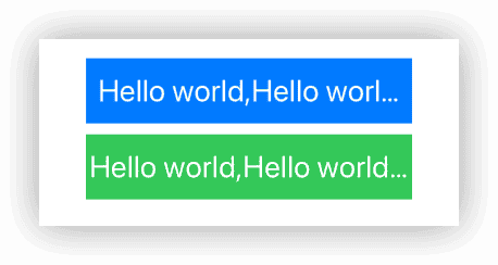
The text content exceeds the width of the rectangle.
Spacer has a set minimum thickness, which by default is 8 px. Even if the text width exceeds the recommended width given by the HStack, the HStack will still preserve its minimum thickness during layout, preventing the text from fully utilizing the width of the rectangular view as shown in the image above.
The solution is:
Spacer(minLength: 0).Of course, you can also use this feature of Spacer to control the width available to the Text in the HStack.
- Placing the composed view at the top or bottom of a view that might fill the screen may yield results that differ from your expectations.
  VStack {
    // Hello world view 1
    HStack {
          Spacer(minLength: 0)
          hello
          Spacer(minLength: 0)
      }
      .frame(width: 300, height: 60)
      .background(.blue)

    HStack {
          Spacer(minLength: 0)
          hello
          Spacer(minLength: 0)
      }
      .frame(width: 300, height: 60) // Same size
      .background(.red)

    Spacer() // Fill the available space in VStack
}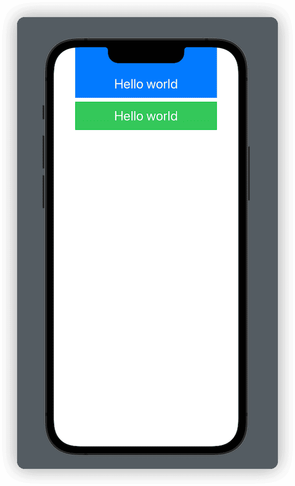
Since SwiftUI 3.0, when using background to add elements conforming to the ShapeStyle protocol, you can set whether to ignore the safe area using the ignoresSafeAreaEdges parameter. The default value is .all (ignores all safe areas). Therefore, when we place the composed hello world view at the top of the VStack (using Spacer), the background of the rectangle will render along with the top safe area.
The solution is: .background(.blue, ignoresSafeAreaEdges: []), to exclude the safe areas you don’t want to ignore.
Moreover, when the given dimensions are unclear (the size of the rectangle is not explicitly set), the above code also needs some adjustments. For example, displaying the hello world view in a List Row, where you want the rectangle to fill the Row:
List {
    HStack {
        Spacer(minLength: 0)
        hello
        Spacer(minLength: 0)
    }
    .background(.blue)
    .listRowInsets(.init(top: 0, leading: 0, bottom: 0, trailing: 0)) // Set the Insets of the Row to 0

}
.listStyle(.plain)
.environment(\.defaultMinListRowHeight, 80) // Set the minimum row height of the List
The hello world view will not fill the height provided by the Row. This is because the height of the HStack is determined by the alignment and arrangement of the container’s subviews. Spacer can only fill horizontally in the HStack and does not have a vertical height (height is 0), so the final required height of the HStack is consistent with the height of the Text.

The solution is:
HStack {
    Spacer(minLength: 0)
    hello
    Spacer(minLength: 0)
}
.frame(maxHeight: .infinity) // Fill the suggested height
.background(.blue)
For brevity, the handling of unclear given dimensions will be omitted in the following sections. A fixed size (
.frame(width: 300, height: 60)) will be uniformly used.
Other Fillers
So, can we use other views to achieve a filling effect similar to Spacer? For example:
HStack {
    Color.clear
    hello
    Color.clear
}
.frame(width: 300, height: 60)
.background(Color.cyan)
Unfortunately, using the above code, Text will only be able to use one-third of the width of the HStack.
When laying out, HStack and VStack provide four different sizing modes for each child view (minimum, maximum, explicit size, and unspecified). If a child view’s required size differs under different modes, it means the view is a variable-sized view. Then, HStack and VStack will distribute the remaining available space (the suggested size given to HStack and VStack by their parent view - the required size of the fixed-size child views) evenly (in cases of the same priority) to these variable-sized views.
Since both Color and Text have variable size characteristics, they equally divide the width of the HStack.

However, we can ensure Text gets the maximum portion by adjusting the layout priority, like so:
HStack {
    Color.clear
        .layoutPriority(0)
    hello
        .layoutPriority(1)
    Color.clear
        .layoutPriority(0)
}
.frame(width: 300, height: 60)
.background(Color.cyan)

Text("Hello world,hello world,hello world") // The width of hello exceeds the width of the rectangle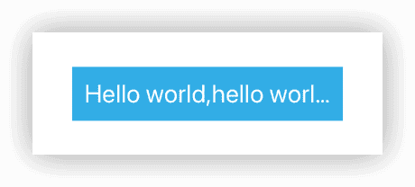
The reason why Text in the above image does not fully utilize the entire width of the HStack is because an explicit spacing is not set for the HStack. Setting it to 0 will solve the issue: HStack(spacing: 0).
Setting explicit spacing for layout containers is a good habit. Without explicit spacing, HStack and VStack might behave unexpectedly during layout. This issue will also be encountered later in the text.
HStack and VStack do not allocate spacing to Spacer, as Spacer itself represents space occupation. Therefore, in the first example, even without setting spacing for HStack, Text still uses the entire width of HStack.
Having mastered the use of view priority, we can also use other variable-sized views as fillers, such as:
Rectangle().opacity(0)Color.blue.opacity(0)ContainerRelativeShape().fill(.clear)
In SwiftUI development, Color, Rectangle, and similar views are often used to evenly divide container space. Moreover, since Color and Rectangle fill in both dimensions (unlike Spacer, which adjusts its filling dimension based on the container), using them as fillers automatically utilizes all available space, including height, eliminating the need for .frame(maxHeight: .infinity) in scenarios with undefined dimensions.
For more in-depth information about Color, read SwiftUI Column #4: Color is Not Just Color.
Alignment Guides
In the previous section, we achieved horizontal centering of Text using fillers. Vertical centering was achieved through the default alignment guide setting of HStack (.center). In this section, we will achieve centering entirely through alignment guides.
ZStack
ZStack { // Using the default alignment guide, equivalent to ZStack(alignment: .center)
    Color.green
    hello
}
.frame(width: 300, height: 60)
The layout logic of the code above is:
- ZStack gives both Color and Text a recommended size of 300 x 60.
- Color takes this recommended size as its required size, filling the ZStack.
- The maximum available width for Text is 300.
- Color and Text align according to the center alignment guide, appearing as Text centered within Color.
However, rewriting the code as follows introduces problems:
ZStack { // Inconsistencies in VStack spacing can occur without explicit settings
    Color.gray
        .frame(width: 300, height: 60)
    hello // Without a predefined width, long text will exceed the width of Color
}
The layout logic here is:
- The size of Color is fixed at 300 x 60 (regardless of ZStack’s recommended size).
- ZStack’s size becomes the maximum of the width and height of Color and Text, which is variable (dependent on the length of the Text).
- When ZStack’s recommended width exceeds 300, the usable width for Text will surpass the width of Color.
This can lead to two potential issues:
- Long text will extend beyond the width of Color.
- Since the composite view is variable in size, spacing added by VStack or HStack may not align with expectations (as shown in the image below where spacing is uneven. Explicitly setting spacing can resolve this issue, so it’s good practice to set spacing explicitly).
VStack { // Without predefined spacing, explicit settings can fix uneven spacing issues
    ZStack {
        Color.green
        hello
    }
    .frame(width: 300, height: 60)

    ZStack { // Inconsistencies in VStack spacing without explicit settings
        Color.gray
            .frame(width: 300, height: 60)
        hello // Difficult to handle text exceeding the width of the rectangle
    }

    // Spacer version
    HStack {
        Spacer(minLength: 0)
        hello
            .sizeInfo()
        Spacer(minLength: 0)
            .sizeInfo()
    }
    .frame(width: 300, height: 60)
    .background(.blue, ignoresSafeAreaEdges: [])
}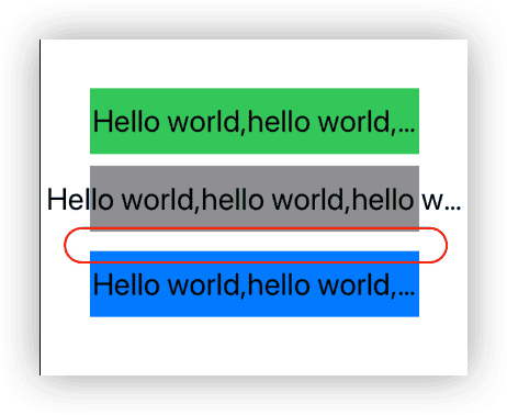
Without explicit spacing values for VStack and HStack (i.e., spacing = nil), the layout containers will try to apply the default spacing values from each subview between adjacent views. Since different types of views have varying default spacing, this can result in seemingly uneven spacing distribution (although the layout container is correctly executing our requirements). To ensure consistent spacing between all views, it’s necessary to set explicit spacing values for the layout containers.
frame
hello
    .frame(width: 300, height: 60) // Uses the default center alignment guide, equivalent to .frame(width: 300, height: 60, alignment: .center)
    .background(.pink)
Layout logic:
- FrameLayout, a layout container, is used to layout the Text.
- FrameLayout suggests a size of 300 x 60 to the Text.
- Text and a placeholder view (a blank view with a size of 300 x 60) align according to the center alignment guide.
This is my personal favorite method for centering, and it is also very convenient for dealing with scenarios of undefined dimensions:
hello
    .frame(maxWidth: .infinity, maxHeight: .infinity)
    .background(.pink)
To understand the implementation principles of frame, read SwiftUI Layout: Cracking the Size Code.
overlay
Rectangle() // Using Color.orange directly also works
    .fill(Color.orange)
    .frame(width: 300, height: 60)
    .overlay(hello) // Equivalent to .overlay(hello, alignment: .center)
Layout logic:
- Rectangle receives a recommended size of 300 x 60 (and uses the entire size).
- Using OverlayLayout, a layout container, both Rectangle and Text are laid out, with the suggested size based on the main view’s requirement size (Rectangle’s requirement size).
- Text and Rectangle align according to the center alignment guide.
Can a similar style be achieved using background? For example:
hello
    .background(
        Color.cyan.frame(width: 300, height: 60)
    )
    .border(.red) // Display border to view the layout size of the composite view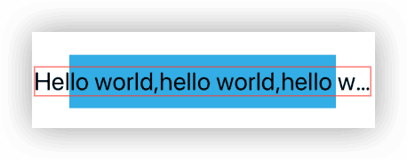
Unfortunately, you will get a result similar to the incorrect use of ZStack mentioned earlier. The text might be too long, and the view may not receive spacing (even with explicit settings).
Read Alignment in SwiftUI: Everything You Need to Know to understand more about the alignment mechanisms of ZStack, overlay, and background.
Geometry
Although it might be a bit of an overkill, when we need more information about a view, GeometryReader is a great choice:
GeometryReader { proxy in
    hello
        .position(.init(x: proxy.size.width / 2, y: proxy.size.height / 2))
        .background(Color.brown)
}
.frame(width: 300, height: 60)
Layout logic:
- GeometryReader receives a suggested size of 300 x 60.
- As GeometryReader has traits similar to Color and Rectangle, it treats the suggested size as its required size (occupying all available space).
- GeometryReader provides a 300 x 60 suggested size to Text.
- The views inside GeometryReader align based on the topLeading by default (similar to
overlay(alignment: .topLeading)). - The position modifier is used to align the center point of the Text with the given position (position is a view modifier that aligns the center point with a CGPoint).
Of course, you can also get the Geometry information of the Text and achieve centering through offset or padding. However, unless the dimensions of the rectangle are clear, using GeometryReader both inside and out can be overly complicated.
Conclusion
This article has selected some representative solutions. As SwiftUI continues to evolve, more and more methods will become available. Understanding the fundamentals of SwiftUI’s layout principles allows you to easily adapt to changing requirements.