Following the release of the new Liquid Glass style, Apple promptly introduced Icon Composer, a tool for creating icons that comply with the Liquid Glass standard. According to Apple’s introduction, Icon Composer appears straightforward to use. It essentially requires users to place images in layers, and that’s it. However, in practice, several details require careful attention. Megabits’ll use his app as an example to briefly describe the issues I encountered during the process.
Importing Assets from Design Tools
This is the icon file for SLIT_STUDIO, designed in Affinity Designer. The concept behind this icon is a melting camera lens with lens flares. It’s divided into nine layers, as shown below.
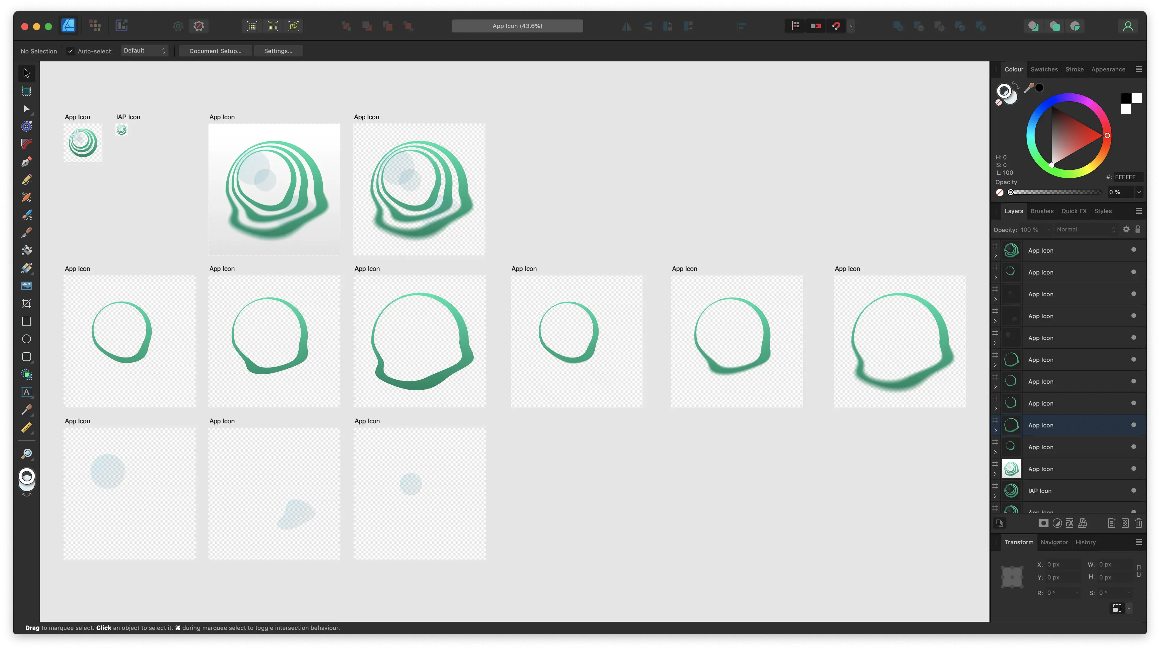
Following Apple’s requirements, I exported each layer as a separate artboard using SVG format. At this point, I encountered a strange phenomenon: even with Specular turned on, the glass highlight effect wasn’t visible.
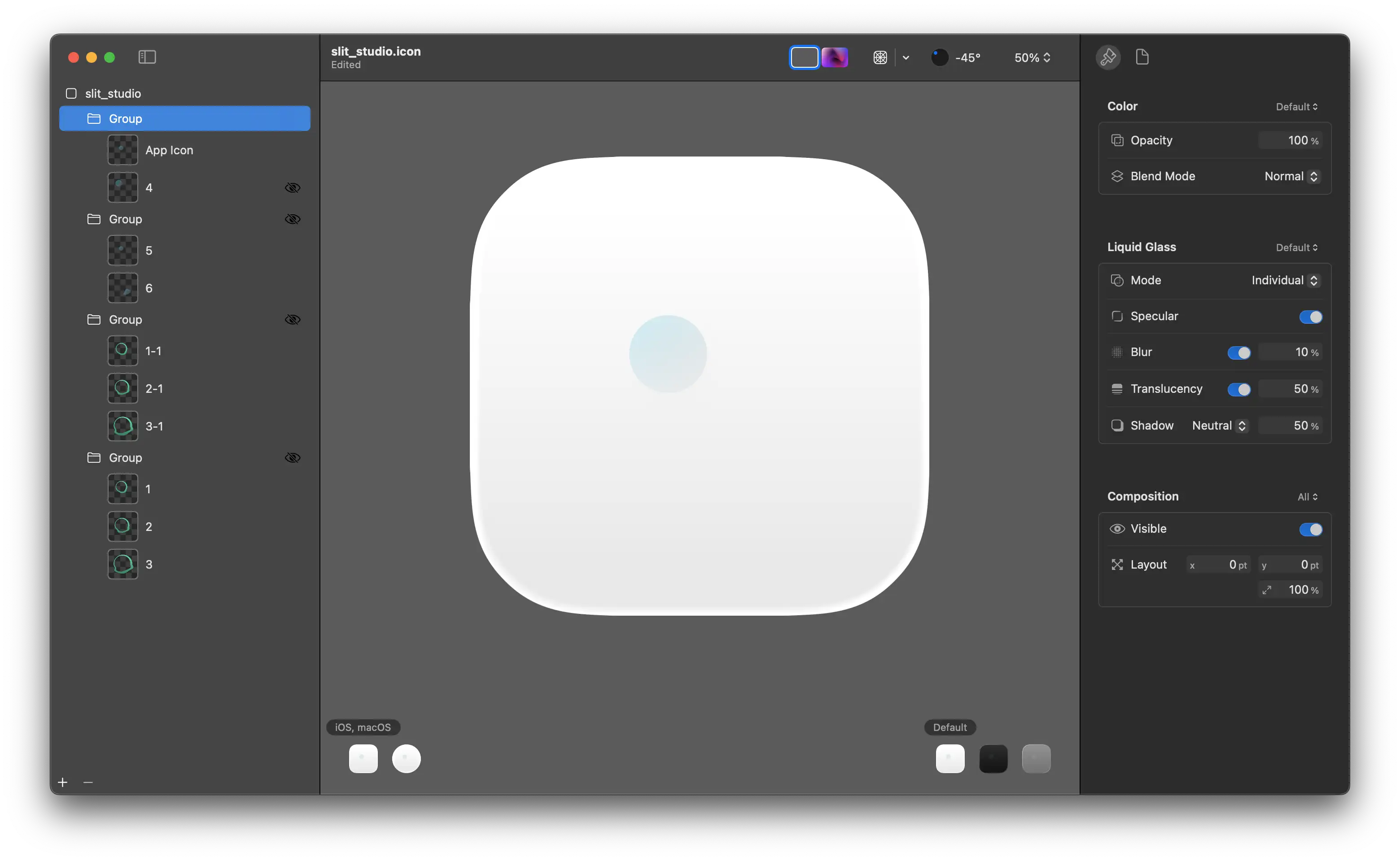
This occurred because the SVG files exported from Affinity contained an outer rectangle with the same dimensions as the artboard. You can see this by opening the file in any text editor. Note the highlighted section in the image below.
<rect x="0" y="0" width="512" height="512" style="fill:none;"/>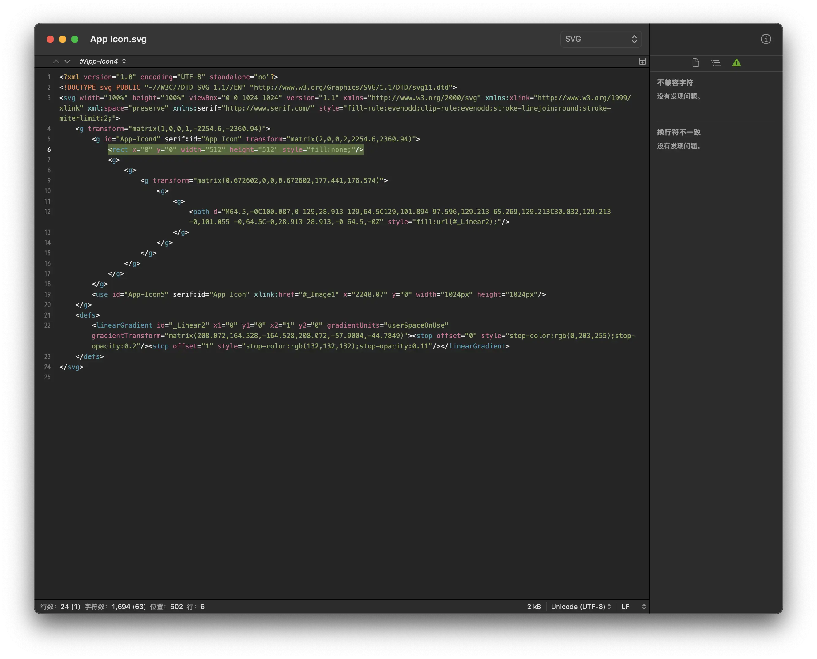
After deleting this line, the problem was resolved.
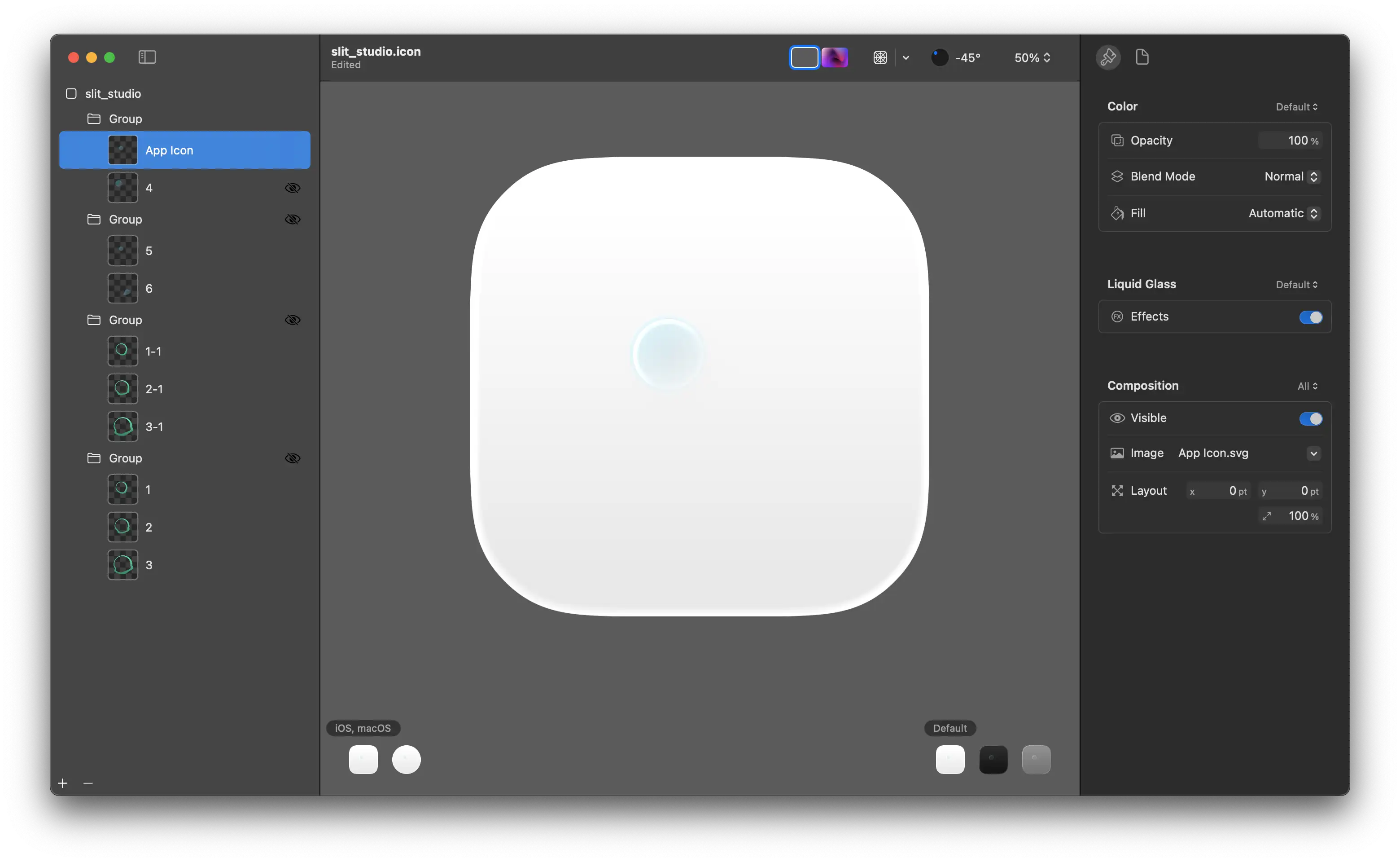
Different software may structure SVG differently, similar to how Dreamweaver used to include unnecessary code when creating web pages. This can affect how Icon Composer interprets the files. I recommend checking all exported SVG images with a text editor.
If you want to avoid this issue entirely, you can choose to use PNG instead of SVG. In this case, Icon Composer will use algorithms to calculate the image edges. However, be careful of aliasing that can appear when scaling PNGs.
Adapting to Monochrome Mode
After handling light and dark modes, you’ll need to address monochrome mode. You may notice that icons in monochrome mode appear grayish. Initially, I thought this was normal for monochrome mode, but upon testing on an actual device, I found it to be much darker than other apps.
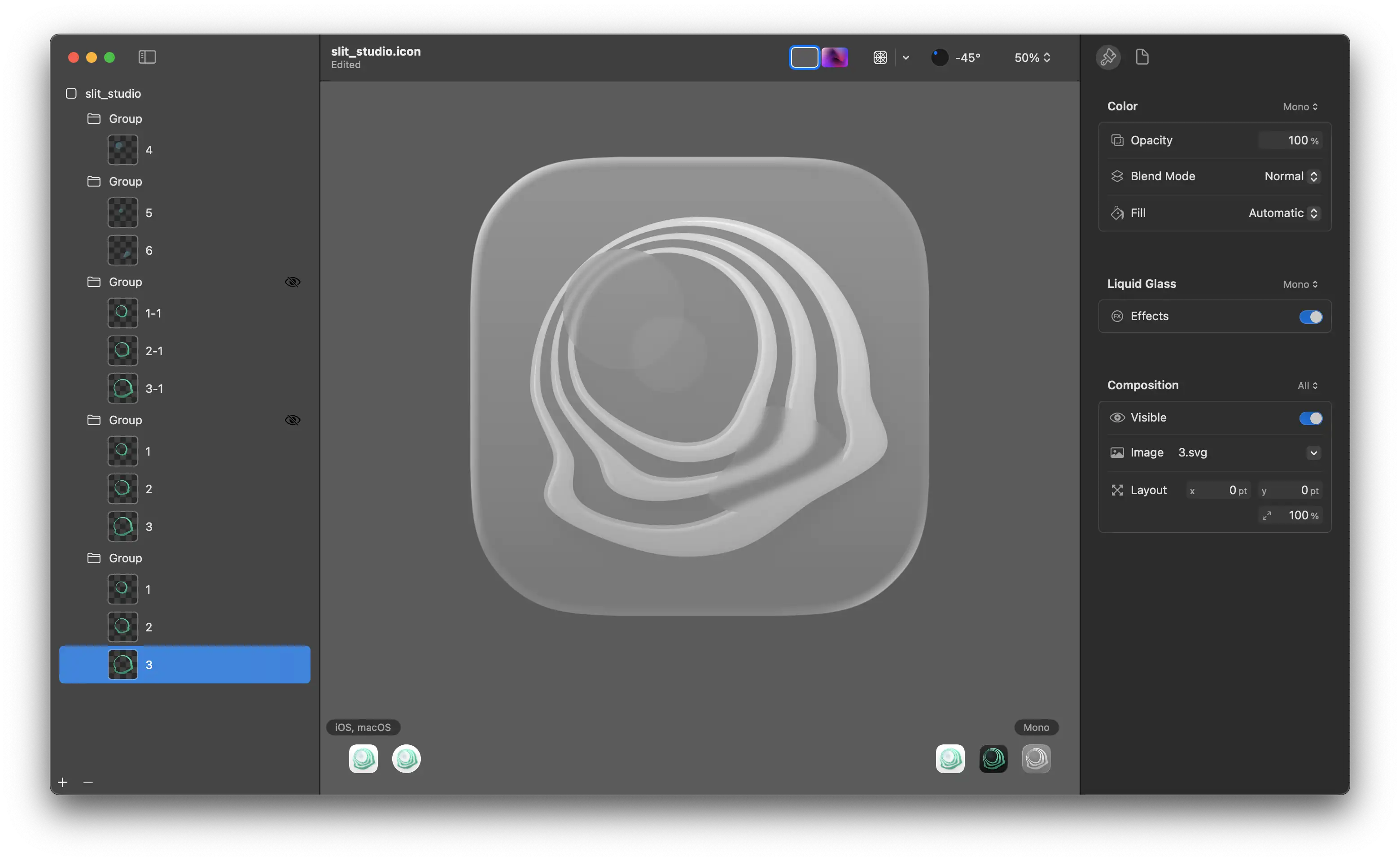
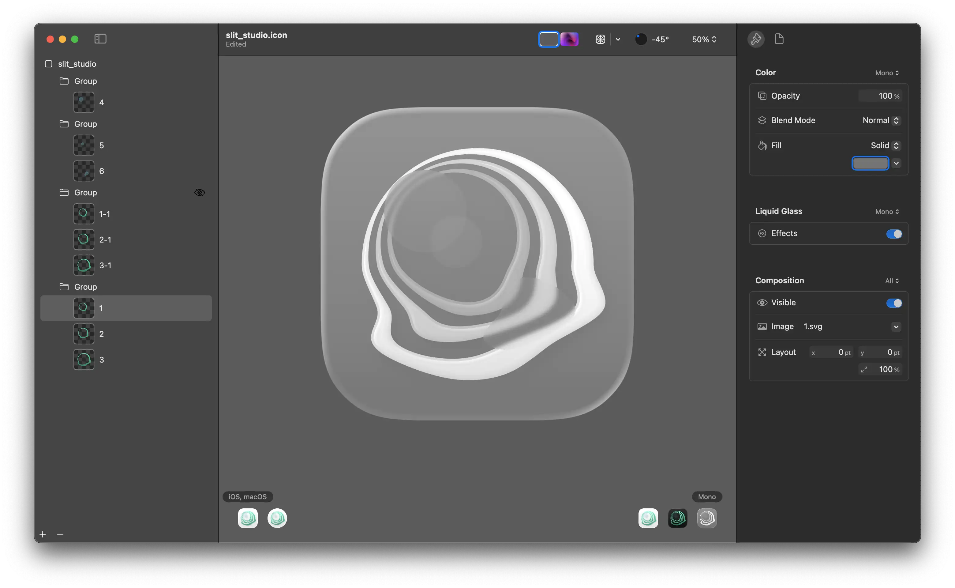
This issue occurs because Icon Composer calculates monochrome brightness based on the brightness of colors in normal mode. Since my icon used primarily green colors, it appeared grayish in monochrome mode. The solution is simple: specify new fill colors for these layers in monochrome mode. Besides filling everything with white, you can get creative. For example, I created a gradient effect where the brightness increases from inside to outside.
Design Trade-offs
Icon Composer has many limitations. The first is the layer limit. In my other app, CodeDrawer, you can see a warning in the bottom left indicating that the layer count exceeds the limit. Likely for performance and battery considerations, icons can have a maximum of four layers.
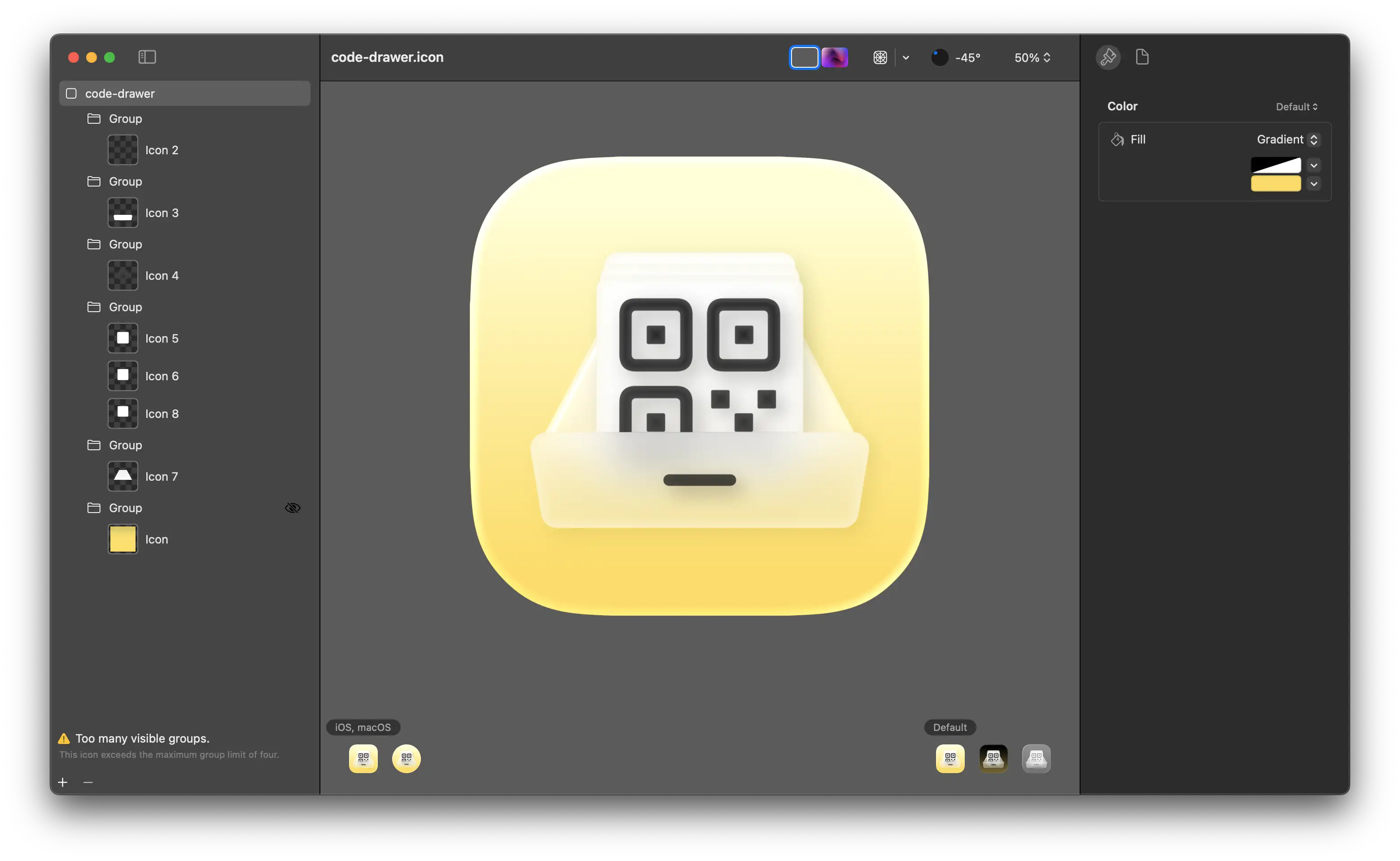
To reduce layer usage, the easiest one is to set the background color in the document settings rather than using a separate layer. Then you need to determine which elements can be merged.
This is the result after adjustments. I enabled highlights for the fourth group and modified some transparency options. Fortunately, the impact wasn’t too significant.
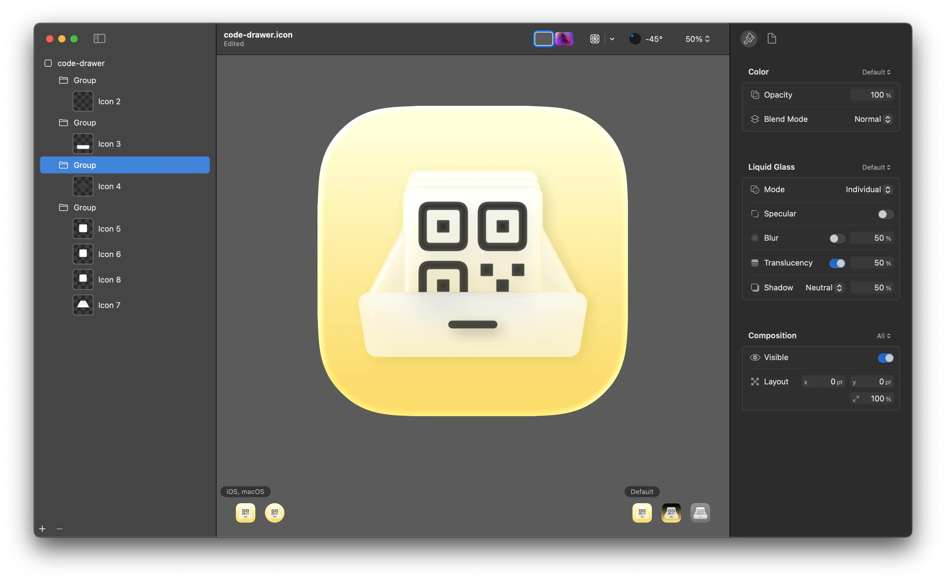
Beyond performance limitations, there are also constraints with the glass effect itself. In this icon, the entire lower half is blurred, but I can’t have something that’s both blurred and has a glass effect simultaneously. Without the glass effect, my icon would stand out awkwardly among others, but with the glass effect, I must sacrifice the blur on the lower half.
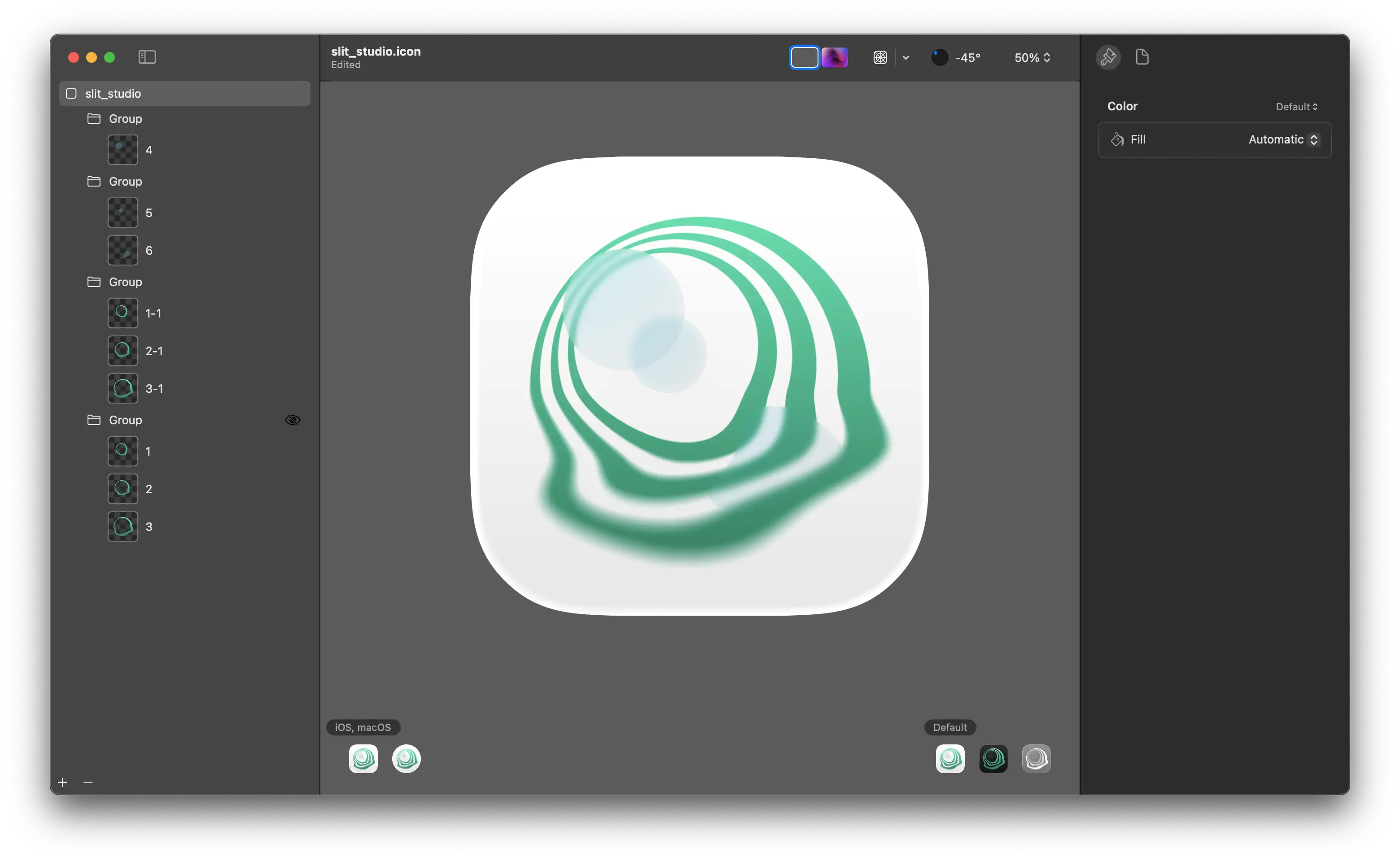
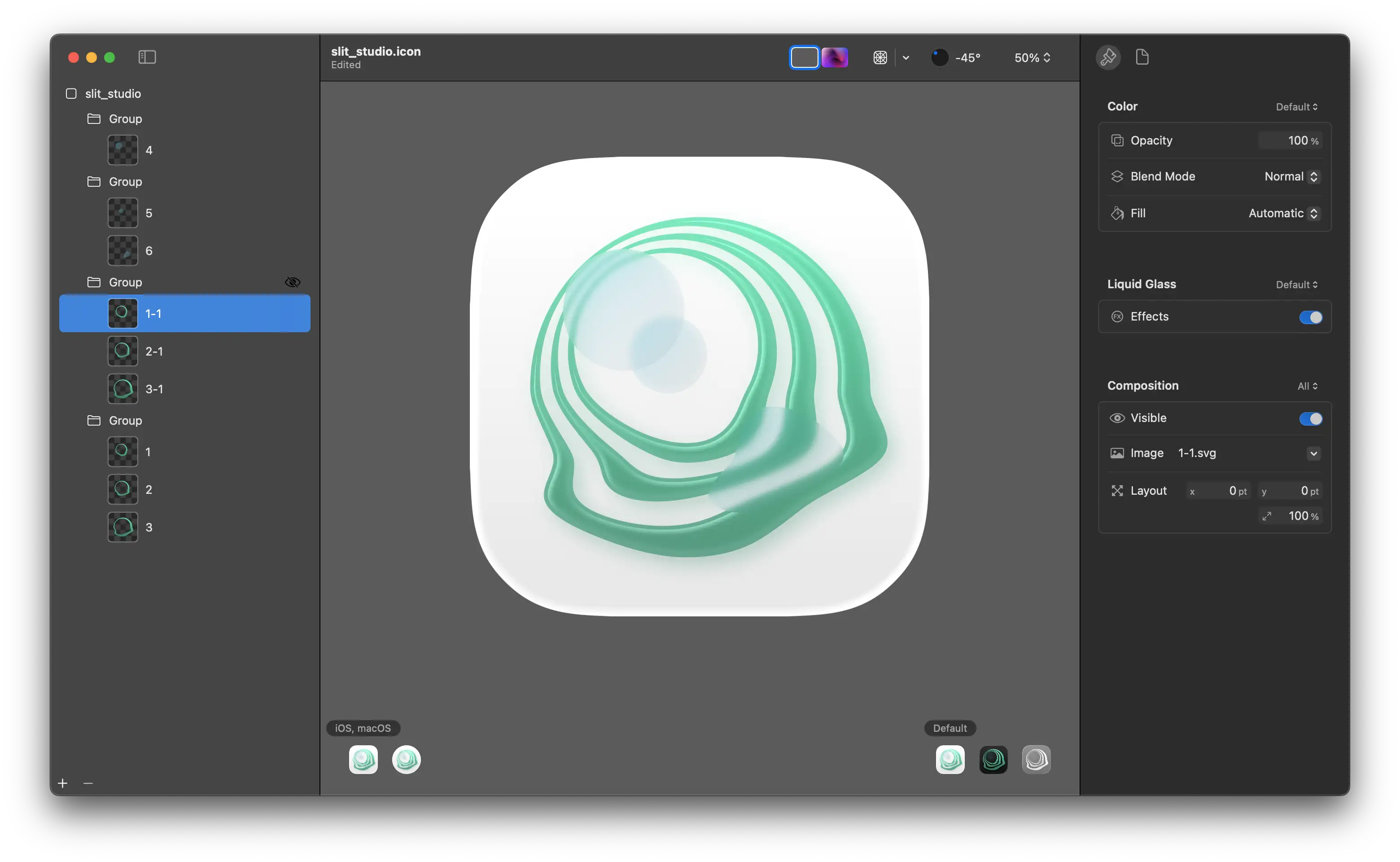
To be honest, I’m not sure which approach is better.
Importing to Xcode
To import an Icon Composer file into Xcode, you need to place the file directly in your app’s directory, at the same level as Assets, not inside it.
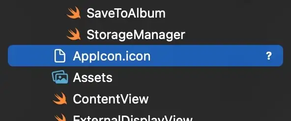
Through testing, I found that when running an app compiled with the new SDK on older system versions, it falls back to the old icon defined in Assets. This makes sense since older OS can’t interpret the .icon file, so they naturally use the legacy version.
Correction: After retesting on iOS 18 Beta 3, I found that the actual behavior differs from the description above. On iOS 18, the system uses a flattened copy of the new icon rather than falling back to the legacy icon in Assets. Previously, I may have mistaken it for using the old version because the glass effect wasn’t obvious enough. Since we’re still in the beta phase, behavioral changes are normal, and developers are encouraged to conduct thorough testing.
Conclusion
Icon Composer imposes significant constraints on icon design. Previously, you could somewhat ignore the design style of other system apps without looking too out of place, but now you need to invest considerable effort to ensure your icon looks appropriate across all modes. This has increased the difficulty of design. As the new system is released and apps gradually adopt the new design style, I’m sure we’ll discover many clever design solutions.