“Alignment” is an extremely important concept in SwiftUI, but many developers struggle to master this layout tool. In WWDC 2022, Apple added the Layout protocol to SwiftUI, giving us more opportunities to understand and validate the layout principles of SwiftUI. This article will comb through the “alignment” of SwiftUI in combination with the content of the Layout protocol, hoping to give readers a clearer understanding and mastery of “alignment”.
You can download the source code required for this article here.
What is Alignment?
Alignment is a behavior that occurs between multiple objects. For example, arranging a stack of books neatly on a desk, standing at attention and aligning to the left (right) during training, etc. In SwiftUI, alignment refers to aligning multiple views in a layout container according to alignment guides. For example, the following code requires all views inside the ZStack container to be aligned according to their respective center points:
ZStack(alignment: .center) {
    Text("Hello")
    Text("World")
    Circle()
        .frame(width: 50, height: 50)
}
The two most crucial points in the “alignment” behavior are:
- What to use as alignment guides
- Which views are being “aligned”
Alignment Guide
Overview
Alignment guide is used to identify the basis for aligning views. It has the following characteristics:
- Alignment guides can not only identify points, but also lines
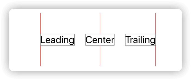
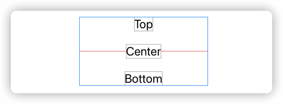
In SwiftUI, HorizontalAlignment and VerticalAlignment are used to identify the reference lines in the vertical and horizontal directions of the view, and they can jointly form the identification of a specific reference point in the view.
HorizontalAlignment.leading, HorizontalAlignment.center, HorizontalAlignment.trailing respectively identify the leading edge, center, and trailing edge (along the horizontal axis of the view).
VerticalAlignment.top, VerticalAlignment.center, VerticalAlignment.bottom respectively identify the top, center, and bottom (along the vertical axis of the view).
Alignment.topLeading is composed of HorizontalAlignment.leading and VerticalAlignment.top, and the intersection of the two reference lines identifies the top-leading of the view.
- Alignment guides are composed of functions.
HorizontalAlignment and VerticalAlignment are essentially functions that return a CGFloat value. The function will return the alignment position (offset) along a specific axis.
- Alignment guides support multiple layout directions.
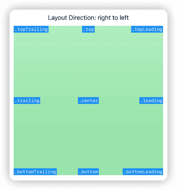
Because alignment guides are composed of functions, they inherently have flexible adaptability. In SwiftUI, the system’s preset alignment guides provide support for different layout directions. By simply modifying the view’s layout direction, the alignment guides will automatically change their corresponding positions.
VStack(alignment:.leading){
    Text("Hello world")
    Text("WWDC 2022")
}
.environment(\.layoutDirection, .rightToLeft)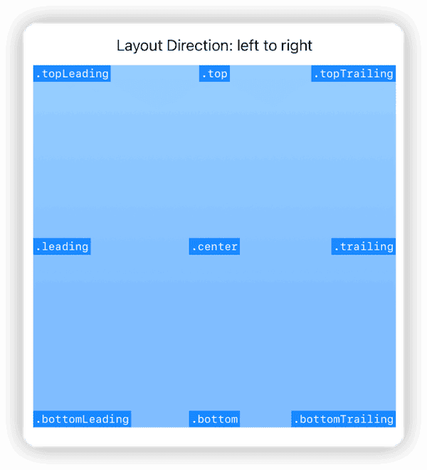
For more information on custom alignment guides and applications of Alignment Guide, I recommend reading Javier’s Alignment Guides in SwiftUI article.
Custom Alignment Guides
In addition to the preset alignment guides provided by SwiftUI, developers can also customize alignment guides:
struct OneThirdWidthID: AlignmentID {
    static func defaultValue(in context: ViewDimensions) -> CGFloat {
        context.width / 3
    }
}
// Define a custom HorizontalAlignment with a reference value of one third of the view's width
extension HorizontalAlignment {
    static let oneThird = HorizontalAlignment(OneThirdWidthID.self)
}

// You can also define a reference point that has two dimensional values for ZStack and frame.
extension Alignment {
    static let customAlignment = Alignment(horizontal: .oneThird, vertical: .top)
}
Custom alignment guides, like SwiftUI’s preset alignment guides, can be used in any container view that supports alignment.
alignmentGuide Modifier
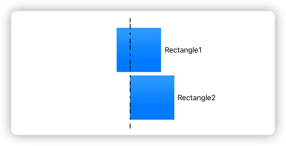
In SwiftUI, developers can use the alignmentGuide modifier to modify the value of a particular alignment guide for a view (for setting explicit values, see the next section). For example:
struct AlignmentGuideDemo:View{
    var body: some View{
        VStack(alignment:.leading) {
            rectangle // Rectangle1
                .alignmentGuide(.leading, computeValue: { viewDimensions in
                    let defaultLeading = viewDimensions[.leading] // default is 0
                    let newLeading = defaultLeading + 30
                    return newLeading
                })

            rectangle // Rectangle2
        }
        .border(.pink)
    }

    var rectangle:some View {
        Rectangle()
            .fill(.blue.gradient)
            .frame(width: 100, height: 100)
    }
}
By using alignmentGuide, we have offset the HorizontalAlignment.leading of Rectangle1 by 30 to the right along the horizontal axis. After aligning with Rectangle2 in VStack according to .leading, the result is as shown in the figure below:
Explicit Values for Alignment Guides
Alignment guide value = explicit value ?? default value
Each alignment guide in a view has a default value (obtained through the defaultValue method in the alignment guide definition). If an explicit value is not set for an alignment guide (explicit value is nil), the alignment guide will return the default value.
Rectangle()
    .fill(.blue.gradient)
    .frame(width: 100, height: 100)
// Default alignment guide values:
// leading: 0 , HorizontalAlignment.center: 50, trailing: 100
// top: 0 , VerticalAlignment.center: 50 , bottom: 100
// firstTextBaseline : 100 , lastTextBaseline : 100
If we use alignmentGuide to set an explicit value for an alignment guide, the value of the alignment guide will be the explicit value we set.
Rectangle()
    .fill(.blue.gradient)
    .frame(width: 100, height: 100)
    .alignmentGuide(.leading, computeValue: { viewDimensions in
        let leading = viewDimensions[.leading] // As the explicit value is nil at this time, the value of leading is 0
        return viewDimensions.width / 3 // Set the explicit value of leading to one third of the width
    })
    .alignmentGuide(.leading, computeValue: { viewDimensions in
        let leading = viewDimensions[.leading] // As an explicit value has been set above, the value of leading is now 33.33
        let explicitLeading = viewDimensions[explicit: .leading] // Explicit value, which is Optional(33.33) at this time
        return viewDimensions[HorizontalAlignment.center] // Set the explicit value of leading again. The explicit value is Optional(50) at this time, and the value of .leading is 50.
    })
Even if you haven’t changed the default value of an alignment guide, providing a return value for alignmentGuide sets an explicit value:
Rectangle()
    .fill(.blue.gradient)
    .frame(width: 100, height: 100)
    .alignmentGuide(.leading, computeValue: { viewDimensions in
        let leading = viewDimensions[.leading] // At this time, the explicit value of leading is nil
        return leading  // At this time, leading is 0, and the explicit value of leading is 0
    })
Special Alignment Guides
In the previous text, we deliberately avoided two alignment guides that are easy to confuse: firstTextBaseline and lastTextBaseline. These two alignment guides vary depending on the content of the view.
When reading the following code, please analyze in your mind the position of the firstTextBaseline and lastTextBaseline alignment guide for the corresponding view:
Rectangle()
    .fill(.orange.gradient)
    .frame(width: 100, height: 100)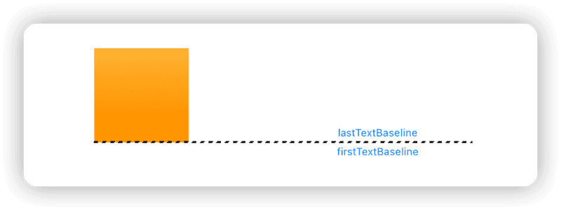
There is no text in the view, so firstTextBaseline and lastTextBaseline are equivalent to bottom.
Text("Hello world")
    .border(.red)
Single line of text, where firstTextBaseline and lastTextBaseline are the same. Text baseline is different from bottom.
Text("山不在高,有仙则名。水不在深,有龙则灵。斯是陋室,惟吾德馨。苔痕上阶绿,草色入帘青。谈笑有鸿儒,往来无白丁。可以调素琴,阅金经。无丝竹之乱耳,无案牍之劳形。南阳诸葛庐,西蜀子云亭。孔子云:何陋之有?")
    .frame(width:200)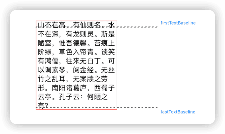
Multi-line text, where firstTextBaseline is the baseline of the first line of text, and lastTextBaseline is the baseline of the last line of text.
The opaque calculation method of firstTextBaseline and lastTextBaseline for layout containers (composite views) in SwiftUI is the main reason for confusion.
Button("Hello world"){}
    .buttonStyle(.borderedProminent)
    .controlSize(.large)
Button(action: {}, label: {
    Capsule(style: .circular).fill(.yellow.gradient).frame(width: 30, height: 15)
})
.buttonStyle(.borderedProminent)
.controlSize(.large)
Text("Hello world")
    .frame(width: 100, height: 100, alignment: .topLeading)
    .border(.red)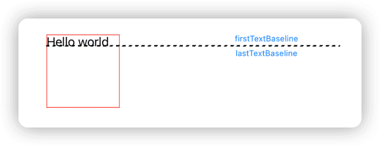
VStack {
    Rectangle().fill(.red.gradient).frame(width: 50, height: 10)
    Text("Hello world")
    Text("WWDC 2022")
    Text("肘子的 Swift 记事本")
    Rectangle().fill(.blue.gradient).frame(width: 50, height: 10)
}
.border(.red)
VStack {
    Rectangle().fill(.red.gradient).frame(width: 50, height: 50)
    Rectangle().fill(.blue.gradient).frame(width: 50, height: 50)
}
.border(.red)
HStack(alignment: .center) {
    Rectangle().fill(.blue.gradient).frame(width: 20, height: 50)
    Text("Hello world")
        .frame(width: 100, height: 100, alignment: .top)
    Text("山不在高,有仙则名。水不在深,有龙则灵。斯是陋室,惟吾德馨。苔痕上阶绿,草色入帘青。谈笑有鸿儒,往来无白丁。可以调素琴,阅金经。无丝竹之乱耳,无案牍之劳形。南阳诸葛庐,西蜀子云亭。孔子云:何陋之有?")
        .frame(width: 100)
    Text("WWDC 2022")
        .frame(width: 100, height: 100, alignment: .center)
    Rectangle().fill(.blue.gradient).frame(width: 20, height: 50)
}
.border(.red)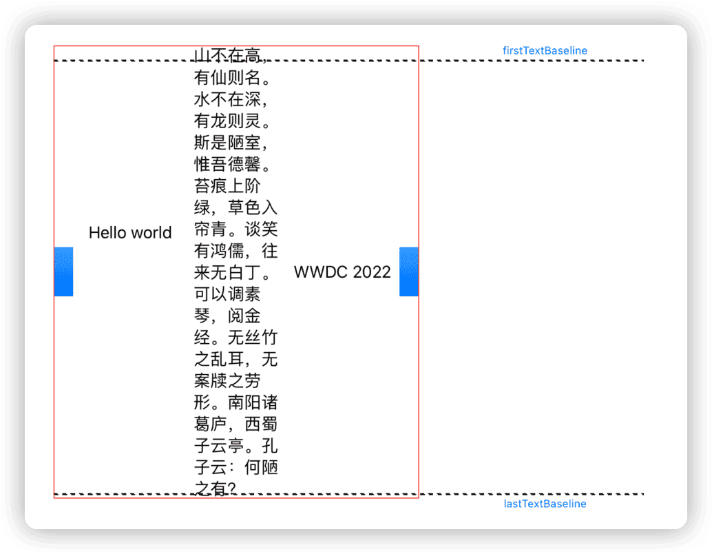
ZStack {
    Text("Hello world")
        .frame(width: 100, height: 100, alignment: .topTrailing)
        .border(.red)
    Color.blue.opacity(0.2)
    Text("肘子的 Swift 记事本")
        .frame(width: 100, height: 100, alignment: .bottomLeading)
        .border(.red)
}
.frame(width: 130, height: 130)
.border(.red)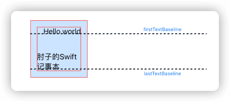
Grid {
    GridRow(alignment:.lastTextBaseline) {
        Text("Good")
        Text("Hello world")
            .frame(width: 50, height:50, alignment: .top)
            .border(.red)
        Text("Nice")
    }
    GridRow {
        Color.red.opacity(0.3)
        Color.green.opacity(0.2)
        Color.pink.opacity(0.2)
    }
    GridRow(alignment:.top) {
        Text("Start")
        Text("WWDC 2022")
            .frame(width: 70, height:50, alignment: .center)
            .border(.red)
        Rectangle()
            .fill(.blue.gradient)
    }
}
.frame(maxWidth: 300, maxHeight: 300)
.border(.red)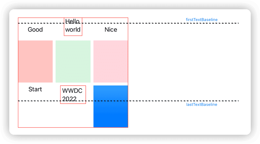
HStack {
    Text("First")
    VStack {
        Text("Hello world")
        Text("肘子的 Swift 记事本")
        Text("WWDC")
    }
    .border(.red)
    .padding()
    Text("Second")
    Rectangle().fill(.red.gradient)
        .frame(maxWidth: 10, maxHeight: 100)
}
.border(.green)
Pause reading and see if you can summarize the calculation rules for firstTextBaseline and lastTextBaseline for SwiftUI’s layout containers (composite views) from the code above.
…
…
…
…
…
…
…
…
…
…
The calculation method for firstTextBaseline and lastTextBaseline in composite views is as follows:
- For firstTextBaseline, if there is an explicit non-nil value for firstTextBaseline in the subviews of the composite view (container), return the firstTextBaseline with the highest explicit value (closest to top), otherwise return the default value (usually bottom).
- For lastTextBaseline, if there is an explicit non-nil value for lastTextBaseline in the subviews of the composite view (container), return the lastTextBaseline with the lowest explicit value (closest to bottom), otherwise return the default value (usually bottom).
This is why even though developers rarely care about and use explicit values for alignment guides in SwiftUI, they are still very important.
Setting Explicit Alignment Guidelines for Custom Layouts that Conform to the Layout Protocol
The Layout protocol introduced in SwiftUI 4.0 gives developers the ability to create custom layout containers. By using the explicitAlignment method provided by the Layout protocol, we can verify whether the algorithm for firstTextBaseline and lastTextBaseline of the layout container (composite view) is correct.
The explicitAlignment method provided by the Layout protocol has two different parameter types corresponding to the VerticalAlignment and HorizontalAlignment types. explicitAlignment allows developers to set explicit values for alignment guidelines from the perspective of layout. The default implementation of explicitAlignment returns nil for any explicit value of alignment guidelines.
The following code snippet is from the source code accompanying this article - a ZStack replica created using the Layout protocol. I will demonstrate my previous assumptions by setting explicit alignment guidelines for both firstTextBaseline and lastTextBaseline in the explicitAlignment method.
// This method is used by SwiftUI to obtain explicit values for specific alignment guidelines
func explicitAlignment(of guide: VerticalAlignment,  // The alignment guideline to query
                       in bounds: CGRect, // The bounds of the custom container, which is calculated by the sizeThatFits method and is consistent with the bounds parameter of placeSubviews
                       proposal: ProposedViewSize,  // The proposed size of the parent view
                       subviews: Subviews,  // A proxy for the subviews within the container
                       cache: inout CacheInfo // Cache data. In this example, we save the viewDimension and virtual bounds information for each subview in the cache data
                      ) -> CGFloat? {
    let offsetY = cache.cropBounds.minY * -1
    let infinity: CGFloat = .infinity

    // Check if there are any views in the subviews with non-nil explicit firstTextBaseline. If so, return the highest position of firstTextBaseline values.
    if guide == .firstTextBaseline,!cache.subviewInfo.isEmpty {
        let firstTextBaseline = cache.subviewInfo.reduce(infinity) { current, info in
            let baseline = info.viewDimension[explicit: .firstTextBaseline] ?? infinity
            // Convert the explicit firstTextBaseline of the subview into an offset value in the bounds
            let transformBaseline = transformPoint(original: baseline + info.bounds.minY, offset: offsetY, targetBoundsMinX: 0)
            // Return the lowest value (the highest position)
            return min(current, transformBaseline)
        }
        return firstTextBaseline != infinity ? firstTextBaseline : nil
    }

    if guide == .lastTextBaseline,!cache.subviewInfo.isEmpty {
        let lastTextBaseline = cache.subviewInfo.reduce(-infinity) { current, info in
            let baseline = info.viewDimension[explicit: .lastTextBaseline] ?? -infinity
            let transformBaseline = transformPoint(original: baseline + info.bounds.minY, offset: offsetY, targetBoundsMinX: 0)
            return max(current, transformBaseline)
        }
        return lastTextBaseline != -infinity ? lastTextBaseline : nil
    }

    return nil
}
Since the default implementation of explicitAlignment using the Layout protocol has the same effect as using our custom implementation, we can prove that our previous assumptions are correct. If you only want your custom layout container to have alignment guidelines consistent with the SwiftUI preset containers, you can directly use the default implementation of the Layout protocol (without implementing the explicitAlignment method).
Even if the layout container provides explicit values for alignment guidelines through explicitAlignment, developers can still make further adjustments through the alignmentGuide method.
Which views to “align”
In the previous section, we spent a considerable amount of space introducing alignment guidelines. In this section, we will explore another key point of “alignment” - in different contexts, which views will use alignment guidelines for “alignment”.
Layout containers that support multiple views such as VStack, HStack, and ZStack
Do you understand the meaning of the alignment parameter in SwiftUI’s commonly used layout container construction methods? How are they implemented?
VStack(alignment:.trailing) { ... }
ZStack(alignment: .center) { ... }
HStack(alignment:.lastTextBaseline) { ... }
GridRow(alignment:.firstTextBaseline) { ... }
Due to Apple’s unclear description of the alignment parameter for container views, developers may easily misunderstand it.
The guide for aligning the subviews in this stack. This guide has the same vertical screen coordinate for every child view —— Apple documentation for VStack’s alignment
For this view declaration code, which of the following text expressions would you choose:
ZStack(alignment: .bottomLeading) {
    Rectangle()
        .fill(.orange.gradient)
        .frame(width: 100, height: 300)
    Rectangle()
        .fill(.cyan.gradient).opacity(0.7)
        .frame(width: 300, height: 100)
}- Stack the subviews (Rectangle1 and Rectangle2) in ZStack in order and align the bottomLeading of each subview with the bottomLeading of ZStack.
- Stack Rectangle1 and Rectangle2 in order and align their bottomLeading.
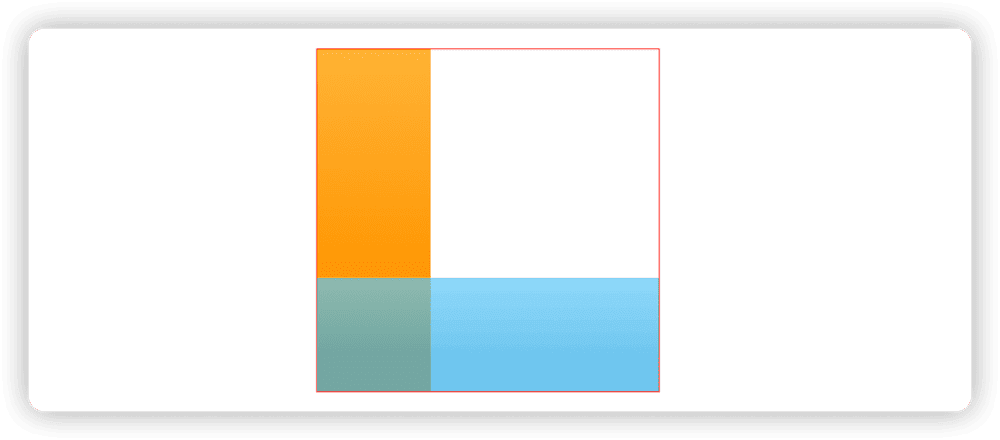
If you choose 1, how would you explain that the alignmentGuide in the following code cannot affect the alignment of the subviews?
ZStack(alignment: .bottomLeading) {
    Rectangle()
        .fill(.orange.gradient)
        .frame(width: 100, height: 300)
    Rectangle()
        .fill(.cyan.gradient).opacity(0.7)
        .frame(width: 300, height: 100)
}
.alignmentGuide(.leading){
    $0[.leading] + 10
}
Most of the time (without explicitly setting alignment guidelines), “Description 1” appears to be correct and intuitive from a human perspective, but from the perspective of SwiftUI, it is executed based on “Description 2”. This is because the alignment guidelines set in the layout container constructor are only used between subviews of the container.
To better understand why “Description 2” is correct, we need to understand the layout principles of SwiftUI and how ZStack works.
When a layout container is laid out, it provides a proposal size for each subview, and the subview will return its required size based on the proposal size provided by the container (the subview can also completely ignore the container’s proposal size and provide any required size). The container arranges all subviews in a virtual canvas according to preset behaviors (such as arranging in a specified axis, aligning points and lines, adding gaps, etc.). After the arrangement is completed, the container summarizes the situation of all subviews and returns its own required size to its parent view (parent container).
Therefore, during the alignment and arrangement process of subviews in the layout container, the size of the layout container has not been determined, so it is not possible to “align” the alignment guidelines of the subviews with those of the container.
By creating a layout container that complies with the Layout protocol, the above process can be clearly displayed. The following code comes from the demonstration code attached to this article, a replica of a ZStack:
// The container's parent view (parent container) calls the container's sizeThatFits method to get the container's required size. This method is usually called multiple times, providing different suggested sizes.
func sizeThatFits(
    proposal: ProposedViewSize, // The suggested size provided by the container's parent view (parent container).
    subviews: Subviews, // The delegate for all subviews currently in the container.
    cache: inout CacheInfo // Cache data, used in this example to save the required size returned by the subview and reduce the number of calls.
) -> CGSize {
    cache = .init() // Clear cache.
    for subview in subviews {
        // Provide a suggested size for the subview and get its required size (ViewDimensions).
        let viewDimension = subview.dimensions(in: proposal)
        // Get the point corresponding to the subview's alignmentGuide based on the MyZStack alignment setting.
        let alignmentGuide: CGPoint = .init(
            x: viewDimension[alignment.horizontal],
            y: viewDimension[alignment.vertical]
        )
        // Create bounds for the subview in the virtual canvas with the alignmentGuide corresponding to the point (0,0).
        let bounds: CGRect = .init(
            origin: .init(x: -alignmentGuide.x, y: -alignmentGuide.y),
            size: .init(width: viewDimension.width, height: viewDimension.height)
        )
        // Save the information about the subview in the virtual canvas.
        cache.subviewInfo.append(.init(viewDimension: viewDimension, bounds: bounds))
    }

    // Generate the MyZStack bounds based on the data of all subviews in the virtual canvas.
    cache.cropBounds = cache.subviewInfo.map(\\.bounds).cropBounds()
    // Return the required size of the current container, which will be used by its parent view to lay it out.
    return cache.cropBounds.size
}

// The container's parent view (parent container) will call this method when needed to set the rendering size for the container's subviews.
func placeSubviews(
    in bounds: CGRect, // The bounds created at the actual rendering position based on the size provided by the current container in sizeThatFits.
    proposal: ProposedViewSize, // The suggested size provided by the container's parent view (parent container).
    subviews: Subviews, // The delegate for all subviews currently in the container.
    cache: inout CacheInfo // Cache data, used in this example to save the required size returned by the subview and reduce the number of calls.
) {
    // The offset value (to 0,0) of the top-left corner of the virtual canvas.
    let offsetX = cache.cropBounds.minX * -1
    let offsetY = cache.cropBounds.minY * -1

    for index in subviews.indices {
        let info = cache.subviewInfo[index]
        // Convert the position information in the virtual canvas to the position information in the rendering bounds.
        let x = transformPoint(original: info.bounds.minX, offset: offsetX, targetBoundsMinX: bounds.minX)
        let y = transformPoint(original: info.bounds.minY, offset: offsetY, targetBoundsMinX: bounds.minY)
        // Set the transformed position information to the subview.
        subviews[index].place(at: .init(x: x, y: y), anchor: .topLeading, proposal: proposal)
    }
}
VStack and HStack will be more complex than ZStack in layout because they need to consider subviews that can dynamically adjust size in a specific dimension, such as Spacer, Text, and frame(minWidth:maxWidth:minHeight). VStack and HStack will make multiple size proposals for subviews (including ideal size, minimum size, maximum size, specific size, etc.), and combine the subview’s layout priority (layoutPriority) to calculate the subview’s required size and ultimately determine its own size.
In short, the meaning of setting alignment for official layout containers like VStack, HStack, and ZStack that can contain multiple subviews is to align and position all subviews in a specific dimension according to the given alignment guidelines.
overlay、background
In SwiftUI, in addition to the familiar VStack, HStack, ZStack, Grid, and List, many modifier functionalities are also implemented through layouts, such as overlay, background, frame, padding, and so on.
You can think of overlay and background as a special version of ZStack.
// Main view
Rectangle()
    .fill(.orange.gradient)
    .frame(width: 100, height: 100)
    // Additional view
    .overlay(alignment:.topTrailing){
        Text("Hi")
    }
For example, the above code can be represented by layout logic (pseudo code):
_OverlayLayout {
    // Main view
    Rectangle()
        .fill(.orange.gradient)
        .frame(width: 100, height: 100)

    // Additional view
    Text("Hi")
        .layoutValue(key: Alignment.self, value: .topTrailing) // A way for the child view to pass information to the nearest container
}
The difference from ZStack is that it only contains two subviews, and its size is determined only by the main view. The main view and the auxiliary view will be aligned according to the set alignment guidelines. Once you understand this, you will know how to adjust the alignment guidelines of the main view or the auxiliary view, such as:
// Main view
Rectangle()
    .fill(.orange.gradient)
    .frame(width: 100, height: 100)
    .alignmentGuide(.trailing, computeValue: {
        $0[.trailing] - 30
    })
    .alignmentGuide(.top, computeValue: {
        $0[.top] + 30
    })
    // Additional view
    .overlay(alignment:.topTrailing){
        Text("Hi")
    }

frame
”frame“ is essentially a layout container in SwiftUI that adjusts the size of its content. It can modify the suggested size passed to the subviews and may also change the required size returned by the subviews to the container. For example:
VStack {
    Text("Hello world")
       .frame(width: 10, height: 30, alignment: .top)
}
In the above code, due to the addition of the frame modifier, the FrameLayout (the backend layout container that implements the frame) will ignore the suggested size provided by VStack, and forcefully provide a suggested size of 10 x 30 for Text. It will also ignore the required size of the child view Text and return a required size of 10 x 30 for the parent view (VStack). Although FrameLayout only contains one child view, it will align the child view with a virtual view of a specific size during layout. Perhaps converting the frame code above into a background layout mode will be more convenient to understand:
_BackgroundLayout {
    Color.clear
        .frame(width: 10, height: 30)

    Text("Hello world")
        .layoutValue(key: Alignment.self, value: .top)
}
The dynamic version of the frame (FlexFrameLayout) decorator is an excellent example for learning and understanding the size negotiation mechanism in SwiftUI layout. Interested friends can use the Layout protocol to replicate it.
Summary
Although this article does not provide specific alignment techniques, as long as you understand and master the two key points of alignment: what to use as alignment guidance and which views to “align”, I believe it will reduce the alignment problems you encounter in development and achieve many effects that were not easy to achieve before through alignment.