In SwiftUI Layout — The Mystery of Size, we explained numerous sizing concepts involved in the SwiftUI layout process. In this post, we will further deepen our understanding of SwiftUI layout mechanism by imitating the view modifiers frame and fixedSize, and demonstrate some issues to be aware of during layout through several examples.
Same Appearance, Different Implications
In SwiftUI, we can utilize different layout containers to generate nearly identical rendering results. For example, ZStack, overlay, background, VStack, HStack can all achieve similar layout effects.

Take ZStack, overlay, background for example:
struct HeartView: View {
    var body: some View {
        Circle()
            .fill(.yellow)
            .frame(width: 30, height: 30)
            .overlay(Image(systemName: "heart").foregroundColor(.red))
    }
}

struct ButtonView: View {
    var body: some View {
        RoundedRectangle(cornerRadius: 12)
            .fill(Color.blue.gradient)
            .frame(width: 150, height: 50)
    }
}

// ZStack
struct IconDemo1: View {
    var body: some View {
        ZStack(alignment: .topTrailing) {
            ButtonView()
            HeartView()
                .alignmentGuide(.top, computeValue: { $0.height / 2 })
                .alignmentGuide(.trailing, computeValue: { $0.width / 2 })
        }
    }
}

// overlay
struct IconDemo2: View {
    var body: some View {
        ButtonView()
            .overlay(alignment: .topTrailing) {
                HeartView()
                    .alignmentGuide(.top, computeValue: { $0.height / 2 })
                    .alignmentGuide(.trailing, computeValue: { $0.width / 2 })
            }
    }
}

// background
struct IconDemo3: View {
    var body: some View {
            HeartView()
            .background(alignment:.center){
                ButtonView()
                    .alignmentGuide(HorizontalAlignment.center, computeValue: {$0[.trailing]})
                    .alignmentGuide(VerticalAlignment.center, computeValue: {$0[.top]})
            }
    }
}
Although IconDemo1, IconDemo2 and IconDemo3 look exactly the same in isolated preview, placing them inside other layout containers reveals distinct differences in their layout result inside the container —— the composition and size of required size are different (see the required size of each marked by red box in the figure below).

This is because different layout containers have different strategies in planning their own required size, which leads to the above phenomenon.
For containers like ZStack, VStack and HStack, their required size consists of the total size obtained after placing all their subviews according to the specified layout rules. While the required size of overlay and background depends entirely on their main view (in this example, the required size of overlay is determined by ButtonView, and the required size of background is determined by HeartView). Suppose the current design requirement is to layout ButtonView and HeartView as a whole, then ZStack is a good choice.
Each container has its applicable scenarios. For example, in the following requirement —— to create a subview like the like function in video App (only consider the position and size of gesture icon during layout), overlay container that depends only on the required size of the main view is very suitable:
struct FavoriteDemo: View {
    var body: some View {
        ZStack(alignment: .bottomTrailing) {
            Rectangle()
                .fill(Color.cyan.gradient.opacity(0.5))
            Favorite()
                .alignmentGuide(.bottom, computeValue: { $0[.bottom] + 200 })
                .alignmentGuide(.trailing, computeValue: { $0[.trailing] + 100 })
        }
        .ignoresSafeArea()
    }
}

struct Favorite: View {
    @State var hearts = [(String, CGFloat, CGFloat)]()
    var body: some View {
        Image(systemName: "hand.thumbsup")
            .symbolVariant(.fill)
            .foregroundColor(.blue)
            .font(.title)
            .overlay(alignment: .bottom) {
                ZStack {
                    Color.clear
                    ForEach(hearts, id: \.0) { heart in
                        Text("+1")
                            .font(.title)
                            .foregroundColor(.white)
                            .bold()
                            .transition(.asymmetric(insertion: .move(edge: .bottom).combined(with: .opacity), removal: .move(edge: .top).combined(with: .opacity)))
                            .offset(x: heart.1, y: heart.2)
                            .task {
                                try? await Task.sleep(nanoseconds: 500000000)
                                if let index = hearts.firstIndex(where: { $0.0 == heart.0 }) {
                                    let _ = withAnimation(.easeIn) {
                                        hearts.remove(at: index)
                                    }
                                }
                            }
                    }
                }
                .frame(width: 50, height: 100)
                .allowsHitTesting(false)
            }
            .onTapGesture {
                withAnimation(.easeOut) {
                    hearts.append((UUID().uuidString, .random(in: -10...10), .random(in: -10...10)))
                }
            }
    }
}
Views of the same appearance may have different implications. When using layout containers to create combined views, the impact on parent container’s layout of the composed view must be considered, and suitable container should be chosen for different requirements.
Appearance and Essence
Similar to UIKit and AppKit, SwiftUI’s layout operations are performed at the view level (essence), while all operations targeting the associated backing layer are still completed through Core Animation. Therefore, adjustments made directly to the CALayer (appearance) are undetectable by SwiftUI’s layout system.
And such operations that adjust content after layout but before rendering are prevalent in SwiftUI, e.g. offset, scaleEffect, rotationEffect, shadow, background, cornerRadius etc. are performed at this stage.
For example:
struct OffsetDemo1:View{
    var body: some View{
        HStack{
            Rectangle()
                .fill(.orange.gradient)
                .frame(maxWidth:.infinity)
            Rectangle()
                .fill(.green.gradient)
                .frame(maxWidth:.infinity)
            Rectangle()
                .fill(.cyan.gradient)
                .frame(maxWidth:.infinity)
        }
        .border(.red)
    }
}
We adjust the position of the middle rectangle with offset, which does not affect the size of HStack at all. In this case, the appearance and essence are decoupled:
Rectangle()
    .fill(.green.gradient)
    .frame(width: 100, height: 50)
    .border(.blue)
    .offset(x: 30, y: 30)
    .border(.green)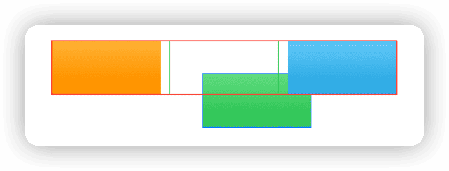
In SwiftUI, the offset modifier corresponds to the CGAffineTransform operation in Core Animation. .offset(x: 30, y: 30) is equivalent to .transformEffect(.init(translationX: 30, y: 30)). Such modifications made directly at the CALayer level do not affect layout.
The above may be the effect you want, but if you want the displaced view to affect the layout of its parent view (container), you may need another approach —— use layout containers instead of Core Animation operations:
// Using padding
Rectangle()
    .fill(.green.gradient)
    .frame(width: 100, height: 50)
    .border(.blue)
    .padding(EdgeInsets(top: 30, leading: 30, bottom: 0, trailing: 0))
    .border(.green)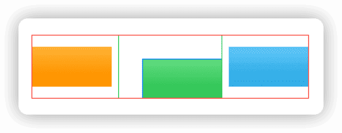
Or:
// Using frame
Rectangle()
    .fill(.green.gradient)
    .frame(width: 100, height: 50)
    .border(.blue)
    .frame(width: 130, height: 80, alignment: .bottomTrailing)
    .border(.green)

// Using position
Rectangle()
    .fill(.green.gradient)
    .frame(width: 100, height: 50)
    .border(.blue)
    .position(x: 80, y: 55)
    .frame(width: 130, height: 80)
    .border(.green)
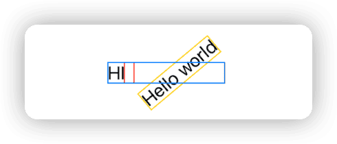
Compared to the offset view modifier, since there is no ready replacement, it is a bit tedious to make the results of rotationEffect in turn affect the layout:
struct RotationDemo: View {
    var body: some View {
        HStack(alignment: .center) {
            Text("HI")
                .border(.red)
            Text("Hello world")
                .fixedSize()
                .border(.yellow)
                .rotationEffect(.degrees(-40))
                .border(.red)
        }
        .border(.blue)
    }
}
extension View {
    func rotationEffectWithFrame(_ angle: Angle) -> some View {
        modifier(RotationEffectWithFrameModifier(angle: angle))
    }
}

struct RotationEffectWithFrameModifier: ViewModifier {
    let angle: Angle
    @State private var size: CGSize = .zero
    var bounds: CGRect {
        CGRect(origin: .zero, size: size)
            .offsetBy(dx: -size.width / 2, dy: -size.height / 2)
            .applying(.init(rotationAngle: CGFloat(angle.radians)))
    }

    func body(content: Content) -> some View {
        content
            .rotationEffect(angle)
            .background(
                GeometryReader { proxy in
                    Color.clear
                        .task(id: proxy.frame(in: .local)) {
                            size = proxy.size
                        }
                }
            )
            .frame(width: bounds.width, height: bounds.height)
    }
}

truct RotationDemo: View {
    var body: some View {
        HStack(alignment: .center) {
            Text("HI")
                .border(.red)
            Text("Hello world")
                .fixedSize()
                .border(.yellow)
                .rotationEffectWithFrame(.degrees(-40))
                .border(.red)
        }
        .border(.blue)
    }
}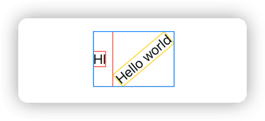
scaleEffect can also be implemented in a similar way to affect the original layout
In SwiftUI, developers need to be clear whether an operation targets the essence (based on layout mechanism) or appearance (at CALayer level), or wants to affect the essence by modifying the appearance, only in this way the final rendered effect can be consistent with the expected layout.
Please read Layout in SwiftUI Way to learn how to use different layout logics in SwiftUI to achieve the same visual design requirements.
Learning from Imitation
In this chapter, we will deepen the understanding of different size concepts in the layout process by imitating frame and fixedSize using the Layout protocol.
The layout logic of frame and fixedSize has been described in the previous section, this section only explains the key code. The imitation code can be obtained Here
frame
There are two versions of frame in SwiftUI. This section imitates frame(width: CGFloat? = nil, height: CGFloat? = nil, alignment: Alignment = .center).
Essentially the frame view modifier is a wrapper around the
_FrameLayoutlayout container. In this example we name the custom layout containerMyFrameLayoutand the view modifiermyFrame.
Wrapping Layout Containers with viewModifier
In SwiftUI, layout containers usually need to be wrapped before using. For example, _VStackLayout is wrapped as VStack, _FrameLayout is wrapped as the frame view modifier.
The effect of this wrapping behavior is (taking MyFrameLayout as an example):
-
Simplify code
Improve the multiple parentheses issue caused by
Layoutprotocol’scallAsFunction -
Preprocess subviews
In “Alignment in SwiftUI: Everything You Need To Know” I have introduced that “alignment” happens between subviews inside a container. Therefore, for
_FrameLayoutwhich only takes one subview from developer but still needs alignment, we need to add aColor.clearview in modifier to resolve the lack of alignment objects.
private struct MyFrameLayout: Layout, ViewModifier {
    let width: CGFloat?
    let height: CGFloat?
    let alignment: Alignment

    func body(content: Content) -> some View {
        MyFrameLayout(width: width, height: height, alignment: alignment)() { // Due to the multiple parentheses caused by callAsFunction
            Color.clear // Add views for alignment assistance.
            content
        }
    }
}

public extension View {
    func myFrame(width: CGFloat? = nil, height: CGFloat? = nil, alignment: Alignment = .center) -> some View {
        self
            .modifier(MyFrameLayout(width: width, height: height, alignment: alignment))
    }

    @available(*, deprecated, message: "Please pass one or more parameters.")
    func myFrame() -> some View {
        modifier(MyFrameLayout(width: nil, height: nil, alignment: .center))
    }
}
frame(width:,height:) Implementation
This version of frame has the following functions:
- When both dimensions have specific values set, use these two values as the required size of the _FrameLayout container, and the layout size of the subview.
- When only one dimension has a specific value A set, use this value A as the required size of the _FrameLayout container in that dimension, and use the required size of the subview in that dimension as the required size of the other dimension (use A and the proposed size obtained by _FrameLayout as the proposed size of the subview).
func sizeThatFits(proposal: ProposedViewSize, subviews: Subviews, cache: inout ()) -> CGSize {
    guard subviews.count == 2, let content = subviews.last else { fatalError("Can't use MyFrameLayout directly") }
    var result: CGSize = .zero

    if let width, let height { // Both dimensions are set.
        result = .init(width: width, height: height)
    }

    if let width, height == nil {  // Only width is set
        let contentHeight = content.sizeThatFits(.init(width: width, height: proposal.height)).height // Required size of the subview on this dimension
        result = .init(width: width, height: contentHeight)
    }

    if let height, width == nil {
        let contentWidth = content.sizeThatFits(.init(width: proposal.width, height: height)).width
        result = .init(width: contentWidth, height: height)
    }

    if height == nil, width == nil {
        result = content.sizeThatFits(proposal)
    }

    return result
}
In placeSubviews, we will utilize the auxiliary view added in the modifier to align and place the subview.
func placeSubviews(in bounds: CGRect, proposal: ProposedViewSize, subviews: Subviews, cache: inout ()) {
    guard subviews.count == 2, let background = subviews.first, let content = subviews.last else {
        fatalError("Can't use MyFrameLayout directly")
    }
    background.place(at: .zero, anchor: .topLeading, proposal: .init(width: bounds.width, height: bounds.height))
    // Get the position of the Color.clear's alignment guide
    let backgroundDimensions = background.dimensions(in: .init(width: bounds.width, height: bounds.height))
    let offsetX = backgroundDimensions[alignment.horizontal]
    let offsetY = backgroundDimensions[alignment.vertical]
    // Get the position of the subview's alignment guide
    let contentDimensions = content.dimensions(in: .init(width: bounds.width, height: bounds.height))
    // Calculate the topLeading offset of content
    let leading = offsetX - contentDimensions[alignment.horizontal] + bounds.minX
    let top = offsetY - contentDimensions[alignment.vertical] + bounds.minY
    content.place(at: .init(x: leading, y: top), anchor: .topLeading, proposal: .init(width: bounds.width, height: bounds.height))
}
Now we can use myFrame to replace frame in views and achieve exactly the same effect.
fixedSize
fixedSize provides an unspecified mode (nil) proposed size for a specific dimension of the subview, so that it returns the ideal size as its required size in that dimension, and uses that size as its own required size returned to the parent view.
private struct MyFixedSizeLayout: Layout, ViewModifier {
    let horizontal: Bool
    let vertical: Bool

    func sizeThatFits(proposal: ProposedViewSize, subviews: Subviews, cache: inout ()) -> CGSize {
        guard subviews.count == 1, let content = subviews.first else {
            fatalError("Can't use MyFixedSizeLayout directly")
        }
        // Prepare the proposed size for submission to the subview
        let width = horizontal ? nil : proposal.width // If horizontal is true then submit the proposal dimensions for the unspecified mode, otherwise provide the suggested dimensions for the parent view in this dimension
        let height = vertical ? nil : proposal.height // If vertical is true then submit the proposal dimensions for the unspecified mode, otherwise provide the suggested dimensions for the parent view in this dimension
        let size = content.sizeThatFits(.init(width: width, height: height)) // Submits the proposal dimensions determined above to the subview and gets the subview's required dimensions
        return size // Take the required size of the child view as the required size of the MyFixedSizeLayout container
    }

    func placeSubviews(in bounds: CGRect, proposal: ProposedViewSize, subviews: Subviews, cache: inout ()) {
        guard subviews.count == 1, let content = subviews.first else {
            fatalError("Can't use MyFixedSizeLayout directly")
        }

        content.place(at: .init(x: bounds.minX, y: bounds.minY), anchor: .topLeading, proposal: .init(width: bounds.width, height: bounds.height))
    }

    func body(content: Content) -> some View {
        MyFixedSizeLayout(horizontal: horizontal, vertical: vertical)() {
            content
        }
    }
}

public extension View {
    func myFixedSize(horizontal: Bool, vertical: Bool) -> some View {
        modifier(MyFixedSizeLayout(horizontal: horizontal, vertical: vertical))
    }

    func myFixedSize() -> some View {
        myFixedSize(horizontal: true, vertical: true)
    }
}
frame Revisited
Given the huge differences between the two versions of frame both functionally and implementation-wise, they correspond to different layout containers in SwiftUI. frame(minWidth:, idealWidth: , maxWidth: , minHeight: , idealHeight:, maxHeight: , alignment:) is a wrapper around the _FlexFrameLayout layout container.
_FlexFrameLayout is essentially a combination of two functionalities:
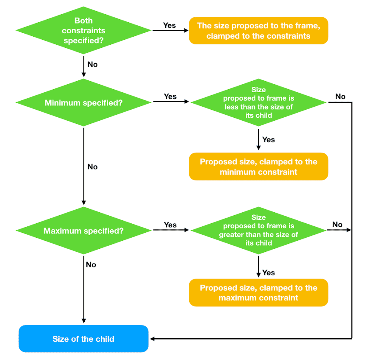
- When ideal value is set and the parent view provides unspecified mode proposed size in that dimension, return the ideal value as required size and use it as layout size of the subview.
- When min or (and) max has value, return the required size in that dimension according to the following rules (diagram from SwiftUI-Lab):
func sizeThatFits(proposal: ProposedViewSize, subviews: Subviews, cache: inout ()) -> CGSize {
    guard subviews.count == 2, let content = subviews.last else { fatalError("Can't use MyFlexFrameLayout directly") }

    var resultWidth: CGFloat = 0
    var resultHeight: CGFloat = 0

    let contentWidth = content.sizeThatFits(proposal).width // Get the required size of the child view in terms of width using the proposal size of the parent view as the proposal size
    // idealWidth has a value and the parent view has an unspecified mode for the proposal size in terms of width, the required width is idealWidth
    if let idealWidth, proposal.width == nil {
        resultWidth = idealWidth
    } else if minWidth == nil, maxWidth == nil { // min and max are both unspecified, returning the required dimensions of the child view in terms of width.
        resultWidth = contentWidth
    } else if let minWidth, let maxWidth { // If both min and max have values
            resultWidth = clamp(min: minWidth, max: maxWidth, source: proposal.width ?? contentWidth)
    } else if let minWidth { // min If there is a value, make sure that the requirement size is not smaller than the minimum value.
        resultWidth = clamp(min: minWidth, max: maxWidth, source: contentWidth)
    } else if let maxWidth { // When max has a value, make sure that the required size is not larger than the maximum value.
        resultWidth = clamp(min: minWidth, max: maxWidth, source: proposal.width ?? contentWidth)
    }

    // Use the required width determined above as the proposal width to get the required height of the child view
    let contentHeight = content.sizeThatFits(.init(width: proposal.width == nil ? nil : resultWidth, height: proposal.height)).height
    if let idealHeight, proposal.height == nil {
        resultHeight = idealHeight
    } else if minHeight == nil, maxHeight == nil {
        resultHeight = contentHeight
    } else if let minHeight, let maxHeight {
            resultHeight = clamp(min: minHeight, max: maxHeight, source: proposal.height ?? contentHeight)
    } else if let minHeight {
        resultHeight = clamp(min: minHeight, max: maxHeight, source: contentHeight)
    } else if let maxHeight {
        resultHeight = clamp(min: minHeight, max: maxHeight, source: proposal.height ?? contentHeight)
    }

    let size = CGSize(width: resultWidth, height: resultHeight)
    return size
}

// Limit values to between minimum and maximum
func clamp(min: CGFloat?, max: CGFloat?, source: CGFloat) -> CGFloat {
    var result: CGFloat = source
    if let min {
        result = Swift.max(source, min)
    }
    if let max {
        result = Swift.min(source, max)
    }
    return result
}
In the View extension, need to check if min, ideal, max values are in ascending order:
public extension View {
    func myFrame(minWidth: CGFloat? = nil, idealWidth: CGFloat? = nil, maxWidth: CGFloat? = nil, minHeight: CGFloat? = nil, idealHeight: CGFloat? = nil, maxHeight: CGFloat? = nil, alignment: Alignment = .center) -> some View {
        // min < ideal < max
        func areInNondecreasingOrder(
            _ min: CGFloat?, _ ideal: CGFloat?, _ max: CGFloat?
        ) -> Bool {
            let min = min ?? -.infinity
            let ideal = ideal ?? min
            let max = max ?? ideal
            return min <= ideal && ideal <= max
        }

        // The official SwiftUI implementation will still execute in case of a numerical error, but will display an error message in the console.
        if !areInNondecreasingOrder(minWidth, idealWidth, maxWidth)
            || !areInNondecreasingOrder(minHeight, idealHeight, maxHeight) {
            fatalError("Contradictory frame constraints specified.")
        }

        return modifier(MyFlexFrameLayout(minWidth: minWidth, idealWidth: idealWidth, maxWidth: maxWidth, minHeight: minHeight, idealHeight: idealHeight, maxHeight: maxHeight, alignment: alignment))
    }
}
Summary
The Layout protocol provides us with an excellent window to gain a deep understanding of the SwiftUI layout mechanism. Whether you need to create custom layout containers using the Layout protocol in your future work or not, mastering it will bring great benefits.