In iOS 16, SwiftUI introduces a new adaptive layout container called ViewThatFits. As the name suggests, its purpose is to find the most appropriate view among a given set of views and use it. For most people, this is a simple and easy-to-use container. However, this article intends to thoroughly analyze it, including rule details, the meaning of ideal size, usage examples, and more. Lastly, we will create a replica version of ViewThatFits to deepen our understanding of it.
ViewThatFits
Definition
In the official documentation of SwiftUI, the definition of ViewThatFits is as follows:
A view that adapts to the available space by providing the first child view that fits.
public struct ViewThatFits<Content> : View where Content : View {
    public init(in axes: Axis.Set = [.horizontal, .vertical], @ViewBuilder content: () -> Content)
}
ViewThatFits evaluates its child views in the order you provide them to the initializer. It selects the first child whose ideal size on the constrained axes fits within the proposed size. This means that you provide views in order of preference. Usually this order is largest to smallest, but since a view might fit along one constrained axis but not the other, this isn’t always the case. By default, ViewThatFits constrains in both the horizontal and vertical axes.
ViewThatFits Judgment and Presentation Logic
Since ViewThatFits selects the most suitable view from the given views, what is its criteria for judgment? What is the order of judgment? And how is it ultimately presented?
- First, ViewThatFits needs to obtain the space it can use, which is the proposed size provided by its parent view.
- The order of judgment is based on the order in the ViewBuilder closure, from top to bottom, one by one for each subview.
- ViewThatFits queries each subview for its ideal size (the required size returned based on the unspecified proposed size).
- Based on the setting of the constrained axis, on the selected constrained axis, the ideal size of the subview is compared with the proposed size provided by the parent view of ViewThatFits.
- If on all the set constrained axes, the ideal size is less than or equal to the proposed size, then the subview is selected, and the judgment of subsequent subviews is stopped.
- If none of the subviews meet the condition, then the last subview in the closure is selected.
- ViewThatFits passes the proposed size provided by the parent view to the selected subview as its own proposed size and obtains the required size of that subview under the explicit proposed size.
- ViewThatFits returns the obtained required size as its own required size to the parent view.
A ViewThatFits will ultimately choose which subview to display based on the following factors:
- The available space for ViewThatFits (proposed size from its parent view)
- The restricted axis set by ViewThatFits
- The ideal size of the subviews on the restricted axis
- The order of arrangement of the subviews
Any change in these factors can result in a different final outcome.
For example, for the code below, a more developer-centric language to describe it would be:
ViewThatFits(in: .horizontal) {
    Text("Hello Beautiful World")
    Text("Hello World")
    Text("Hi")
}
ViewThatFits will select the first Text view within its closure that can be displayed without wrapping within the given width.
Therefore, when we place the above code in different contexts, the resulting subview (the selected subview) may vary.
ViewThatFits(in: .horizontal) {
    Text("Hello Beautiful World") // 100 < width < 200
    Text("Hello World") //  20 < width < 100
    Text("Hi") // 10 < width < 20
}
.border(.blue) // required size of ViewThatFits
.frame(width:100)
.border(.red) // proposed size from parent View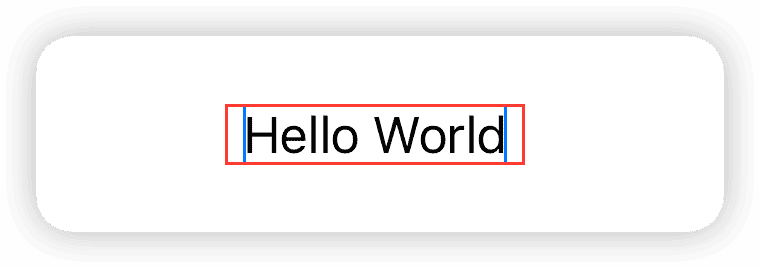
In the case where the width is only 100, the final display will be Text("Hello World"). When the width is adjusted to 200, it will be displayed as Text("Hello Beautiful World").

Let’s add a little challenge by using .frame(width:10) to set the available size (proposed size by the parent view) of ViewThatFits to 10. Based on the different widths of Text marked in the code comments, what will be the final rendering look like?
ViewThatFits(in: .horizontal) {
    Text("Hello Beautiful World") // 100 < width < 200
    Text("Hello World") //  20 < width < 100
    Text("Hi") // 10 < width < 20
}
.border(.blue) // required size of ViewThatFits
.frame(width:10)
.border(.red) // proposed size from parent View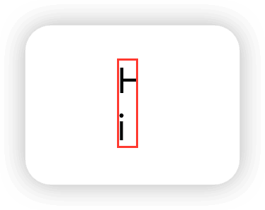
Our initial intention was to choose a text that fits the given size and does not automatically wrap. Why did it end up like this?
First, ViewThatFits compares each one individually and finds that none of the ideal widths of the Text in the closure are less than or equal to 10, so it selects the last Text("Hi"). At this point, Text("Hi") only receives a proposed size with a width of 10. According to the default display rule of Text (wrapping when it doesn’t fit), it takes two lines to fully display “Hi”.
From this, it can be seen that ViewThatFits itself does not impose ideal size constraints on subviews when it is finally presented. It only uses the ideal size of subviews for evaluation during the inspection phase, and during the final presentation phase, it submits a valuable proposed size to the subviews and uses the subviews’ required size as its own required size.
To deal with this extreme situation (text wrapping), we need to make special settings for the subviews, for example, by using fixedSize to force the display of the complete content (the final display size may exceed the proposed size given by the parent view):
Text("Hi")
    .fixedSize(horizontal: true, vertical: false)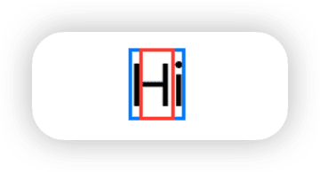
Alternatively, you can use lineLimit to restrict it to only use one line of vertical space, but it cannot guarantee to display all the content completely:
Text("Hi")
    .lineLimit(1)
Well, I admit, I intentionally made the question more complicated. To use ViewThatFits correctly, we must fully understand its evaluation and rendering logic, as well as grasp the concept of “ideal size”. Otherwise, we may face situations that are inconsistent with our expectations.
Ideal Size
In SwiftUI, compared to proposed size, many developers have less exposure to and understanding of ideal size.
In terms of layout, the “ideal size” refers to the required size returned by a view when its parent view proposes an unspecified size.
In easier to understand language, the ideal size is the size occupied by a view’s most ideal rendering result when no size constraints (ideal external environment) are imposed on it.
Different types of views have different rules for their ideal rendering.
For example:
- Rectangle: On the ideal state axis, it only occupies 10 (all Shapes follow this rule).
- Text: On the ideal state axis, it occupies as much space as possible to show all text (no truncation).
- ScrollView: If the ideal state axis is the same as the scrolling direction, it shows all child views without scrolling, ignoring the parent’s proposed size.
- VStack, HStack, ZStack: The overall rendering of all child views in their ideal state.
In SwiftUI, we can force a view to render with its ideal size using fixedSize:
struct IdealSizeDemo: View {
    var body: some View {
        VStack {
            Text("GeometryReader has been present since the birth of SwiftUI, playing a crucial role in many scenarios.")
                .fixedSize()
            Rectangle().fill(.orange)
                .fixedSize()
            Circle().fill(.red)
                .fixedSize()
            ScrollView(.horizontal) {
                HStack {
                    ForEach(0 ..< 50) { i in
                        Rectangle().fill(.blue).frame(width: 30, height: 30)
                            .overlay(Text("\(i)").foregroundStyle(.white))
                    }
                }
            }
            .fixedSize()
            VStack {
                Text("GeometryReader has been present since the birth of SwiftUI, playing a crucial role in many scenarios.")
                Rectangle().fill(.yellow)
            }
            .fixedSize()
        }
    }
}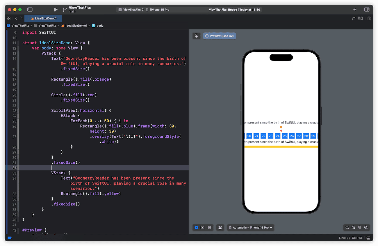
From the screenshots, we can see that the “ideal rendering” of Text, Shape and ScrollView is quite predictable, consistent with our descriptions above. The only one that’s a bit strange is VStack:
VStack {
    Text("GeometryReader has been present since the birth of SwiftUI, playing a crucial role in many scenarios.")
    Rectangle().fill(.yellow)
}
.fixedSize()
For this type of view, its “ideal rendering” is a compound state:
- Width: VStack asks each child view for its ideal width, uses the maximum value as its own required size, and passes it as the proposed size to child views during final layout (placeSubviews).
- Height: VStack sums the ideal height of all child views plus Spacing as its own required height.
SwiftUI provides two versions of fixedSize. The one we currently use requires the view to use ideal sizes in both horizontal and vertical axes, while the other version allows us to constrain a single axis.
struct IdealSizeDemo2: View {
    var body: some View {
        Text("GeometryReader has been present since the birth of SwiftUI, playing a crucial role in many scenarios.")
            .fixedSize(horizontal: false, vertical: true)
            .border(.red, width: 2)
            .frame(width: 100, height: 100)
            .border(.blue, width: 2)
    }
}
fixedSize(horizontal: false, vertical: true) means we require the Text to render in its ideal state vertically, while continuing to use the explicit proposed width (100) horizontally. In easier to understand terms, it forces the Text to show all content when there is an explicit width constraint.
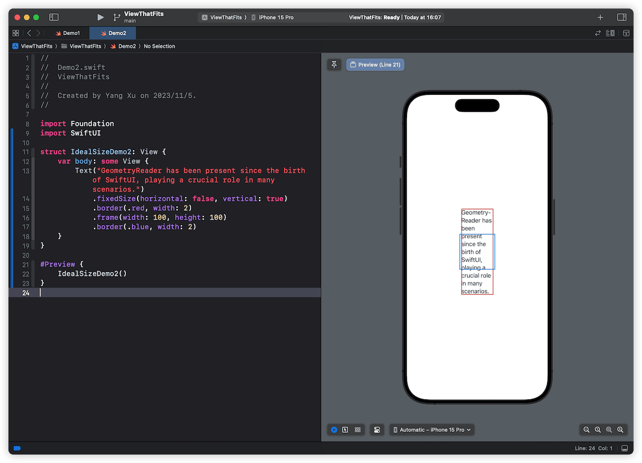
From the screenshot we can see that, due to fixedSize, the Text ignores the 100 x 100 proposed size from its parent and makes full use of vertical space to display the complete text content.
This constraint of ideal size on a single axis corresponds exactly to the restricted axes setting in the ViewThatFits initializer. Through configuration, we can make ViewThatFits only evaluate child views’ ideal sizes on certain axes.
struct IdealSizeDemo3: View {
    var body: some View {
        HStack {
            // ViewThatFits result
            ViewThatFits(in: .vertical) {
                Text("1: GeometryReader has been present since the birth of SwiftUI, playing a crucial role in many scenarios.")
                Text("2: In addition, some views believe that:")
            }
            .border(.blue)
            .frame(width: 200, height: 100, alignment: .top)
            .border(.red)

            // Text1's ideal size ,only vetical fixed
            Text("1: GeometryReader has been present since the birth of SwiftUI, playing a crucial role in many scenarios.")
                .fixedSize(horizontal: false, vertical: true)
                .border(.blue)
                .frame(width: 200, height: 100, alignment: .top)
                .border(.red)

            // Text2's ideal size ,only vetical fixed
            Text("2: In addition, some views believe that:")
                .fixedSize(horizontal: false, vertical: true)
                .border(.blue)
                .frame(width: 200, height: 100, alignment: .top)
                .border(.red)
        }
    }
}
The code above clearly demonstrates the criteria for ViewThatFits selecting the second Text. When Text1 is constrained to its ideal height vertically, its height exceeds what ViewThatFits can provide (blue border taller than red). While the height of Text2 meets the requirement of ViewThatFits.
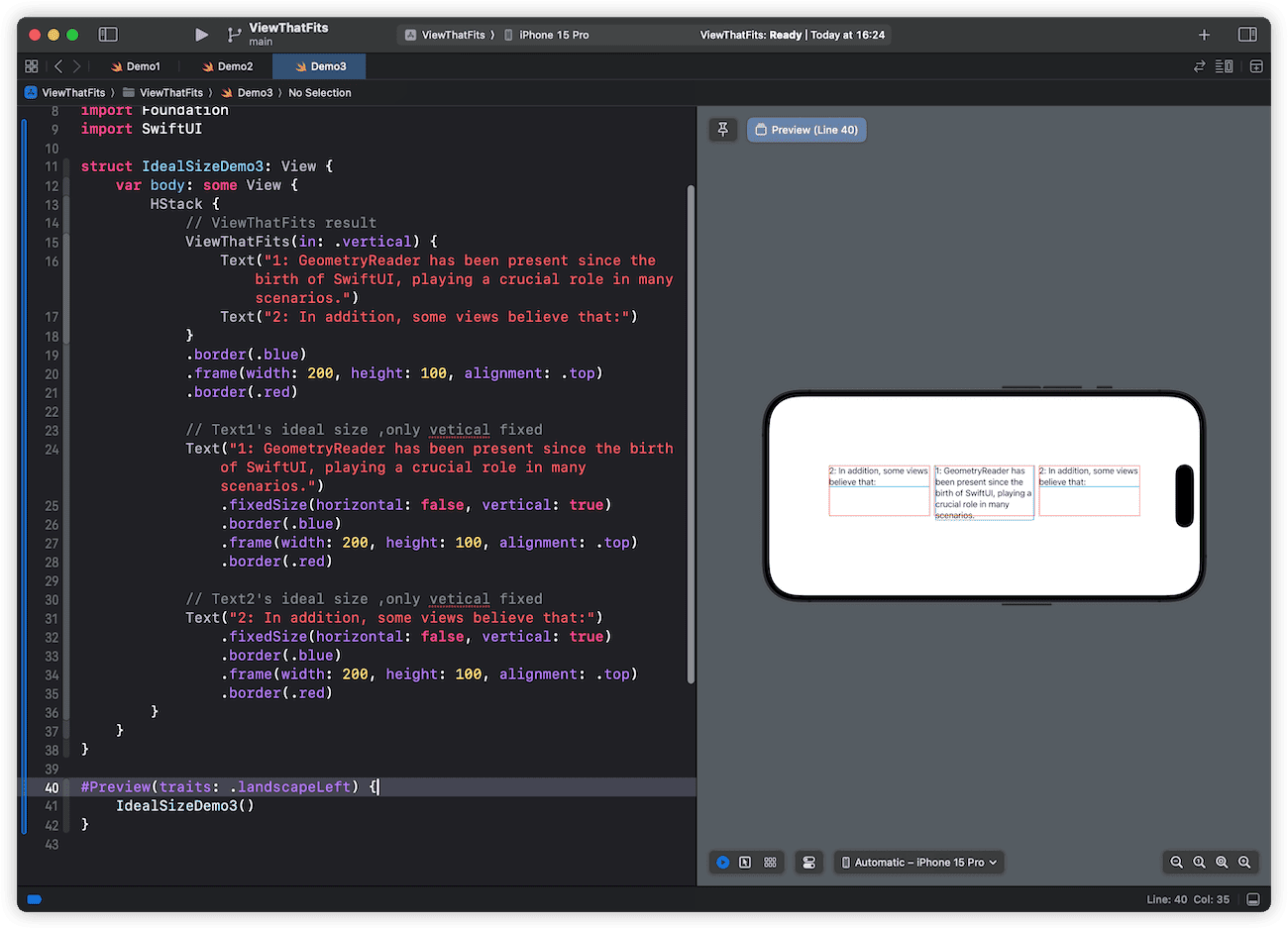
In fact, even if Text2’s ideal height is greater than what ViewThatFits provides, according to ViewThatFits judgment rules, it will still select the last child view (Text2) by default when none meet the criteria. However, what would the final rendering look like in this case?
ViewThatFits(in: .vertical) {
    Text("1: GeometryReader has been present since the birth of SwiftUI, playing a crucial role in many scenarios.")
    Text("2: In addition, some views believe that:")
}
.border(.blue)
.frame(width: 200, height: 30, alignment: .top)
.border(.red)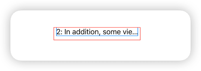
Developers must be clear that ViewThatFits makes judgments based on ideal sizes, but the selected child view is not rendered in its ideal state during final display. Since ViewThatFits can only provide a height of 30, Text2 will truncate the text according to its default display rules during final rendering.
In SwiftUI, we can modify a view’s rendering in its ideal state using frame.
struct SetIdealSize: View {
    @State var useIdealSize = false
    var body: some View {
        VStack {
            Button("Use Ideal Size") {
                useIdealSize.toggle()
            }
            .buttonStyle(.bordered)

            Rectangle()
                .fill(.orange)
                .frame(width: 100, height: 100)
                .fixedSize(horizontal: useIdealSize ? true : false, vertical: useIdealSize ? true : false)

            Rectangle()
                .fill(.cyan)
                .frame(idealWidth: 100, idealHeight: 100)
                .fixedSize(horizontal: useIdealSize ? true : false, vertical: useIdealSize ? true : false)

            Rectangle()
                .fill(.green)
                .fixedSize(horizontal: useIdealSize ? true : false, vertical: useIdealSize ? true : false)
        }
        .animation(.easeInOut, value: useIdealSize)
    }
}
The difference between .frame(width: 100, height: 100) and .frame(idealWidth: 100, idealHeight: 100) is that the former is considered as the view’s required size in any scenario (ideal state or not), while the latter only serves as the required size in the ideal state.
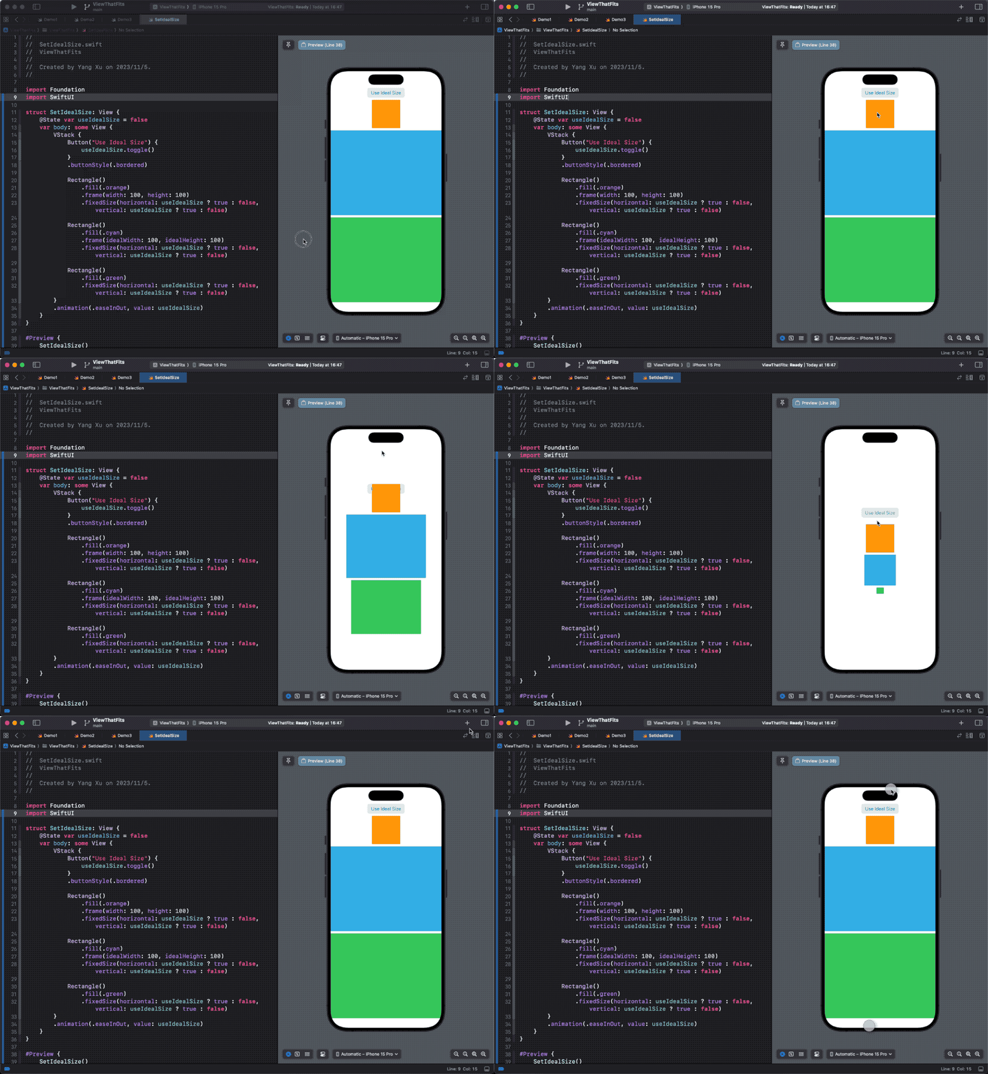
If you want to learn more about ideal dimensions and recommended dimensions, please read the article SwiftUI Layout — The Mystery of Size.
Examples
All theoretical knowledge is meant to serve practical applications. In this section, we will demonstrate the functionality of ViewThatFits through several examples.
Adaptive Scrolling
With the code below, we can achieve automatic scrolling when the content width exceeds the given width.
struct ScrollViewDemo: View {
    @State var step: CGFloat = 3
    var count: Int {
        Int(step)
    }

    var body: some View {
        VStack(alignment:.leading) {
            Text("Count: \(count)")
            Slider(value: $step, in: 3 ... 20, step: 1)

            ViewThatFits {
                content
                ScrollView(.horizontal,showsIndicators: true) {
                    content
                }
            }
        }
        .frame(width: 300)
        .border(.red)
    }

    var content: some View {
        HStack {
            ForEach(0 ..< count, id: \.self) { i in
                Rectangle()
                    .fill(.orange.gradient)
                    .frame(width: 30, height: 30)
                    .overlay(
                        Text(i, format: .number).foregroundStyle(.white)
                    )
            }
        }
    }
}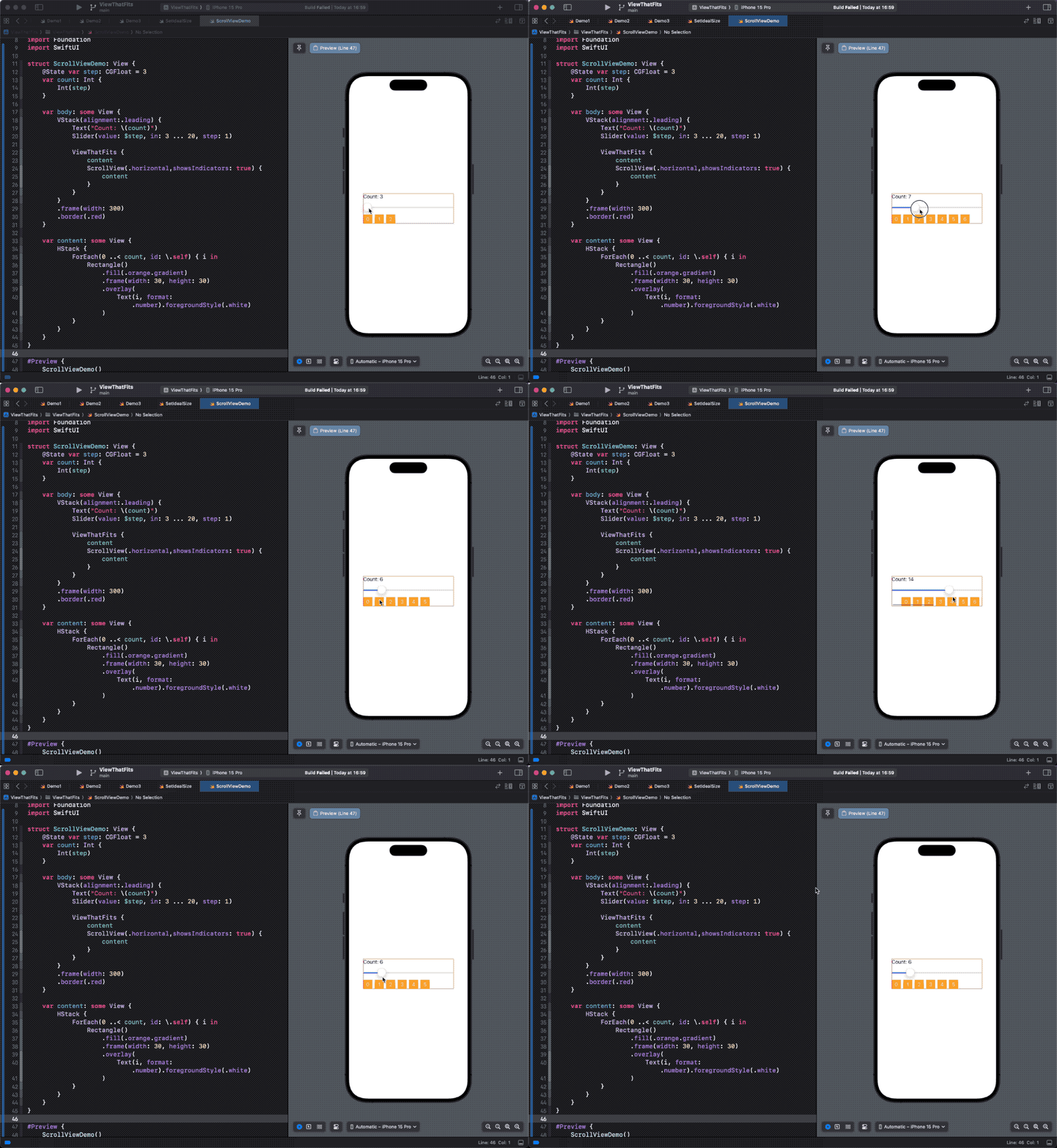
If the width of content exceeds the allowed width (300) of ViewThatFits, ViewThatFits will choose the last subview that uses ScrollView. In this example, even though ScrollView renders with a width that exceeds the allowed width of ViewThatFits in an ideal state, it is ultimately chosen because it is the last subview. This is also a typical case of inconsistency between judgment and rendering.
Selecting the appropriate length of text
This is also the most common scenario where ViewThatFits is used, to find the most suitable one from a given set of texts for the current space.
struct TextDemo: View {
    @State var width: CGFloat = 100
    var body: some View {
        VStack {
            Slider(value: $width, in: 30 ... 300)
                .padding()
            ViewThatFits {
                Text("Fatbobman's Swift Weekly")
                Text("Fatbobman's Weekly")
                Text("Fat's Weekly")
                Text("Weekly")
                    .fixedSize()
            }
            .frame(width: width)
            .border(.red)
        }
    }
}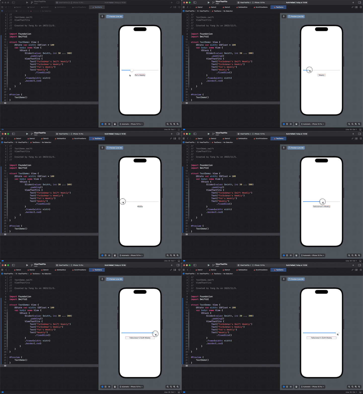
In order to ensure that the text can be fully displayed even in limited space, we have applied fixedSize to the last Text.
Some developers may use the following code (with the same content but different font sizes) to provide subviews of different sizes for ViewThatFits:
ViewThatFits {
    Text("Fatbobman's Swift Weekly")
        .font(.body)
    Text("Fatbobman's Swift Weekly")
        .font(.subheadline)
    Text("Fatbobman's Swift Weekly")
        .font(.footnote)
}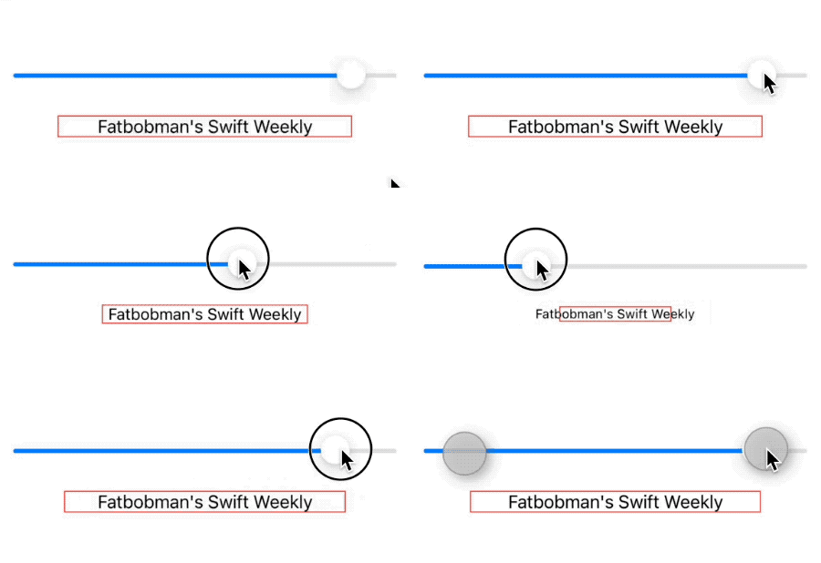
And for requirements where the content is the same but the size may vary, ViewThatFits may not be the optimal solution. The following code can provide better results:
Text("Fatbobman's Swift Weekly")
    .lineLimit(1)
    .font(.body)
    .minimumScaleFactor(0.3)
    .frame(width: width)
    .border(.red)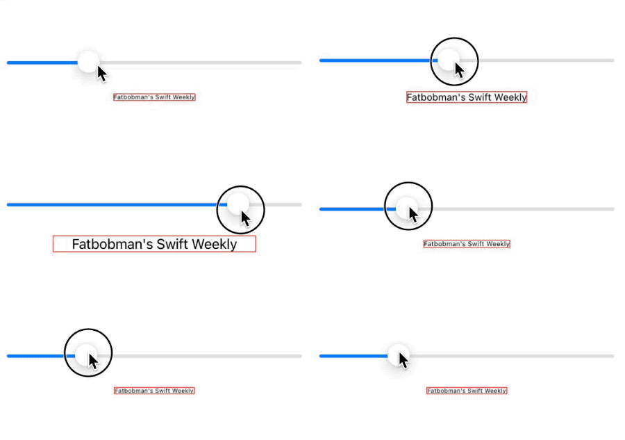
ViewThatFits is better at providing different alternative content for different spaces.
Adaptive horizontal and vertical layouts
In the given space, automatically choose the appropriate layout:
var logo: some View {
    Rectangle()
        .fill(.orange)
        .frame(idealWidth: 100, maxWidth: 200, idealHeight: 100)
        .overlay(
            Image(systemName: "heart.fill")
                .font(.title)
                .foregroundStyle(.white)
        )
}

var title: some View {
    Text("Hello World")
        .fixedSize()
        .font(.headline).bold()
        .frame(maxWidth: 120)
}

struct LayoutSwitchDemo: View {
    @State var width: CGFloat = 100
    var body: some View {
        VStack {
            ViewThatFits(in: .horizontal) {
                HStack(spacing: 0) {
                    logo
                    title
                }
                VStack(spacing: 0) {
                    logo
                    title
                }
            }
            .frame(maxWidth: width, maxHeight: 130)
            .border(.blue)

            Spacer()
            Slider(value: $width, in: 90 ... 250).padding(50)
        }
    }
}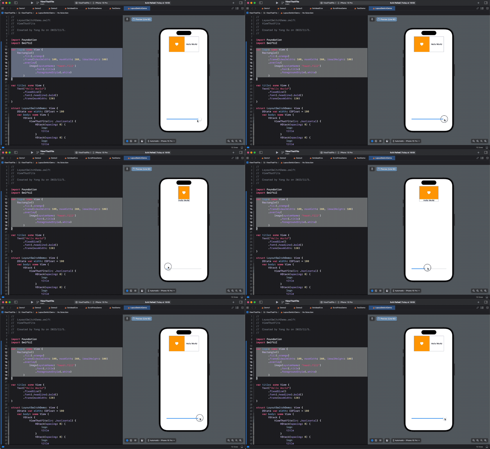
In this example, we take advantage of the different proposed size modes ViewThatFits uses during child view evaluation and final rendering, to ensure the rendered child view always fills the ViewThatFits view. For the logo and title, we do not provide explicit sizes. By setting the ideal size for the Rectangle, we supply options for ViewThatFits to select a proper child. Once the child is selected, the logo inside will adjust its own size based on what ViewThatFits provides during final rendering.
Recreating ViewThatFits with Layout Protocol
In learning SwiftUI, I often try to recreate some layout containers and modifiers. Through this process, besides verifying some conjectures, I can gain a deeper understanding and mastery of them. In this section, we will create a layout container conforming to Layout protocol to recreate ViewThatFits.
We have already thoroughly explained the implementation details of ViewThatFits (judgment rules, rendering logic) in the first chapter, so it’s very convenient to implement it using the Layout protocol.
struct _MyViewThatFitsLayout: Layout {
    let axis: Axis.Set
    func sizeThatFits(proposal: ProposedViewSize, subviews: Subviews, cache: inout Int?) -> CGSize {
        // No subviews, return zero
        guard !subviews.isEmpty else { return .zero }
        // One subview, returns the required size of the subview
        guard subviews.count > 1 else {
            cache = subviews.endIndex - 1
            return subviews[subviews.endIndex - 1].sizeThatFits(proposal)
        }
        // From the first to the penultimate subview, obtain its ideal size in the limited axis one by one for judgment.
        for i in 0..<subviews.count - 1 {
            let size = subviews[i].dimensions(in: .unspecified)
            switch axis {
            case [.horizontal, .vertical]:
                if size.width <= proposal.replacingUnspecifiedDimensions().width && size.height <= proposal.replacingUnspecifiedDimensions().height {
                    cache = i
                    // If the judgment conditions are met, return the required size of the subview (ask with the normal recommended size)
                    return subviews[i].sizeThatFits(proposal)
                }
            case .horizontal:
                if size.width <= proposal.replacingUnspecifiedDimensions().width {
                    cache = i
                    return subviews[i].sizeThatFits(proposal)
                }
            case .vertical:
                if size.height <= proposal.replacingUnspecifiedDimensions().height {
                    cache = i
                    return subviews[i].sizeThatFits(proposal)
                }
            default:
                break
            }
        }
        // If none of the above are satisfied, use the last subview
        cache = subviews.endIndex - 1
        return subviews[subviews.endIndex - 1].sizeThatFits(proposal)
    }

    func placeSubviews(in bounds: CGRect, proposal: ProposedViewSize, subviews: Subviews, cache: inout Int?) {
        for i in subviews.indices {
            if let cache, i == cache {
                subviews[i].place(at: bounds.origin, anchor: .topLeading, proposal: proposal)
            } else {
                // Place the subviews that do not need to be displayed in a position that cannot be displayed
                subviews[i].place(at: .init(x: 100_000, y: 100_000), anchor: .topLeading, proposal: .zero)
            }
        }
    }

    func makeCache(subviews _: Subviews) -> Int? {
        nil
    }
}

public struct MyViewThatFitsByLayout<Content>: View where Content: View {
    let axis: Axis.Set
    let content: Content

    public init(axis: Axis.Set = [.horizontal, .vertical], @ViewBuilder content: @escaping () -> Content) {
        self.axis = axis
        self.content = content()
    }

    public var body: some View {
        _MyViewThatFitsLayout(axis: axis) {
            content
        }
    }
}
After inspection, our replica version is identical to the performance of ViewThatFits.
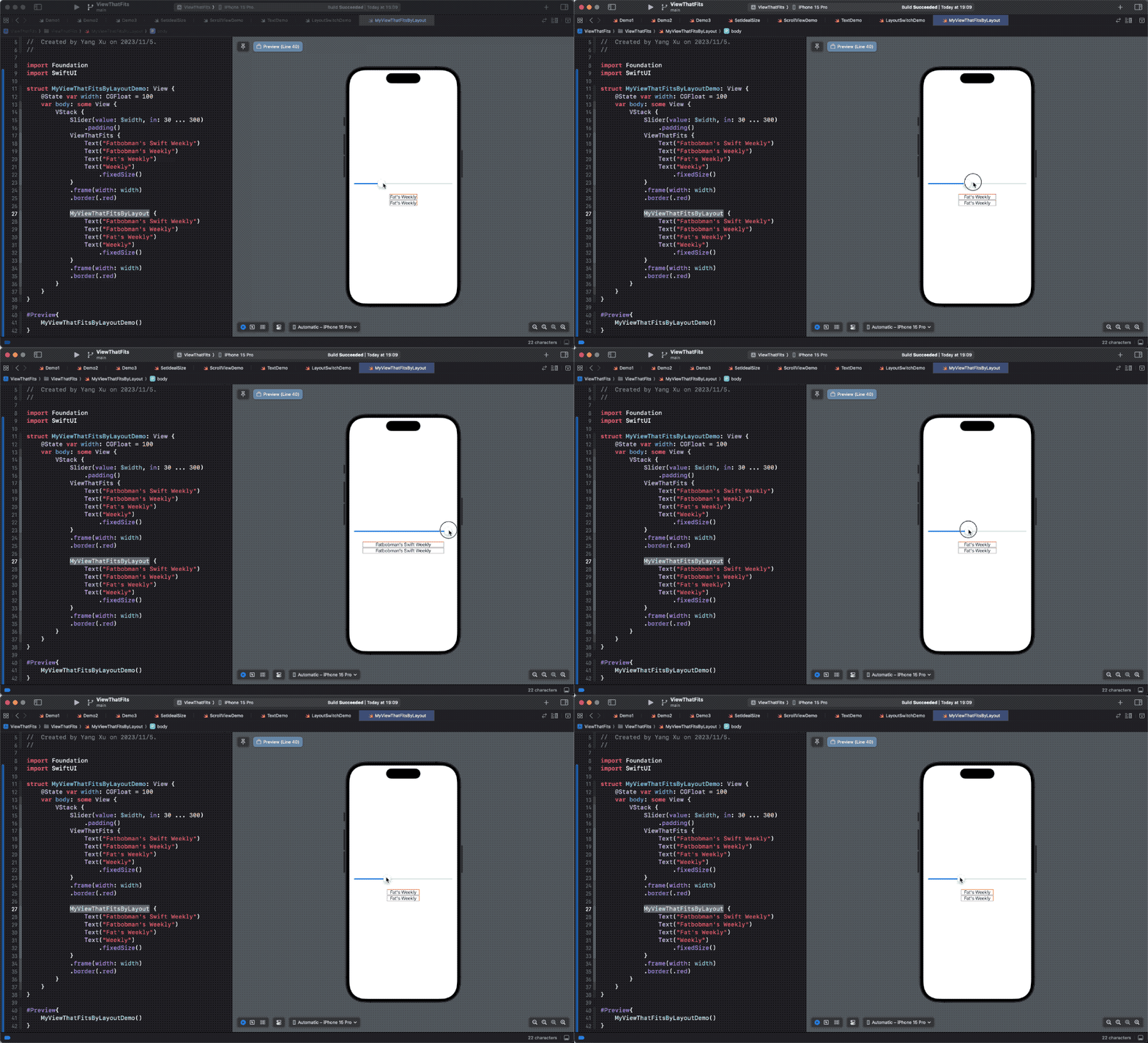
You can access the full code of this article here.
Summary
As we have seen, ViewThatFits is a powerful and flexible component in the SwiftUI toolbox. It can help developers elegantly solve a variety of layout challenges, enhancing the user experience and adaptability of interfaces in applications. However, like any powerful tool, its effectiveness depends on a deep understanding of how to use it and its limitations.
In this article, we have delved deeply into the ViewThatFits container in SwiftUI. From its basic definition to complex layout mechanisms, we have tried to reveal the logic and potential behind this powerful tool. Through a detailed analysis of ideal sizes and layout adaptability, we have shown how ViewThatFits can play a role in a variety of application scenarios.
Although ViewThatFits is very useful in handling various views and layout challenges, it is not omnipotent. In some complex layout requirements, developers may need more precise control or adopt other layout strategies. Therefore, understanding its internal working principles and limitations is crucial so that developers can fully utilize its advantages while avoiding potential layout problems.