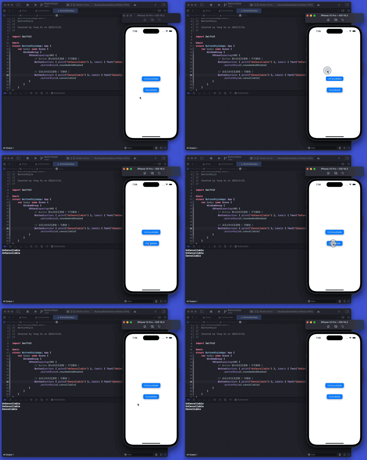
Changing the appearance or behavior of components through Style is a very powerful feature provided by SwiftUI. This article will introduce how to customize the appearance and interaction behavior of a Button by creating implementations that conform to the ButtonStyle or PrimitiveButtonStyle protocol.
The example code for this article can be found here
Customizing the Appearance of a Button
Buttons are a common component in UI design. Compared to UIKit, SwiftUI uses the Button view, allowing developers to create buttons with minimal code.
Button(action: signIn) {
    Text("Sign In")
}
In most cases, developers customize the appearance of a button by providing different views to the label parameter of the Button.
struct RoundedAndShadowButton<V>:View where V:View {
    let label:V
    let action: () -> Void
    init(label: V, action: @escaping () -> Void) {
        self.label = label
        self.action = action
    }
    var body: some View {
        Button {
            action()
        } label: {
            label
                .foregroundColor(.white)
                .padding(EdgeInsets(top: 8, leading: 16, bottom: 8, trailing: 16))
                .background(
                    RoundedRectangle(cornerRadius: 10)
                        .foregroundColor(.blue)
                    )
                .compositingGroup()
                .shadow(radius: 5,x:0,y:3)
                .contentShape(Rectangle())
        }
        .buttonStyle(.plain)
    }
}

let label = Label("Press Me", systemImage: "digitalcrown.horizontal.press.fill")

RoundedAndShadowButton(label: label, action: { pressAction("button view") })
Customize Interaction Animation with ButtonStyle
Unfortunately, the above code cannot modify the button’s press effect after clicking. Luckily, SwiftUI provides the ButtonStyle protocol to help us customize interaction animations.
public protocol ButtonStyle {
    @ViewBuilder func makeBody(configuration: Self.Configuration) -> Self.Body
    typealias Configuration = ButtonStyleConfiguration
}

public struct ButtonStyleConfiguration {
    public let role: ButtonRole?
    public let label: ButtonStyleConfiguration.Label
    public let isPressed: Bool
}
The usage of the ButtonStyle protocol is very similar to ViewModifier. By using the information provided by ButtonStyleConfiguration, developers only need to implement the makeBody method to customize the interactive animation.
- label: The current view of the target button, usually corresponding to the label parameter content in the Button view.
- role: A parameter added in iOS 15 to identify the role of the button (cancel or destructive).
- isPressed: The current pressed state of the button, which is the driving force for most people to use ButtonStyle.
struct RoundedAndShadowButtonStyle:ButtonStyle {
    func makeBody(configuration: Configuration) -> some View {
        configuration.label
            .foregroundColor(.white)
            .padding(EdgeInsets(top: 8, leading: 16, bottom: 8, trailing: 16))
            .background(
                RoundedRectangle(cornerRadius: 10)
                    .foregroundColor(.blue)
                )
            .compositingGroup()
            // Adjust interactive animations based on isPressing
            .shadow(radius:configuration.isPressed ? 0 : 5,x:0,y: configuration.isPressed ? 0 :3)
            .scaleEffect(configuration.isPressed ? 0.95 : 1)
            .animation(.spring(), value: configuration.isPressed)
    }
}

extension ButtonStyle where Self == RoundedAndShadowButtonStyle {
    static var roundedAndShadow:RoundedAndShadowButtonStyle {
        RoundedAndShadowButtonStyle()
    }
}
Applying the buttonStyle decorator to the Button view
Button(action: { pressAction("rounded and shadow") }, label: { label })
       .buttonStyle(.roundedAndShadow)
Creating a versatile ButtonStyle implementation requires considering many conditions, such as role, controlSize, dynamic font size, color mode, and so on. Similar to ViewModifier, you can access more information through environment values:
struct RoundedAndShadowProButtonStyle:ButtonStyle {
    @Environment(\.controlSize) var controlSize
    func makeBody(configuration: Configuration) -> some View {
            configuration.label
                .foregroundColor(.white)
                .padding(getPadding())
                .font(getFontSize())
                .background(
                    RoundedRectangle(cornerRadius: 10)
                        .foregroundColor( configuration.role == .destructive ? .red : .blue)
                )
                .compositingGroup()
                .overlay(
                    VStack {
                        if configuration.isPressed {
                            RoundedRectangle(cornerRadius: 10)
                                .fill(Color.white.opacity(0.5))
                                .blendMode(.hue)
                        }
                    }
                    )
                .shadow(radius:configuration.isPressed ? 0 : 5,x:0,y: configuration.isPressed ? 0 :3)
                .scaleEffect(configuration.isPressed ? 0.95 : 1)
                .animation(.spring(), value: configuration.isPressed)
    }

    func getPadding() -> EdgeInsets {
        let unit:CGFloat = 4
        switch controlSize {
            case .regular:
                return EdgeInsets(top: unit * 2, leading: unit * 4, bottom: unit * 2, trailing: unit * 4)
            case .large:
                return EdgeInsets(top: unit * 3, leading: unit * 5, bottom: unit * 3, trailing: unit * 5)
            case .mini:
                return EdgeInsets(top: unit / 2, leading: unit * 2, bottom: unit/2, trailing: unit * 2)
            case .small:
                return EdgeInsets(top: unit, leading: unit * 3, bottom: unit, trailing: unit * 3)
            @unknown default:
                fatalError()
        }
    }

    func getFontSize() -> Font {
        switch controlSize {
            case .regular:
                return .body
            case .large:
                return .title3
            case .small:
                return .callout
            case .mini:
                return .caption2
            @unknown default:
                fatalError()
        }
    }
}

extension ButtonStyle where Self == RoundedAndShadowProButtonStyle {
    static var roundedAndShadowPro:RoundedAndShadowProButtonStyle {
        RoundedAndShadowProButtonStyle()
    }
}

// 使用
HStack {
    Button(role: .destructive, action: { pressAction("rounded and shadow pro") }, label: { label })
        .buttonStyle(.roundedAndShadowPro)
        .controlSize(.large)
    Button(action: { pressAction("rounded and shadow pro") }, label: { label })
        .buttonStyle(.roundedAndShadowPro)
        .controlSize(.small)
}
Customizing Interaction Behavior with PrimitiveButtonStyle
In SwiftUI, the default interaction behavior of a Button is to perform the specified action when the button is released. Additionally, when you tap the button and keep your finger (or mouse) pressed without releasing it, the action will still be executed even if you move outside the Button view.
Although the default gesture of a Button is similar to a TapGesture, the Button’s gesture is an irreversible action. However, if you use a TapGesture and move outside the clickable area without releasing your finger, SwiftUI will not invoke the action specified in the onEnded closure.
According to feedback from Yoo_Das, the statement “the Button’s gesture is an irreversible action” in the previous paragraph is not accurate enough. The Button’s gesture can be considered a conditional and reversible action. After pressing the button, if you move your finger beyond a certain preset distance (the specific value is unclear) before releasing it, the closure of the button will not be called.
If we want to achieve a similar effect as the TapGesture (a button that can be canceled), we can use another protocol provided by SwiftUI called PrimitiveButtonStyle.
public protocol PrimitiveButtonStyle {
    @ViewBuilder func makeBody(configuration: Self.Configuration) -> Self.Body
    typealias Configuration = PrimitiveButtonStyleConfiguration
}

public struct PrimitiveButtonStyleConfiguration {
    public let role: ButtonRole?
    public let label: PrimitiveButtonStyleConfiguration.Label
    public func trigger()
}
The main difference between PrimitiveButtonStyle and ButtonStyle is that PrimitiveButtonStyle requires developers to manually handle the interaction logic and call the trigger method at the appropriate time (which can be understood as the closure corresponding to the action parameter of Button).
struct CancellableButtonStyle:PrimitiveButtonStyle {
    @GestureState var isPressing = false

    func makeBody(configuration: Configuration) -> some View {
        let drag = DragGesture(minimumDistance: 0)
            .updating($isPressing, body: {_,pressing,_ in
                if !pressing { pressing = true}
            })

        configuration.label
            .foregroundColor(.white)
            .padding(EdgeInsets(top: 8, leading: 16, bottom: 8, trailing: 16))
            .background(
                RoundedRectangle(cornerRadius: 10)
                    .foregroundColor( configuration.role == .destructive ? .red : .blue)
            )
            .compositingGroup()
            .shadow(radius:isPressing ? 0 : 5,x:0,y: isPressing ? 0 :3)
            .scaleEffect(isPressing ? 0.95 : 1)
            .animation(.spring(), value: isPressing)
            // Get click status
            .gesture(drag)
            .simultaneousGesture(TapGesture().onEnded{
                configuration.trigger() // Perform the action specified by Button
            })
    }
}

extension PrimitiveButtonStyle where Self == CancellableButtonStyle {
    static var cancellable:CancellableButtonStyle {
        CancellableButtonStyle()
    }
}
Perhaps someone would say that since the code above can simulate the click state through DragGesture, it is possible to achieve the same effect without using PrimitiveButtonStyle. In this case, what are the advantages of using Style?
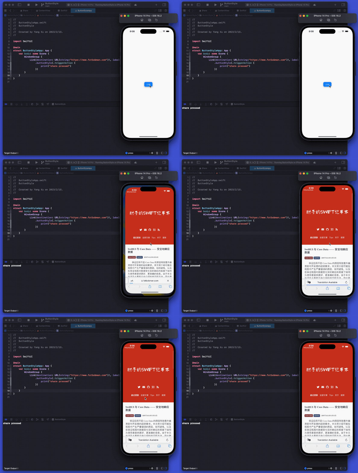
- ButtonStyle and PrimitiveButtonStyle are API specifically designed for button styles. They can be applied not only to Button views, but also to many pre-built system button functionalities in SwiftUI, such as EditButton, Share, Link, NavigationLink (not in List), etc.
- The
keyboardShortcutmodifier can only be applied to Button, and the view + TapGesture cannot set shortcuts.
Whether it is double-clicking, long-pressing, or even triggered by motion sensing, developers can customize their button interaction logic through the PrimitiveButtonStyle protocol.
Pre-built System Styles
Starting from iOS 15, SwiftUI provides richer pre-built Styles based on the original PlainButtonStyle and DefaultButtonStyle.
- PlainButtonStyle: No modifications are made to the Button view.
- BorderlessButtonStyle: The default style in most cases. If the text color is not specified, the text is changed to the accent color.
- BorderedButtonStyle: Adds a rounded rectangular background to the button, using the tint color as the background color.
- BorderedProminentButtonStyle: Adds a rounded rectangular background to the button, with the system’s accent color as the background color.
Among them, PlainButtonStyle not only applies to Button, but also affects the behavior of cells in List and Form. By default, even if the view of the cell contains multiple buttons, SwiftUI will treat the cell of the List as a single button (calling the actions of all buttons when clicked). By setting the PlainButtonStyle style for the List, this behavior can be adjusted so that multiple buttons in a cell can be triggered separately.
List {
    HStack {
        Button("11"){print("1")}
        Button("22"){print("2")}
    }
}
.buttonStyle(.plain)
Notes
- Unlike ViewModifier, ButtonStyle does not support chaining. Button will only adopt the nearest Style.
VStack {
    Button("11"){print("1")} // plain
    Button("22"){print("2")} // borderless
        .buttonStyle(.borderless)
    Button("33"){print("3")} // borderedProminent
        .buttonStyle(.borderedProminent)
        .buttonStyle(.borderless)
}
.buttonStyle(.plain)- Some button styles behave and appear differently in different contexts, and may not even work. For example, it is not possible to style a NavigationLink within a List.
- Adding gesture operations (such as TapGesture) to the label view or ButtonStyle implementation of a Button will cause the Button to no longer invoke its specified closure action. Additional gestures should be added outside of the Button, for example using the simultaneousGesture implementation mentioned below.
Add a Trigger to a Button
In SwiftUI, to determine whether a button has been pressed (especially system buttons), we usually add a trigger by setting parallel gestures:
EditButton()
    .buttonStyle(.roundedAndShadowPro)
    .simultaneousGesture(TapGesture().onEnded{ print("pressed")})
    .withTitle("edit button with simultaneous trigger")
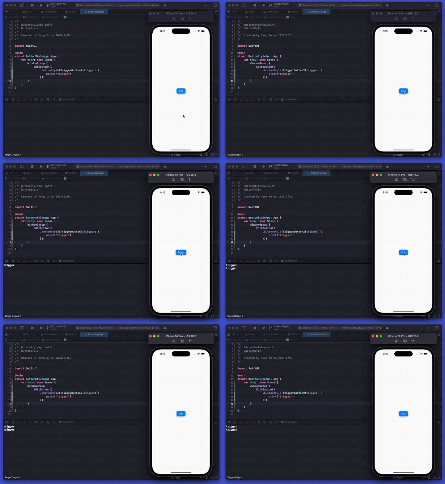
However, the above method does not work on macOS. Through Style, we can add a trigger to the button style when setting its style:
struct TriggerActionStyle:ButtonStyle {
    let trigger:() -> Void
    init(trigger: @escaping () -> Void) {
        self.trigger = trigger
    }
    func makeBody(configuration: Configuration) -> some View {
        configuration.label
            .foregroundColor(.white)
            .padding(EdgeInsets(top: 8, leading: 16, bottom: 8, trailing: 16))
            .background(
                RoundedRectangle(cornerRadius: 10)
                    .foregroundColor(.blue)
                )
            .compositingGroup()
            .shadow(radius:configuration.isPressed ? 0 : 5,x:0,y: configuration.isPressed ? 0 :3)
            .scaleEffect(configuration.isPressed ? 0.95 : 1)
            .animation(.spring(), value: configuration.isPressed)
            .onChange(of: configuration.isPressed){ isPressed in
                if !isPressed {
                    trigger()
                }
            }
    }
}

extension ButtonStyle where Self == TriggerActionStyle {
    static func triggerAction(trigger perform:@escaping () -> Void) -> TriggerActionStyle {
        .init(trigger: perform)
    }
}
Of course, you can achieve the same result using PrimitiveButtonStyle:
struct TriggerButton2: PrimitiveButtonStyle {
    var trigger: () -> Void

    func makeBody(configuration: PrimitiveButtonStyle.Configuration) -> some View {
        MyButton(trigger: trigger, configuration: configuration)
    }

    struct MyButton: View {
        @State private var pressed = false
        var trigger: () -> Void

        let configuration: PrimitiveButtonStyle.Configuration

        var body: some View {
            return configuration.label
                .foregroundColor(.white)
                .padding(EdgeInsets(top: 8, leading: 16, bottom: 8, trailing: 16))
                .background(
                    RoundedRectangle(cornerRadius: 10)
                        .foregroundColor(.blue)
                )
                .compositingGroup()
                .shadow(radius: pressed ? 0 : 5, x: 0, y: pressed ? 0 : 3)
                .scaleEffect(pressed ? 0.95 : 1)
                .animation(.spring(), value: pressed)
                .onLongPressGesture(minimumDuration: 2.5, maximumDistance: .infinity, pressing: { pressing in
                    withAnimation(.easeInOut(duration: 0.3)) {
                        self.pressed = pressing
                    }
                    if pressing {
                        configuration.trigger()
                        trigger()
                    } else {
                        print("release")
                    }
                }, perform: {})
        }
    }
}
Summary
Although the effect of custom styles is significant, unfortunately, SwiftUI currently only provides a few component style protocols for developers to customize, and the properties provided are also limited. Hopefully, in future versions, SwiftUI can provide developers with more powerful custom component capabilities.