Text is heavily used in SwiftUI. Compared to its counterparts in UIKit/AppKit, Text requires no configuration and works out of the box, but this also means developers lose more control over it. In this article, I will demonstrate through a real-world case study how to accomplish seemingly “impossible” tasks with SwiftUI’s approach: finding the first view among a given set where text is not truncated, and using it as the required size.
An Interesting Challenge
A few days ago, I received an email from Marc. While developing the iOS client for GNU Taler, he encountered an interesting layout adaptation problem:
In a list, he needed to display views containing descriptions and amounts. To ensure both description and amount content could be fully displayed, Marc preset multiple different layout schemes:
- Compact Layout: Single-line description + horizontal arrangement
- Standard Layout: Up to two-line description + horizontal arrangement
- Extended Layout: Unlimited lines + vertical arrangement
Marc wanted to automatically select the first layout scheme that could display text completely (without truncation) according to priority order (Compact → Standard → Extended).
struct ContentView1: View {
    // MARK: - Sample Data
    private let short = "short Text"
    private let medium =
        "some text which can obviously be wrapped in two lines"
    private let long = "A lot of text which can obviously be wrapped in many lines!"

    var body: some View {
        List {
            AdaptiveAmountRow(title: short)
            AdaptiveAmountRow(title: medium)
            AdaptiveAmountRow(title: long)
        }
    }
}

// Three preset layout schemes

/// Compact layout - Single-line horizontal arrangement
HStack(alignment: .center) {
    titleView // maxLines = 1
    Spacer(minLength: 2)
    amountView.fixedSize() // Amount never truncates
}

/// Standard layout - Two-line horizontal arrangement
HStack(alignment: .lastTextBaseline) {
    titleView // maxLines = 2
    Spacer(minLength: 2)
    amountView.fixedSize()
}

/// Extended layout - Vertical arrangement
VStack(alignment: .leading) {
    titleView // maxLines = nil (unlimited)
    HStack {
        Spacer()
        amountView.fixedSize()
    }
}
In this scheme, AdaptiveAmountRow intelligently selects from three preset layouts based on text content length:
- If text can be fully displayed in Compact Layout, prioritize single-line layout
- If line wrapping is needed, try Standard Layout with two-line layout
- If text is too long, finally choose Extended Layout, ensuring all content can be fully displayed
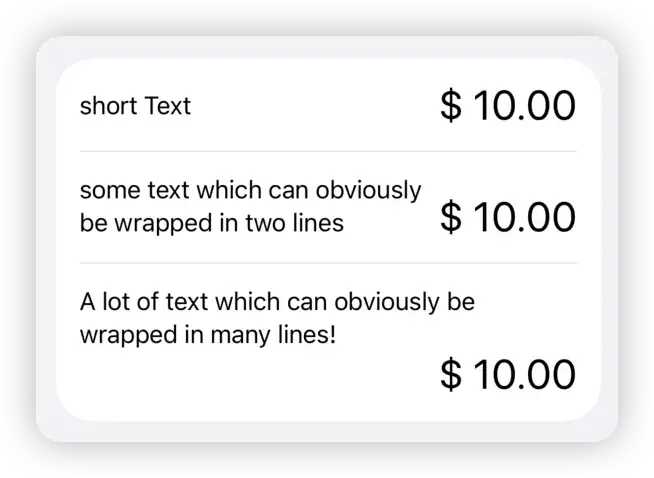
I’ve simplified Marc’s actual requirements in the above description but retained the key information.
Where Do the Challenges Come From?
We face two core challenges:
- How to determine if Text is truncated - SwiftUI’s Text doesn’t provide any information about whether text is fully displayed. When space is limited, it can only choose to use available space and intelligently truncate content according to truncation rules
- How to intelligently select and apply layouts - Find the first view that isn’t truncated and use its size as the container’s required size
Ultimate Goal: Build an intelligent container that can find the first scheme from multiple preset layouts that can fully display text content, and automatically apply that layout.
Fighting Fire with Fire — Using SwiftUI’s Way to Determine Text Truncation
Perhaps many developers would first think of NSAttributedString when trying to determine if Text is fully displayed. Through methods like boundingRect, NSAttributedString has the ability to calculate the required size for text layout under given constraints (such as limited width or height). However, this approach isn’t entirely suitable for Marc’s requirements. Since it requires accurately obtaining SwiftUI Text’s font information (including dynamic type adjustments), plus the subtle differences in how SwiftUI handles text rendering and truncation, applying this method is not only cumbersome but also prone to misjudgments.
Although SwiftUI’s Text doesn’t provide the ability to know if it’s fully displayed, it’s not difficult for developers to require Text to ignore proposed size in another dimension when one dimension is constrained, ensuring complete display. By using fixedSize + GeometryReader, we can obtain size information needed in another dimension to fully display current text when one dimensional size is fixed.
struct Dimension: View {
    private let long = "A lot of text which can obviously be wrapped in many lines!"
    var body: some View {
        Text(long)
            .border(Color.red, width: 2)
            .fixedSize(horizontal: false, vertical: true)
            .background(
                GeometryReader { geometry in
                    Color.clear
                        .task(id: geometry.size) {
                            print(geometry.size) // 100.0 x 108.3
                        }
                })
            .frame(width: 100, height: 50)
            .border(.blue, width: 2)
    }
}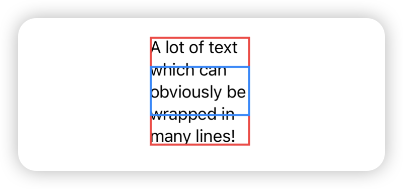
In the above code, although we limit Text’s available space horizontally and vertically through .frame(width: 100, height: 50), .fixedSize(horizontal: false, vertical: true) tells Text to ignore vertical limitations and ensure text is fully displayed. Through GeometryReader, we can see that with a width limit of 100, fully displaying all text requires 108.3 vertical size.
Similarly, we can use the same principle to determine how much width is needed at minimum to fully display content when height is limited.
That is, we now have a way to find how much space a Text needs in another dimension for complete display when one dimension is constrained. This way we can obtain the following three sizes:
- The size
Textactually occupies after display under given suggested size - Based on current horizontal suggested size, the vertical size needed to fully display
Text - Based on current vertical suggested size, the horizontal size needed to fully display
Text
By comparing the height and width of the first size with the height and width of the latter two sizes respectively, we can know whether Text can be fully displayed within the currently given Proposed size.
struct Dimension: View {
    private let long = "A lot of text which can obviously be wrapped in many lines!"
    @State private var displayDimension: CGSize?
    @State private var verticalDimension: CGSize?
    @State private var horizontalDimension: CGSize?

    var isTruncated: Bool? {
        guard let displayDimension, let verticalDimension, let horizontalDimension else { return nil }
        // Check if truncated in any dimension
        if displayDimension.width > verticalDimension.width || displayDimension.height > horizontalDimension.height {
            return true
        } else {
            return false
        }
    }

    var body: some View {
        Text(long)
            .getDimension(dimension: $displayDimension)
            .background(
                Text(long) // Minimum height needed for full display under width constraint
                    .fixedSize(horizontal: false, vertical: true)
                    .hidden()
                    .getDimension(dimension: $verticalDimension)
             )
            .background(
                Text(long) // Minimum width needed for full display under height constraint
                    .fixedSize(horizontal: true, vertical: false)
                    .hidden()
                    .getDimension(dimension: $horizontalDimension)
                )
            .frame(width: 100, height: 50)

        if let isTruncated  {
            Text(isTruncated ? "Truncated" : "Not Truncated")
        }
    }
}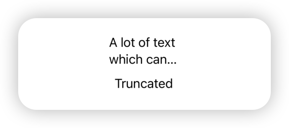
After reducing text content, we can see isTruncated shows false.

Although we need to add two calculations, we at least achieved the first core requirement: determining if Text is truncated.
Now we just need to choose an appropriate method to notify the parent view of the isTruncated result. In the actual solution, I chose to use PreferenceKey.
An Alternative ViewThatFits
Finding the first one that meets conditions from a bunch of given subviews is very similar to ViewThatFits use cases. But for the current challenge, obviously ViewThatFits isn’t suitable.
For example, in the three preset layouts, since Text automatically truncates text, ViewThatFits cannot judge based on whether text is truncated. Obviously we need to create a custom rule intelligent layout selector.
Since we already have some notification mechanism that allows this selector to know whether Text in a subview is truncated, the most important thing to solve is: How to make the intelligent layout selector use the required size of the finally selected layout as its own required size?
Use Layout protocol? It’s not impossible, but limited by the protocol’s constraints in obtaining text truncation status, I chose the ZStack + layoutPriority solution I introduced in a recent article.
In the article Exploring the Secrets of layoutPriority in SwiftUI ZStack, we explored an interesting rule about ZStack layout: ZStack doesn’t simply take the minimum bounds containing all subviews; it only considers the set of subviews with the highest layoutPriority, calculates the minimum aligned size that can accommodate them all, and uses this as its own required size.
This means if we place all preset layouts in the same ZStack, check them one by one according to priority, find the first layout where Text is fully displayed, set its layoutPriority higher than others, and hide the display of other layouts. At this point, ZStack will use this preset layout’s required size as its own required size. Thus achieving our own intelligent layout selector: find the first layout that meets requirements and use its required size as the final required size.
The general implementation logic is:
struct ZStackContainer: View {
    @State private var layoutStatuses: [LayoutMode: Bool] = [:]

    /// The first layout mode that can display the content without truncation
    private var optimalLayoutMode: LayoutMode? {
        return layoutStatuses.keys
            .sorted(by: { $0 < $1 })
            .first { !(layoutStatuses[$0] ?? true) }
    }

    private func isLayoutSelected(_ mode: LayoutMode) -> Bool {
        return optimalLayoutMode == mode
    }

    var body: some View {
        ZStack {
            Compact()
                .layoutPriority(isLayoutSelected(.compact) ? 2 : 1)
                .opacity(isLayoutSelected(.compact) ? 1 : 0)

            Standard()
                .layoutPriority(isLayoutSelected(.standard) ? 2 : 1)
                .opacity(isLayoutSelected(.standard) ? 1 : 0)

            Extended()
                .layoutPriority(isLayoutSelected(.extended) ? 2 : 1)
                .opacity(isLayoutSelected(.extended) ? 1 : 0)
        }
    }
}
At this point, we have completed this challenge using pure SwiftUI approach and achieved the ultimate goal.
Open Source and Taler
Although I immediately wanted to share this case’s solution approach through my blog, since this was a paid commission, I still needed to ask Marc if this problem-solving approach could be made public. Marc readily agreed to my request. He told me that GNU Taler itself is a digital payment system based on free software, specifically designed to provide privacy-friendly online transactions. It doesn’t use blockchain technology but adopts blind signatures to protect user privacy.
This means Taler embraces open source projects and accepts scrutiny from every user. For a transaction system that focuses on privacy, transparency is an important cornerstone for gaining user trust.
Thanks to Marc’s permission, I organized the above approach into complete code and placed it on GitHub Gist for everyone’s reference.
The image below demonstrates the practical application of this intelligent layout solution in Taler Wallet:
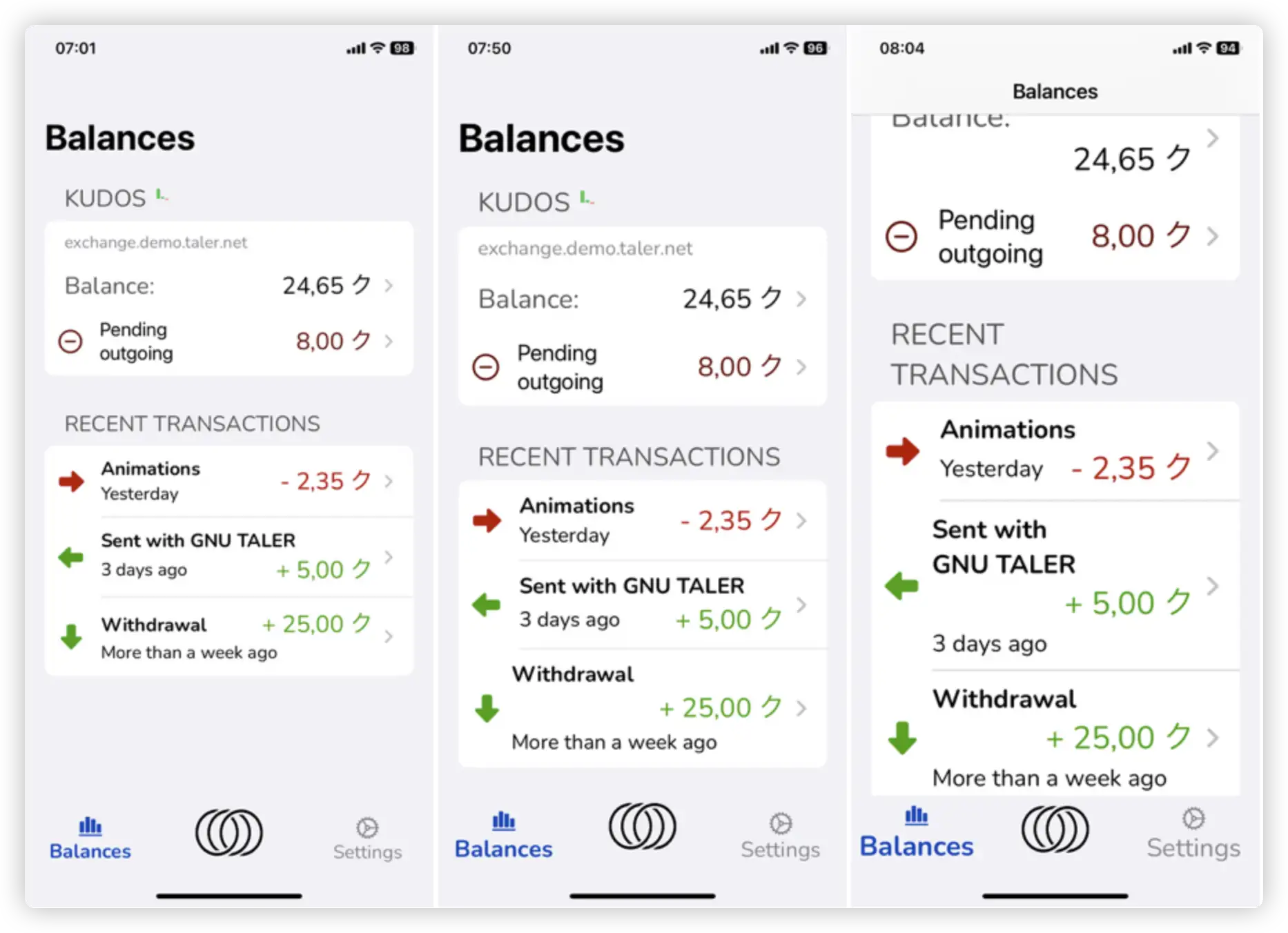
The three screenshots from left to right clearly show how the system automatically selects the most appropriate layout based on different lengths of transaction description text, ensuring all information is fully displayed while maintaining a clean and elegant interface.
Integration Leads to Mastery
Over the past few years, as my understanding of SwiftUI has deepened, I increasingly feel that when using SwiftUI for layout, deeply understanding its underlying mechanisms can better help you handle increasingly complex layout requirements.
For the current case, almost every specific knowledge point has been explored in dedicated theme articles on my blog:
- Flexible use of
fixedSize - Size measurement with
GeometryReader backgrounddoesn’t affect composite view’s required size- Data upward passing with
PreferenceKey ZStack’slayoutPrioritymechanism
But only when you can fully master and integrate these mechanisms together can you achieve some seemingly “impossible” tasks.
SwiftUI has a low barrier to entry, but using it well isn’t easy. This is precisely the charm of technical learning—every seemingly independent knowledge point might become the key to solving complex problems at some moment.