With SwiftUI 5.0, Apple has significantly enhanced the functionality of ScrollView. Numerous new and improved APIs have been added. This article will introduce these new features, hoping to help developers in need more and earlier.
The complete demo code can be obtained here.
contentMargins
public func contentMargins(_ edges: Edge.Set = .all, _ length: CGFloat?, for placement: ContentMarginPlacement = .automatic) -> some ViewAdd margin to the content or scroll indicator of a scrollable container.
- Not limited to ScrollView, supports all scrollable containers (including List, TextEditor, etc.).
- Treat all subviews in the scrollable container as a whole and add margin to it. It was very difficult to achieve a similar operation in List or TextEditor before.
- The default ContentMarginPlacement (.automatic) will cause the length between the indicator and content to be inconsistent. If you want to keep the length consistent, use
.scrollContent. - Applicable to all scrollable containers within the scope.
struct ContentMarginsForScrollView: View {
    @State var text = "Hello world"
    var body: some View {
        VStack {
            ScrollView(.horizontal) {
                HStack {
                    CellView(color: .yellow)
                        // a custom overlay view for easy display of auxiliary information
                        .idView("leading")
                    ForEach(0 ..< 5) { i in
                        CellView()
                            .idView(i)
                    }
                    CellView(color: .green)
                        .idView("trailing")
                }
            }

            // Also affected by contentMargins
            TextEditor(text: $text)
                .border(.red)
                .padding()
                .contentMargins(.all, 30, for: .scrollContent)
        }
        // Applies to all scrollable containers within the scope
        .contentMargins(.horizontal, 50, for: .scrollContent)
    }
}
safeAreaPadding
Add padding to the safe area of the view. In some scenarios, this is similar to using safeAreaInsets. For example, in the code below, adding insets to the leading direction of a ScrollView produces the same result as using safe area insets.
struct SafeAreaPaddingDemo: View {
    var body: some View {
        VStack {
            ScrollView {
                ForEach(0 ..< 20) { i in
                    CellView(width: nil)
                        .idView(i)
                }
            }
            .safeAreaPadding(.leading,20)
            // .safeAreaInset(edge: .leading){
            //       Color.clear.frame(width:20)
            //  }
        }
    }
}- This property applies not only to scrollable views, but to all types of views.
- It only affects the nearest view.
- The handling logic of safeAreaInset and safeAreaPadding for the additional safe area of the full-screen is inconsistent.
For example, in the following two implementations, the bottom space of the ScrollView is different.
Using safeAreaInset:
ScrollView {
    ForEach(0 ..< 20) { i in
        CellView(width: nil)
            .idView(i)
    }
}
.safeAreaInset(edge: .bottom){
    Text("Bottom View")
        .font(.title3)
        .foregroundColor(.indigo)
        .frame(maxWidth: .infinity, maxHeight: 40)
        .background(.green.opacity(0.6))
}
Using safeAreaPadding:
ZStack(alignment: .bottom) {
    ScrollView {
        ForEach(0 ..< 20) { i in
            CellView(width: nil)
                .idView(i)
        }
    }
    .safeAreaPadding(.bottom, 40)

    Text("Bottom View")
        .font(.title3)
        .foregroundColor(.indigo)
        .frame(maxWidth: .infinity, maxHeight: 40)
        .background(.green.opacity(0.6))
}
The blank space that appears when using safeAreaInset is due to its default spacing not being 0. Simply set the spacing to 0, and the effect will be the same as without it.
.safeAreaInset(edge: .bottom,spacing: 0){ // spacing: 0
        Text("Bottom View")
            .font(.title3)
            .foregroundColor(.indigo)
            .frame(maxWidth: .infinity, maxHeight: 40)
            .background(.green.opacity(0.6))
    }
Read the article “Mastering Safe Area in SwiftUI” to learn more about safe areas.
scrollIndicatorsFlash
Control Scroll Indicators
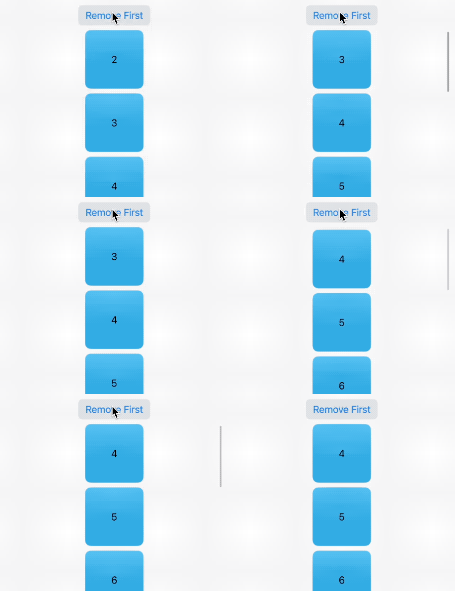
Using scrollIndicatorsFlash(onAppear: true) will briefly flash the scroll indicator when the scroll view appears.
Using scrollIndicatorsFlash(trigger:) will briefly flash the scroll indicator on all scrollable containers within the scope of the modifier when the provided value changes.
struct ScrollIndicatorsFlashDemo: View {
    @State private var items = (0 ..< 50).map { Item(n: $0) }
    var body: some View {
        VStack {
            Button("Remove First") {
                guard !items.isEmpty else { return }
                items.removeFirst()
            }.buttonStyle(.bordered)
            ScrollView {
                ForEach(items) { item in
                    CellView(width: 100, debugInfo: "\(item.n)")
                        .idView(item.n)
                        .frame(maxWidth:.infinity)
                }
            }
            .animation(.bouncy, value: items.count)
        }
        .padding(.horizontal,10)
        .scrollIndicatorsFlash(onAppear: true)
        .scrollIndicatorsFlash(trigger: items.count)
    }
}
scrollClipDisable
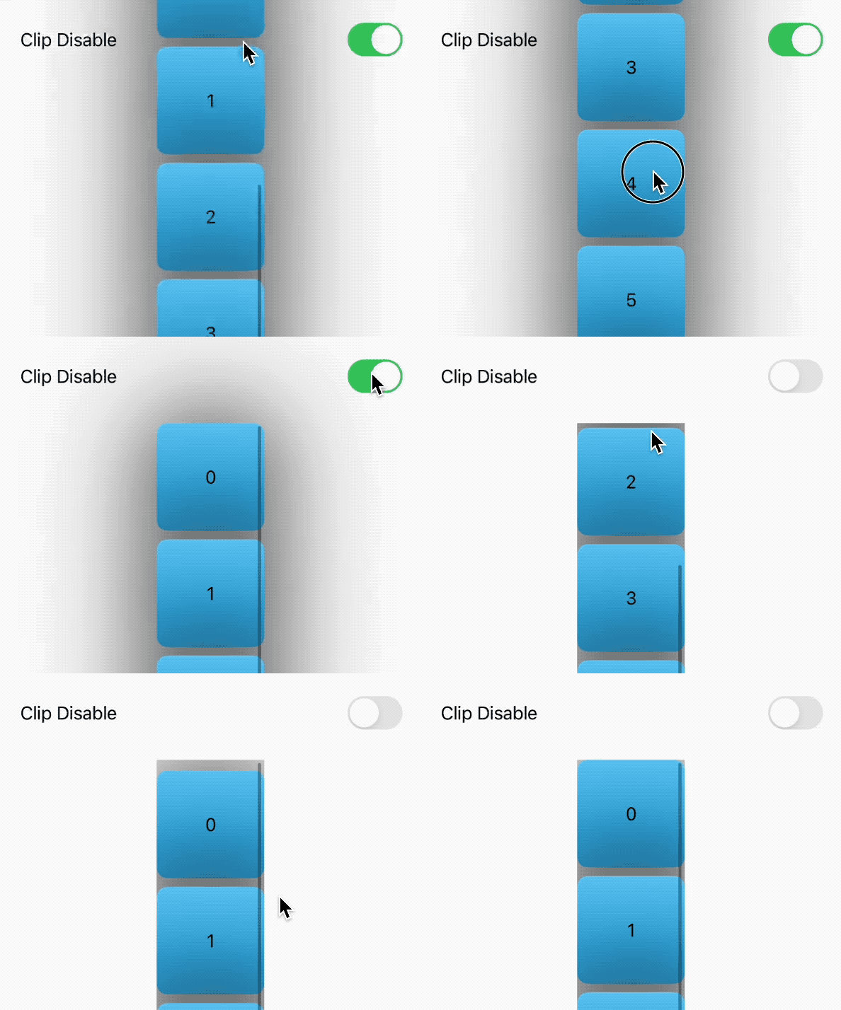
scrollClipDisable is used to control whether clipping is applied to the scrolling content to fit the boundaries of the scrolling container.
When scrollClipDisable is false, the scrolling content is clipped to fit the boundaries of the scrolling container. Any portion that exceeds the boundaries will not be displayed.
When scrollClipDisable is true, the scrolling content is not clipped. It can extend beyond the boundaries of the scrolling container, allowing more content to be displayed.
- Only applicable to ScrollView
- Applicable to all scrollable containers within the scope
struct ScrollClipDisableDemo: View {
    @State private var disable = true
    var body: some View {
        VStack {
            Toggle("Clip Disable", isOn: $disable)
                .padding(20)
            ScrollView {
                ForEach(0 ..< 10) { i in
                    CellView()
                        .idView(i)
                        .shadow(color: .black, radius: 50)
                }
            }
        }
        .scrollClipDisabled(disable)
    }
}
scrollTargetLayout
This modifier is used in conjunction with the scrollTargetBehavior(ViewAlignedScrollTargetBehavior mode) or scrollPosition(id:) introduced below.
This modifier should be applied to layout containers in ScrollView that contain main repetitive content, such as LazyHStack or VStack.
@State private var isEnabled = true

ScrollView {
    LazyVStack {
        ForEach(items) { item in
            CellView(width: 200, height: 140)
                .idView(item.n)
        }
    }
    .scrollTargetLayout(isEnabled: isEnabled)
}
scrollPosition(initialAnchor:)
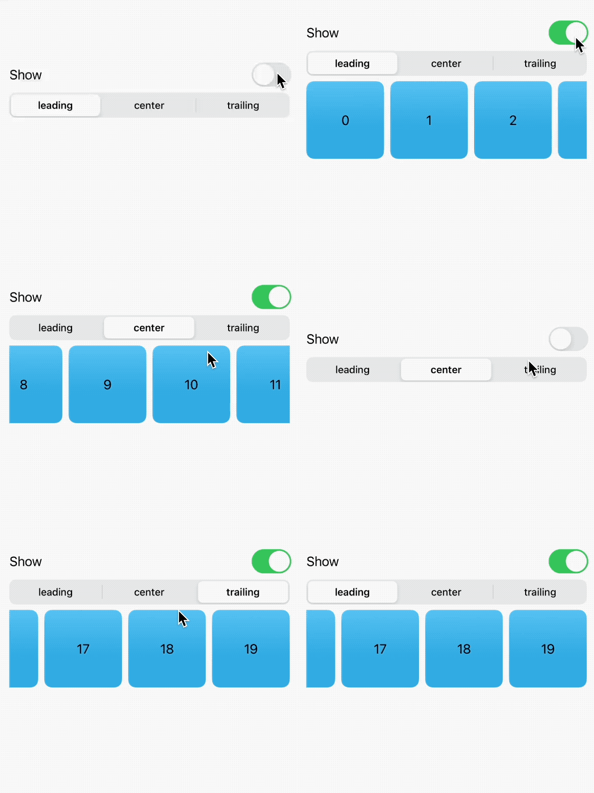
Using this modifier, you can specify the anchor point of the initially visible portion of the scroll view content. It only affects the initial state of the scroll view and is set at once. It is usually used to achieve scenarios such as showing data from the bottom in IM applications or displaying data from the trailing end. You can set the initial position of both axes at the same time using UnitPoint.
struct ScrollPositionInitialAnchorDemo: View {
    @State private var show = false
    @State private var position: Position = .leading
    var body: some View {
        VStack {
            Toggle("Show", isOn: $show)
            Picker("Position", selection: $position) {
                ForEach(Position.allCases) { p in
                    Text(p.rawValue).tag(p)
                }
            }
            .pickerStyle(.segmented)
            if show {
                ScrollView(.horizontal) {
                    LazyHStack {
                        ForEach(0 ..< 10000) { i in
                            CellView(debugInfo: "\(i)")
                                .idView(i)
                        }
                    }
                }
                .scrollPosition(initialAnchor: position.unitPoint)
            }
        }
        .padding()
    }

    enum Position: String, Identifiable, CaseIterable {
        var id: UnitPoint { unitPoint }
        case leading, center, trailing
        var unitPoint: UnitPoint {
            switch self {
            case .leading:
                .leading
            case .center:
                .center
            case .trailing:
                .trailing
            }
        }
    }
}
Although it is easy to achieve initial positioning using this modifier, there are still serious performance issues when the dataset is large. You can use the approach described in the article “Demystifying SwiftUI List Responsiveness: Best Practices for Large Datasets” to solve this problem.
scrollPostion(id:)
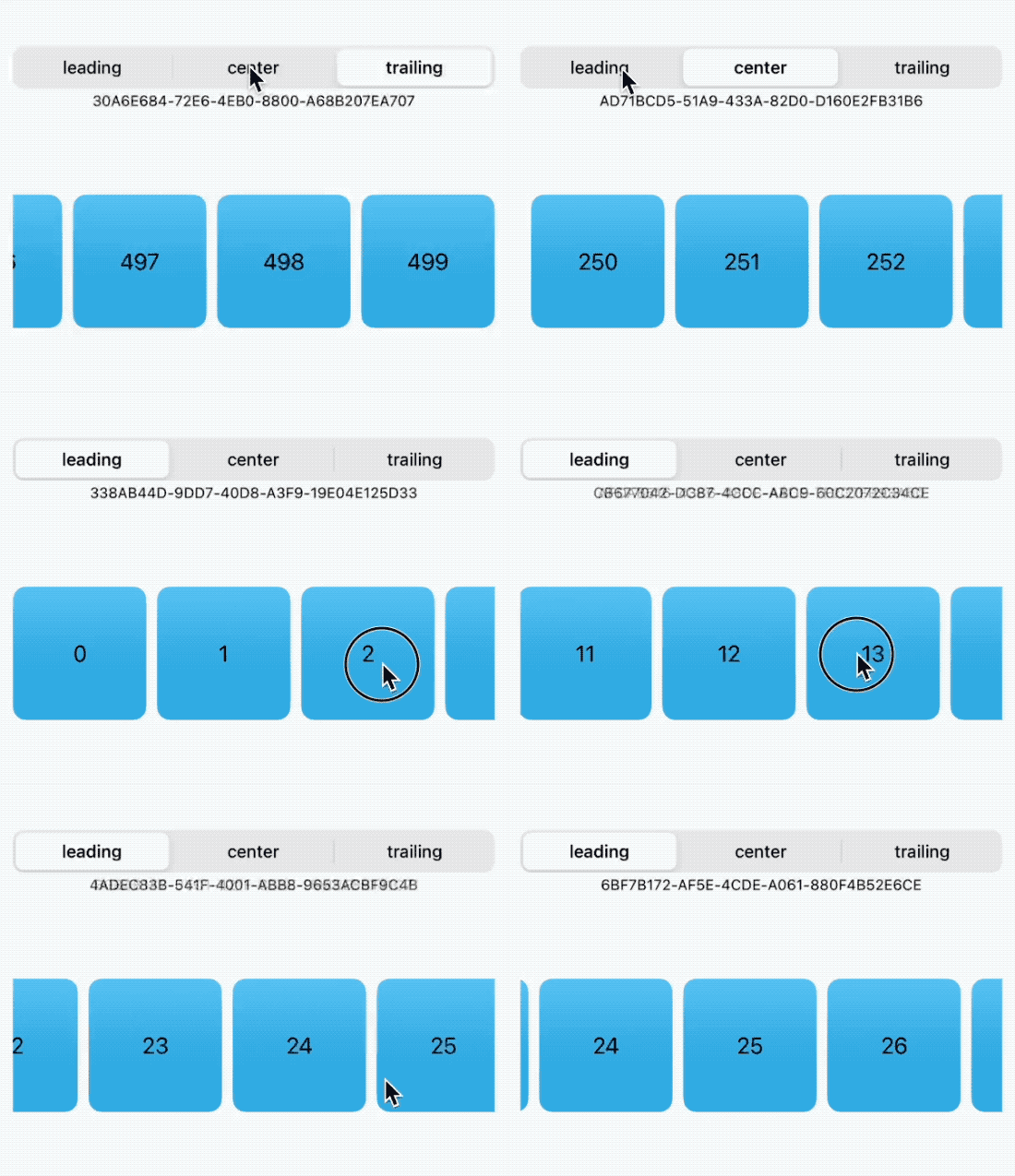
Using this modifier allows the ScrollView to scroll to a specific position. It can be thought of as a simplified version of ScrollViewReader.
- Only applicable to ScrollView
- When the data source in ForEach follows the Identifiable protocol, there is no need to explicitly use the
idmodifier to set the identifier - When used with scrollTargetLayout, the current scroll position (view identifier) can be obtained
- Anchor point setting is not supported, and the anchor point is fixed to the center of the subview
- As mentioned in the article “Demystifying SwiftUI List Responsiveness: Best Practices for Large Datasets”, performance issues may also occur when the dataset is large.
struct ScrollPositionIDDemo: View {
    @State private var show = false
    @State private var position: Position = .trailing
    @State private var items = (0 ..< 500).map {
        Item(n: $0)
    }

    @State private var id: UUID?

    var body: some View {
        VStack {
            Picker("Position", selection: $position) {
                ForEach(Position.allCases) { p in
                    Text(p.rawValue).tag(p)
                }
            }
            .pickerStyle(.segmented)
            Text(id?.uuidString ?? "").fixedSize().font(.caption2)
            ScrollView(.horizontal) {
                LazyHStack {
                    ForEach(items) { item in
                        CellView(debugInfo: "\(item.n)")
                            .idView(item.n)
                    }
                }
                .scrollTargetLayout()
            }
            .scrollPosition(id: $id)
        }
        .animation(.default, value: id)
        .padding()
        .frame(height: 300)
        .task(id: position) {
            switch position {
            case .leading:
                id = items.first!.id
            case .center:
                id = items[250].id
            case .trailing:
                id = items.last!.id
            }
        }
    }
}
Corresponding ScrollViewReader version:
ScrollViewReader { proxy in
    ScrollView(.horizontal) {
        LazyHStack {
            ForEach(items) { item in
                CellView(debugInfo: "\(item.n)")
                    .idView(item.n)
                    .id(item.id)
            }
        }
    }
    .task(id: position) {
        switch position {
        case .leading:
            proxy.scrollTo(items.first!.id)
        case .center:
            proxy.scrollTo(items[250].id)
        case .trailing:
            proxy.scrollTo(items.last!.id)
        }
    }
}
The internal implementation principles of ScrollViewReader and scrollPostion(id:) should be similar. However, ScrollViewReader can be used in a List and can also set an anchor point. When used in conjunction with scrollTargetLayout, scrollPostion(id:) can obtain the current scroll position (identity).
scrollTargetBehavior
scrollTargetBehavior is used to set the scrolling behavior of ScrollView: paging or alignment with subviews.
Using .scrollTargetBehavior(.paging) makes ScrollView scroll in pages, scrolling one page (i.e., ScrollView’s visible size) at a time.
LazyVStack {
    ForEach(items) { item in
        CellView(width: 200, height: 140)
            .idView(item.n)
    }
}
.scrollTargetBehavior(.paging)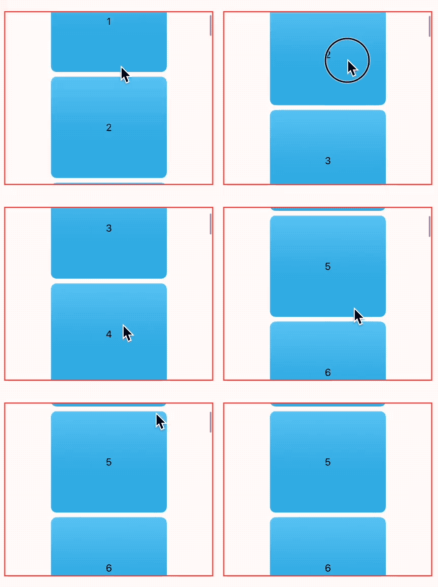
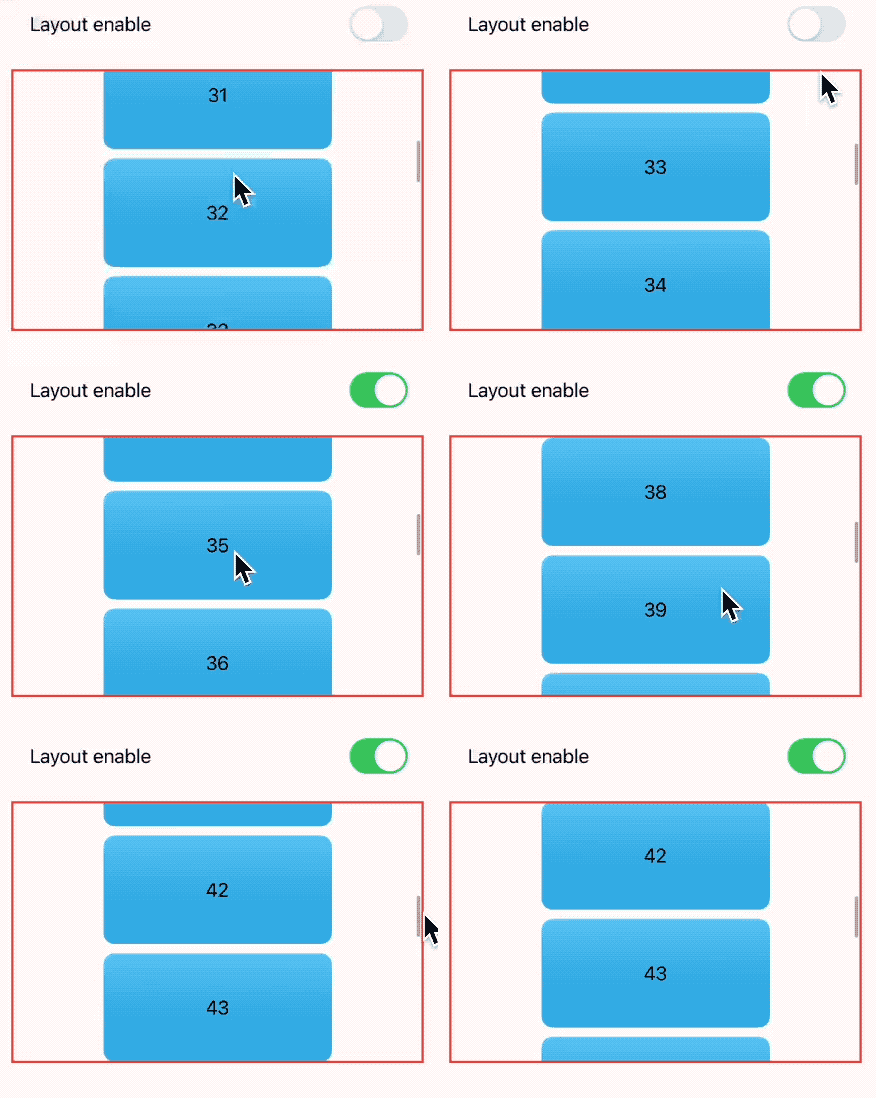
When set to .scrollTargetBehavior(.viewAligned), scrollTargetLayout must be used in conjunction. When scrolling stops, the top of the container will align with the top of the child view (in vertical mode). Developers can control the enablement of scrollTargetLayout to toggle the viewAligned behavior.
struct ScrollTargetBehaviorDemo: View {
    @State var items = (0 ..< 100).map { Item(n: $0) }
    @State private var isEnabled = true
    var body: some View {
        VStack {
            Toggle("Layout enable", isOn: $isEnabled).padding()
            ScrollView {
                LazyVStack {
                    ForEach(items) { item in
                        CellView(width: 200, height: 95)
                            .idView(item.n)
                    }
                }
                .scrollTargetLayout(isEnabled: isEnabled)
            }
            .border(.red, width: 2)
        }
        .scrollTargetBehavior(.viewAligned)
        .frame(height: 300)
        .padding()
    }
}
With .scrollTargetBehavior(.viewAligned(limitBehavior:)), we can define the mechanism for aligning the scroll target behavior.
.automaticis the default behavior, limited in compact horizontal size classes, otherwise unlimited..alwaysalways limits the number of scrollable views..neverdoes not limit the number of scrollable views.
With ViewAlignedScrollTargetBehavior, developers can also override the scrolling position of the scroll view based on the system-provided target (implementation details have not been studied in detail yet).
NamedCoordinateSpace.scrollView
Apple introduced the NamedCoordinateSpace type in SwiftUI 5, which allows users to name coordinate systems and provides a preset .scrollView coordinate system (only supported by ScrollView). With this coordinate system, developers can easily obtain the positional relationship between subviews and the scroll view. Using this information, we can easily achieve many effects, especially when combined with another new API, the visualEffect modifier.
struct CoordinatorDemo: View {
    var body: some View {
        ScrollView {
            ForEach(0 ..< 30) { _ in
                CellView()
                    .overlay(
                        GeometryReader { proxy in
                            if let distanceFromTop = proxy.bounds(of: .scrollView)?.minY {
                                Text(distanceFromTop * -1, format: .number)
                            }
                        }
                    )
            }
        }
        .border(.blue)
        .contentMargins(30, for: .scrollContent)
    }
}
Unlike the coordinate system set with .coordinateSpace(.named("MyScrollView")), the default .scrollView coordinate system can correctly handle margins created with contentMargins.
ScrollView {
    ForEach(0 ..< 30) { _ in
        CellView()
            .overlay(
                GeometryReader { proxy in
                    if let distanceFromTop = proxy.bounds(of: .named("MyScrollView"))?.minY {
                        Text(distanceFromTop * -1, format: .number)
                    }
                }
            )
    }
}
.border(.blue)
.contentMargins(30, for: .scrollContent)
// margin not recognized
.coordinateSpace(.named("MyScrollView"))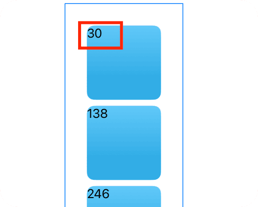
bounds(of coordinateSpace: NamedCoordinateSpace) -> CGRect?is a newly added API this year, used to obtain the boundary rectangle of the specified coordinate space.
scrollTransition
Actually, in many scenarios, we don’t need to get very precise position relationships through NamedCoordinateSpace.scrollView. Apple provides us with another API that simplifies the process.
When a subview slides in and out of the visible area of the scroll view that contains it, scrollTransition applies the given transition animation to the view and smoothly transitions between different stages.
Currently, three phase states (Phase) are defined:
topLeading: The view slides into the visible area of the scroll containeridentity: Indicates that the view is currently in the visible areabottomTrailing: The view slides out of the visible area of the scroll container
The transition closure of scrollTransition requires you to return a type that conforms to the VisualEffect protocol (VisualEffect protocol defines an effect type that does not affect view layout, and Apple has made many modifiers conform to this protocol).
struct ScrollTransitionDemo: View {
    @State var clip = false
    var body: some View {
        ZStack(alignment: .bottom) {
            ScrollView {
                ForEach(0 ..< 30) { i in
                    CellView()
                        .idView(i)
                        .scrollTransition(.animated) { content, phase in
                            content
                                .scaleEffect(phase != .identity ? 0.6 : 1)
                                .opacity(phase != .identity ? 0.3 : 1)
                        }
                }
            }
            .frame(height: 300)
            .scrollClipDisabled(clip)
            Toggle("Clip", isOn: $clip)
                .padding(16)
        }
    }
}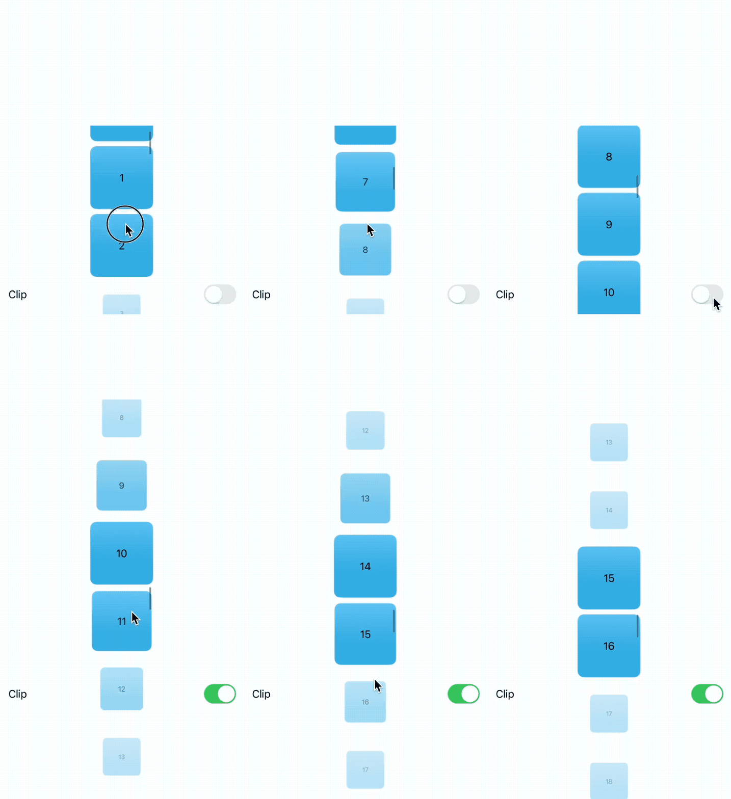
The scrollTransition can be considered as a simplified version of NamedCoordinateSpace.scrollView and visualEffect modifiers for easier implementation of effects.
Summary
I never imagined that Apple would enhance the ScrollView so extensively in SwiftUI 5. It’s commendable that they not only provided long-awaited features but also did an excellent job in designing and implementing the API.
Personally, I believe that with the native solution of ScrollView in SwiftUI 5, most requirements can be met, so we will see more people using the combination of ScrollView and LazyStack.