SwiftUI Overlay Container is a view container component for SwiftUI. It is a customizable, efficient, and convenient view manager.
With simple configuration, SwiftUI Overlay Container can help you complete basic tasks such as view organization, queue processing, transition, animation, interaction, and display style configuration. This allows developers to focus more on implementing the application’s views themselves.
History
In the summer of 2020, while adding a side-scrolling menu to Health Notes, I found that it was often necessary to dynamically add another view on top of a view, such as a prompt, advertisement, floating button, beginner’s guide, and so on. Therefore, I wrote a component to help developers quickly complete the above requirements in SwiftUI. However, due to my limited technical abilities at the time, many ideas were not well implemented.
Last year, I rewrote this component, not only implementing previously unsupported features, but more importantly, testing whether my abilities have improved during this time.
You can get the latest version from here.
Design Motivation
When we need to display new content on top of a view (such as pop-ups, side menus, help tips, etc.), there are many excellent third-party solutions that can help us implement them separately, but there is no solution that can simultaneously handle different scenario requirements. In SwiftUI, describing views has become very easy, so we can completely extract the display logic of the above scenarios, create a library that can cover more usage scenarios, and help developers organize the display style and interaction logic of views.
Functionality and Features
- Supports multiple containers
- Multiple views are supported within a single container
- Can push views to any specified container inside or outside SwiftUI view code
- Container configurations can be dynamically modified (except for queue types)
- Views inside containers have multiple layout options
- Multiple queue types are available to guide how the container displays views
Quick Start Guide
For more detailed information, please refer to the demos in the repository and the comments in the source code.
Creating a Container
Create a view container on top of the specified view. The size of this container is the same as the size of the view it is attached to:
VStack{
    // your view
}
.overlayContainer("containerA", containerConfiguration: AConfiguration())
When a view container does not need to be attached to a specific view:
ViewContainer("containerB", configuration: BConfiguration())Displaying a View in a Container
Display the MessageView in the view container containerA.
.containerView(in: "containerA", configuration: MessageView(), isPresented: $show, content: ViewConfiguration())Alternatively, use the Container Manager.
struct ContentView1: View {
    @Environment(\.overlayContainerManager) var manager
    var body: some View {
        VStack {
            Button("push view in containerB") {
                manager.show(view: MessageView(), in: "containerB", using: ViewConfiguration())
            }
        }
    }
}
Revoke all views within the specified container
struct ContentView1: View {
    @Environment(\.overlayContainerManager) var manager
    var body: some View {
        VStack {
            Button("push view in containerB") {
                manager.dismissAllView(in: ["containerA","containerB"], animated: true)
            }
        }
    }
}
Basics
Container
A component that receives and displays views. At minimum, a container needs to be set with a name, a view display type, and a view queue type.
A default view style can be set for a container. If a view does not specify a style property, the container’s default style will be used instead.
Display Types for Containers
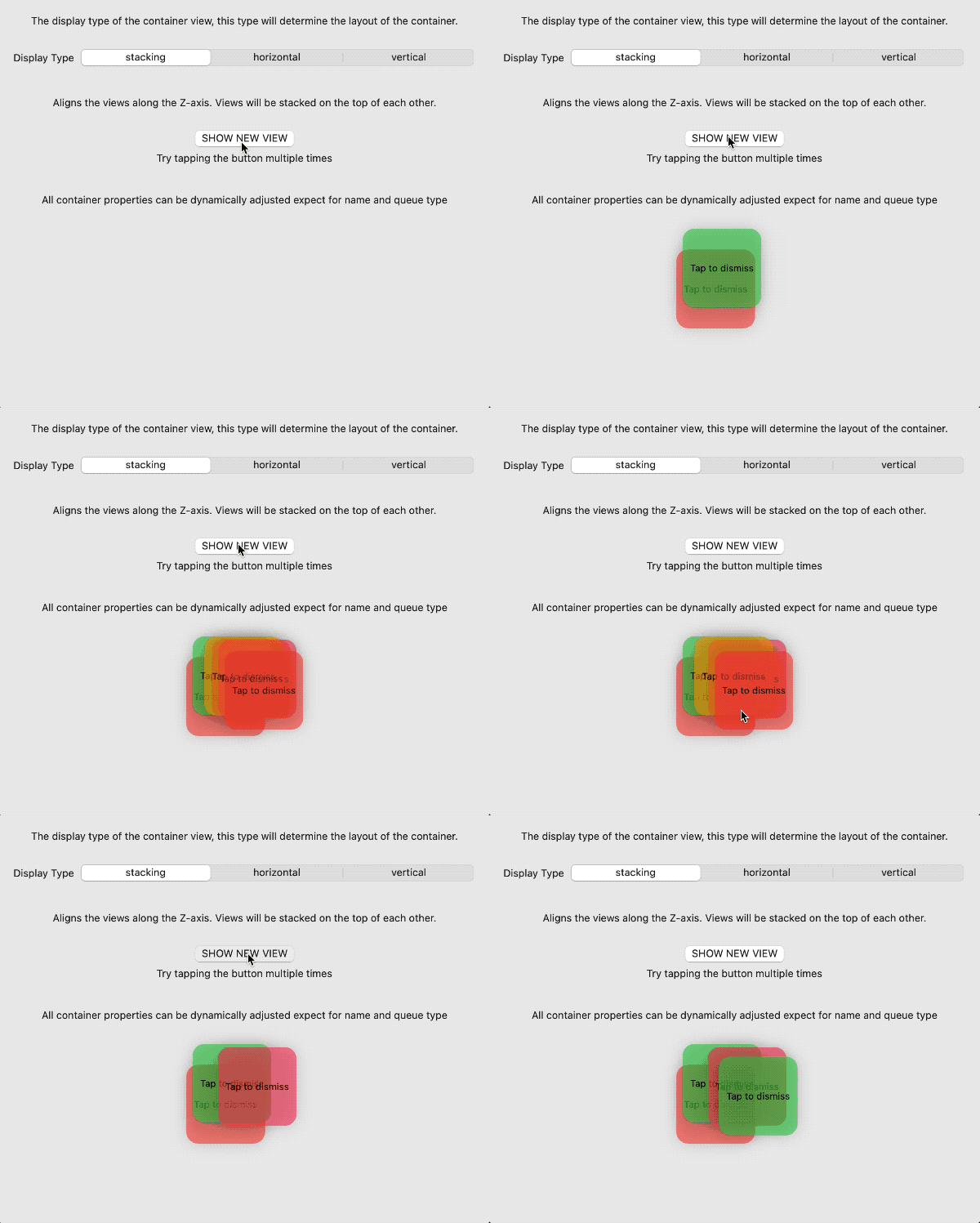
- Stacking
When multiple views are displayed within a container, the views stack along the Z-axis. It behaves similarly to the ZStack.
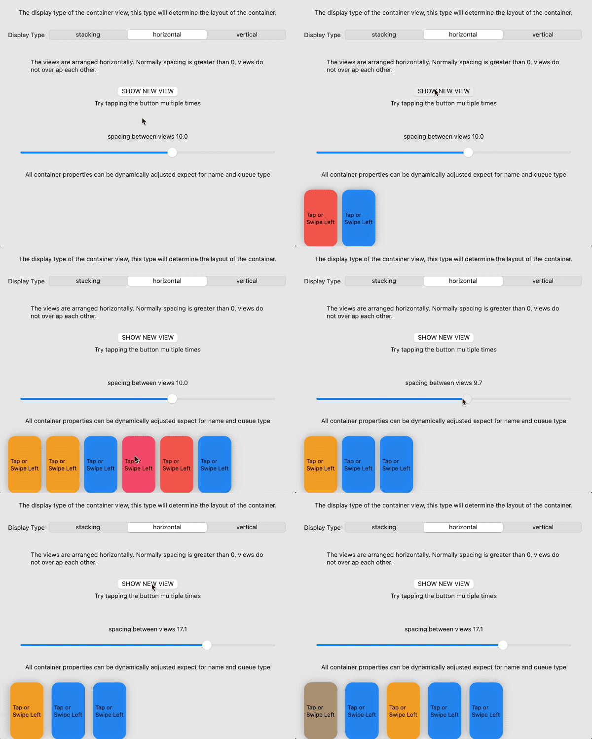
- horizontal
When multiple views are displayed in a container at the same time, the views are arranged along the X-axis. It behaves similarly to the HStack.
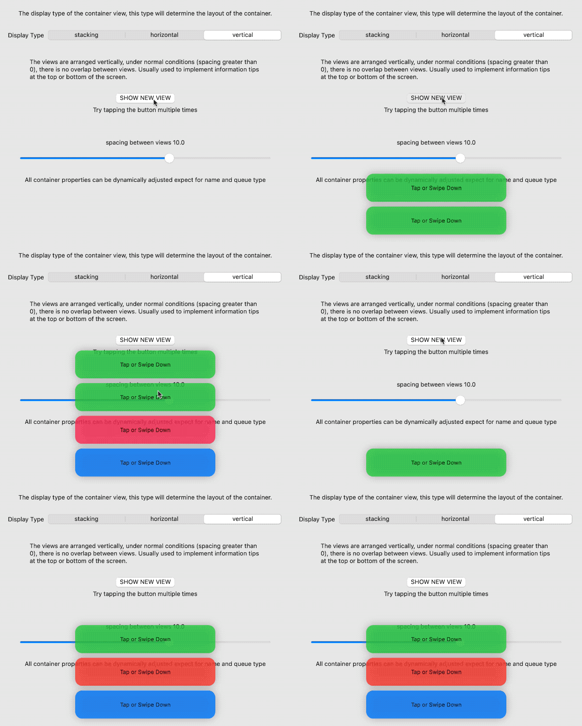
- vertical
When multiple views are displayed in a container at the same time, the views are arranged along the Y-axis. Its behavior is similar to VStack.
Queue Type
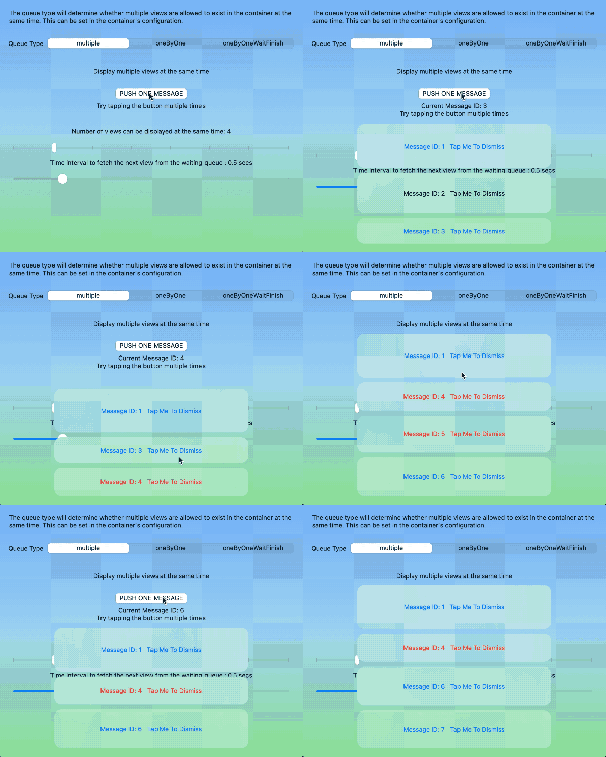
- Multiple
Multiple views can be displayed simultaneously within the container. When the number of views given exceeds the maximum number of views set in the container, the excess views will be temporarily stored in a waiting queue, and will be filled one by one after the displayed views are canceled.
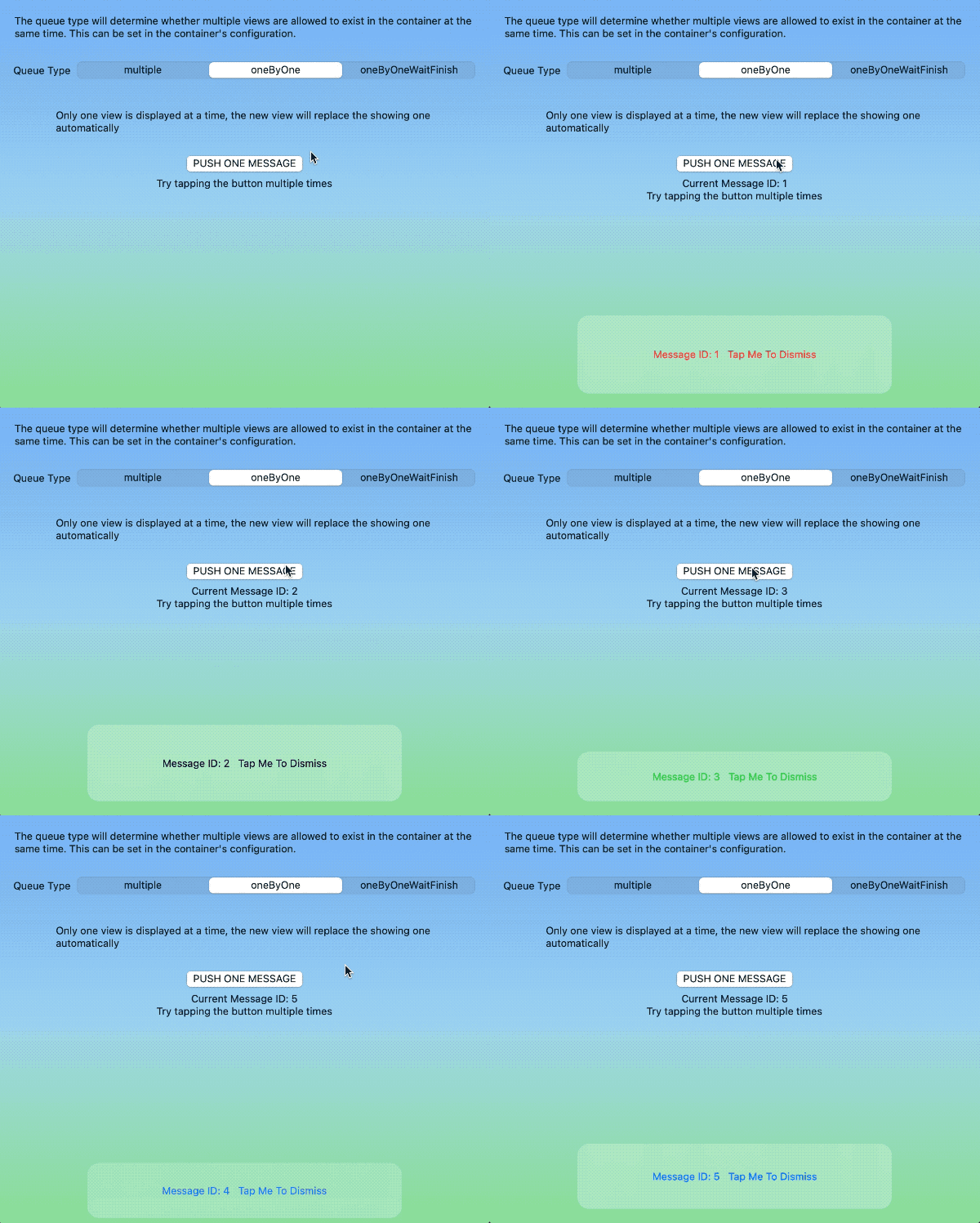
- oneByOne
Only one view can be displayed in the container at the same time. The newly added view will automatically replace the currently displayed view.
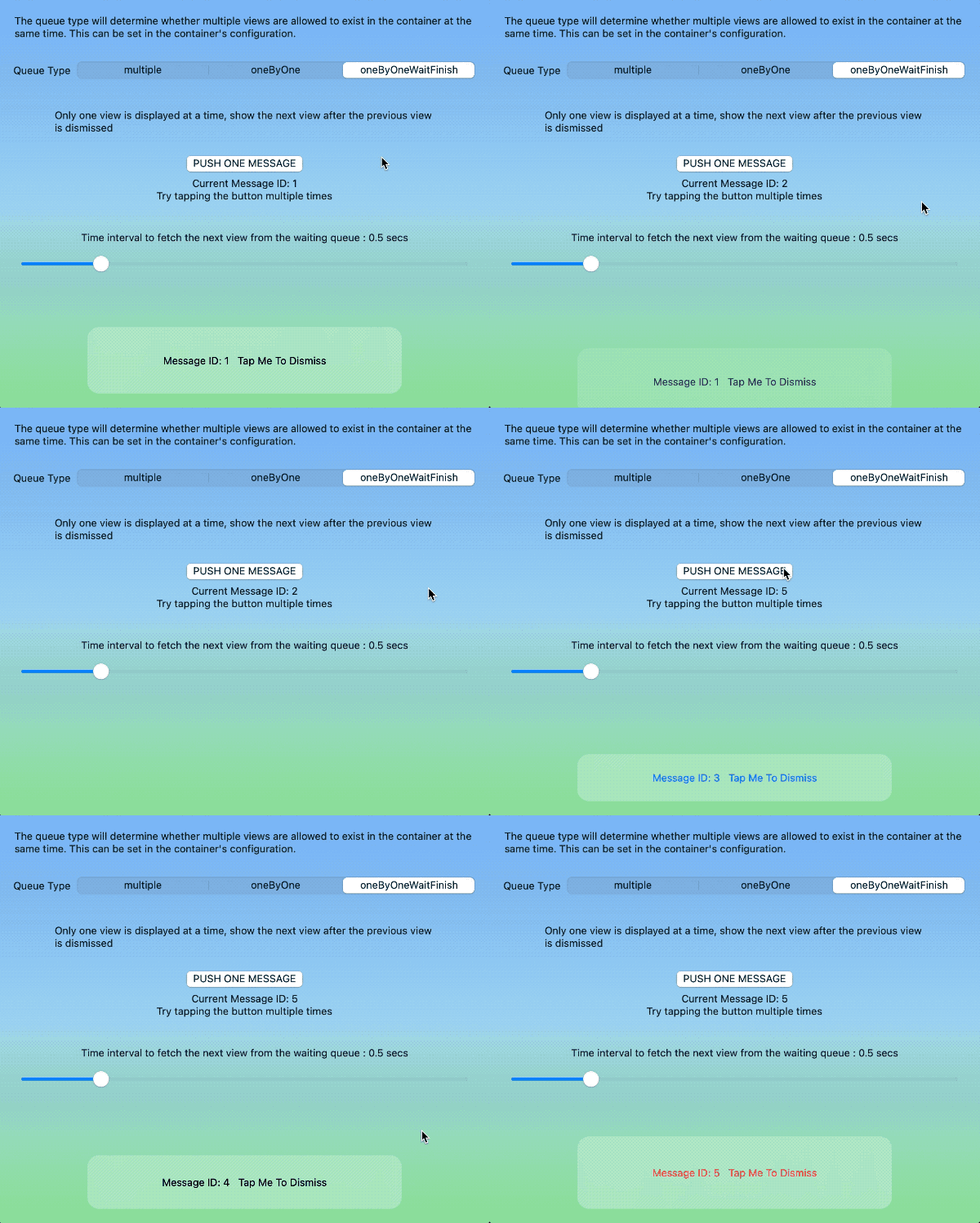
- oneByOneWaitFinish
Only one view can be displayed in the container at the same time. A new view can only be displayed after the currently displayed view has been dismissed.
Configuring Containers
At a minimum, the following attributes must be set when configuring containers:
struct MyContainerConfiguration:ContainerConfigurationProtocol{
    var displayType: ContainerViewDisplayType = .stacking
    var queueType: ContainerViewQueueType = .multiple
}
Other properties that can be set include:
- delayForShowingNext
The time interval for automatically displaying the next view
- maximumNumberOfViewsInMultipleMode
The maximum number of views that can be displayed simultaneously in multiple mode
- spacing
The spacing between views in vertical or horizontal mode
- insets
In stacking mode, this value represents the inset of the view. In horizontal and vertical mode, this value represents the inset of the view group.
- All other container view configurations (used as default values for container views)
See the configuration container view section below for details.
Environment Values in Containers
Each container provides an environment value, overlayContainer, for the view inside the container. Views within the container can use this value to access information about the container (name, size, display type, queue type) and perform dismiss actions.
struct MessageView: View {
    @Environment(\.overlayContainer) var container
    var body: some View {
        RoundedRectangle(cornerRadius: 10)
            .frame(width: 300, height: 10)
            .overlay(
                HStack {
                    Text("container Name:\(container.containerName)")
                    Button("Dismiss me"){
                        container.dismiss()
                    }
                }
            )
    }
}
Container Views
All SwiftUI views can be displayed within a container. You can create a single view configuration for views with similar functionality, or you can individually set a specific view to conform to the ContainerViewConfigurationProtocol.
Configure Container View
public protocol ContainerViewConfigurationProtocol {
    var alignment: Alignment? { get }
    var tapToDismiss: Bool? { get }
    var backgroundStyle: ContainerBackgroundStyle? { get }
    var backgroundTransitionStyle: ContainerBackgroundTransitionStyle { get }
    var shadowStyle: ContainerViewShadowStyle? { get }
    var dismissGesture: ContainerViewDismissGesture? { get }
    var transition: AnyTransition? { get }
    var autoDismiss: ContainerViewAutoDismiss? { get }
    var disappearAction: (() -> Void)? { get }
    var appearAction: (() -> Void)? { get }
    var animation: Animation? { get }
}-
alignment
Set the alignment of a view or view group within a container. In stacking mode, you can set different alignments for each view, while in vertical or horizontal mode, all views (or view groups) share the alignment setting of the container.
-
tapToDismiss
When backgroundStyle is set for a view, is it allowed to undo the view by clicking on the background?
Refer to the project demo code for more details
-
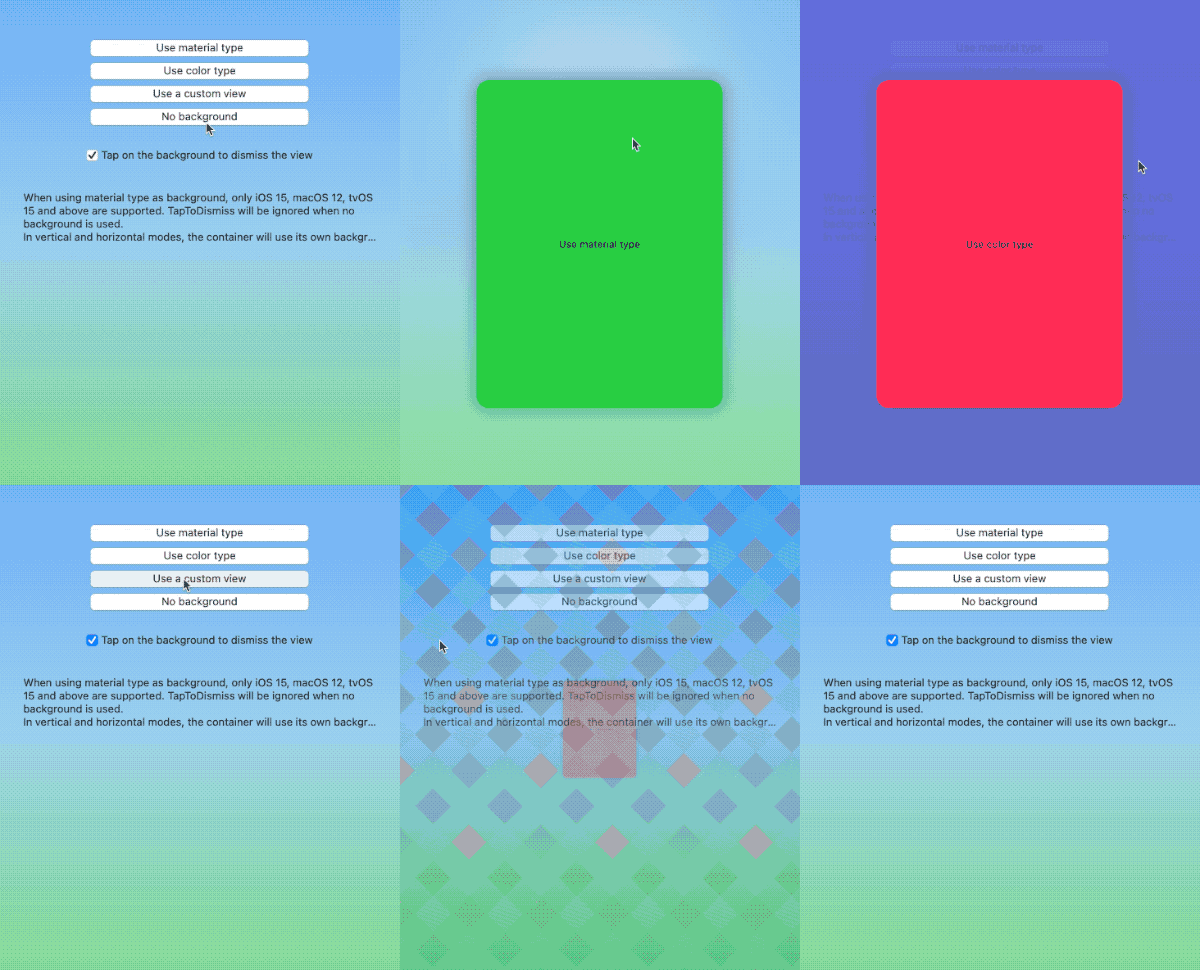
backgroundStyle
Set the background for a container view. Currently, color, blur, and customView are supported.
Some versions of the operating system (iOS 14, watchOS) do not support the blur mode. If you want to use blur in these versions, you can wrap other blur code with customView.
Refer to the project demo code for more details
-
backgroundTransitionStyle
Background transition. Default is opacity, set to identity to cancel the transition.
-
shadowStyle
To add a shadow to a view.
-
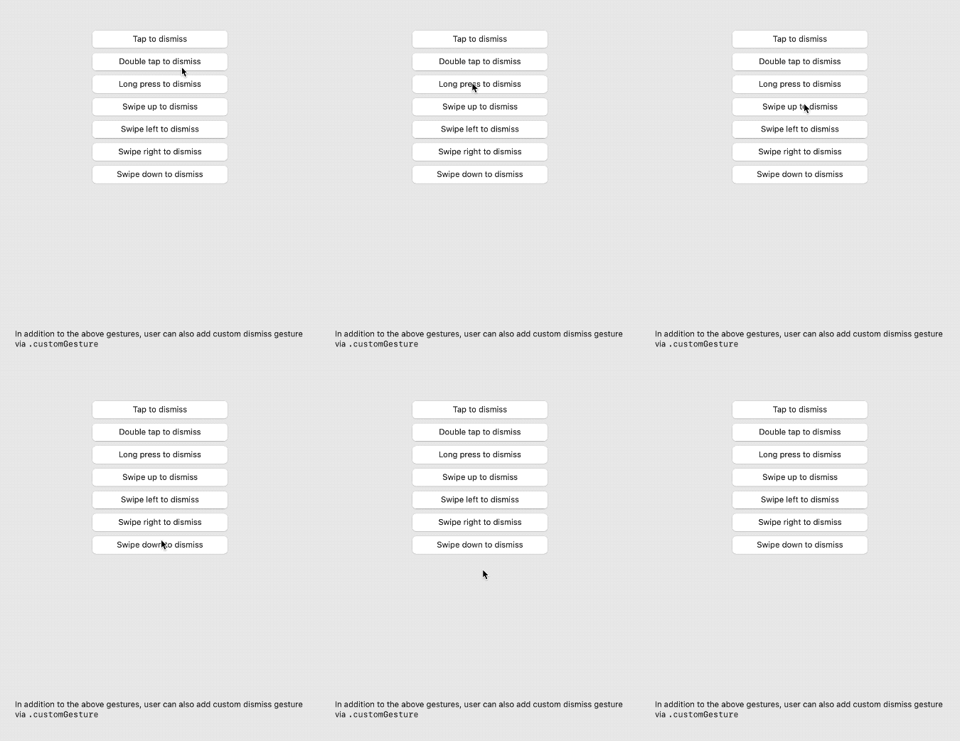
dismissGesture
To add a dismiss gesture to a view, the following gestures are currently supported: single tap, double tap, long press, swipe left, swipe right, swipe up, swipe down, and custom gestures.
For custom gestures, use
eraseToAnyGestureForDismissto erase the type.
let gesture = LongPressGesture(minimumDuration: 1, maximumDistance: 5).eraseToAnyGestureForDismiss()In tvOS, only long press is supported.
Refer to the project’s demo code for more details.
-
transition
Transition of the view
-
animation
Animation of the view transition
-
autoDismiss
Whether to support automatic dismissal.
.seconds(3)means the view will automatically dismiss after 3 seconds.Refer to the project demonstration code for more details.
-
disappearAction
Closure to be executed after the view is dismissed
-
appearAction
Closure to be executed before the view is displayed in the container
Container Manager
The container manager is the bridge between program code and containers. Users can use specific methods of the container manager to make the designated container perform tasks like displaying views and undoing views.
Environment Values of the Container Manager
In SwiftUI, view code calls the container manager through environment values.
struct ContentView1: View {
    @Environment(\.overlayContainerManager) var manager
    var body: some View {
        VStack {
            Button("push view in containerB") {
                manager.show(view: MessageView(), in: "containerB", using: ViewConfiguration())
            }
        }
    }
}
The container manager currently provides the following methods:
-
show(view: Content, with ID: UUID?, in container: String, using configuration: ContainerViewConfigurationProtocol, animated: Bool) -> UUID?Displays the view in the specified container and returns the ID of the view.
-
dismiss(view id: UUID, in container: String, animated flag: Bool)Dismisses the view with the specified ID in the specified container.
-
dismissAllView(notInclude excludeContainers: [String], onlyShowing: Bool, animated flag: Bool)Dismisses all views in all containers except the specified ones. When
onlyShowingis true, only dismisses the views that are currently being shown. -
dismissAllView(in containers: [String], onlyShowing: Bool, animated flag: Bool)Dismisses all views in the specified containers.
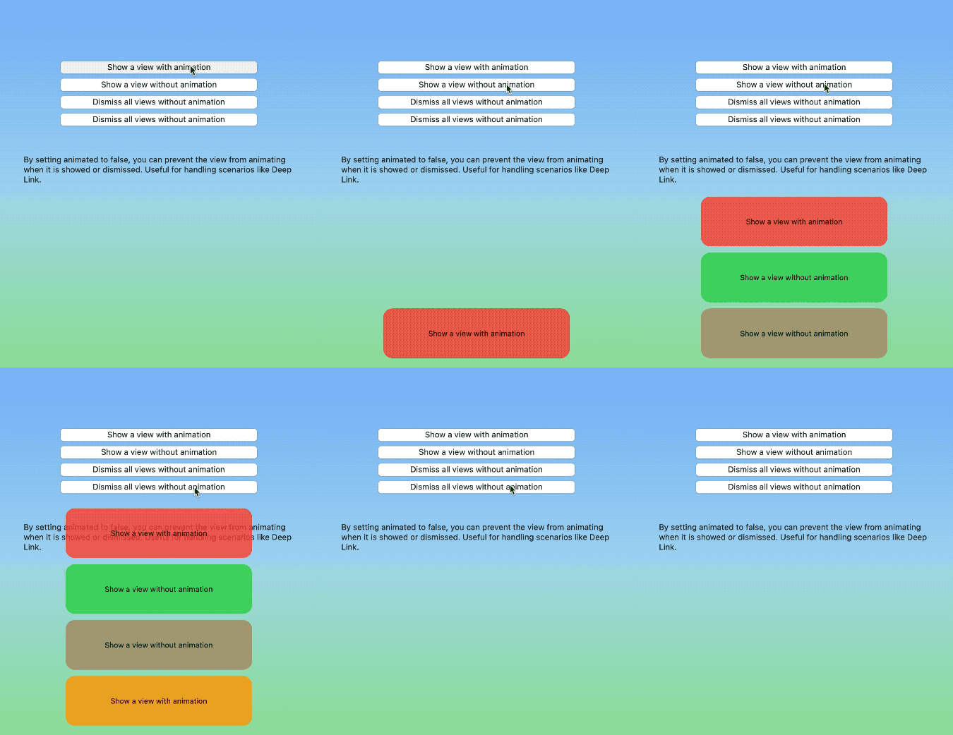
Disabling Animations
Whether you directly call the container manager or use the view modifier, setting animated to false can forcibly cancel the transition animations.
This is particularly effective for handling scenarios such as Deep Linking.
Using Outside of SwiftUI Views
If you want to call the container manager outside of SwiftUI views, you can directly access the singleton instance of ContainerManager:
let manager = ContainerManager.share
manager.show(view: MessageView(), in: "containerB", using: ViewConfiguration())
System Requirements
- iOS 14+
- macOS 11+
- tvOS 14+
- watchOS 7+
Installation
The preferred way to install SwiftUIOverlayContainer is through Swift Package Manager.
dependencies: [
  .package(url: "https://github.com/fatbobman/SwiftUIOverlayContainer.git", from: "2.0.0")
]
Copyright
This library is released under the MIT license.
Help and Support
You can provide feedback or suggestions by creating issues.