As SwiftUI enters its third year, it offers more native functionalities than at its inception, but there are still many tasks that cannot be accomplished with native SwiftUI code alone. For a considerable time, developers will need to rely on UIKit (or AppKit) code within SwiftUI. Fortunately, SwiftUI provides a convenient way for developers to wrap UIKit (or AppKit) views (or controllers) into SwiftUI views.
This article explains the following points through the wrapping of UITextField:
- How to use UIKit views in SwiftUI
- How to give your UIKit wrapper views a SwiftUI style
- Considerations when using UIKit views in SwiftUI
If you’re already familiar with using
UIViewRepresentable, you can start reading from theStyling in SwiftUIsection.
Basics
Before demonstrating the wrapping code, let’s introduce some basics related to using UIKit views in SwiftUI.
Don’t worry if you don’t understand the following content immediately, more details in the subsequent demonstration will help you grasp the necessary knowledge.
Lifecycle
One of the main differences between SwiftUI and UIKit (or AppKit) is that SwiftUI views are value types and not references to the actual rendered content on the screen. In SwiftUI, developers create descriptions of views without actually rendering them.
In UIKit (or AppKit), views (or view controllers) have clear lifecycle milestones, like viewDidload, loadView, viewWillAppear, didAddSubView, didMoveToSuperview, etc., acting as hooks for developers to execute logic in response to system events.
SwiftUI views, being value types and declarations, lack a clear lifecycle. SwiftUI provides several modifiers (like onAppear, similar to UIKit’s viewWillAppear) to mimic the behavior of UIKit’s hook methods. Unlike UIKit, onAppear and onDisappear are declared on the parent view of the current view.
When wrapping a UIKit view into a SwiftUI view, it’s important to understand the differences in their lifecycles and approach the integration from a SwiftUI perspective, rather than trying to find direct method correspondences.
UIViewRepresentable Protocol
Wrapping a UIView in SwiftUI is straightforward: create a struct that conforms to the UIViewRepresentable protocol.
UIViewControllerRepresentablecorresponds toUIViewController,NSViewRepresentabletoNSView, andNSViewControllerRepresentabletoNSViewController. The internal structure and logic are consistent across these.
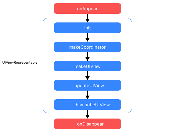
The UIViewRepresentable protocol is simple, including only four methods: makeUIView, updateUIView, dismantleUIView, and makeCoordinator. makeUIView and updateUIView are mandatory to implement.
UIViewRepresentable itself conforms to the View protocol, so any struct that adheres to it is treated as a standard SwiftUI view. However, due to its special purpose, the lifecycle of a UIViewRepresentable differs from a standard SwiftUI view.
-
makeCoordinator
If a Coordinator is declared,
UIViewRepresentablewill first create its instance after initialization, to be used in other methods. Coordinator defaults toVoid. This method is called only once in the lifecycle, creating only one coordinator instance. -
makeUIView
Creates an instance of the UIKit view to be wrapped. This method is called only once in the lifecycle.
-
updateUIView
SwiftUI updates the interface parts affected by changes in the application’s state. When injected dependencies in
UIViewRepresentablechange, SwiftUI callsupdateUIView. Its timing is consistent with the standard SwiftUI view’sbody, but whilebodycomputes values,updateUIViewjust notifies theUIViewRepresentableof dependency changes, leaving it to the developer to respond accordingly.This method is called multiple times in the lifecycle until the view is removed from the view tree (or switched to another branch not containing the view).
After
makeUIViewis executed,updateUIViewwill always be executed once. -
dismantleUIView
Before the
UIViewRepresentableview is removed from the view tree, SwiftUI callsdismantleUIView, often used for cleanup actions like removing observers.dismantleUIViewis a type method. -
sizeThatFits
Returns the required size of the view. Starting with iOS 16, UIViewRepresentable has incorporated a sizeThatFits method consistent with the logic of the Layout protocol.
The following code creates a spinner like ProgressView:
struct MyProgrssView: UIViewRepresentable {
    func makeUIView(context: Context) -> UIActivityIndicatorView {
        let view = UIActivityIndicatorView()
        view.startAnimating()
        return view
    }

    func updateUIView(_ uiView: UIActivityIndicatorView, context: Context) {}
}

struct Demo: View {
    var body: some View {
        MyProgrssView()
    }
}
The Black Box
In SwiftUI, when drawing on the screen, the system starts evaluating the body of views from the top of the view tree, recursively evaluating any child views until the final result is obtained. However, SwiftUI cannot perform an infinite number of calls to render views, so it must find a way to shorten the recursion. To end recursion, SwiftUI includes several primitive types. When recursion reaches these primitive types, recursion ends, and SwiftUI no longer cares about their body, allowing them to manage their assigned areas.
SwiftUI marks a View as a primitive type by defining its body as Never. UIViewRepresentable is one such primitive type (others include Text, ZStack, Color, List, etc.).
public protocol UIViewRepresentable : View where Self.Body == NeverIn fact, almost all primitive types are wrappers around underlying UIKit or AppKit components.
As a primitive type, SwiftUI knows little about the internals of UIViewRepresentable (as it doesn’t need to). Developers typically need to work in the Coordinator of the UIViewRepresentable view to ensure communication and connection between the two frameworks (SwiftUI and UIKit).
Coordinator
Apple frameworks often use the term “Coordinator”, like in UIKit’s coordinator design pattern or Core Data’s persistent store coordinator. However, in UIViewRepresentable, the concept of a Coordinator is entirely different, serving mainly the following purposes:
-
Implementing UIKit view delegates
UIKit components often rely on delegates for functionality. A delegate is an object that responds to events occurring elsewhere. For example, in UIKit, a delegate object attached to a text field view is called when a user types or presses the return key. By declaring the coordinator as the delegate for a UIKit view, delegate methods can be implemented within it.
-
Communicating with the SwiftUI framework
As mentioned,
UIViewRepresentable, being a primitive type, takes on more communication with the SwiftUI framework or other views. In the coordinator, communication with SwiftUI or other modules can be managed through two-way bindings (Binding), notification centers, or unidirectional data flows like Redux. -
Handling complex logic within UIKit views
In UIKit development, business logic is often placed in the UIViewController. Since SwiftUI lacks the concept of a Controller, and views are merely state presentations, it can be challenging to completely strip complex functionalities from UIKit components according to SwiftUI’s pattern. Thus, complex business logic that can’t be separated is placed in the coordinator, close to delegate methods, for better coordination and management.
Wrapping UITextField
In this section, we will use the above knowledge to implement a TextFieldWrapper with basic functionality.
Version 1.0
In the first version, we aim to replicate the functionality similar to the following native code:
TextField("name:",text:$name)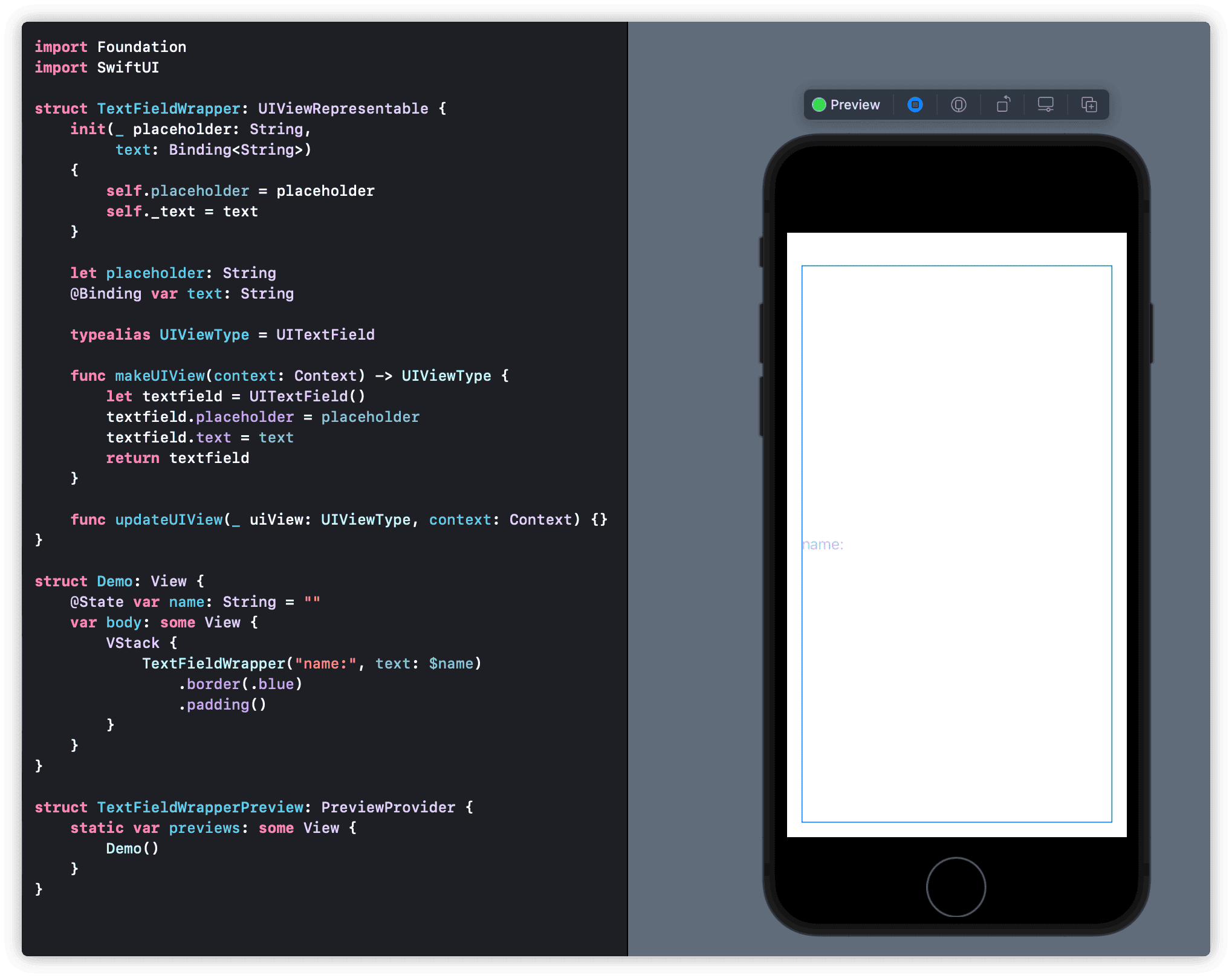
In makeUIView, we create an instance of UITextField and set its placeholder and text. In the preview, we can see the placeholder displayed normally. If you type text into it, it behaves just like TextField.
Using .border, we notice that the size of TextFieldWrapper does not meet expectations. This is because UITextField, without constraints, will occupy all available space by default. This issue did not occur in the previous demonstration with UIActivityIndicatorView. Therefore, for different UIKit components, we need to understand their default settings and constrain them as necessary.
Adding the following statement to makeUIView aligns the text field’s size with our expectations:
        textfield.setContentHuggingPriority(.defaultHigh, for: .vertical)
        textfield.setContentCompressionResistancePriority(.defaultLow, for: .horizontal)
Let’s adjust the Demo view by adding Text("name:\(name)") under .padding(). Normally, as with TextField, any text entered should be displayed in the Text below, but this is not the case with our current code version.
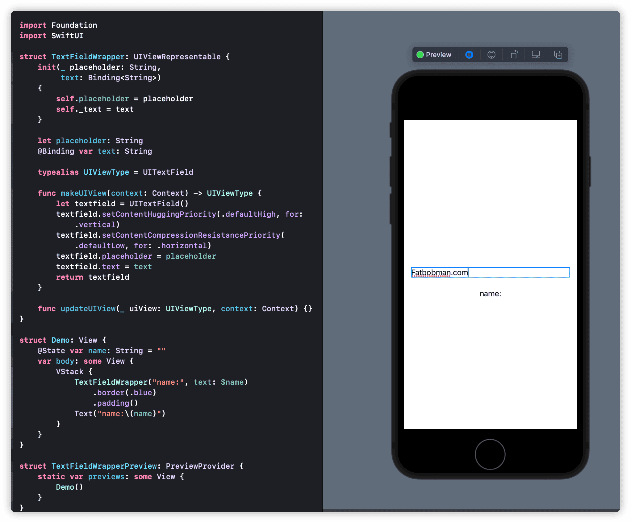
Let’s analyze the code again.
Even though we declared a Binding<String> type text and assigned it to textfield in makeUIView, UITextField does not automatically pass the entered content back to Binding<String> text. This means that the name in the Demo view does not change with text entry.
UITextField calls the delegate method func textField(_ textField: UITextField, shouldChangeCharactersIn range: NSRange, replacementString string: String) -> Bool with each text entry
. Therefore, we need to create a coordinator and implement this method in the coordinator to pass the entered content to the name variable in the Demo view.
Creating the coordinator:
extension TextFieldWrapper{
    class Coordinator:NSObject,UITextFieldDelegate{
        @Binding var text:String
        init(text:Binding<String>){
            self._text = text
        }

        func textField(_ textField: UITextField, shouldChangeCharactersIn range: NSRange, replacementString string: String) -> Bool {
            if let text = textField.text as NSString? {
                let finaltext = text.replacingCharacters(in: range, with: string)
                self.text = finaltext as String
            }
            return true
        }
    }
}
We need to pass data back in the textField method, so Binding<String> is also used in the Coordinator, making operations on text equivalent to operations on name in the Demo view.
If the Coordinator in a UIViewRepresentable view is not Void, it must be instantiated with makeCoordinator. Add the following code to TextFieldWrapper:
    func makeCoordinator() -> Coordinator {
        .init(text: $text)
    }
Finally, in makeUIView, add:
textfield.delegate = context.coordinatorUITextField will look for and call the corresponding delegate methods in the coordinator after certain events occur.
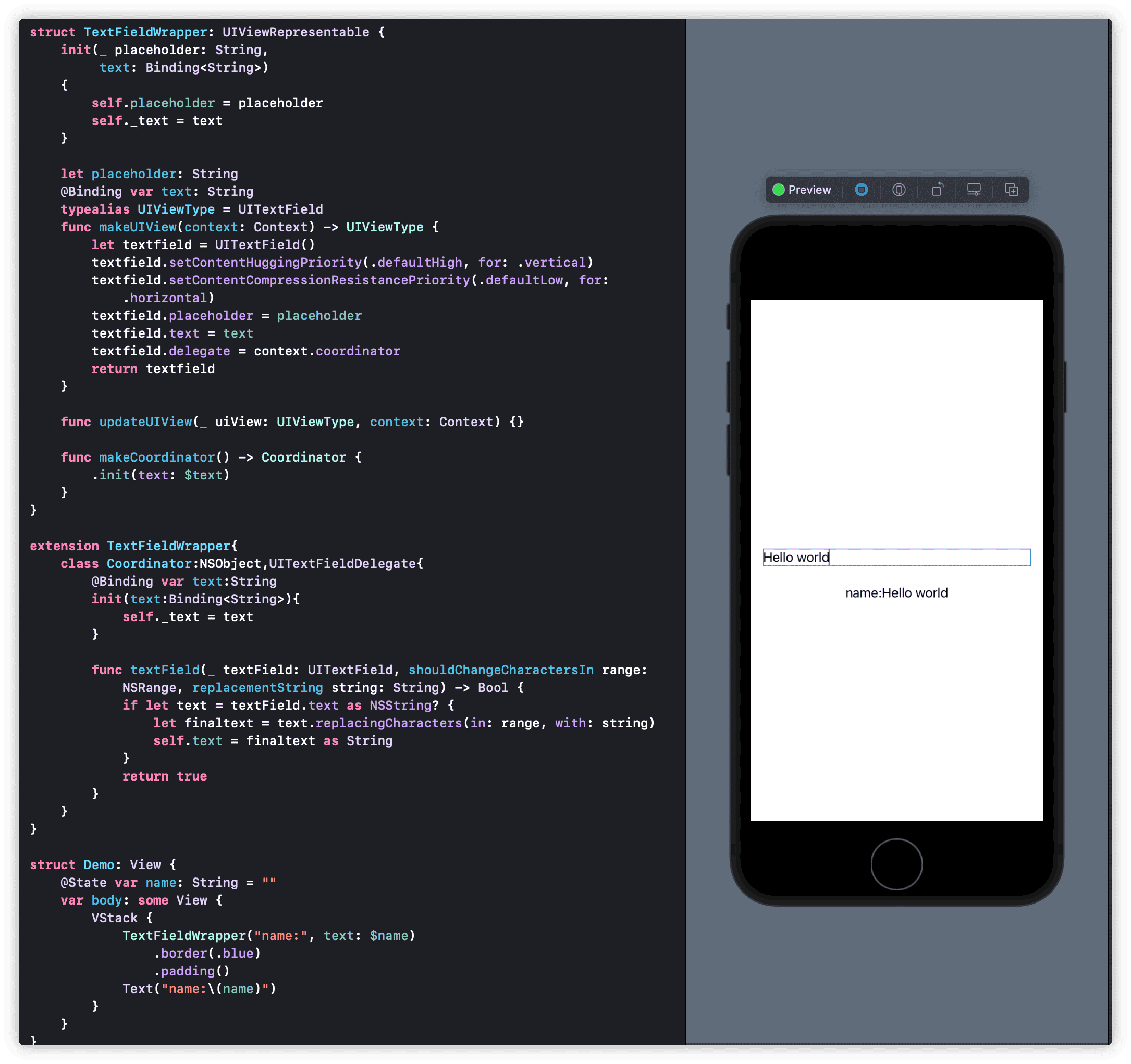
At this point, our UITextField wrapper behaves like the native TextField.
Are you sure?
Let’s modify the Demo view again:
struct Demo: View {
    @State var name: String = ""
    var body: some View {
        VStack {
            TextFieldWrapper("name:", text: $name)
                .border(.blue)
                .padding()
            Text("name:\(name)")
            Button("Random Name"){
                name = String(Int.random(in: 0...100))
            }
        }
    }
}
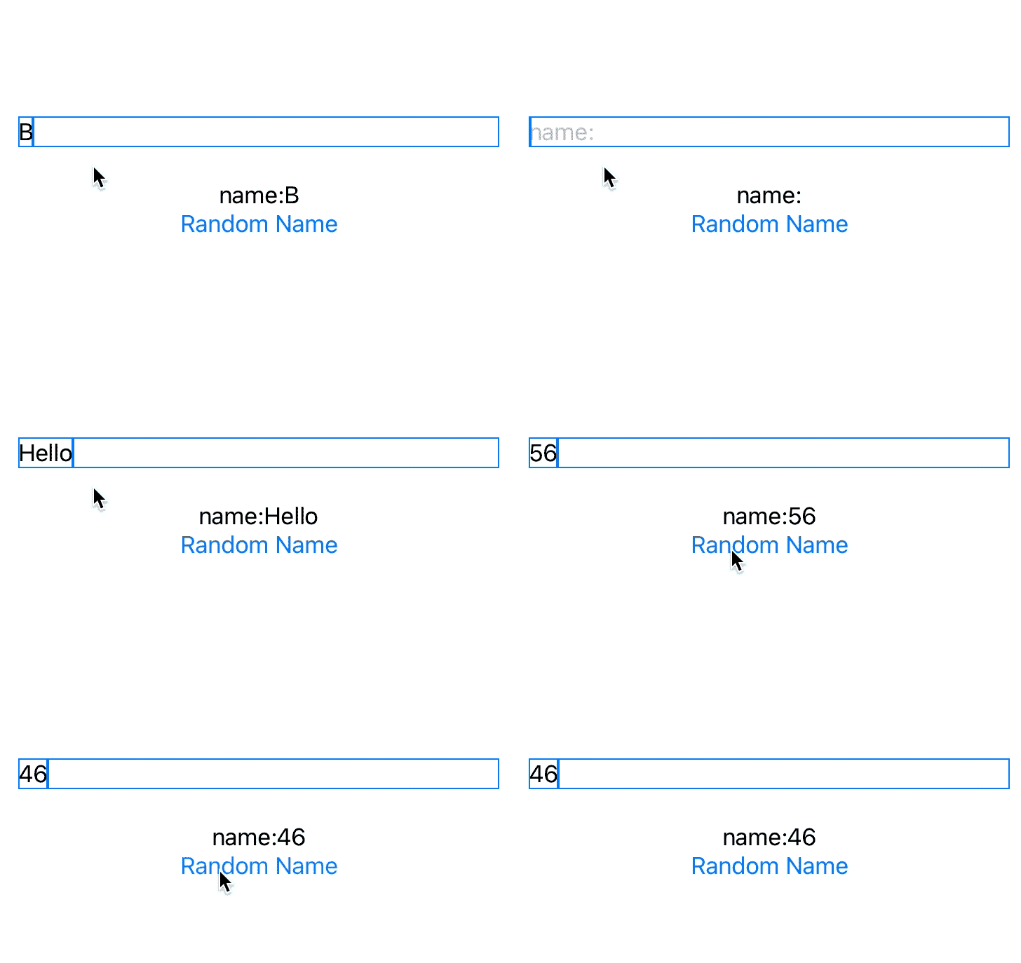
As expected with the native TextField, when we press the Random Name button, both Text and the text in TextFieldWrapper should change to a random number generated by String(Int.random(in: 0...100)). However, if you test with the above code, the text in TextFieldWrapper does not change.
In makeUIView, we used textfield.text = text to get the value of name from the Demo view, but makeUIView is only executed once. When Random Name is clicked causing name to change, SwiftUI will call updateUIView, which we have not handled. Adding the following code to updateUIView will resolve this:
    func updateUIView(_ uiView: UIViewType, context: Context) {
        DispatchQueue.main.async {
            uiView.text = text
        }
    }
The
makeUIViewmethod’scontext: Contextparameter allows access to theCoordinator(custom coordinator),transaction(how to handle state updates, animation mode), andenvironment(collection of environment values for the current view). We will demonstrate its use later. Thiscontextis also accessible inupdateUIViewanddismantleUIView. The parameter_ uiView:UIViewTypeinupdateUIViewis the UIKit view instance created inmakeUIView.
Now, our TextFieldWrapper indeed behaves just like TextField.
Version 2.0 - Adding Settings
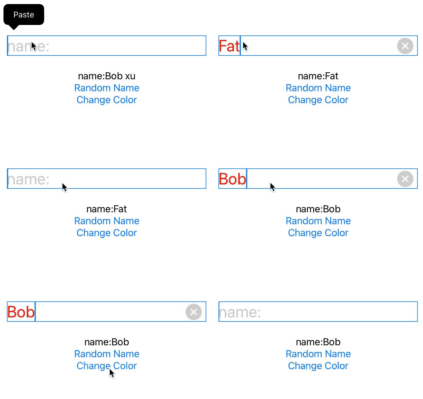
Building on the first version, we’ll add configurations like color, font, clearButtonMode, onCommit, and onEditingChanged to TextFieldWrapper.
To avoid complicating the example, we’ll use
UIColorandUIFontas configuration types. Converting SwiftUI’sColorandFontto their UIKit versions would significantly increase the code size.
color, font, and the newly added clearButtonMode do not require two-way data flow, so we don’t need to use Binding for them. We just need to respond to their changes in updateView.
onCommit and onEditingChanged correspond to the UITextField delegate methods textFieldShouldReturn, textFieldDidBeginEditing, and textFieldDidEndEditing. We need to implement these methods in the coordinator and call the corresponding blocks.
First, modify the coordinator:
extension TextFieldWrapper {
    class Coordinator: NSObject, UITextFieldDelegate {
        @Binding var text: String
        var onCommit: () -> Void
        var onEditingChanged: (Bool) -> Void

        init(text: Binding<String>,
             onCommit: @escaping () -> Void,
             onEditingChanged: @escaping (Bool) -> Void) {
            self._text = text
            self.onCommit = onCommit
            self.onEditingChanged = onEditingChanged
        }

        // Delegate methods...
    }
}
Modify TextFieldWrapper:
struct TextFieldWrapper: UIViewRepresentable {
    // Initializer and properties...

    typealias UIViewType = UITextField

    func makeUIView(context: Context) -> UIViewType {
        // Create and configure UITextField...
    }

    func updateUIView(_ uiView: UIViewType, context: Context) {
        // Update properties...
    }

    func makeCoordinator() -> Coordinator {
        .init(text: $text, onCommit: onCommit, onEditingChanged: onEditingChanged)
    }
}
Modify the Demo view:
struct Demo: View {
    @State var name: String = ""
    @State var color: UIColor = .red

    var body: some View {
        // VStack with TextFieldWrapper and other views...
    }
}
SwiftUI Styling
We not only implemented settings for font and color but also added a clearButtonMode setting not present in the native TextField. Using the above method, we can gradually add more settings to TextFieldWrapper to enhance its functionality.
But there seems to be something off with the code!
As we add more configurations, the code becomes more cumbersome to use. How can we implement chainable calls like the native TextField, for example:
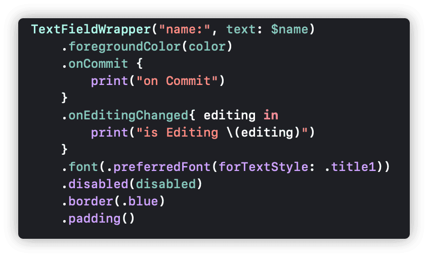
    TextFieldWrapper("name:", text: $name)
        .clearMode(.whileEditing)
        .onCommit { print("commit") }
        .foregroundColor(.red)
        .font(.title)
        .disabled(allowEdit)
In this section, we will rewrite the configuration code to style the UIKit wrapper in SwiftUI.
We start with the code from the end of version 1.0.
The so-called SwiftUI style, more precisely, refers to functional programming’s chainable calls. Operations are linked together with dots (.), enhancing readability. As Swift treats functions as first-class citizens, implementing the above chainable calls is quite straightforward. However, there are a few points to consider:
- How to change values within the View (as View is a structure)
- How to handle the returned type (to ensure the call chain remains effective)
- How to utilize and interact with existing data in the SwiftUI framework
The following examples use different approaches for demonstration. In actual use, choose the appropriate solution based on the specific needs.
foregroundColor
In SwiftUI, we often use foregroundColor to set the foreground color. For instance:
VStack {
    Text("hello world")
        .foregroundColor(.red)
}
.foregroundColor(.blue)
There’s a difference between the two foregroundColor uses above.
extension Text {
    public func foregroundColor(_ color: Color?) -> Text
}

extension View {
    public func foregroundColor(_ color: Color?) -> some View
}
The method name is the same, but the target objects differ. Text only looks for a foregroundColor setting in the current environment when it doesn’t have its own setting. The native TextField doesn’t have its foregroundColor, and we can’t access the SwiftUI view’s foregroundColor environment value (presumably). So, we can create
a dedicated foregroundColor for TextFieldWrapper.
Add a variable to TextFieldWrapper:
private var color: UIColor = .labelAdd in updateUIView:
uiView.textColor = colorSet the configuration method:
extension TextFieldWrapper {
    func foregroundColor(_ color: UIColor) -> Self {
        var view = self
        view.color = color
        return view
    }
}It’s that simple. Now we can use .foreground(.red) to set the text color of TextFieldWrapper.
This method is a common way to add extensions for specific view types. It has two advantages:
- Use of
privatekeeps configuration variables unexposed. - It returns a specific type of view, maintaining the stability of the chain.
We can use this approach for almost all chainable extensions. For a clearer and simpler code with many extensions, use the following approach:
extension View {
    func then(_ body: (inout Self) -> Void) -> Self {
        var result = self
        body(&result)
        return result
    }

    func foregroundColor(_ color: UIColor) -> Self {
        then {
            $0.color = color
        }
    }
}
disabled
SwiftUI has many extensions for View, many of which are passed down through EnvironmentValue. By directly responding to changes in these environment values, we can add configuration functionalities to TextFieldWrapper without writing specific extensions.
For example, View has a .disabled extension, commonly used to control the operability of interactive components (the corresponding EnvironmentValue for .disable is isEnabled).
Add to TextFieldWrapper:
@Environment(\.isEnabled) var isEnabledAdd in updateUIView:
uiView.isEnabled = isEnabledJust two statements, and TextFieldWrapper can directly use View’s disable extension to control its data entry capability.
Remember the context mentioned earlier? We can directly access environment values from the context. Thus, supporting native View extensions becomes even simpler.
No need to add @Environment, just add in updateUIView:
uiView.isEnabled = context.environment.isEnabledWhen writing this article, running this code under iOS 15 beta showed a warning
AttributeGraph: cycle detected through attribute. This is likely an iOS 15 bug, so please ignore it.
Using environment values for settings is a very convenient approach. The only thing to note is that it changes the return value of the chainable structure. Therefore, any chainable methods following this node should be extensions for View, like the foregroundColor we created earlier, which can only be placed before this node.
font
We can also create our environment values for configuring TextFieldWrapper. For example, SwiftUI provides a font environment value of type Font. In this case, we’ll create an environment value setting for UIFont.
Create the environment value myFont:
struct MyFontKey: EnvironmentKey {
    static var defaultValue: UIFont?
}

extension EnvironmentValues {
    var myFont: UIFont? {
        get { self[MyFontKey.self] }
        set { self[MyFontKey.self] = newValue }
    }
}
Add in updateUIView:
uiView.font = context.environment.myFontThere are multiple ways to implement the font method:
- Extend
TextFieldWrappersimilar toforegroundColor
    func font(_ font: UIFont) -> some View {
        environment(\.myFont, font)
}- Extend
View
extension View {
    func font(_ font: UIFont?) -> some View {
        environment(\.myFont, font)
    }
}
Both methods change the return value of the chainable node to something other than TextFieldWrapper, so subsequent methods in the chain should be extensions for View.
onCommit
In version 2 of the code, we added the onCommit feature to TextFieldWrapper, which triggers when the user presses return. In this example, we introduce a modifiable version of onCommit that does not require passing through the coordinator’s constructor.
A key technique here, as seen in previous examples, is the ability to change variables within the coordinator directly in updateUIView. This can be done as follows:
context.coordinator.onCommit = onCommit
context.coordinator.onEditingChanged = onEditingChanged
This method is an effective way to facilitate communication between SwiftUI and the coordinator.
Avoiding Overuse of UIKit Wrapping
While using UIKit or AppKit within SwiftUI is not difficult, careful consideration is needed when deciding to wrap a UIKit control (especially when there’s an existing native SwiftUI solution).
Apple has big ambitions for SwiftUI, not only bringing a declarative and reactive programming experience to developers but also investing heavily in cross-device and cross-platform support within the Apple ecosystem.
Apple has optimized each native control, like TextField, for different platforms (iOS, macOS, tvOS, watchOS) – a task difficult for others to replicate. Therefore, before wrapping a system control for a specific feature, consider the following points:
Official Native Solutions
SwiftUI has developed rapidly in recent years, with each version introducing new features. The documentation support for SwiftUI has improved significantly in the last two years, though it’s not yet satisfactory. For developers, I recommend purchasing “A Companion for SwiftUI” by Javier. This app provides a more comprehensive and clear guide to SwiftUI APIs than the official documentation. It reveals many functionalities provided by SwiftUI.
Native Combinations for Solutions
Before SwiftUI 3.0, there was no searchbar. Two approaches were possible: wrapping a UIKit UISearchBar or combining native SwiftUI methods to create a searchbar. Both approaches could yield satisfactory results. However, the native method offers more flexibility in composition and supports using LocalizedString as a placeholder. I personally prefer the combination approach.
Note: SwiftUI does not officially offer conversions for many data types to other framework types, such as
ColorandFont, though these can still be converted with some extra coding.LocalizedStringcan only be converted through non-standard means (usingMirror), which might not be reliable long-term.
Introspect for SwiftUI
In version 2, we added clearButtonMode to TextFieldWrapper, a feature not yet supported by native TextField. However, wrapping UITextField just for this feature would be a mistake.
Introspect uses introspection to find UIKit (or AppKit) components behind native controls. Many features not yet exposed in SwiftUI can be implemented using this extension library.
For example, the following code adds clearButtonMode to the native TextField:
        import Introspect
        extension TextField {
            func clearButtonMode(_ mode:UITextField.ViewMode) -> some View{
                introspectTextField{ tf in
                    tf.clearButtonMode = mode
                }
            }
        }

        TextField("name:",text:$name)
           .clearButtonMode(.whileEditing)
Conclusion
The interoperability between SwiftUI and UIKit/AppKit offers developers great flexibility. While it’s easy to learn, mastering it can be challenging. Sharing mutable states and complex interactions between UIKit views and SwiftUI views is often complicated, requiring various bridging layers between the two frameworks.
This article does not delve into wrapping coordinators with complex logic or communicating interactions between SwiftUI and Redux. The topic is too broad and may need another article for exploration.