As the year comes to a close, Raycast has released its 2025 Wrapped report. On my list of frequently used extensions, Images Compression (Zipic’s Raycast extension) famously took the top spot without suspense.
For content creators, compressing images as much as possible while maintaining clarity is a daily necessity. Zipic has been the biggest hero in helping me achieve this balance of “elegance and efficiency” over the past two years. It represents not just a compression tool, but an ultimate native development experience.
To dig into the story behind it, I invited Zipic’s creator, Shili, to review the product’s journey from 0 to 1. Since the content is quite detailed, I have split the original text into three parts: Product Design (this article), Distribution and Sales, and Technical Retrospective.
Building an indie product is easy to talk about, but you don’t realize how deep the water is until you actually dive in. From a small requirement in my day job to becoming the main product I work on today, the pitfalls I’ve stepped into and the things I’ve learned with Zipic are far greater than I anticipated.
Hi everyone, I’m Shili 👋! In this article, I want to talk about some real technical challenges and decision-making thoughts during the development of Zipic. This isn’t a tutorial, but more of a creation log. I hope it helps fellow makers who are also tinkering on the macOS platform.
From Pain Point to Product
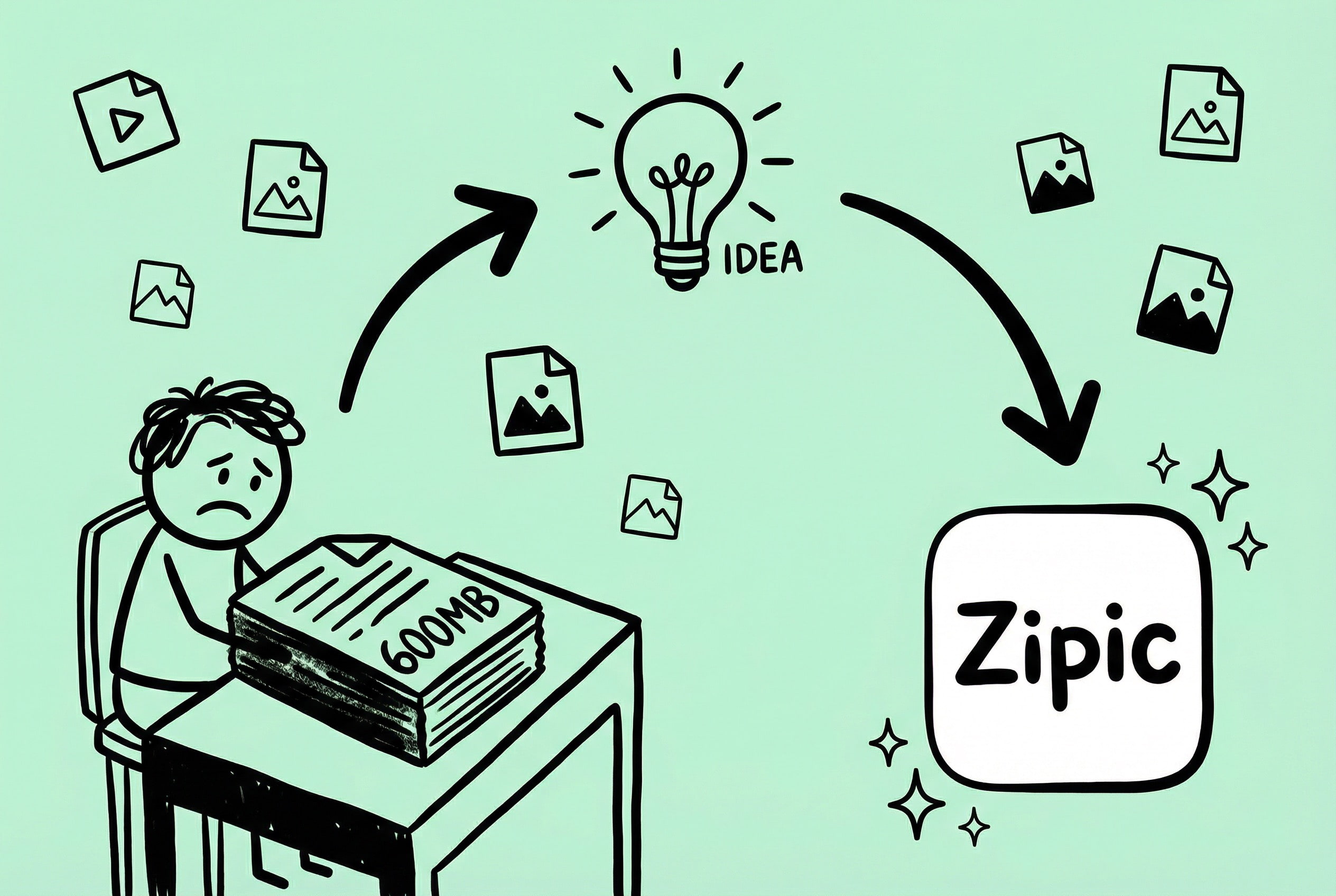
While working as a Product Manager at my previous company, my daily work was inseparable from documents and PPTs. Every proposal required a large number of screenshots and flowcharts. File size gradually became a nuisance—a single PPT could easily reach tens or hundreds of MBs. Sending files required waiting, saving a few versions ate up hundreds of MBs, and opening them was laggy. The deepest impression was when an outsourcing agency delivered a 600+ MB PPT, which stood out like a sore thumb on my 256GB MBP.
From “Annoyed” to “Action”
The root cause was actually images. Each screenshot was several MBs; stuffing them into a document naturally caused the size to explode. Instead of complaining about large documents, it was better to compress the images first.
I looked for several tools and settled on Tuya, which had a good design and good results. But after using it for a while, I felt unsatisfied: the app size was large (a common ailment of Electron apps), the interaction method was singular, and supported formats were limited. The thought popped into my head: “Why not build one myself?”
After thinking about it for a while, the positioning became clear: instead of compressing the document afterwards, it’s better to process the images at the source. What Zipic needed to do was address the basic need of image compression—but make it more native, more lightweight, and more flexible.
Zipic’s Core Principles
- Small and Beautiful: Focus on image compression and do this one thing well.
- Native Experience: Developed with SwiftUI, fully adhering to macOS design guidelines.
- Efficient and Flexible: Support more quick interaction methods.
- Rich Formats: Support more common image/document formats.
- Privacy & Security: All processing is done locally; no data is uploaded.
Although I finally decided to make an image compression tool, document compression functionality has always been on my Roadmap. I plan to support document and video compression in the 2.0 major version, turning it into a complete solution from source to final optimization.
But that’s a story for later. Next, let’s talk about some issues and experiences encountered during the making of Zipic.
Decisions and Thoughts in Product Iteration
No matter how beautiful the code is, it’s useless if users don’t find it handy. Zipic has undergone countless iterations from the first version to now, and every change has been driven by user feedback.
The Iteration Process of UI/UX Optimization
I thought the interface of the first version of Zipic was quite good—simple, clean, and macOS-style. But soon after launch, I received feedback: “Where can I see the comparison before and after compression?” “How do I know if the compression quality is good?”
My design at the time only displayed the file size after compression and the compression rate, thinking numbers were enough to explain the issue. But users didn’t think so; they wanted to see with their own eyes whether the image quality had suffered 😅.
Channels for collecting user feedback: in-app feedback entry, Twitter/X keyword monitoring. Negative feedback is often the most valuable.
Comparison View: Giving Users “Certainty”
User feedback “I want to see the compression effect” is a functional requirement on the surface, but a psychological need underneath—they need to confirm that “compression didn’t ruin my picture.”
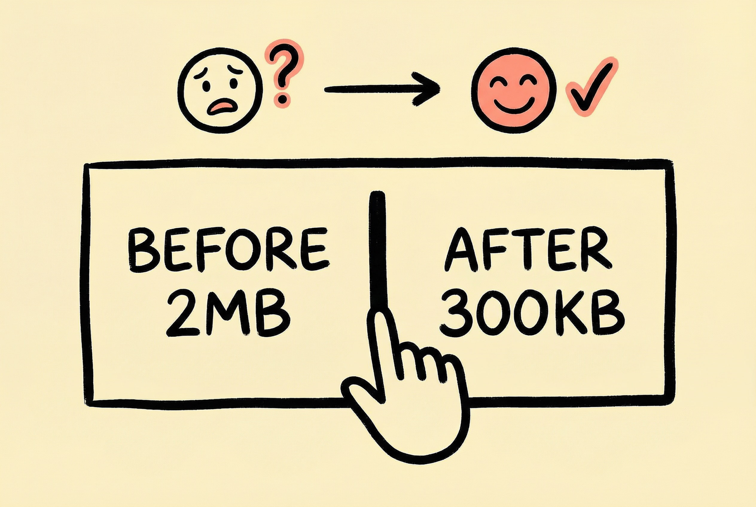
Numbers like 85% compression rate or 2MB saved are rational information, but the user’s worry is emotional: “Did the picture quality really not get worse?” Numbers cannot answer this question; only seeing it with their own eyes can bring peace of mind.
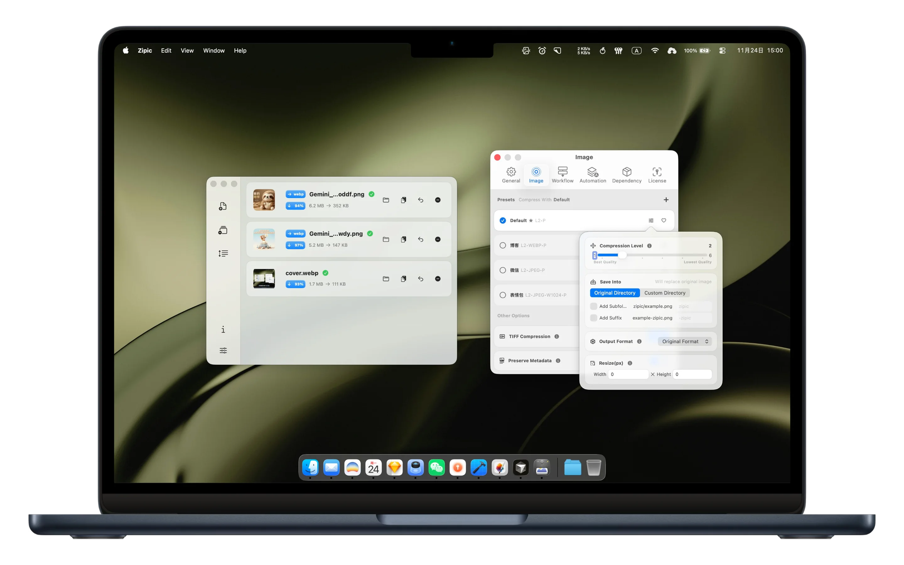
So I added a comparison view: swipe left and right to see the difference before and after compression, supporting pixel-level zooming comparison. It’s not technically complex; it’s just two images superimposed with a draggable divider controlling the display area.
There was a trade-off in product decision-making: the comparison view needs to load both the original and compressed images simultaneously, which affects processing speed. Ultimately, I chose to keep it off by default but easy to turn on—not affecting users who pursue efficiency, but available for users who need verification to check at any time. This concept of “Progressive Disclosure” is applicable in many scenarios: keep the core flow simple and expand advanced features on demand.
Multiple Compression Entries: Integrating into User’s Existing Workflow
Initially, Zipic only supported basic operations like dragging to the main window, selecting files, or dragging to the Dock icon. It worked fine, but I felt it was “not enough.”
Later I figured it out: the problem wasn’t the function itself, but that users had to interrupt their current work to use the tool. When writing a blog post and wanting to compress a screenshot, you have to open Zipic first, then drag the image in—this “switching cost,” although only a few seconds, is enough to break the flow state.
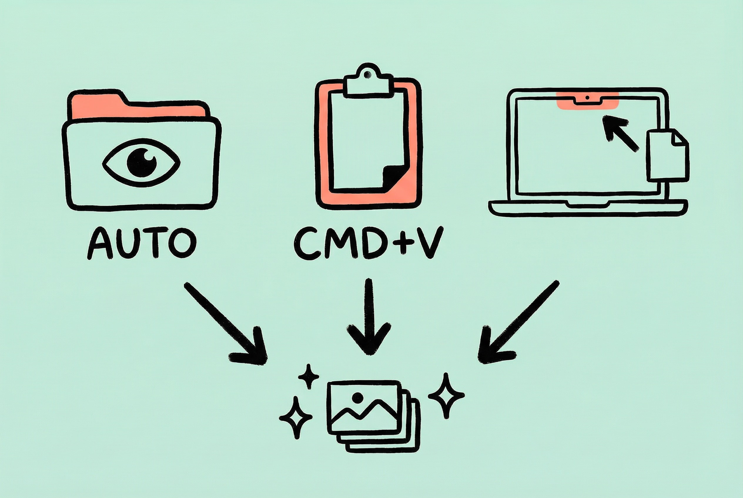
The solution is: Don’t make the user adapt to the tool, but let the tool integrate into the user’s existing workflow. So I successively added:
- Directory Monitor: Automatically compress new images after setting up a monitored folder; users don’t even need to initiate the action.
- Clipboard Compression: Compress directly by pasting after copying an image; the screenshot workflow is uninterrupted.
- Notch Drop: Drag files to the Notch area of the screen to trigger compression directly, without opening a window first.
- Productivity Tool Integration: Support Raycast extensions and URL Schemes. Keyboard warriors can compress files just by hitting Enter after selecting them in Finder, without touching the mouse at all.
These entry points turned Zipic from a “tool that needs to be specifically opened” into an “assistant available anytime.” When designing utility products, it’s worth thinking about: In what scenario does the user need this function? Can it be triggered directly in that scenario instead of making the user go around in a circle?
Presets: Reducing Repetitive Decisions
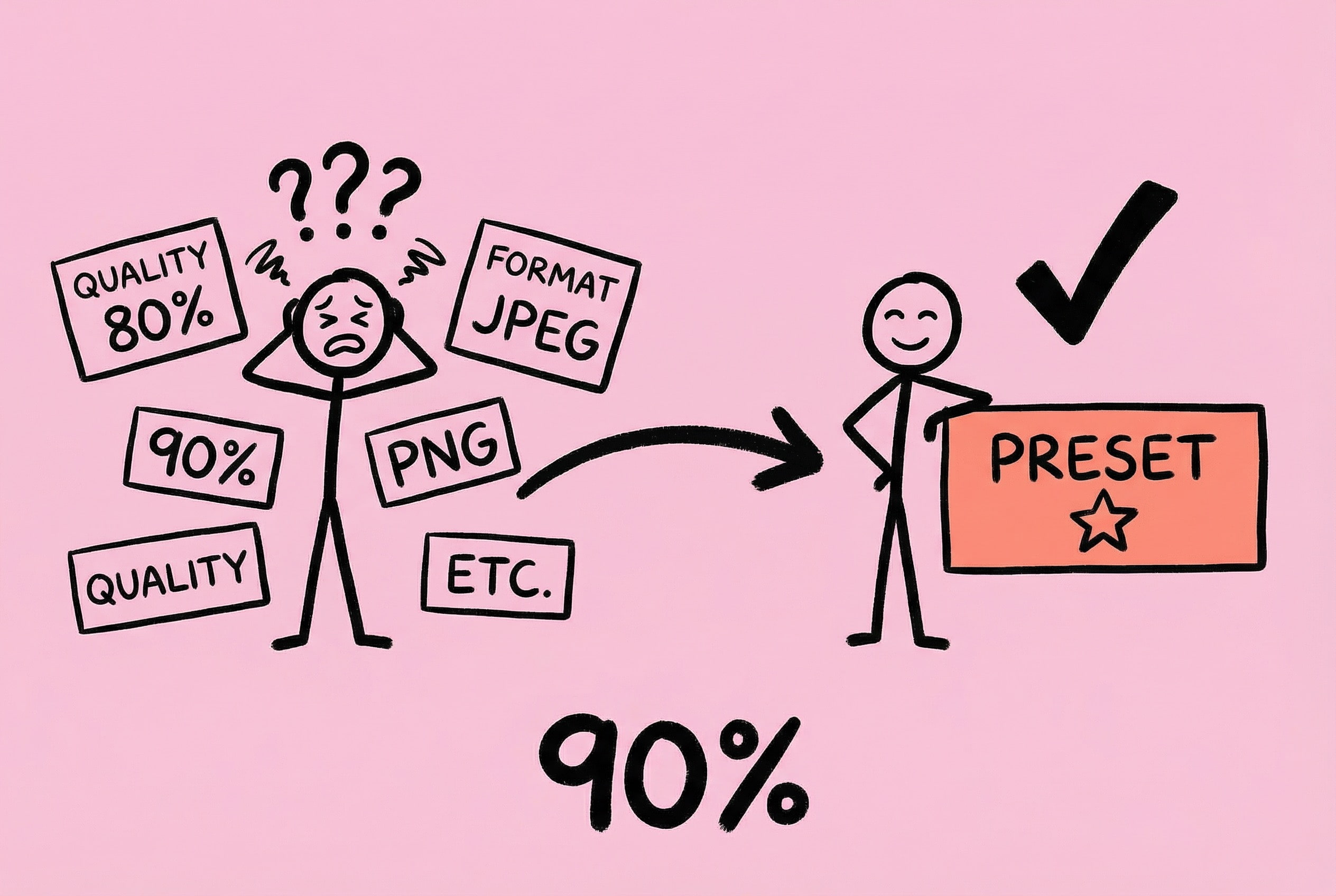
In early versions, quality and format had to be selected manually for each compression. Functionally fine, but after using it for a while, I found: 90% of the time I choose the same configuration, so why do I have to re-select it every time?
This is a cognitive load issue. Every choice consumes a bit of attention. Although insignificant individually, cumulatively it makes the tool feel “tiring.”
The essence of the preset function is to solidify repetitive decisions. Users only need to think once “what configuration do I usually need,” and after that, it’s one-click completion. Extending this thought: any high-frequency operation with a fixed pattern is worth considering providing a “remember my choice” capability.
Welcome Window: Show, Don’t Tell
Version 1.8.0 added a Welcome Window (Onboarding), solving the feature discovery problem.
Zipic’s features were getting richer, but data showed many users only used basic drag-and-drop compression, while flagship features like Notch Drop and Directory Monitor were unknown. If you build a feature but users don’t know about it, it’s as if you never built it.
Users rarely read text instructions seriously. The reason is simple: reading has a cost. Users open a tool to complete a task, not to learn.
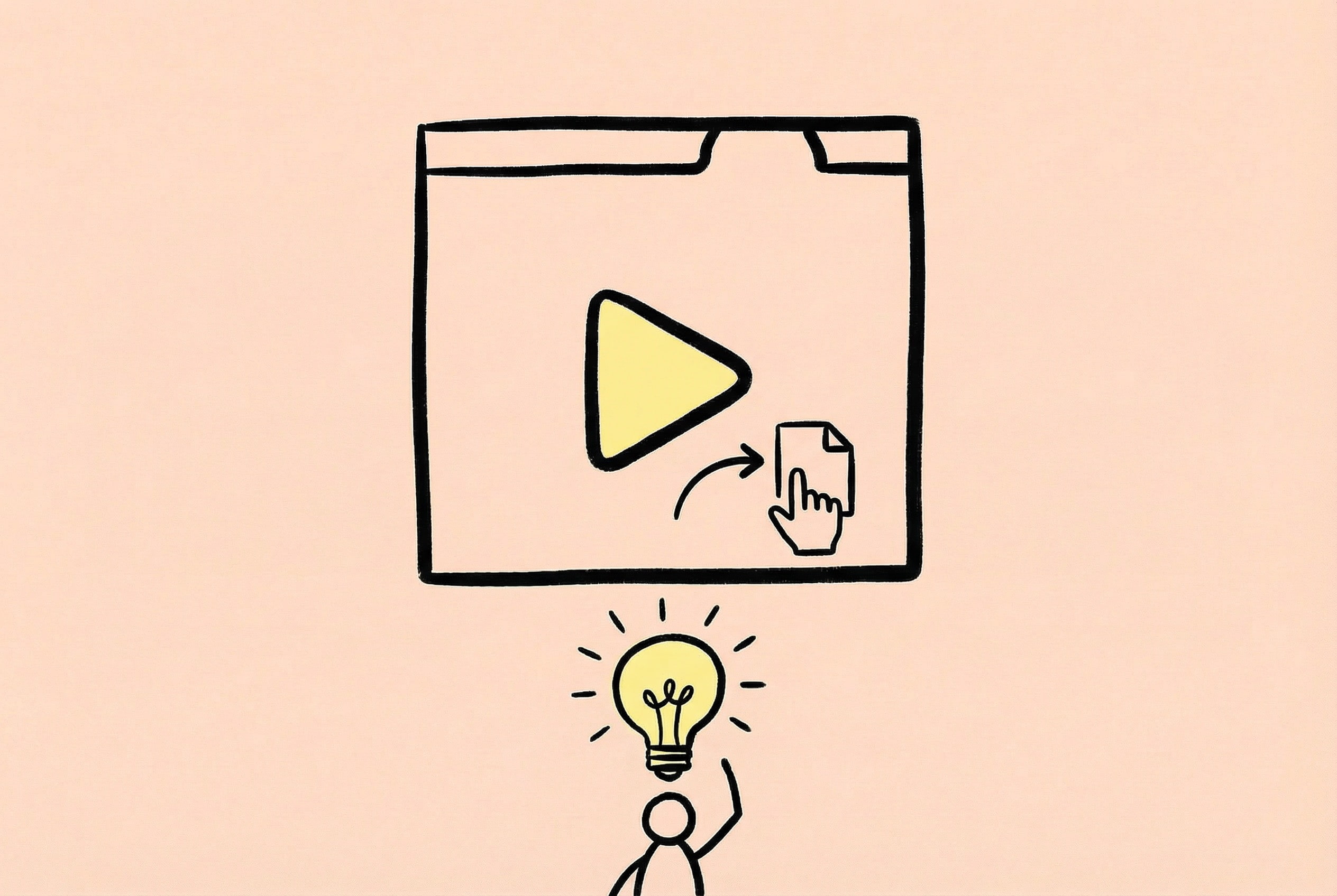
My approach is: Show, Don’t Tell. Instead of explaining in text “You can drag files to the Notch area,” it’s better to demonstrate the operation directly with animation. Users can “get it” at a glance—“Oh, I can use it this way too”—without understanding any text.
Technically, Lottie was chosen as the animation format—small file size, supports vector scaling, and precise playback control. A loop animation was made for each feature point, showing specific gestures and feedback effects. The welcome window has four steps: Welcome Page -> Dependency Installation (Auto) -> Feature Carousel -> Completion Page. Users can click the indicator to jump, not necessarily having to watch in order—respecting the user’s time.

A detail: The animation was adapted for both light/dark themes, switching automatically according to system appearance. Double the workload, but visual consistency is important; users shouldn’t see a blindingly bright animation in dark mode.
After launch, users said “I didn’t know Zipic could monitor folders and compress automatically, it’s so convenient”—this is exactly the effect I wanted. The value of a feature is only realized when it is used.
Trade-offs in Feature Priority
The Boundary Between Free vs. Pro
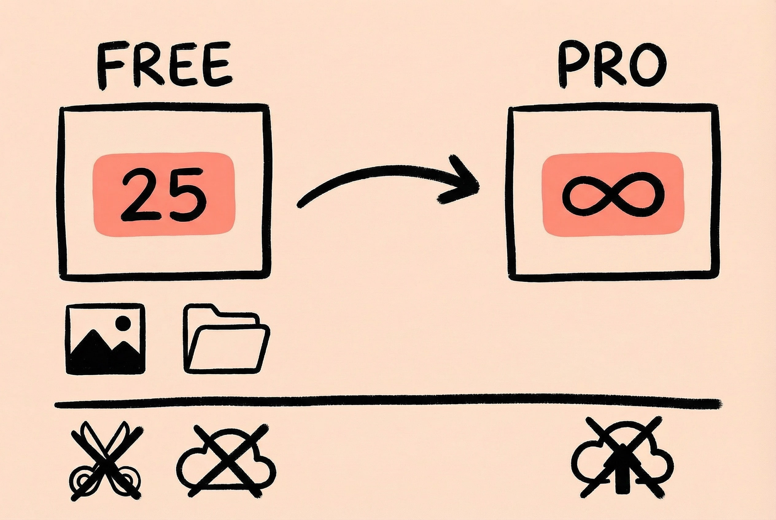
I agonized over this issue for a long time. Pricing strategy directly affects user conversion and product reputation. The final logic for division was: The Free version covers core needs, the Pro version provides efficiency improvements.
- Free Version: Basic compression, common formats (JPEG, PNG, WebP, HEIC), limited format conversion, 25 images per day limit.
- Pro Version: Unlimited batching, more formats (AVIF, TIFF, PDF, GIF), full format conversion, Directory Monitor, Clipboard Compression, Notch Drop, unlimited presets, etc.
The consideration for this division is: Users who occasionally compress a few images find the free version completely sufficient and won’t feel restricted; while heavy users (designers, bloggers, developers) will naturally pay for efficiency.
Feature Richness vs. Product Complexity
Every added feature makes the interface a bit more complex. My principle is: I’d rather do less than build a monstrosity.
For example, a user suggested adding an “Image Cropping” function. Is the request reasonable? Yes. But if added, Zipic changes from a “compression tool” to an “image editing tool,” and the positioning becomes blurred. I ultimately rejected it, recommending users use the system’s Preview app to crop before compressing.
Similar rejected requests include: Upload to image hosting, image stitching… These are good features, but they do not belong within Zipic’s boundaries.
Performance Must Be Felt by the User
Performance optimization isn’t just about benchmark scores in the code, but the actual feel users have when using the product.
The Invisible Experience of Memory Management
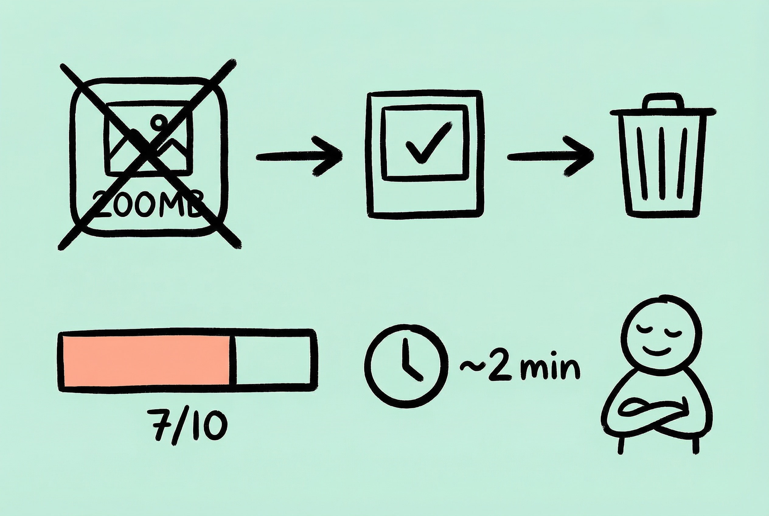
Image compression is a memory-intensive operation. Decoding an 8000x6000 photo into memory takes up nearly 200MB. If handled improperly, the most direct feeling for the user is: computer fans spinning wildly, or even the app crashing.
To avoid this, Zipic adopted a streaming processing + timely release strategy—not loading all images into memory first, but releasing immediately after processing one. Thumbnail previews use downsampling technology, loading only the required resolution. These backend technical decisions reflect on the frontend as “light, fast, lag-free.”
No “Freezing”: Timely Progress Feedback
When batch processing, what users fear most is the app “freezing”—the interface gets stuck, not knowing what the program is doing, just waiting blindly. This is also part of the performance experience: Psychological Waiting Time.
My approach is to provide an overall progress bar (completed/total) and estimated remaining time (dynamically calculated based on the average time of processed files), giving users a clear expectation of the whole process and alleviating the anxiety of waiting.
Note: I will expand on the specific technical implementation of ImageIO downsampling and double-queue concurrency in the Technical Retrospective of this series.
Reflections on Building an Indie Product
Looking back at the whole process of Zipic from idea to product, I have a lot of emotions. Along the way, there was excitement, anxiety, a sense of accomplishment, and many “I wish I had known…” moments.
Thoughts on Technology Stack Selection
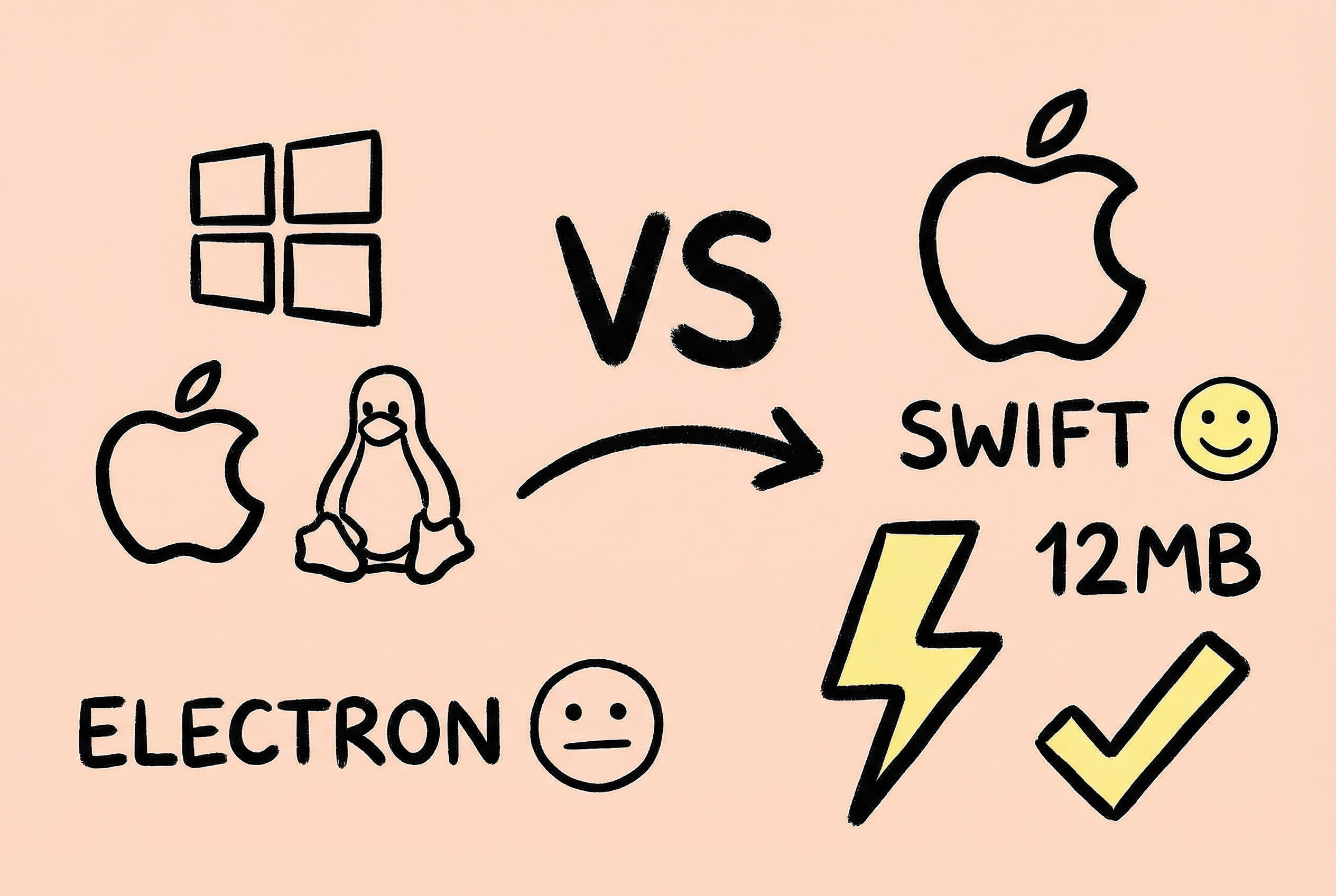
Before making Zipic, I also struggled: Should I use cross-platform solutions like Electron or Tauri? Running on multiple platforms with one codebase sounds tempting.
But in the end, I chose Swift + SwiftUI native development. The reason is simple: I want to make “the best image compression tool on macOS,” not “a tool that barely runs on multiple platforms.”
The advantages of native development are obvious: small app size (Zipic is only about 12MB), fast startup speed, low memory usage, and high integration with the system. SwiftUI’s declarative syntax is also very comfortable to write, and combined with Xcode’s preview function, UI development efficiency is quite high.
Of course, SwiftUI has its pitfalls—performance in complex scenarios is not as good as AppKit, and some system APIs still need AppKit bridging. Zipic’s main window was eventually refactored with AppKit to solve some edge case issues.
My advice is: If your target users are mainly on one platform, native development is worth considering. Cross-platform solutions are suitable for quickly validating ideas, but to achieve the ultimate experience, native still has irreplaceable advantages.
Balance Between Product and Technology
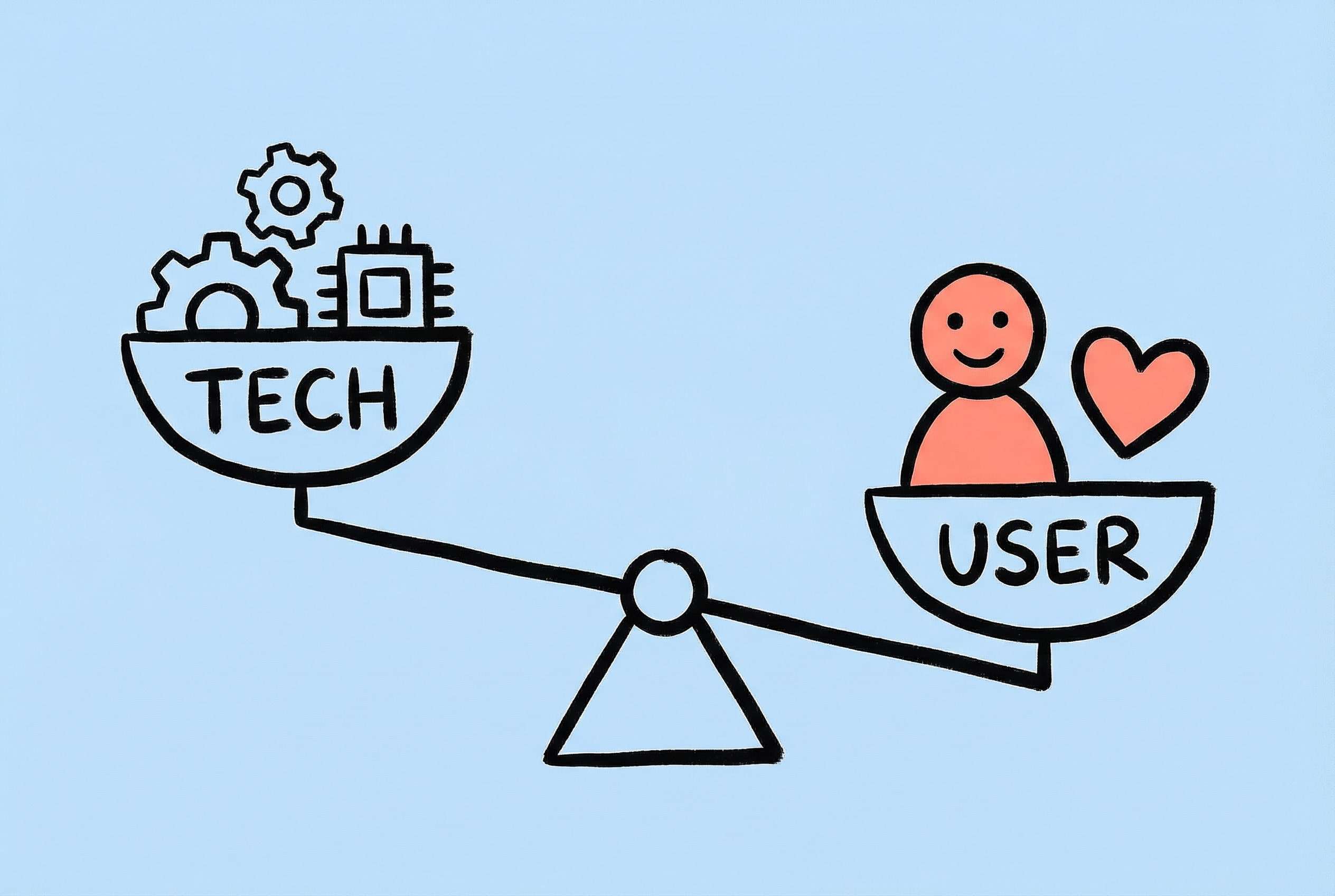
As developers, it’s easy to fall into the trap of “tech vanity”—wanting to use a new framework because it’s cool, or refactoring because a new architecture looks elegant. But users don’t care what technology you use; they only care: Does this tool solve my problem? Is it handy to use?
User feedback drives development, not technical interest. Before launching every feature, ask yourself: Is this really what users need? Or is it just something I feel “should be there”?
Challenges of Indie Development
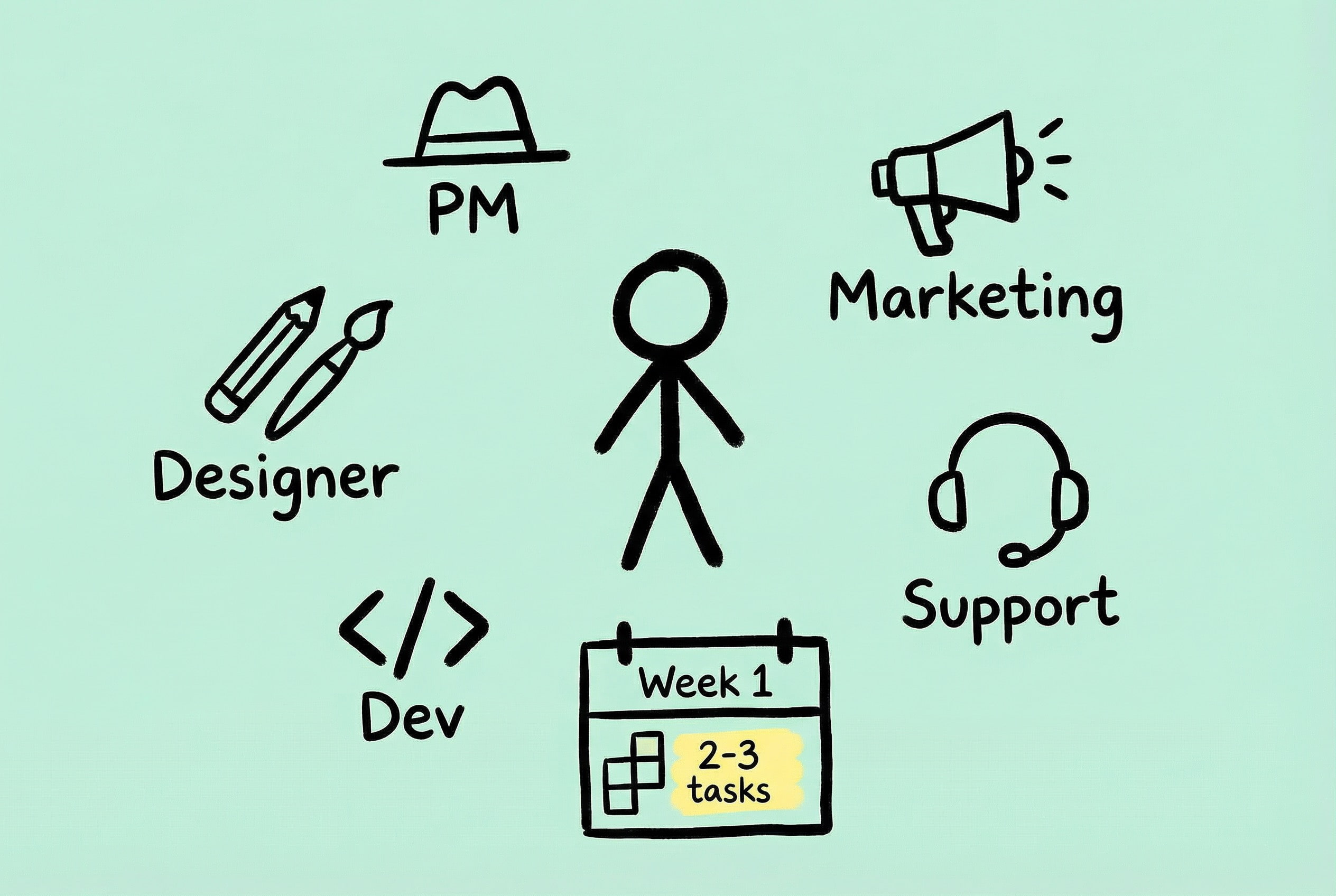
The biggest challenge of indie development is not technology, but one person playing too many roles: product manager, UI designer, frontend developer, backend developer, operations, customer service… Time management becomes particularly important. My approach is to plan by the week, focusing on only 2-3 core tasks per week, and learning to put those “doable but not urgent” things off to next week or even next month.
Marketing is the shortcoming most easily ignored by tech people, and it is a vast subject. Many developers (including the former me) feel “if the product is good, people will naturally use it,” but it might turn into “even good wine needs a bush.” There are too many similar products on the market; most users simply don’t have the chance to discover you, and even good products might be seen by very few people.
My experience is: When you are not good at marketing, what you can do immediately is increase exposure as much as possible. For this year’s Black Friday, I started preparing in mid-November, submitting PRs to various Black Friday deal collection repositories on GitHub, eventually successfully submitting to 11 sites. The effect was obvious: The combined sales of Zipic and Orchard during this Black Friday were more than double that of Zipic’s Black Friday event last year.
Reddit is also worth paying attention to. Most of last year’s Black Friday orders came from a post I made in r/macapps. One post brought a lot of conversions. You can also seriously comment on posts to recommend your product; Reddit is also a good place to discover user needs.
In the end, only with revenue can it be sustainable. No matter how good the technology or how exquisite the product, if it doesn’t sell, it’s just self-indulgence. Indie development is not purely a technical job; learning marketing and promotion is a required course (a primary school student struggling through cultivation 🫠).
One more point: Learn to accept “imperfection.” Initial versions may have flaws, but releasing first, collecting feedback, and iterating quickly is more effective than holding back for a “perfect version.”
Outlook for the Future
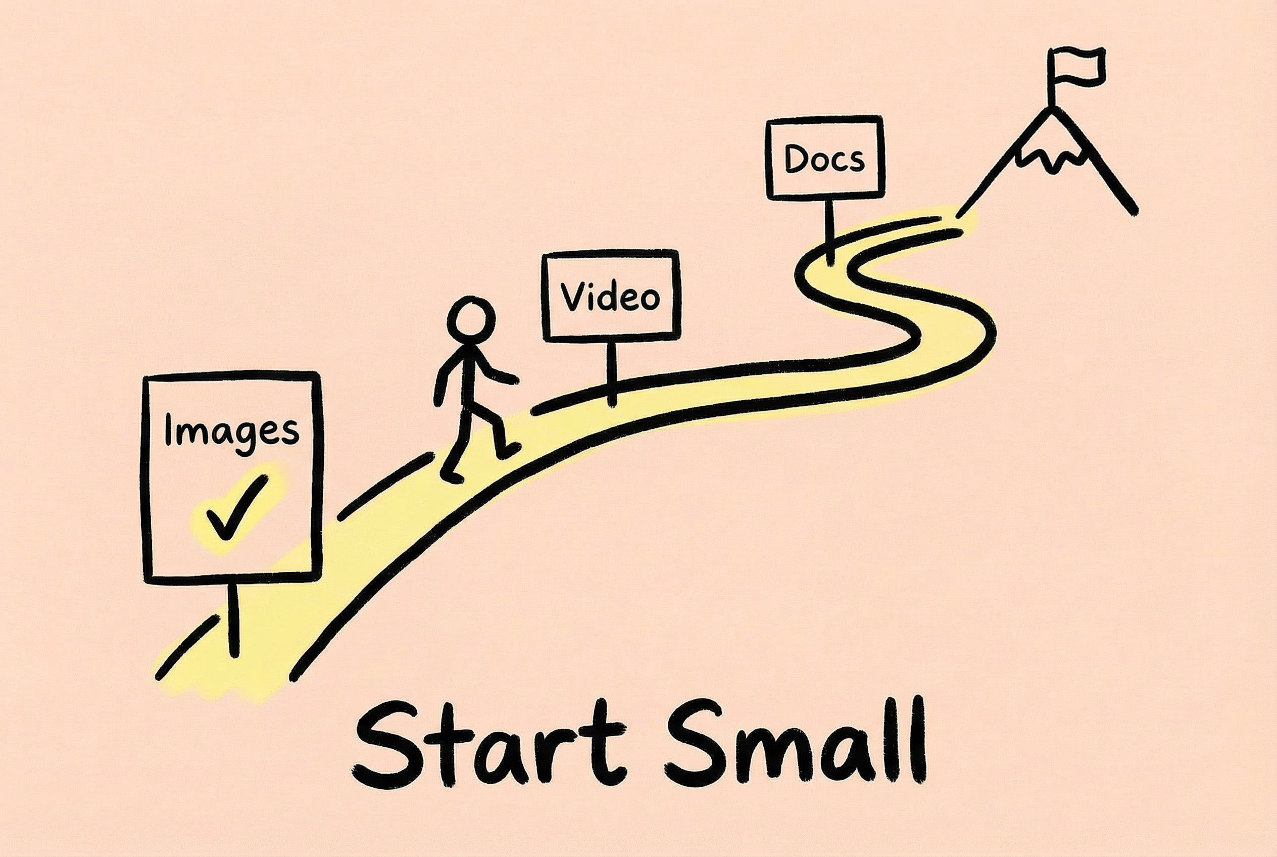
Zipic’s Roadmap still has many things I want to do: video compression, document compression (finally picking up the initial idea)… taking it one step at a time.
For friends who also want to make indie products, try starting by solving your own problems first. The pain points encountered daily are likely others’ pain points too. Cutting in from a small need and making a “small and beautiful” tool is easier to get positive feedback than trying to make a “comprehensive” platform right away. Zipic was my first product after quitting my job to do indie development, and it allowed me to verify that this path is feasible.
Finally, thank you to every user of Zipic. Your feedback, suggestions, and even complaints are the driving force for me to keep moving forward.
“Solving user problems elegantly and efficiently is where the value of a product lies.”
Zipic
If you are interested in Zipic, you can visit the Official Website to download a trial. pdocs.zipic.app has detailed help instructions. If you have any questions or suggestions, feel free to contact me at any time!
In the next two posts, I will share Zipic’s Distribution and Sales and Technical Retrospective. Interested friends can stay tuned for follow-up content.