The Text component is extremely common in SwiftUI applications. Over the past few years, despite Apple continually expanding its capabilities, developers have been eager for deeper control over this component. At WWDC 2024, SwiftUI introduced the TextRenderer protocol, granting developers new powers to adjust the rendering performance of the Text component, making it possible to achieve many previously unimaginable effects. This article will delve into this new feature.
What is the Role of the TextRenderer Protocol?
Apple officially describes the TextRenderer protocol as:
A value that can replace the default text view rendering behavior.
The TextRenderer protocol empowers developers to adjust the presentation of the Text component before it renders. By applying implementations based on the TextRenderer to the Text component, we enable it to display maximally according to our intentions.
The declaration of the TextRenderer protocol reveals its straightforward design, with the core being the draw method. In this method, developers need to render based on the element information provided by Text.Layout within a GraphicsContext.
@available(iOS 17.0, macOS 14.0, tvOS 17.0, watchOS 10.0, *)
public protocol TextRenderer : Animatable {
// Core method, developers can customize render elements within Text, adding effects
func draw(layout: Text.Layout, in ctx: inout GraphicsContext)
// If the custom effect changes the display size, this method can be used to provide new required dimensions
@available(iOS 18.0, macOS 15.0, tvOS 18.0, watchOS 11.0, visionOS 2.0, *)
func sizeThatFits(proposal: ProposedViewSize, text: TextProxy) -> CGSize
// If size adjustments are made through sizeThatFits, this adjusts the text's position within the new dimensions
@available(iOS 18.0, macOS 15.0, tvOS 18.0, watchOS 11.0, visionOS 2.0, *)
var displayPadding: EdgeInsets { get }
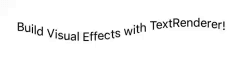
}The following example demonstrates how TextRenderer can be applied to Text. In this code, characters tagged with the ColorfulEffect attribute are enhanced with colorful effects and display dynamically from left to right.
let textRenderer = Text("TextRenderer")
  .customAttribute(ColorfulEffect())
  .foregroundStyle(.pink)
  .bold()

Text("Build Visual Effects\nwith \(textRenderer)")
  .font(.system(.title, design: .rounded, weight: .semibold))
  .textRenderer(AppearanceEffectRenderer(elapsedTime: time, totalDuration: 0.8))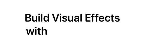
Fundamental Concepts Explained
In the TextRenderer protocol’s draw method, the primary parameter is Text.Layout, which carries information about the layout and custom properties related to the Text view. Text.Layout represents the entire layout structure of the text, containing multiple Lines.

Line
Line represents a single line within the text layout, containing several Runs. Thanks to the Layout protocol conforming to the RandomAccessCollection protocol, we can easily iterate through Layout to access each Line.
for line in layout {
  ctx.draw(line) // Direct rendering without modifications
}
The typographicBounds attribute of Line details boundaries, dimensions, text baselines, line spacing, and more. With this data, we can more precisely adjust the rendering effects of the text.
Run
Run refers to a sequence of glyphs within the text layout, comprising multiple RunSlices. By iterating through Line, we can access the Run in each line.
for line in layout {
  for run in line {
    ctx.draw(run) // Direct rendering without modifications
  }
}
For more convenient manipulation of Run, the following extension can be used:
extension Text.Layout {
  var flattenedRuns: some RandomAccessCollection<Text.Layout.Run> {
    flatMap { line in
      line
    }
  }
}

for run in layout.flattenedRuns {
  ...
}
Layout.Run is similar to the concept of Run in AttributedString, where each Run is a group of glyphs associated with the same styling properties.
Text("Hello world") // A single Run

let name = Text("fatbobman").foregroundStyle(.pink)
Text("Hello \(name) !\(Image(systemName:"heart"))") // Four Runs, 'Hello ','fatbobman',' !', and 'heart symbol'
Unlike AttributedString, we cannot directly obtain the current features from Run, such as underlines, bold, or italic. In this case, the role of Run is primarily for acquiring custom properties, which will be detailed later.
Explore AttributedString: Making Text More Beautiful Than Ever to learn more about
AttributedString.
RunSlice
RunSlice represents a part of a Run, a slice of glyphs, which can be accessed by iterating through Run.
// Extend the Layout protocol to simplify iteration
extension Text.Layout {
  var flattenedRunSlices: some RandomAccessCollection<Text.Layout.RunSlice> {
    flattenedRuns.flatMap(\.self)
  }
}

for slice in layout.flattenedRunSlices {
  ...
}
RunSlices obtained directly through iterating Run typically correspond to individual glyphs, but since Text supports interpolation of images, we cannot fully consider them as text.
The subscript method of Run can also be used to access a RunSlice composed of multiple glyphs.
GraphicsContext
Another parameter used in the draw method is GraphicsContext. This is a context for drawing custom graphics provided by SwiftUI since iOS 15, launched alongside the Canvas view. It is similar to UIKit’s CGContext but is specifically designed for SwiftUI, integrating closely with the layout and rendering system of SwiftUI.
GraphicsContext offers a range of methods for drawing various elements and adding effects. In TextRenderer implementations, we manipulate this context to alter the original rendering style of the text.
To ensure that changes are applied only to specific text elements (such as Line, Run, RunSlice), we typically create a copy and work on it.
Since these data inherently contain sufficient layout information, GraphicsContext can directly render Line, Run, and RunSlice without the need to explicitly specify position and size.
let copy = context
copy.opacity = 0.5
copy.draw(slice) // Render RunSlice with 50% opacity
Creating Colorful Text Effects
After discussing some fundamental concepts, we will now demonstrate the powerful capabilities of TextRenderer through a specific example. In this section, we will implement a TextRenderer named ColorfulEffect, which can assign unique color variations to each character in Text, making the text appear more vibrant and colorful.
struct ColorfulRender: TextRenderer {
  func draw(layout: Text.Layout, in context: inout GraphicsContext) {
    // Iterate through RunSlice and their indices
    for (index, slice) in layout.flattenedRunSlices.enumerated() {
      // Calculate the angle of color adjustment based on the index
      let degree = Angle.degrees(360 / Double(index + 1))
      // Create a copy of GraphicsContext
      var copy = context
      // Apply hue rotation filter
      copy.addFilter(.hueRotation(degree))
      // Draw the current Slice in the context
      copy.draw(slice)
    }
  }
}

struct ColorfulDemo: View {
  var body: some View {
    Text("Hello World")
      .font(.title)
      .fontWeight(.heavy)
      .foregroundStyle(.red)
      .textRenderer(ColorfulRender())
  }
}
It is important to note that RunSlice does not only represent character; the ColorfulEffect also affects images embedded within Text.
let heart = Image(systemName: "heart.fill")
Text("Hello \(heart) World")
  .font(.title)
  .fontWeight(.heavy)
  .foregroundStyle(.red)
  .textRenderer(ColorfulRender())
In this example, we have made personalized adjustments to each RunSlice. Depending on specific needs, you can also choose to operate on the basis of Line or Run to achieve different visual effects.
Imparting Dynamic Effects to Text
In this section, we will utilize the TextRenderer to bestow text with a dynamic, sine wave-based animation effect.
struct AnimatedSineWaveOffsetRender: TextRenderer {
  let timeOffset: Double // Time offset
  func draw(layout: Text.Layout, in context: inout GraphicsContext) {
    let count = layout.flattenedRunSlices.count // Count all RunSlices in the text layout
    let width = layout.first?.typographicBounds.width ?? 0 // Get the width of the text line
    let height = layout.first?.typographicBounds.rect.height ?? 0 // Get the height of the text line
    // Iterate through each RunSlice and its index
    for (index, slice) in layout.flattenedRunSlices.enumerated() {
      // Calculate the sine wave offset for the current character
      let offset = animatedSineWaveOffset(
        forCharacterAt: index,
        amplitude: height / 2, // Set amplitude to half the line height
        wavelength: width,
        phaseOffset: timeOffset,
        totalCharacters: count
      )
      // Create a copy of the context and translate it
      var copy = context
      copy.translateBy(x: 0, y: offset)
      // Draw the current RunSlice in the modified context
      copy.draw(slice)
    }
  }

  // Calculate the sine wave offset based on character index
  func animatedSineWaveOffset(forCharacterAt index: Int, amplitude: Double, wavelength: Double, phaseOffset: Double, totalCharacters: Int) -> Double {
    let x = Double(index)
    let position = (x / Double(totalCharacters)) * wavelength
    let radians = ((position + phaseOffset) / wavelength) * 2 * .pi
    return sin(radians) * amplitude
  }
}
By continuously adjusting the time offset, we can achieve periodic animation effects within the view.
struct AnimatedSineWaveDemo: View {
  @State var offset: Double = 0
  @State var timer = Timer.publish(every: 0.05, on: .main, in: .common).autoconnect()
  var body: some View {
    Text("Build Visual Effects with TextRenderer!")
      .font(.system(size: 16))
      .textRenderer(AnimatedSineWaveOffsetRender(timeOffset: offset))
      .onReceive(timer) { _ in
        if offset > 1_000_000_000_000 {
          offset = 0 // Reset the time offset
        }
        offset += 10
      }
  }
}
While the animation effects are eye-catching, they also expose some potential issues. For instance, when we add a border to Text, it reveals that the actual size of the text exceeds the dimensions set by the layout system.

To address this, we need to use the TextRenderer’s sizeThatFits and displayPadding methods to adjust the final layout size and position of the text.
struct AnimatedSineWaveOffsetRender: TextRenderer {
  let fontSize: CGFloat // Font size information for calculating display padding

  ...

  func sizeThatFits(proposal: ProposedViewSize, text: TextProxy) -> CGSize {
    let originalSize = text.sizeThatFits(proposal)
    return CGSize(width: originalSize.width, height: originalSize.height * 2) // Adjust size based on maximum amplitude
  }

  var displayPadding: EdgeInsets {
    let height = fontSize * 1.2
    return EdgeInsets(top: -height / 2, leading: 0, bottom: 0, trailing: 0) // Adjust text position
  }
}

Text("Build Visual Effects with TextRenderer!")
  .font(.system(size: 16))
  .textRenderer(AnimatedSineWaveOffsetRender(timeOffset: offset, fontSize: 16))
  .border(.blue)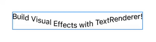
Through these methods, we ensure that the post-animation text size aligns with the layout dimensions and that the text displays in the correct position. These adjustments show that while TextRenderer provides vast creative space, fine-tuning may be required in practical applications to cater to specific scenarios.
Customizing Specific Text Segments Using TextAttribute
Since the current Run does not provide detailed text feature information, SwiftUI introduced the TextAttribute protocol to allow precise control over specific segments within Text.
In this example, we will apply a colorful effect only to specified segments within Text.
First, we define a type that conforms to the TextAttribute protocol. In ColorfulAttribute, we will adjust the color only for RunSlice that contains this attribute.
struct ColorfulAttribute: TextAttribute {}

struct ColorfulAttributeRender: TextRenderer {
  func draw(layout: Text.Layout, in context: inout GraphicsContext) {
    for (index, slice) in layout.flattenedRunSlices.enumerated() {
      // Check if the current Slice contains the ColorfulAttribute property
      if slice[ColorfulAttribute.self] != nil {
        let degree = Angle.degrees(360 / Double(index + 1))
        var copy = context
        copy.addFilter(.hueRotation(degree))
        copy.draw(slice)
      } else {
        // No adjustments needed, draw directly
        context.draw(slice)
      }
    }
  }
}
Use the customAttribute decorator to set custom attributes for specific text segments.
struct ColorfulAttributeDemo: View {
  var body: some View {
    let weekly = Text("Fatbobman Swift Weekly")
      .bold()
      .foregroundStyle(.pink)
      .customAttribute(ColorfulAttribute())

    Text("Subscribe \(weekly) now!")
      .textRenderer(ColorfulAttributeRender())
  }
}
Additionally, we can also iterate directly over Run and use the subscript method of Run to perform checks. In the following example, we add a blur effect to Run that possesses the BlurAttribute:
struct BlurAttribute: TextAttribute {}

struct BlurEffect: TextRenderer {
  func draw(layout: Text.Layout, in ctx: inout GraphicsContext) {
    for run in layout.flattenedRuns {
      if run[BlurAttribute.self] != nil {
        // Apply a blur effect to Run with BlurAttribute
        var blurContext = ctx
        let radius = run.typographicBounds.rect.height / 5
        blurContext.addFilter(.blur(radius: radius))
        blurContext.draw(run)
      }
      // Draw all Run, whether blurred or not
      ctx.draw(run)
    }
  }
}

struct BlurEffectDemo: View {
  var body: some View {
    let weekly = Text("Fatbobman Swift Weekly")
      .bold()
      .foregroundStyle(.pink)
      .customAttribute(BlurAttribute())

    Text("Subscribe \(weekly) now!")
      .textRenderer(BlurEffect())
  }
}
Implementing TextRenderer Suitable for Transitions
With the introduction of the Transition protocol starting in iOS 17, we can use TextRenderer implementations as the logic for transition animations. This section will show how to create a transition effect based on the code example presented by Apple in their WWDC 2024 Session.
If you are not familiar with the concept of transitions, please read Demystifying SwiftUI Animation: A Comprehensive Guide to understand the basics of transitions. Although this article was written before the introduction of the
Transitionprotocol, the animation logic discussed is still applicable.
First, we define a TextRenderer implementation called LineByLineEffect, which displays text line by line.
struct LineByLineEffect: TextRenderer {
  var elapsedTime: TimeInterval // Time elapsed
  var elementDuration: TimeInterval // Duration per line
  var totalDuration: TimeInterval // Total duration

  func draw(layout: Text.Layout, in context: inout GraphicsContext) {
    // Rendering logic is determined by elapsedTime
    ...
  }
}
totalDuration is the total duration of the animation, and elapsedTime is how much time has already passed. In the draw method, we calculate the current rendering based on the value of elapsedTime.
The full code can be viewed here: Sample Code.
By applying LineByLineEffect with the textRenderer decorator, we can adjust parameters to display the text at any point during the animation process. The following code demonstrates the state of the text at 0.432 seconds into a total duration of 0.9 seconds.
let weekly = Text("Fatbobman's Swift Weekly")
  .foregroundStyle(.pink).bold()
let swiftui = Text("SwiftUI")
  .foregroundStyle(.green).bold()
Text("Get weekly handpicked updates on \(swiftui) from \(weekly)!")
  .font(.system(.title, design: .rounded, weight: .semibold))
  .textRenderer(LineByLineEffect(elapsedTime: 0.432, elementDuration: 0.6, totalDuration: 0.9))
Next, we encapsulate LineByLineEffect into a Transition implementation, where the transition animation generates interpolation data and passes it to the elapsedTime parameter to complete the transition.
struct LineByLineTransition: Transition {
  let duration: TimeInterval
  init(duration: TimeInterval = 1.0) {
    self.duration = duration
  }

  func body(content: Content, phase: TransitionPhase) -> some View {
    // Set elapsedTime based on the transition phase, the transition will automatically generate interpolation data
    let elapsedTime = phase.isIdentity ? 0 : duration
    // Create LineByLineEffect
    let renderer = LineByLineEffect(
      elapsedTime: elapsedTime,
      totalDuration: duration
    )

    content.transaction { t in
      // Decide whether to enable animation transitions based on disablesAnimations
      if !t.disablesAnimations {
        // Override the default animation of the transaction with a linear animation
        t.animation = .linear(duration: duration)
      }
    } body: { view in
      view.textRenderer(renderer)
    }
  }
}
For more details on
Transactionand animation control, refer to Mastering Transaction for Precise Control of SwiftUI Animations.
To ensure that LineByLineEffect correctly receives animation interpolation data, we set the animatableData property of LineByLineEffect as follows:
struct LineByLineEffect: TextRenderer {
  var animatableData: Double {
    get { elapsedTime }
    set { elapsedTime = newValue }
  }
}
Now, applying LineByLineTransition to the text, we achieve the following transition effect:
let weekly = Text("Fatbobman's Swift Weekly")
  .foregroundStyle(.pink).bold()
let swiftui = Text("SwiftUI")
  .foregroundStyle(.green).bold()
Text("Get weekly handpicked updates on \(swiftui) from \(weekly)!")
  .font(.system(.title, design: .rounded, weight: .semibold))
  .transition(LineByLineTransition())
This approach allows TextRenderer not only to create dynamic text effects but also to provide animation logic for text transitions, demonstrating its powerful capabilities in dynamic interface expression.
Backward Compatibility Discussion
Although the code discussed in this article currently applies only to iOS 18 (or equivalent versions of other systems), TextRenderer and its main related APIs have been made backward compatible to iOS 17.
It is very likely that with the official release of Xcode 16, the implementation of TextRenderer will be operable on iOS 17. This means that developers can start using these new features without upgrading to the latest operating system version.
Considerations:
In the process of building and using TextRenderer implementations, the following points should be considered:
- Limitations in Text Feature Information Retrieval: The inability to directly extract detailed feature information from
Runsomewhat limits the capability to customize complex text effects usingTextRenderer. To address this, consider splitting long texts into multiple independentTextcomponents, each with its own effects applied. - Single
TextRendererApplication: Currently, eachTextcomponent can only apply oneTextRendererimplementation. If there is a need to reuse independent effects, it is advisable to separate the related logic fromTextRendererto facilitate reuse across multiple text components. - Complexity of Transition Animations: When using
TextRendererfor transition animations, careful consideration must be given to the number of elements split, the duration of the animation, and the total duration to ensure smooth execution.
Summary and Outlook
TextRenderer is a powerful tool provided by SwiftUI that enables developers to customize the rendering of text. This not only increases control over text rendering but also provides access to many previously unavailable details, such as determining whether text is truncated through the Layout’s isTruncated property, the number of lines displayed after rendering, and specific layout data of the text.
By using
TextRenderer, the previously challenging requirement for embedding tags withinTextcan now be easily addressed. I have updated the article Mixing Text and Image in SwiftUI to include the new solution based onTextRenderer.
I believe that Apple will continue to introduce more such advanced features, further unleashing the potential of SwiftUI. Over the next few years, as these features continue to be refined and expanded, we can expect SwiftUI to play an increasingly important role in application development.