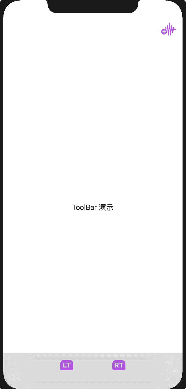
SwiftUI 2.0 provides some new controls with similar functions to existing controls but different names and usages in order to achieve better multi-platform support while maintaining compatibility with 1.0 version code. For example, ToolBar, navigationTitle, etc. Toolbar can implement all the functions of navigationbarItems and add adaptations on multiple platforms. It adopts a completely new syntax which makes the code easier to read.
In the current Xcode Version 12.0 beta 2 (12A6163b), ToolBar still has many issues on macOS.
Basic Usage
struct ToolBarTest: View {
    var body: some View {
        NavigationView{
            Text("ToolBar Demo")
                .toolbar{
                    ToolbarItem(placement:.automatic){
                        HStack(spacing:20){
                            Button(action:{print("wave")}){
                                Image(systemName: "waveform.path.badge.plus")
                                    .foregroundColor(.purple)
                                    .scaleEffect(1.5, anchor: .center)
                            }

                        }
                    }
                    //placement sets the position, the parsing of the View in ToolBarItem is not completely consistent with expectations, I don't know if it's a special restriction or a bug. For example, unable to display colorful symbols, unable to use Spacer, etc.
                    ToolbarItem(placement: .bottomBar){
                        HStack(spacing:100){
                            Button(action:{print("lt")}){
                                Image(systemName: "lt.rectangle.roundedtop.fill")
                                    .foregroundColor(.purple)
                                    .scaleEffect(1.5, anchor: .center)
                            }

                            Button(action:{print("rt")}){
                                Image(systemName: "rt.rectangle.roundedtop.fill")
                                    .foregroundColor(.purple)
                                    .scaleEffect(1.5, anchor: .center)
                            }
                        }
                    }
                }
        }
    }
}
Multi-platform Adaptation
In order to better adapt to multiple platforms, placement provides multi-platform adaptive options like automatic. Some placement values are available across platforms, some are only supported on selected platforms, and some can run on multiple platforms but can only be displayed correctly on selected platforms.
import SwiftUI

struct ToolBarTest: View {
    @State var placementSelection:Placement = .automatic
    @State var placement:ToolbarItemPlacement = .automatic
    @State var show = true

    var body: some View {
        NavigationView{
            VStack{

                Picker("placement:",selection:$placementSelection){
                    ForEach(Placement.allCases,id:\.self){ placement in
                        Text(placement.rawValue)
                            .tag(placement)
                    }
                }
                .labelsHidden()
                .padding(.all, 10)
                .onChange(of: placementSelection) { value in
                    switch value{
                    //Omitted switch cases

                    #if os(iOS)
                    case .bottomBar:
                        placement = .bottomBar
                    //Don't know why there's a bug that won't display after setting
                    //ToolbarItem(placement:.bottomBar) can display

                    case .navigationBarLeading:
                        placement = .navigationBarLeading
                    case .navigationBarTrailing:
                        placement = .navigationBarTrailing
                    #endif
                    }
                }

                //On macOS, setting id is needed to explicitly set whether to show ToolBar, not needed on iOS
                //Currently on macOS, not explicitly closing it may result in ToolBars from different Views mixing together or appearing repeatedly. Don't know if it's a bug or design logic
                .toolbar(id:"ToolBar") {
                    ToolbarItem(id:"1",placement:placement,showsByDefault:show) {
                        Button("Confirm"){

                        }
                    }
                }

                .navigationTitle("Toolbar Demo")

                #if os(macOS)
                Toggle("Show ToolBar",isOn:$show)
                Spacer()
                #endif
            }

            .frame(maxWidth:.infinity,maxHeight: .infinity)
        }

    }
}

enum Placement:String,CaseIterable{
    case automatic,principal,navigation
    case primaryAction,status,confirmationAction
    case cancellationAction,destructiveAction

    #if os(iOS)
    case navigationBarLeading,navigationBarTrailing,bottomBar
    #endif
}Demo of different placements on macOS
Regrettably
There are currently many bugs on macOS. The parsing of ToolBarItem for Views is still incomplete. ToolBarContentBuilder does not support logical judgments.