TipKit is a new framework introduced by Apple at WWDC 2023, designed to easily display tips within your applications. It can be utilized to introduce new features to users, help them discover hidden options, or demonstrate quicker ways to accomplish tasks. TipKit operates across different hardware environments and operating systems within the Apple ecosystem, including iPhone, iPad, Mac, Apple Watch, and Apple TV.
Developers can control the timing and frequency of tip displays through setting rules and display frequency strategies. Additionally, they can access the status of a tip and information about events linked to tips through APIs. Although TipKit was primarily created to showcase tips, its functionalities are not limited to this alone.
I will explore the TipKit framework in two articles. In this article, we start by learning how to use TipKit; in the next article, we will discuss more tips, considerations, implementation principles, and the extension of TipKit to other scenarios.
September 2024 Update: At WWDC 2024, the functionalities of the TipKit framework were significantly expanded. This series of articles has been revised to reflect the latest updates.
How to Define a Tip
In TipKit, defining a tip involves declaring a structure that conforms to the Tip protocol. The Tip protocol defines the title, image, message, and rules for determining the conditions under which the tip should appear.
struct InlineTip: Tip {
    var title: Text {
        Text("Save as a Favorite")
    }
    var message: Text? {
        Text("Your favorite backyards always appear at the top of the list.")
    }
    var image: Image? {
        Image(systemName: "star")
    }
}
Making the Tip Effective
The tip shown in the image below is actionable, instructive, and memorable, making it a recommended display method.

Here are some examples of information unsuitable for tip display:
- Promotional information
- Error messages
- Non-actionable information
- Overly complex content that cannot be immediately understood

Initializing the Tip Container
To enable the TipKit framework to function in your application, configure the tip container before the first tip appears, typically during the initial phase of the application. For example:
import TipKit

@main
struct TipKitExamplesApp: App {
    init() {
      // Configure Tip's data container
      try? Tips.configure()
    }
    var body: some Scene {
        WindowGroup {
            ContentView()
        }
    }
}
Tips.configure is used to initialize the data container, where TipKit stores information about tips and associated events. It supports adjusting the global display frequency strategy for tips through parameters, as detailed later.
Adding a Tip in a SwiftUI View
TipKit provides two methods of displaying tips: inline (TipView) and pop-up (popoverTip).
Apple has provided a Demo showcasing various functionalities of Tip, and this article uses some of the code provided in that demo.
Inline
TipView, provided by TipKit, allows tips to be added inline within a view. Apple recommends using this style as much as possible to avoid obscuring content and UI elements that users might want to view or interact with.
struct InlineView: View {
    // Create an instance of your tip content.
    var tip = InlineTip()

    var body: some View {
        VStack(spacing: 20) {
            Text("A TipView embeds itself directly in the view. Make this style of tip your first choice as it doesn't obscure or hide any underlying UI elements.")

            // Place your tip near the feature you want to highlight.
            TipView(tip, arrowEdge: .bottom)
            Button {
                // Invalidate the tip when someone uses the feature.
                tip.invalidate(reason: .actionPerformed)
            } label: {
                Label("Favorite", systemImage: "star")
            }

            Text("To dismiss the tip, tap the close button in the upper right-hand corner of the tip or tap the Favorite button to use the feature, which then invalidates the tip programmatically.")
            Spacer()
        }
        .padding()
        .navigationTitle("TipView")
    }
}
In the code above, an InlineTip instance is first created within the view, then TipView is placed at the desired location. Developers can set the direction of the arrow through the arrowEdge parameter; if set to nil, the arrow will not display.
TipView integrates into layouts like any other SwiftUI view, impacting the existing layout upon display. In other words, developers can place it in any layout container and apply various view modifiers to it.
TipView(tip)
    .frame(width: 250)
    .symbolRenderingMode(.multicolor)
Pop-up
The popoverTip view modifier is used to display tips as an overlay within a view.

struct PopoverTip: Tip {
    var title: Text {
        Text("Add an Effect")
            .foregroundStyle(.indigo)
    }
    var message: Text? {
        Text("Touch and hold \(Image(systemName: "wand.and.stars")) to add an effect to your favorite image.")
    }
}

struct PopoverView: View {
    // Create an instance of your tip content.
    var tip = PopoverTip()

    var body: some View {
        VStack(spacing: 20) {
            ....
            Image(systemName: "wand.and.stars")
                .imageScale(.large)
                // Add the popover to the feature you want to highlight.
                .popoverTip(tip)
                .onTapGesture {
                    // Invalidate the tip when someone uses the feature.
                    tip.invalidate(reason: .actionPerformed)
                }
            ....
        }
    }
}
You can adjust the positioning of the Tip relative to the view it’s applied to using the arrowEdge, which cannot be set to nil:
.popoverTip(tip, arrowEdge: .leading)
On iOS, pop-up windows are presented modally, meaning interaction with other elements is only possible after the Tip is closed or hidden. Additionally, developers cannot apply view modifiers to Tips displayed via popoverTip.
How to Adjust the Appearance of a Tip
For TipView and popoverTip provided by TipKit, we can adjust their display effects in the following ways:
Applying Modifiers to Text and Image Without Changing Their Types
Without altering the types of Text and Image, we can use suitable modifiers to enhance the display of text and images. For example:
struct InlineTip: Tip {
    var title: Text {
        Text("Save \(Image(systemName: "book.closed.fill")) as a Favorite")
    }
    var message: Text? {
        Text("Your ") +
        Text("favorite")
            .bold()
            .foregroundStyle(.red) +
        Text(" backyards always appear at the \(Text("top").textScale(.secondary)) of the list.")
    }
    var image: Image? {
        Image(systemName: "externaldrive.fill.badge.icloud")
            .symbolRenderingMode(.multicolor)
    }
}
This method is effective for both TipView and popoverTip.
Using Modifiers Specific to TipView
TipView(tip, arrowEdge: .bottom)
    .tipImageSize(.init(width: 30, height: 30))
    .tipCornerRadius(0)
    .tipBackground(.red)
This method is only effective for TipView.
Unique modifiers, standard view modifiers, and Text and Image containing additional information can be combined.
Customizing the Appearance of TipView with TipViewStyle
Like many SwiftUI components, TipKit also allows customization of the TipView appearance through styling.
struct MyTipStyle: TipViewStyle {
    func makeBody(configuration: Configuration) -> some View {
        VStack {
            if let image = configuration.image {
                image
                    .font(.title2)
                    .foregroundStyle(.green)
            }
            if let title = configuration.title {
                title
                    .bold()
                    .font(.headline)
                    .textCase(.uppercase)
            }
            if let message = configuration.message {
                message
                    .foregroundStyle(.secondary)
            }
        }
        .frame(maxWidth: .infinity)
        .backgroundStyle(.thinMaterial)
        .overlay(alignment: .topTrailing) {
            // Close Button
            Image(systemName: "multiply")
                .font(.title2)
                .alignmentGuide(.top) { $0[.top] - 5 }
                .alignmentGuide(.trailing) { $0[.trailing] + 5 }
                .foregroundStyle(.secondary)
                .onTapGesture {
                    // Invalidate Reason
                    configuration.tip.invalidate(reason: .tipClosed)
                }
        }
        .padding()
    }
}

TipView(tip, arrowEdge: .bottom)
    .tipViewStyle(MyTipStyle())
Developers may choose not to add a close button in the custom style to prevent users from invalidating the tip through that route.
Additionally, developers can completely abandon
TipViewandpopoverTipby implementing complete control over tip display methods through responding to tip states (this will be detailed in the next article).
Adding an Action Button to a Tip
So far, the tips we’ve created have been purely for display. By adding actions, we can make tips more interactive and functional.
struct PasswordTip: Tip {
var title: Text {
Text("Need Help?")
}
var message: Text? {
Text("Do you need help logging in to your account?")
}
var image: Image? {
Image(systemName: "lock.shield")
}
var actions: [Action] {
// Define a reset password button.
Action(id: "reset-password", title: "Reset Password")
// Define a FAQ button.
Action(id: "faq", title: "View our FAQ")
}
}
// In View
struct PasswordResetView: View {
@Environment(\.openURL) private var openURL
// Create an instance of your tip content.
private var tip = PasswordTip()
var body: some View {
VStack(spacing: 20) {
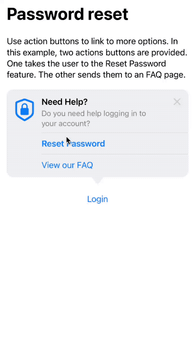
Text("Use action buttons to link to more options. In this example, two actions buttons are provided. One takes the user to the Reset Password feature. The other sends them to an FAQ page.")
// Place your tip near the feature you want to highlight.
TipView(tip, arrowEdge: .bottom) { action in
// Define the closure that executes when someone presses the reset button.
if action.id == "reset-password", let url = URL(string: "https://iforgot.apple.com") {
openURL(url) { accepted in
print(accepted ? "Success Reset" : "Failure")
}
}
// Define the closure that executes when someone presses the FAQ button.
if action.id == "faq", let url = URL(string: "https://appleid.apple.com/faq") {
openURL(url) { accepted in
print(accepted ? "Success FAQ" : "Failure")
}
}
}
Button("Login") {}
Spacer()
}
.padding()
.navigationTitle("Password reset")
}
}
In the code above, we first add Action data in PasswordTip. Here, the id is used to identify different actions in the callback closure.
var actions: [Action] {
    Action(id: "reset-password", title: "Reset Password")
    Action(id: "faq", title: "View our FAQ")
}
In the Tip protocol, actions are defined as @Tips.OptionsBuilder var options: [TipOption] { get }, which is a Result builder, thus allowing for the composition and return of an array of Actions as described.
In the view, the source of actions is determined by adding a closure behind TipView to implement corresponding operations.
TipView(tip, arrowEdge: .bottom) { action in
    if action.id == "reset-password", let url = URL(string: "https://iforgot.apple.com") {
        openURL(url) { accepted in
            print(accepted ? "Success Reset" : "Failure")
        }
    }
    if action.id == "faq", let url = URL(string: "https://appleid.apple.com/faq") {
        openURL(url) { accepted in
            print(accepted ? "Success FAQ" : "Failure")
        }
    }
}
popoverTip also supports versions with actions.
.popoverTip(tip){ action in
   // ....
}
In this example, as we need to use the openURL provided by the view environment value, the implementation of actions is performed in the view. If there is no need to use information within the view, you can directly add corresponding operation code in the action definition.
Action(id: "faq", title: "View our FAQ", perform: {
    if let url = URL(string: "https://appleid.apple.com/faq") {
        UIApplication.shared.open(url)
    }
})

TipView(tip, arrowEdge: .bottom)
Establishing Display Rules for Tips
Apple wouldn’t have needed to create the TipKit framework if it were just to provide the Tip view templates mentioned above. The power of TipKit lies in allowing developers to create unique rules for each tip and use those rules to decide whether to display the tip.
Rules are based on certain states (parameters) or user events, so we first need to define the required parameters and events within the Tip type.
Defining Parameters for a Tip
We can use the @Parameter property wrapper to define a variable that represents the application state we want to track.
struct ParameterRuleTip: Tip {
    // Define the app state you want to track.
    @Parameter
    static var isLoggedIn: Bool = false
}
Expanding the property wrapper, we see the full code generated by @Parameter:
static var $isLoggedIn: Tips.Parameter<Bool> = Tips.Parameter(Self.self, "isLoggedIn", false)
static var isLoggedIn: Bool = false
{
    get {
        $isLoggedIn.wrappedValue
    }
    set {
        $isLoggedIn.wrappedValue = newValue
    }
}
The type of $isLoggedIn is Tips.Parameter<Bool>, which provides the ability to persist the value of ParameterRuleTip.isLoggedIn.
TipKit offers an
@Parameter(.transient)option for@Parameter. When enabled, TipKit uses the default value provided in the tip definition instead of the persisted value upon app restart. Unlike thetransientoption in Core Data or SwiftData, even with thetransientoption enabled in TipKit, data is still persisted. This is primarily to facilitate dynamic synchronization of the parameter across different applications and components using the same TipKit data source.
The parameter’s definition isn’t limited to within the declaration of a Tip. In fact, parameters can be declared in any type, such as:
struct ContentView: View {
  @Parameter static var isLoggedIn: Bool = false
}
Declaring parameters outside of a Tip enhances the reusability of the Tip.
Creating Rules to Determine Tip Display Based on State
Now, using the previously defined isLoggedIn property, we can create a rule to determine if the conditions are met to display ParameterRuleTip.
struct ParameterRuleTip: Tip {
    // Define the app state you want to track.
    @Parameter
    static var isLoggedIn: Bool = false

    var rules: [Rule] {
        [
            // Define a rule based on the app state.
            #Rule(Self.$isLoggedIn) {
                // Set the conditions for when the tip displays.
                $0 == true
            }
        ]
    }
    // ...
}
For parameters declared in other types, the location of the parameter must be specified when writing the rule, for example:
#Rule(ContentView.$isLoggedIn) {#Rule(Self.$isLoggedIn) indicates that the rule will observe the ParameterRuleTip.isLoggedIn property and pass isLoggedIn as a parameter to the closure.
#Rule is also a macro, and when expanded, you’ll find that TipKit’s rules are based on Predicates.
Tip.Rule(Self.$isLoggedIn) {
    PredicateExpressions.build_Equal(
        lhs: PredicateExpressions.build_Arg($0),
        rhs: PredicateExpressions.build_Arg(true)
    )
}
In the view, we can show or hide the tip by modifying the value of isLoggedIn:
struct ParameterView: View {
// Create an instance of your tip content.
private var tip = ParameterRuleTip()
var body: some View {
VStack(spacing: 20) {
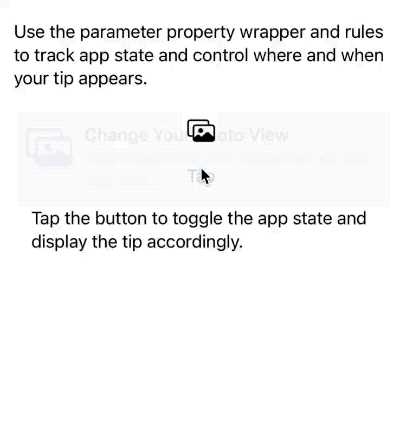
Text("Use the parameter property wrapper and rules to track app state and control where and when your tip appears.")
// Place your tip near the feature you want to highlight.
TipView(tip, arrowEdge: .bottom)
Image(systemName: "photo.on.rectangle")
.imageScale(.large)
Button("Tap") {
// Trigger a change in app state to make the tip appear or disappear.
ParameterRuleTip.isLoggedIn.toggle()
}
Text("Tap the button to toggle the app state and display the tip accordingly.")
Spacer()
}
.padding()
.navigationTitle("Parameters")
}
}
In the code above, for demonstration purposes, we modify the value of isLoggedIn by clicking a button. However, we could also pass changes to values through constructors, for instance:
struct ParameterRuleTip: Tip {
    init(isLoggedIn: Bool){
        Self.isLoggedIn = isLoggedIn
    }
    // ...
}

struct ParameterView: View {
    private var tip: ParameterRuleTip
    init(isLoggedIn: Bool) {
        tip = ParameterRuleTip(isLoggedIn: isLoggedIn)
    }
    // ...
}
In reality, developers can read or set the value of ParameterRuleTip.$isLoggedIn anywhere in the application, whether in a view or not. TipKit will observe these changes to decide whether to display ParameterRuleTip.
The state of ParameterRuleTip.isLoggedIn can only be observed by TipKit in real-time and cannot be used as a data source for SwiftUI views.
Defining Events for Tips
In addition to using specific states to determine tip visibility, TipKit also provides another method for setting rules based on statistical analysis.
First, we need to define an event for the Tip, and then decide whether to display the Tip based on the frequency and number of occurrences of that event.
struct EventRuleTip: Tip {
    // Define the user interaction you want to track.
    static let didTriggerControlEvent = Event(id: "didTriggerControlEvent")
    ....

    var rules: [Rule] {
        [
            // Define a rule based on the user-interaction state.
            #Rule(Self.didTriggerControlEvent) {
                // Set the conditions for when the tip displays.
                $0.donations.count >= 3
            }
        ]
    }
}
Like parameters, events are static properties. The id is the identifier of the event.
The rule below means that the EventRuleTip will only be displayed after the didTriggerControlEvent has been triggered at least three times.
#Rule(Self.didTriggerControlEvent) {
    // Set the conditions for when the tip displays.
    $0.donations.count >= 3
}
We can generate events anywhere in the application using the event property.donate() method. TipKit will record the time of each event generation, which will be used for judgment and filtering.
struct EventView: View {
// Create an instance of your tip content.
private var tip = EventRuleTip()
var body: some View {
VStack(spacing: 20) {
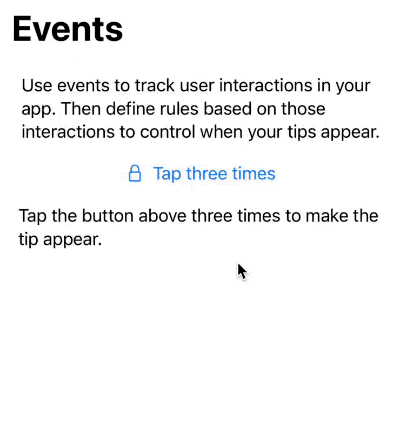
Text("Use events to track user interactions in your app. Then define rules based on those interactions to control when your tips appear.")
// Place your tip near the feature you want to highlight.
TipView(tip)
Button(action: {
// Donate to the event when the user action occurs.
Task { await EventRuleTip.didTriggerControlEvent.donate() }
}, label: {
Label("Tap three times", systemImage: "lock")
})
Text("Tap the button above three times to make the tip appear.")
Spacer()
}
.padding()
.navigationTitle("Events")
}
}
In the demo above, we generate the corresponding event by clicking the button. When the event count reaches three, the conditions of the rule are met, and the EventRuleTip is displayed.
Button(action: {
    // Donate to the event when the user action occurs.
    Task { await EventRuleTip.didTriggerControlEvent.donate() }
}, label: {
    Label("Tap three times", systemImage: "lock")
})
TipKit also provides a synchronous version of the event generation method with a callback function (sendDonation).
Button(action: {
    // Donate to the event when the user action occurs.
    EventRuleTip.didTriggerControlEvent.sendDonation {
        print("donate a didTriggerControlEvent")
    }
}, label: {
    Label("Tap three times", systemImage: "lock")
})
We can make judgments based on several aspects of the event:
// Total events >= 3
$0.donations.count >= 3
// Events within a week < 3
$0.donations.donatedWithin(.week).count < 3
// Events within three days > 3
$0.donations.donatedWithin(.days(3)).count > 3
Currently, each generated Event in TipKit only records the time of creation, and custom DonationInfo is not yet available. If custom DonationInfo were available, we could add more specific information when creating events for more targeted rule setting.
public func donate(_ donation: DonationInfo) asyncWe can define various events, such as entering a specific view, clicking buttons, or receiving network data. Use TipKit’s events as a method of recording and filtering, applying it to other scenarios.
Similar to parameter definitions, the definition of events does not need to be limited to within the Tip declaration. TipKit distinguishes events by their id, regardless of their declaration location. This means that although the events in the following code are declared in two different locations, the donate action triggers the same event:
struct ContentView: View {
  static let didTriggerControlEvent = Tips.Event(id: "didTriggerControlEvent")
}

struct EventRuleTip: Tip {
    static let didTriggerControlEvent = Event(id: "didTriggerControlEvent")
}

await EventRuleTip.didTriggerControlEvent.donate()
await ContentView.didTriggerControlEvent.donate()
We will discuss the relationship between events and their id in more depth in the advanced section.
Rule Applicability
If no specific rules are set for a Tip, it can be considered to have a default rule that is always true.
Multiple rules can also be created within a Tip. In the Tip protocol, rules are defined as @Tips.RuleBuilder var rules: [Self.Rule] { get }, also a Result Builder. Multiple rules are combined using an AND relationship, and all must be satisfied for the tip to display. For example, the two rules mentioned above can be combined as follows:
var rules: [Rule] {
    #Rule(Self.didTriggerControlEvent) {
        $0.donations.count > 3
    }
    #Rule(Self.$isLoggedIn) {
        $0 == true
    }
}
The Tip will only display when isLoggedIn is true, and the didTriggerControlEvent has occurred more than three times.
Methods to Invalidate a Tip
In the previous code examples, the following lines appeared twice:
tip.invalidate(reason: .actionPerformed)
configuration.tip.invalidate(reason: .tipClosed)
These two lines serve the same purpose: they invalidate a Tip and record the reason for it.
Currently, TipKit provides three reasons for invalidating a Tip:
actionPerformed: Primarily used for invalidations actively triggered by developers in the code.tipClosed: Recorded when the close button (x) on the Tip view is clicked.displayCountExceeded: When the number of Tip displays exceeds a set threshold, TipKit will automatically invalidate the Tip and record this reason (explained below).
It is important to note that invalidating a Tip and preventing a Tip from displaying are two different concepts.
We use rules to decide if a Tip meets the conditions for display, but a prerequisite is that the Tip must not already be invalidated. Otherwise, even if the display rules are met, TipKit will not display an invalidated Tip.
Setting the Maximum Display Count for a Tip
In the earlier discussion, we mentioned another reason for Tip invalidation: displayCountExceeded. By defining options within a Tip, we can control its maximum number of displays.
struct OptionTip: Tip {
    var title: Text {
        Text("Edit Actions in One Place")
    }

    var options: [Option] {
        // Show this tip once.
        Tips.MaxDisplayCount(1)
    }
}
In the code above, we set Tips.MaxDisplayCount(1) so that the Tip view (whether TipView or popoverTip) can only be displayed once. Once shown, TipKit will set this Tip to an invalidated state.
TipKit also provides another option for ignoring the global display frequency policy (see below):
Tips.IgnoresDisplayFrequency(true)Setting the Maximum Display Duration for a Tip
In iOS 18+ versions, TipKit introduced a new TipOption: MaxDisplayDuration. This option allows a Tip to be automatically invalidated after its display time accumulates to a preset duration.
The duration is calculated cumulatively. For example, if a Tip’s maximum display duration is set to 300 seconds, it will no longer be displayed after the cumulative display time at different moments exceeds 300 seconds.
The minimum continuous display time for a Tip is set to 60 seconds to prevent it from disappearing too quickly after being displayed. By default, there is no maximum display duration set for Tips.
struct FavoriteBackyardTip: Tip {
    var options: [any Option] {
        // Tip will automatically be invalidated
        // after it has been displayed for 5 minutes.
        MaxDisplayDuration(300.0)
    }
}
Setting a Global Display Frequency Strategy for Tips through Configuration
One might wonder, if the rule evaluation for a Tip is true and it has not been invalidated, would it continuously display? Would that not be annoying to the user?
TipKit has already considered this, thus allowing developers to set a global Tip display frequency strategy through Configuration.
struct TipKitExamplesApp: App {
    init() {
        try? Tips.configure([
            // The system shows no more than one tip per day.
            .displayFrequency(.daily)
        ])
    }
    var body: some Scene {
        WindowGroup {
            ContentView()
        }
    }
}
By setting .displayFrequency(.daily) in the configuration, we can ensure that an unexpired Tip, if its rules are true, is only displayed once a day. Other settings include: hourly, weekly, monthly, immediate (no frequency limits).
When a Tip’s options are set to Tips.IgnoresDisplayFrequency(true), it will ignore the global display frequency settings.
Resetting All Data in TipKit
We can use the following code to reset all Tip data saved in the current app, including events, invalidation states, and display counts. This command is usually used when testing or making significant changes to the app.
try Tips.resetDatastore()This method should be run before
try? Tips.configure().
Configuration Commands for Testing
For testing convenience, you can use the following APIs to forcibly display or hide Tips:
// Display all Tips, regardless of whether they are invalidated or the rules are true.
try? Tips.showAllTipsForTesting()

// Display specific Tips, regardless of whether they are invalidated or the rules are true.
try? Tips.showTipsForTesting([EventRuleTip.self, ParameterRuleTip.self])

// Hide all Tips, even if they have not been invalidated and the rules are true.
try? Tips.hideAllTipsForTesting()
Setting the Location for Saving TipKit Data
We can also change the location where TipKit saves data. When using App Groups, multiple apps or components can share the same TipKit data source. For example, if a Tip is invalidated in App A, the invalidation state will also be reflected in App B.
try? Tips.configure([
    .datastoreLocation(.groupContainer(identifier: "appGroup-id"))
])
Or save the data to a specified directory.
try? Tips.configure([
    .datastoreLocation(.url(URL.documentsDirectory))
])
By default, TipKit data is saved in the
Application Supportdirectory.
Sharing Tip Data Across Devices
In iOS 18+ versions, TipKit provides the ability to synchronize the state data of Tips across multiple devices. For example, if a rule is set for a Tip to be displayed a maximum of three times, after a user views the Tip three times on different devices (using the same iCloud account), the Tip will automatically be invalidated.
Enabling this synchronization feature requires a process similar to configuring Core Data with CloudKit, including adding a CloudKit container and enabling permissions for receiving remote notifications. For detailed information, please see Core Data with CloudKit: Syncing Local Database to iCloud Private Database.
To prevent data conflicts, TipKit recommends configuring a dedicated CloudKit container for its events, with the container name suggested to have a .tips suffix, such as: iCloud.com.apple.TipKitTrails.tips.
Developers need to specify the CloudKit container used in Tips.configure:
@main
struct TipKitTrails: App {
    init() {
        do {
            // Sync the TipKit datastore using CloudKit.
            try Tips.configure([
                .cloudKitContainer(.named("iCloud.com.apple.TipKitTrails.tips"))
            ])
        }
        catch {
            // Handle TipKit errors
            print("Error initializing TipKit \(error.localizedDescription)")
        }
    }
}
If using the automatic option, TipKit will search for the first container with a .tips suffix in the project; if no such container exists, it will use the main container:
.cloudKitContainer(.automatic)Managing Multiple Tips and Sequential Display with TipGroup
From the previous descriptions, it is clear that although each Tip in TipKit has a detailed definition, when multiple Tips exist in a view at the same time, it’s challenging for developers to effectively control their display order and relationship, making it difficult to display them sequentially by the rules.
In iOS 18+ versions, TipKit introduced the concept of TipGroup. With TipGroup, developers can now group multiple Tips together, ensuring that only the Tips that meet the conditions are displayed.
struct Tip1: Tip {
  @Parameter static var show: Bool = false
  var title: Text {
    Text("Tip1")
  }

  var rules: [Rule] {
    #Rule(Self.$show){
      $0
    }
  }
}

struct Tip2: Tip {
  var title: Text {
    Text("Tip2")
  }
}

struct TipGroupDemo: View {
  @State var tips = TipGroup(.ordered) { // Declare TipGroup, type as ordered display
    Tip1()
    Tip2()
  }

  var body: some View {
    VStack {
      Text("Hello World")
        .popoverTip(tips.currentTip) // Display the Tip that meets the conditions

      Button("Start Show Tips"){
        Tip1.show = true // Activate Tip1
      }
      .buttonStyle(.bordered)
    }
  }
}
Developers can also use the same TipGroup across multiple components, so that only the component that meets the conditions can display the corresponding Tip:
var body: some View {
  VStack(spacing:80) {
    Text("Hello World")
      .popoverTip(tips.currentTip as? Tip1) // Corresponding to Tip1

    Text("Fatbobman's Blog")
      .popoverTip(tips.currentTip as? Tip2) // Corresponding to Tip2

    Button("Start Show Tips"){
      Tip1.show = true
    }
    .buttonStyle(.bordered)
  }
}
In an ordered TipGroup, only after all preceding Tips have been invalidated will the subsequent Tips be displayed.
The firstAvailable priority will display the first Tip that meets the display rules, which is very useful when there are multiple unrelated Tips in the view but you only want to display one at a time.
struct TipGroupDemo: View {
  @State var tips = TipGroup(.firstAvailable) { // Display the first Tip that meets its display rules
    Tip1()
    Tip2()
  }

  var body: some View {
    VStack(spacing:80) {
      Text("Hello World")
        .popoverTip(tips.currentTip) // Display the first Tip that meets its display rules


      Button("Show Tip1"){
        Tip1.show = true
      }
      .buttonStyle(.bordered)

      Button("Show Tip2"){
        Tip2.show = true
      }
      .buttonStyle(.bordered)
    }
  }
}
In this tweet, I shared a solution for implementing ordered Tip display in iOS 17.
TipGroup is a powerful tool that, when combined with display rules and frequency strategies, can effectively guide users to gradually discover app features without overwhelming the application with too many prompts.
Next Steps
In this article, we introduced the basic usage of TipKit. In the next article, we will explore more about TipKit, including its data saving mechanisms, using TipKit with UIKit, using TipKit as a statistical tool outside the realm of prompts, and how to implement completely custom views (not using TipView or popoverView) among other advanced topics.